Viral Hooks
Trending short videosVintage 90s sports fashion catalog
G

@gamedaygrails

Instagram · Carousel
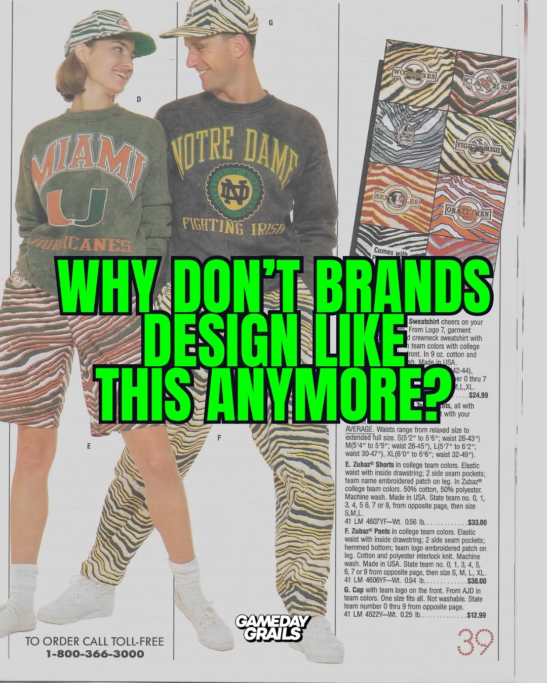
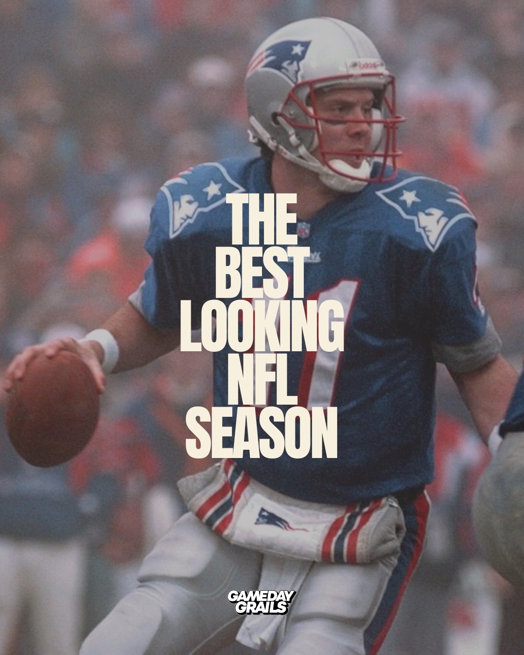
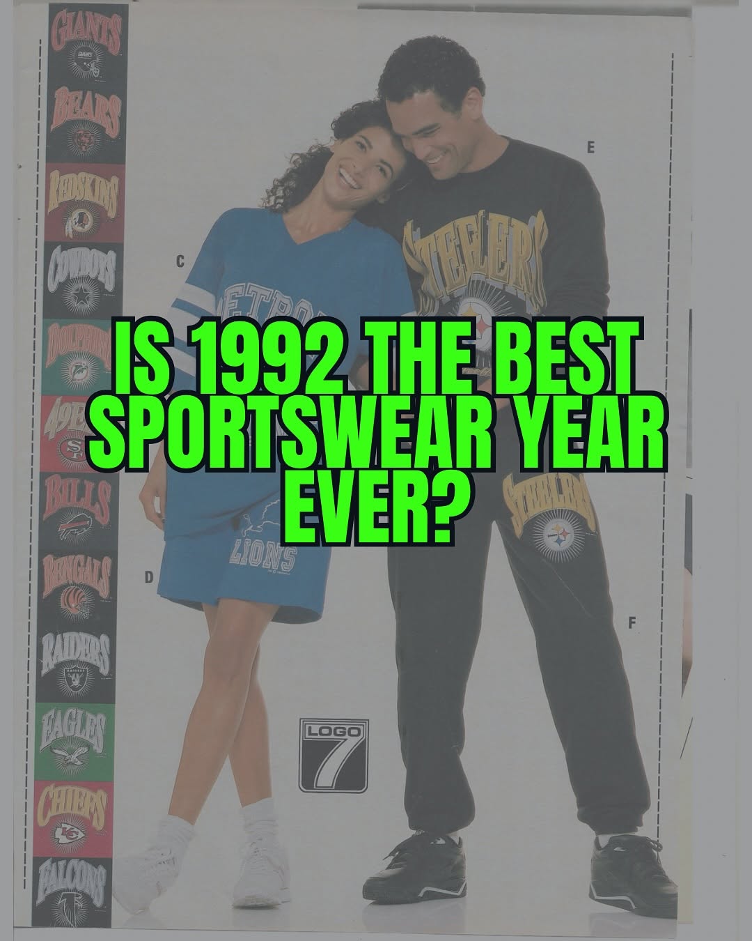
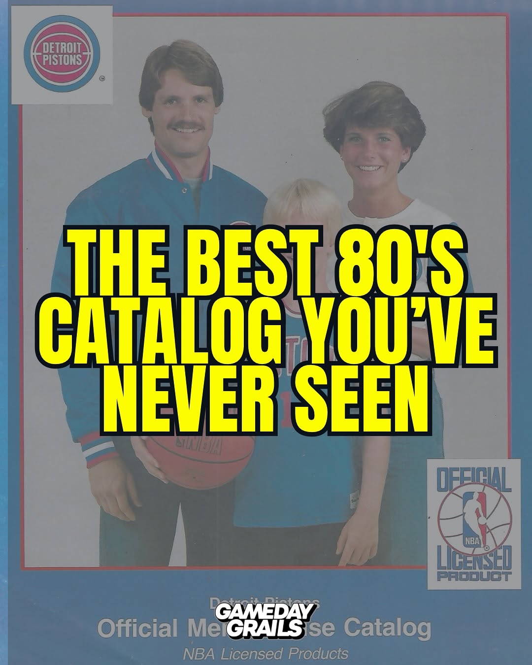
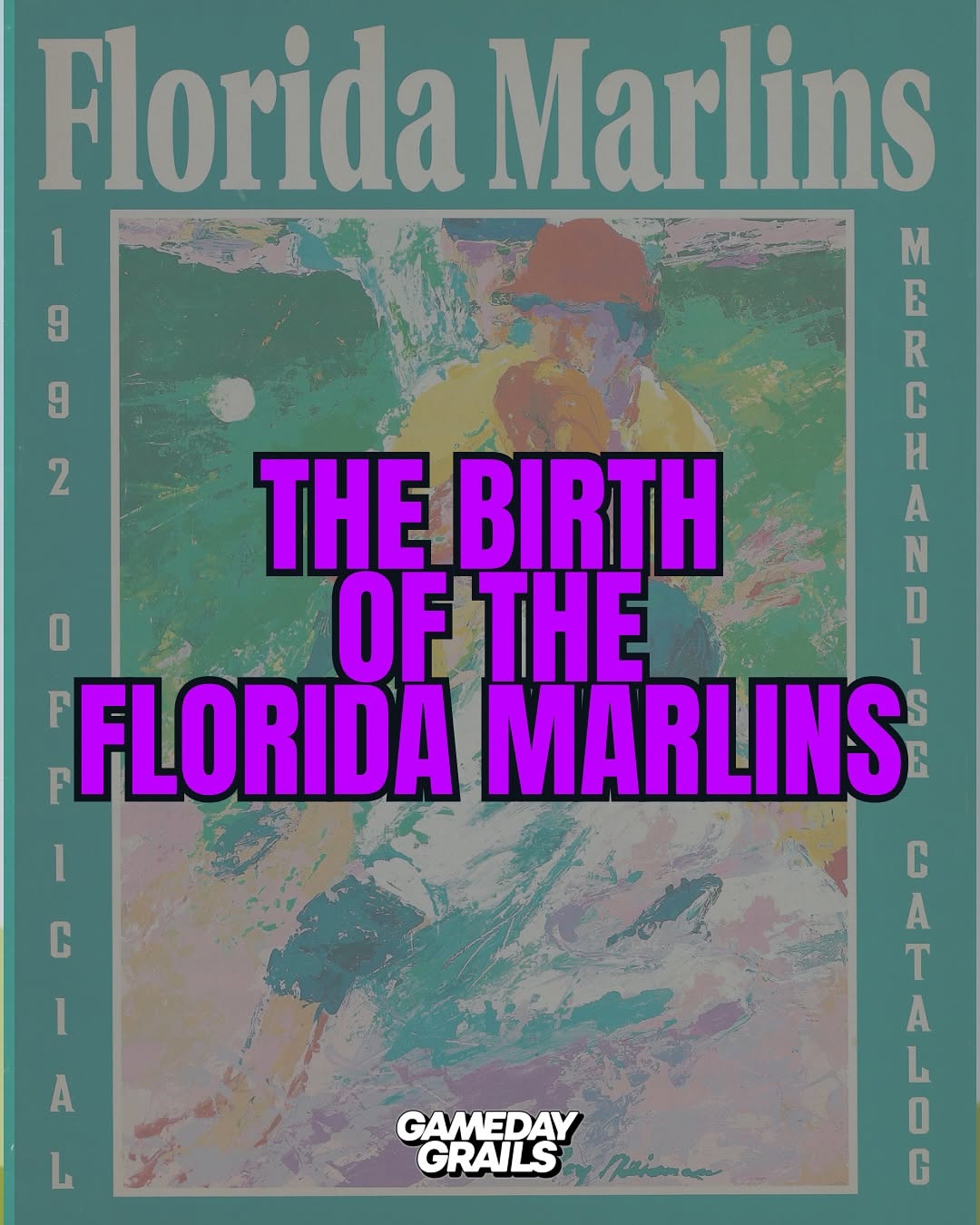
@gamedaygrails WHY DON’T BRANDS DESIGN LIKE THIS ANYMORE? Title says it all. The golden era gave us variety!!! Us fans got multiple options to match our personality, from muted to exuberant. Enjoy a few scans from the 1992 spring/summer Sears Starting Lineup catalog (the one with Jordan on it is the fall/winter btw) #vintagesportswear #90saesthetic #vintagecatalog #nba #nfl #mlb #designinspiration
View original on Instagram

The edit1 shot · 6 text
Shots Text

Performance

Views
28.1K
Likes
1.9K
Comments
93
Engagement
7.1%

Video #15832 · Carousel

Vintage 90s sports fashion catalogfrom @gamedaygrails

[01]

Overview

This carousel post displays a series of scanned pages from a 1992 Sears 'Starting Lineup' catalog. It showcases the bold, colorful, and often eccentric sports apparel designs of the era, posing the question of why modern brands have moved away from this aesthetic.

[02]

Simple outline

  1. 1Hook with rhetorical critique
  2. 2Establish the baseline thesis
  3. 3Present visual evidence stack
  4. 4Let visuals drive engagement

[03]

Related videos

[04]

Classification

Format
Concepts
Nostalgia HighlightEditorial CarouselBuying List
Elements
Text Overlay

[05]

Hook analysis

What stops the scroll in the first 3 seconds

Title hook · 45%

WHY DON'T BRANDS DESIGN LIKE THIS ANYMORE?

Verbal hook · 10%

WHY DON’T BRANDS DESIGN LIKE THIS ANYMORE? Title says it all.

Visual hook · 45%

The immediate visual impact of bold, retro 90s fashion, including vibrant zebra-print Zubaz pants and oversized team sweatshirts, creates a strong nostalgic pattern interrupt. The bright green, blocky text overlay further grabs attention against the vintage catalog background.

[07]

Hook and payoff

The promise the opener makes, and how the video pays it back

Hook

A bold, text-heavy cover slide featuring a rhetorical question that critiques current trends and creates a nostalgia-driven curiosity gap.

Payoff

A final striking visual that caps off the gallery, leaving the viewer with a sense of nostalgia or agreement, naturally driving them to the caption for deeper context or the comments to validate the opening critique.

[08]

Narrative framework

The structural pattern this video runs on

Framework

The Nostalgic Critique Gallery

Leverage a polarizing or nostalgic rhetorical question about a decline in modern quality, followed by a text-minimal, highly curated visual gallery that serves as undeniable proof.

  1. 1

    The Thesis Statement

    The opening slide establishes the core argument using a strong text overlay to frame the upcoming visual experience, positioning the creator as a curator of lost quality.

  2. 2

    The Visual Evidence Stack

    A sequence of text-minimal slides that rely entirely on curated visual examples to prove the cover slide's point. The removal of heavy text overlays forces the user to focus on the visual details, while a repeating subtle watermark maintains brand continuity.

Themes

  • Nostalgia
  • 90s Aesthetic
  • Retro Design
  • Brand Evolution

Techniques

  • Archival Scanning
  • Text Overlay
  • Content Curation

Trends

  • Vintage Fashion Resurgence
  • 90s Nostalgia

Post caption

WHY DON’T BRANDS DESIGN LIKE THIS ANYMORE? Title says it all. The golden era gave us variety!!! Us fans got multiple options to match our personality, from muted to exuberant. Enjoy a few scans from the 1992 spring/summer Sears Starting Lineup catalog (the one with Jordan on it is the fall/winter btw) #vintagesportswear #90saesthetic #vintagecatalog #nba #nfl #mlb #designinspiration
Text overlays

  • title · photo_0

    WHY DON'T BRANDS DESIGN LIKE THIS ANYMORE?

  • branding · photo_0

    GAMEDAY GRAILS

  • branding · photo_1

    GAMEDAY GRAILS

  • branding · photo_2

    GAMEDAY GRAILS

  • branding · photo_3

    GAMEDAY GRAILS

  • branding · photo_4

    GAMEDAY GRAILS