@boysnoize
Instagram · Carousel
@boysnoize New music. “SHUT IT DOWN” @fukintayson 🎶

@boysnoize
Instagram · Carousel
@boysnoize New music. “SHUT IT DOWN” @fukintayson 🎶
Performance
Video #28804 · Carousel
[01]
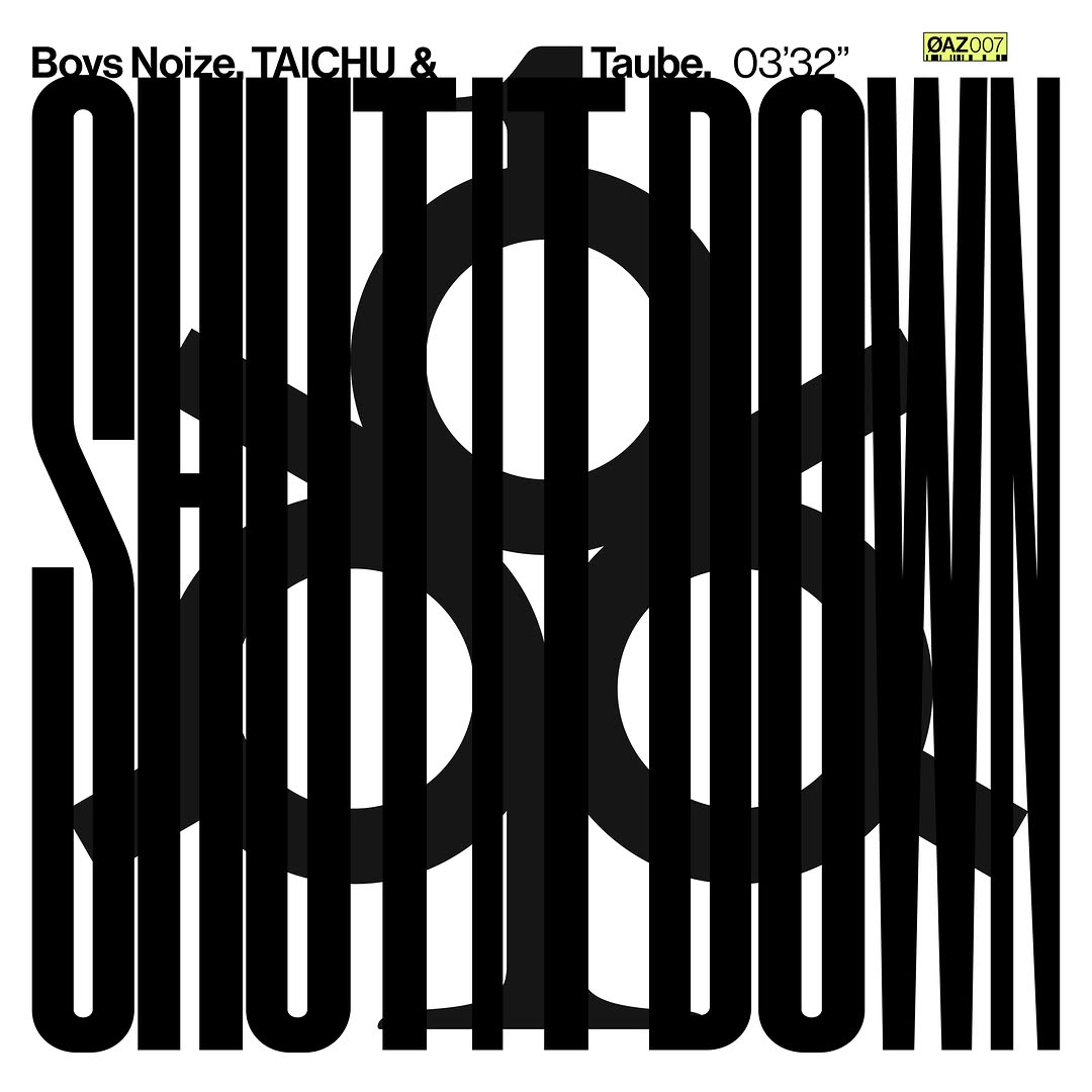
This is a promotional graphic, likely a single cover, for the song 'SHUT IT DOWN'. It uses a bold, black-and-white typographic design where the song title is repeated and fragmented by vertical bars, creating a striking and modern visual to announce new music.
[02]
[03]
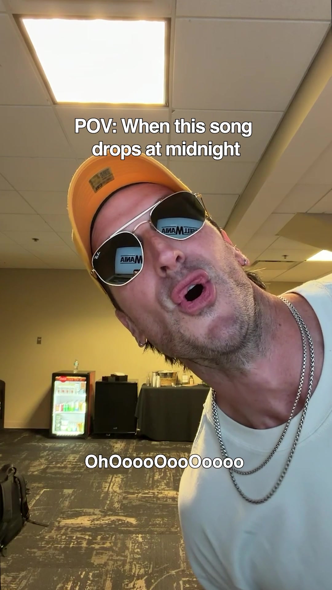 524.1K30.5×POV reaction to new music@russelldickersonofficial · Hype Teaser
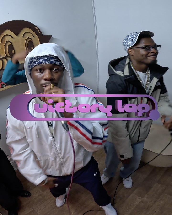 1M14.6×Musicians performing with graphic overlay.@victorylapradio · Behind The Scenes
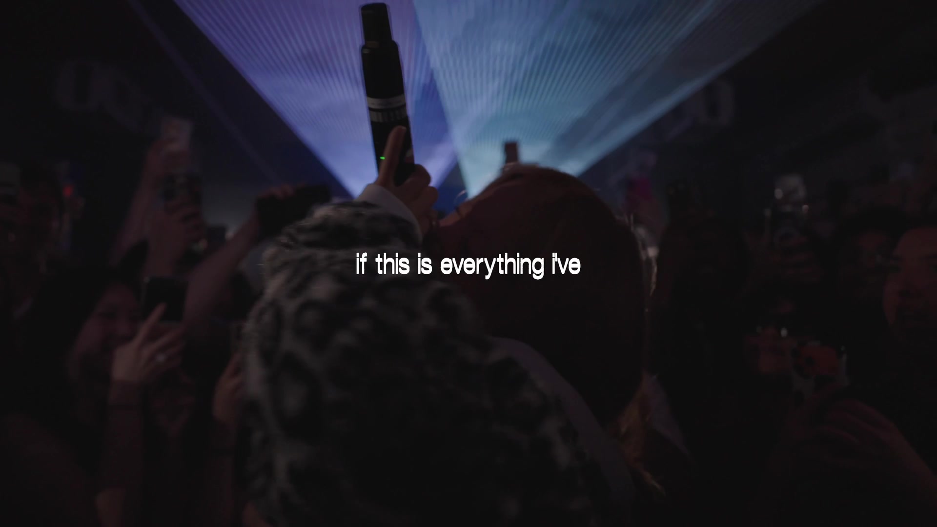 360.1K26.7×Live performance with lyric overlays@tiffdidwhat · Live Performance
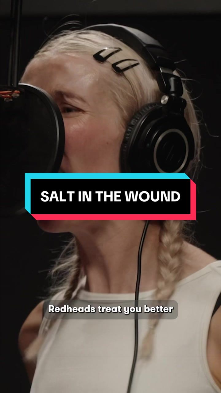 1.6M24.4×Band records brand-themed rock song@wendys · Brand Showcase
 89.4KChaotic screaming music video teaser@tiffdidwhat · Hype Teaser
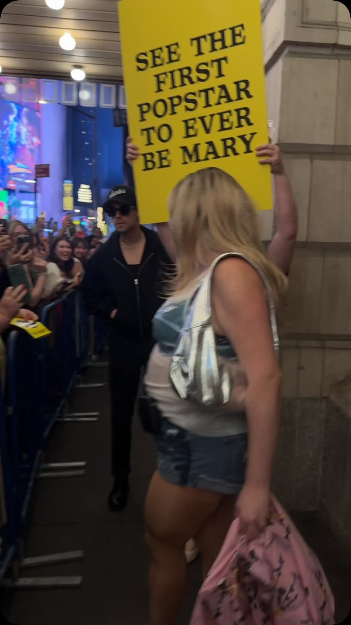 410.9K5×Live album cover reveal event@megsstalter · Surprise Reveal
 2.8MSinger performs behind frosted glass@lolayounggg · Aesthetic Teaser
 114.5K1.3×Gritty black and white rap performance@smbrickbab · Vibe Showcase
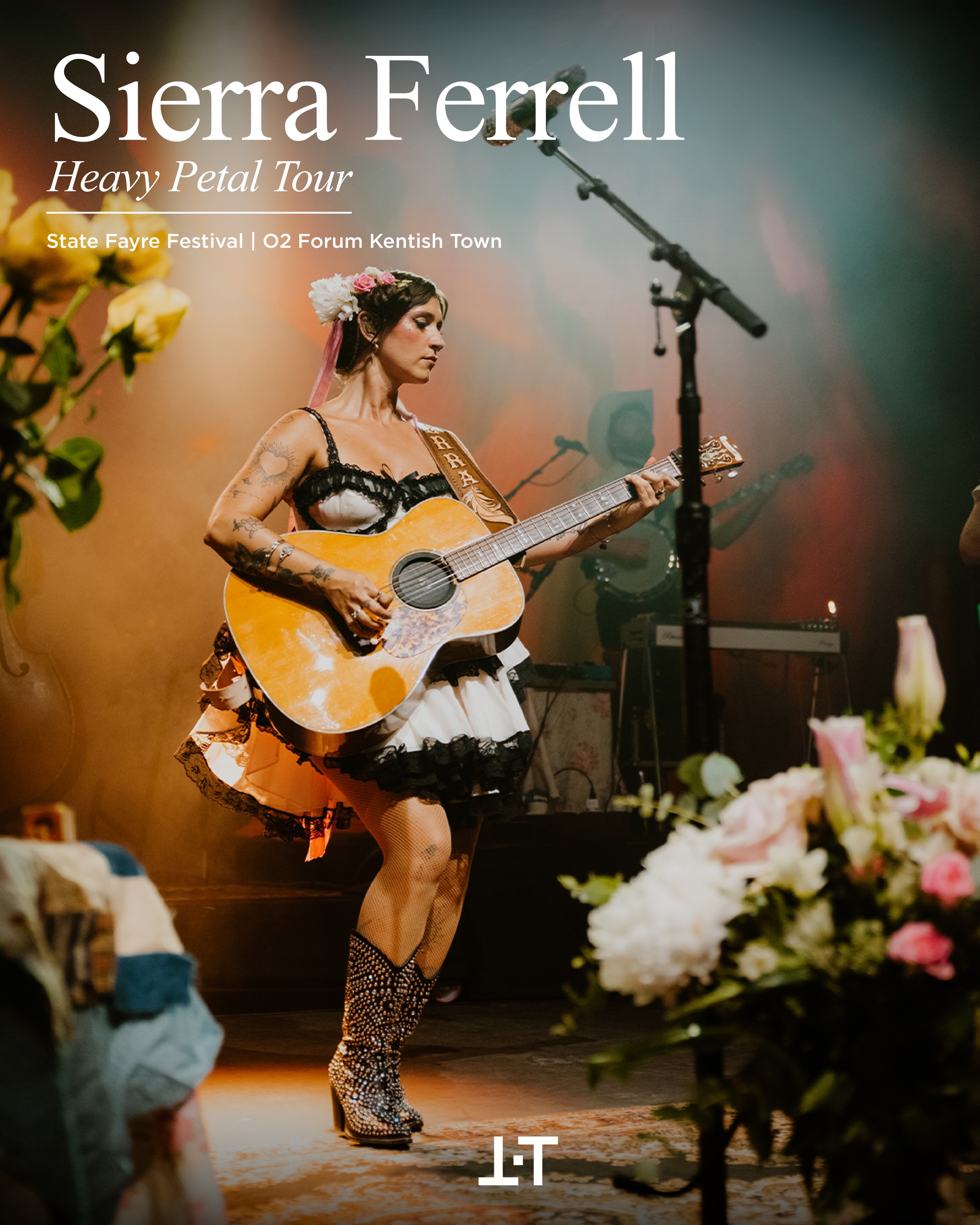 137.1K36.5×Musician Sierra Ferrell performing on stage.@the.team.music · Event Showcase
 3.6M28.9×Rooftop live music performance clip@raybullraybull · Live Performance
 5.5M194.2×Rock band hype video montage@the_moonrocks · Vibe Showcase
 304K9.8×Dramatic orchestra performance as meme@minnorch · Metaphorical Action
[04]
[05]
What stops the scroll in the first 3 seconds
Title hook · 35%
SHUT IT DOWN
Verbal hook · 25%
New music. “SHUT IT DOWN” @fukintayson 🎶
Visual hook · 40%
High-contrast, fragmented typography where the words 'SHUT IT DOWN' are obscured by vertical black bars, creating a visually disruptive and intriguing pattern that draws the eye.
[07]
The promise the opener makes, and how the video pays it back
Hook
Grabs attention with a visually complex and dominant typographic treatment of the core subject, compelling the viewer to pause and decode the message.
Payoff
Delivers a complete, self-contained announcement. The viewer understands the 'who,' 'what,' and 'brand' from a single static image, with the caption providing the direct call-to-action.
[08]
The structural pattern this video runs on
Framework
The Layered Statement
This framework compresses a full announcement into a single, visually dense image. It uses typographic layering and hierarchy to convey all necessary information at once, creating a static 'poster' that functions as a complete narrative without requiring a swipe.
The Context Header
A line of text at the top of the frame provides essential context (e.g., authors, collaborators, key stats) that frames the main message.
The Dominant Title
The core message is presented as a massive, stylized typographic element that serves as both the title and the primary artwork, dominating the visual space.
The Corner Stamp
A small, discrete identifier (like a logo, catalog number, or handle) is placed in a corner to provide branding or metadata without distracting from the main visual.
New music. “SHUT IT DOWN” @fukintayson 🎶
informational · photo_0
Boys Noize, TAICHU & Taube, 03'32"
title · photo_0
SHUT IT DOWN
branding · photo_0
ØAZ007