Post caption
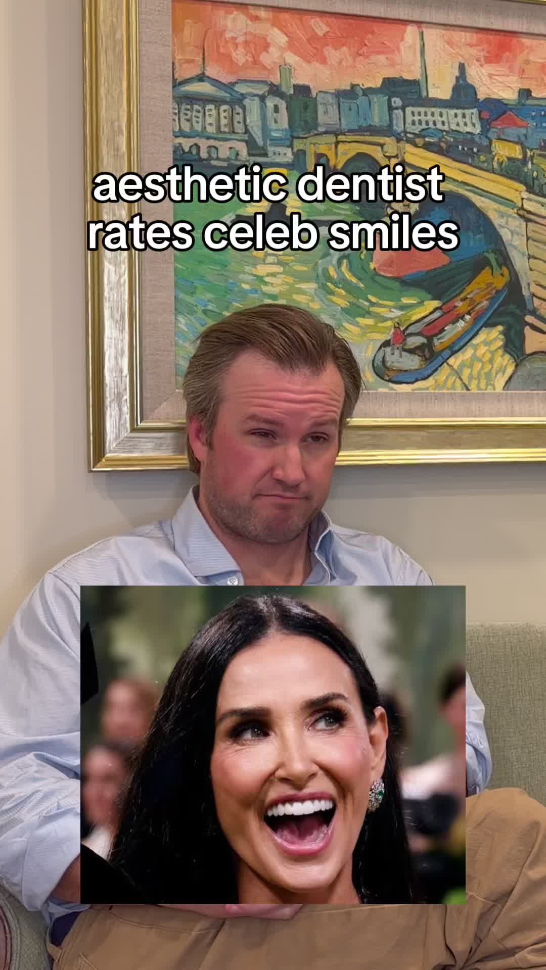
Positioning? Genuinely good. Gum line, tooth shape, all textbook. That part of the job is done right.
Where it falls apart is up close. Full coverage across the board, and none of it has line angles, the little edges that catch and bend light the way real enamel does. No texture either, so every tooth reads as one flat shade. Same issue as Celine, honestly, just a shade brighter than it needs to be. Your teeth should roughly match the white of your eyes. Go past that and it stops looking like teeth and starts looking like a veneer ad.
Good work disappears into the smile. This is good work you can still see.
#demimoore #smilemakeovers #aestheticdentist
Transcript
Three. She's had work done. She has full coverage veneers or crowns on everything. They're too white. But good be no, this is what Simon Cowell should look like if he didn't go to Mexico and cheap out. Her teeth are in the right positions. I actually like around the gums, the shaping, it looks very natural. The only thing that I don't care for is it's similar to Selenium, it's very apparent that there's something on her tier. They're a little too bulky. The other thing is is there's not really good natural textures on the teeth. Some of the best artists or cosmetic dentists or better, ceramists, whatever you wanna call them on the planet will put some textures that make it look very natural. To me, I got these done, and you can just tell they're all kind of one uniform color. They're, they have a nice flat profile towards the front and in kind of what we call these line angles. So the edges that reflect light look really good. That's what Celine Dion's missing. I'm gonna knock her a little bit because hers are too bright. The ideal way to look at this is your teeth should match the whites of your eyes. Right? If you go too far beyond that, it's gonna look unnatural, and that's what Demi has going on here. But the positioning is really good. The as far as, like, the edges and how it shapes with the gums, the the outline is really good, but then the detail and structure inside it's really good. So kinda like the painting that I'm sitting behind, or the painting that I'm sitting in front of. You know, art matters. Right? The framing, really good on her. The individual things are really good, but if you got up close and looked at the brush strokes, you'd be kinda disappointed, and that's really doing more smile. Like, as you look at it, the brush strokes are just slightly off. It's missing stuff. It's kind of flat. It's too reflective. It's apparently fake.