@alextwma
Instagram · Talking Head Edit
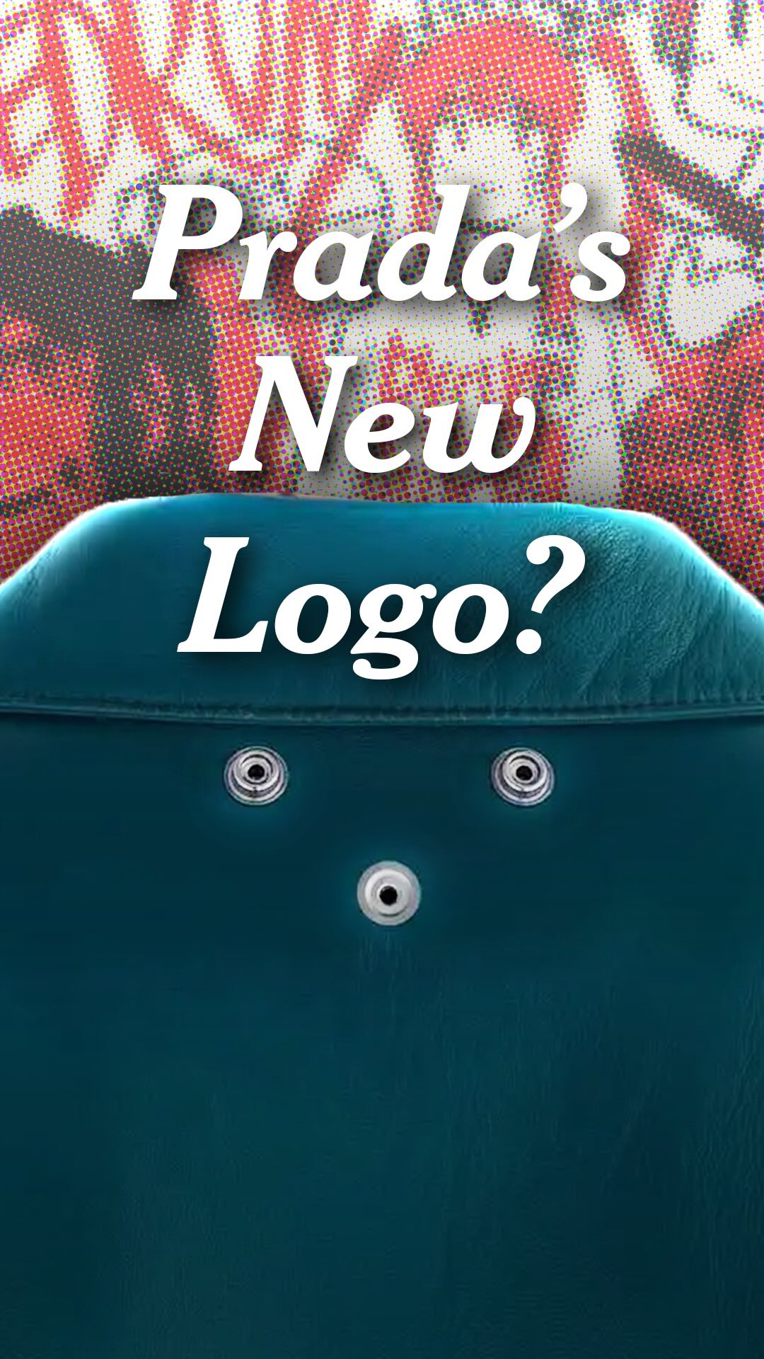
@alextwma Logos are looking a bit different these days. How? And why?

@alextwma
Instagram · Talking Head Edit
@alextwma Logos are looking a bit different these days. How? And why?
Performance
Video #47044 · Talking Head Edit
[01]
The creator explains the trend of luxury fashion brands moving away from conspicuous logos towards more subtle branding. He uses Prada's triangle logo as a case study, showing how its overuse led to a new strategy of using the 'impression' of the logo (three snap buttons) rather than the logo itself. The creator then compares this to Stone Island's removable patch, Amiri's logo-embedded patterns, and Gucci's embossed logos, arguing that this shift creates a new hierarchy of luxury where being understood by a select few is more valuable than being seen by everyone.
[02]
[03]
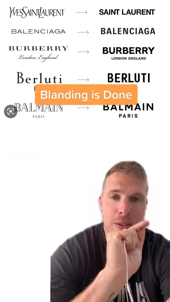 1.1MCreator explains new branding trend@orenmeetsworld · Breakdown
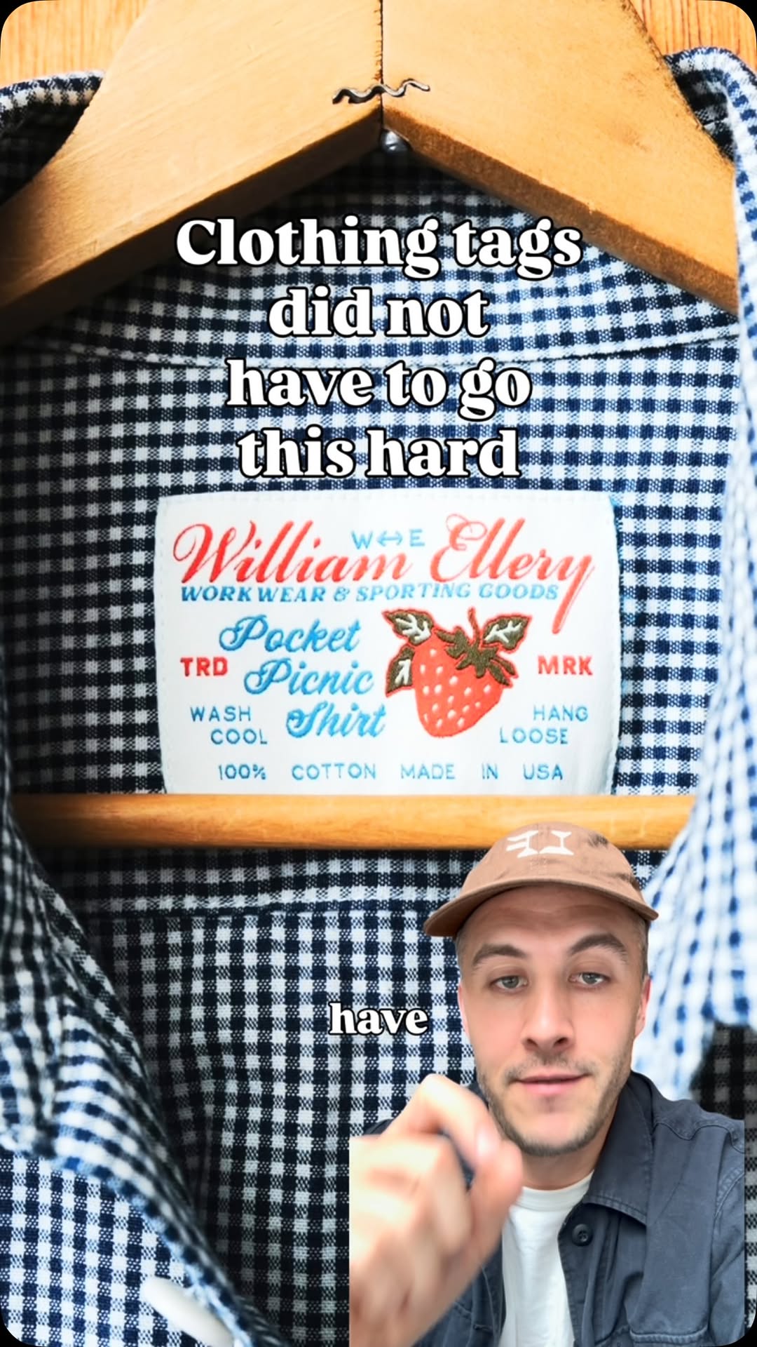 358.1K20.2×Creator critiques bland branding trend@clayton.chambrs · Good vs Bad
 912.6K16.1×Critiquing luxury brand marketing failures@orenmeetsworld · Breakdown
 321K1×Analysis of intellectualism as a trend@deathtostock · Breakdown
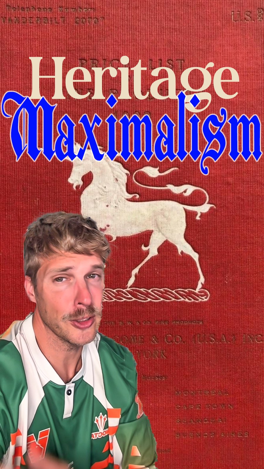 286.7K1.7×Explaining heritage maximalism branding trend@orenmeetsworld · Breakdown
 187.6K3×Demonstrates luxury branding with high-end visuals@house.of.ag · Value Vlog
 124.2K4.4×Streetwear brand review and critique@readytowearfiend · Breakdown
 326.2K35×Analyzing a brand's cohesive strategy@sebell · Case Study Breakdown
 456.3K10.2×Explaining the chaos packaging trend@clayton.chambrs · Breakdown
 2.6M630.8×Explaining brand strategy with luxury product@lukas.mullen · Case Study Breakdown
 296.7K23.5×Luxury brand suit quality critique@fineasjackson · Hot Take
 584.7K2.1×Countdown list of brand alternatives@connoisseurbyhugo · Rapid Fire Listicle
[04]
[05]
What stops the scroll in the first 3 seconds
Verbal hook · 60%
So logos used to look like this, but now they look more like this.
Visual hook · 40%
An extreme close-up of a Prada logo on a shoe that starts blurry and then racks focus to become sharp, creating visual intrigue and immediately establishing the video's topic.
[06]
Steal this for your own video
So used to look like this, but now they look more like this.
[07]
The promise the opener makes, and how the video pays it back
Hook
A direct 'Then vs. Now' visual comparison that establishes a clear shift in a familiar concept, immediately creating curiosity about the reason for the change.
Payoff
A powerful, philosophical statement that reframes the entire topic, revealing that the true value has shifted from mass visibility to the exclusivity of understanding, which is inherently more valuable because it's harder to replicate or fake.
[08]
The structural pattern this video runs on
Framework
The Insider's Deconstruction
Deconstructing a cultural or industry shift by showcasing a series of increasingly subtle examples that illustrate a new, more exclusive philosophy, moving from overt signaling to covert understanding.
The Problem Diagnosis
Use a popular, mainstream example to illustrate why the 'old way' has become undesirable (e.g., overexposed, outdated, tacky), establishing the core problem that the new trend solves.
The First Solution: The Phantom Signal
Introduce the first innovative solution where the overt signal is removed, but its 'impression' or 'ghost' remains, recognizable only to those 'in the know'.
The Reinforcing Case Study
Present a second, similar example from a different but related context to validate the first solution and establish it as a legitimate pattern, not an isolated incident.
The Second Solution: The Integrated Signal
Showcase a more advanced solution where the signal is not just an add-on but is fully integrated into the core design or pattern of the object, making it a functional part of the aesthetic.
The Third Solution: The Whisper Signal
Present the most subtle solution, where the signal is reduced to a textural or barely-visible element (e.g., embossing, tone-on-tone), requiring close inspection and deep knowledge to identify.
Logos are looking a bit different these days. How? And why?
contextual · beginning
So logos used to look like this.
contextual · beginning
But now they look more like THIS.
contextual · middle
The answer is simple.
contextual · middle
you now leave the impression of a logo
contextual · middle
Hiding their logos in plain sight.
contextual · end
Being understood by a select few.
contextual · end
And that's a MUCH harder thing to fake.
No logos used to look like this, but now they look more like this. Because today rank are finding more clever ways to make their recognition earned. That means logos are becoming harder to find and sometimes the best logo is not including one at all. Take something like this, Prada's famous triangle you see on bags, jacket pockets, and shoes. The logo was everywhere just a few years ago. You almost couldn't escape it, but now it feels overdone, outdated, and frankly a little bit tacky. They can't remove it entirely because that's the point of a logo, to signal to others that you're part of some select group. So what does a high fashion brands like Prada do when tier universal selling point, their logo on clothes, no longer works? The answer is simple. In the same location you typically find a logo, you now leave the impression of a logo, three silver snap buttons with a removable logo patch to go with it. The wearer now gets to choose how they want to wear Prada's triangle and even if they take it off, a keen eye will still recognize the button outline as none other than Prada. Instead of everyone knowing where your jacket is from, only those with knowledge of the brand will worst. And this is great for Prada because it lets them add another step to the luxury hierarchy. It's no longer about showing off because that's not classy. They're saying that real luxury wants to be reserved. Some of you might have made the connection to Stone Island's arm patch too. Their signature compass logo is removable better leaves behind two buttons. For many, they're just better, but once again for a consumer with knowledge of the brand and its clothes, it's unmistakably Stone Island. It's become a way for wearers to signal a logo without using a logo somehow making it more impressive than simply displaying it for all eyes to see, but some brands today are taking a different approach, hiding their logos in plain sight. Look closely at this gray suit from Amiri last year. The Amiri logo is actually embedded into the checkered pattern. From afar, you wouldn't be able to tell. And as a bonus, it creates a really unique shape up close. Instead of something like Louis Vuitton's monogram blazer, they're using their logo to actually contribute to the design. It's a way of saying yes, you wear a designer, but that you have an eye for design too. Finally, some brands are simply toning it down. Instead of bold contrast text in big letters, they're opting for smaller logos that are embossed into the fabric itself. Just looking at this image, you wouldn't be able to tell that it's Gucci, but right at the base of the neckline, there's a subtle Gucci push out of the dress or for Courreges, a similarly discreet placement of their famous AC logo. Visible logos have been a part of fashion for a really long time. I actually made a video on how that came to be if you're curious. But there's certainly an evolution happening and it might not be long before they disappear completely. Because brands have found something more valuable than their logo being seen, being understood by a select few, and that's a much harder thing to fake.