@hansloreidesign
TikTok · Greenscreen Talking Head
@hansloreidesign Good Design should make you a little nervous: Episode 3

@hansloreidesign
TikTok · Greenscreen Talking Head
@hansloreidesign Good Design should make you a little nervous: Episode 3
Performance
Video #16326 · Greenscreen Talking Head
[01]
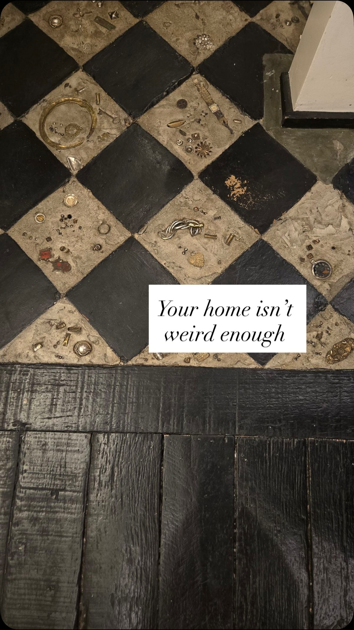
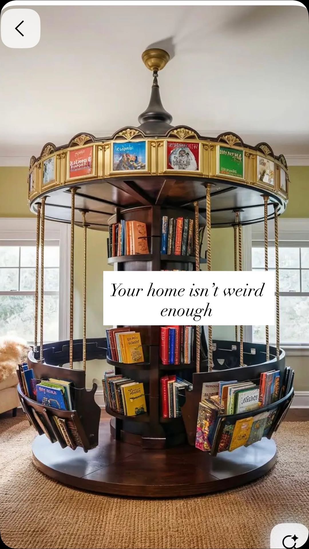
The creator presents a series of contrarian interior design opinions, arguing that people should make bolder choices that make them 'a little nervous.' He contrasts common, safe options with more unique and high-end alternatives for various home elements, including light switches, sconces, garden decor, toilets, bathroom tiles, art, and address numbers, using illustrative images to support each point.
[02]
[03]
 170.2K8.5×Comparing safe vs. bold design@hansloreidesign · Good vs Bad
 1M4.2×List of weird home design alternatives@lilswalty · Rapid Fire Listicle
 741.2K5×Critiquing boring decor with weird alternatives@lilswalty · Rapid Fire Listicle
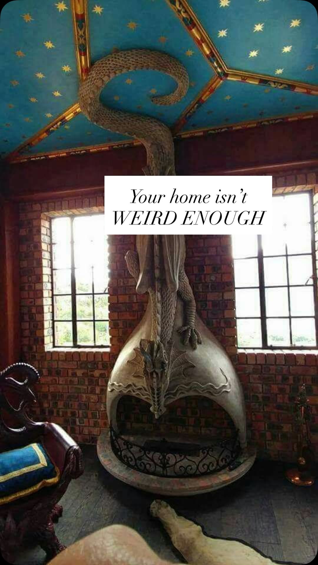 2M8.7×List of weird home decor@lilswalty · Rapid Fire Listicle
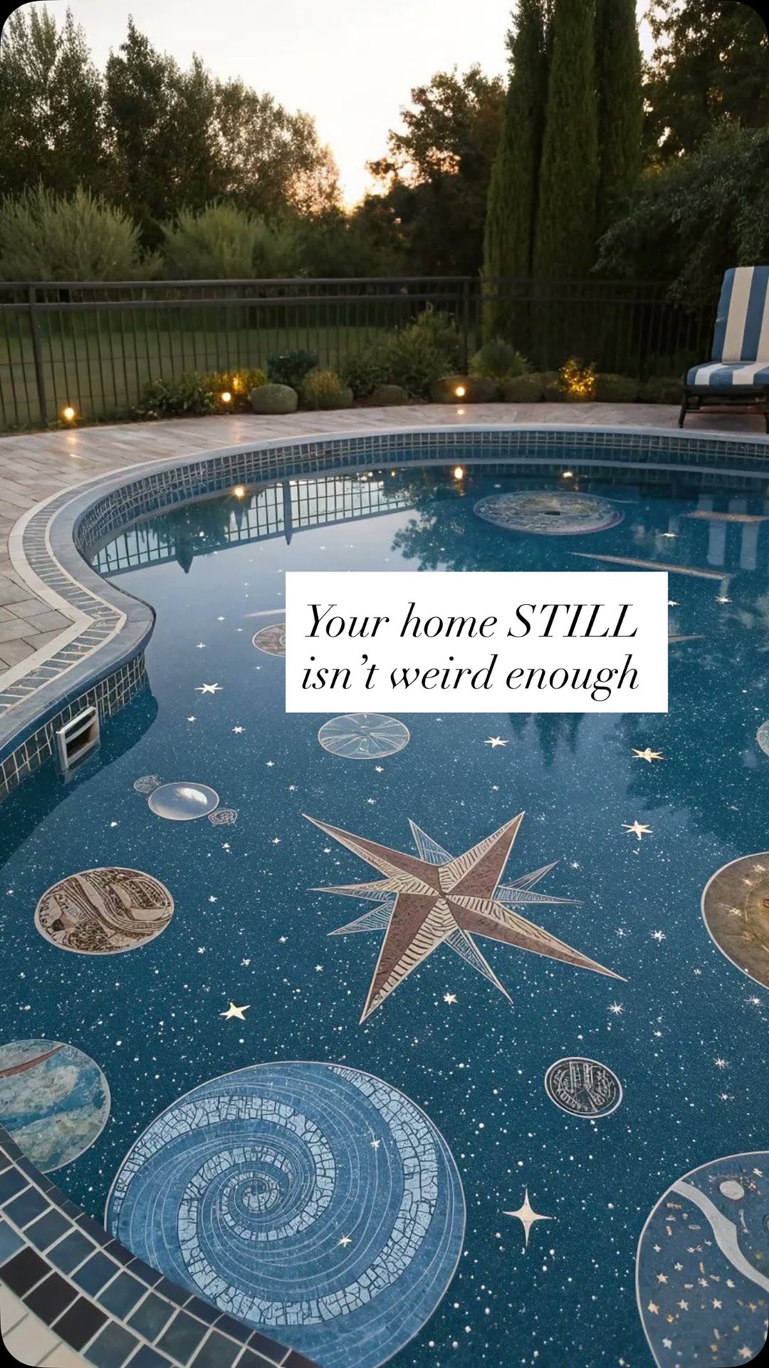 663.8K2.6×Contrasting boring vs. weird homes@lilswalty · Rapid Fire Listicle
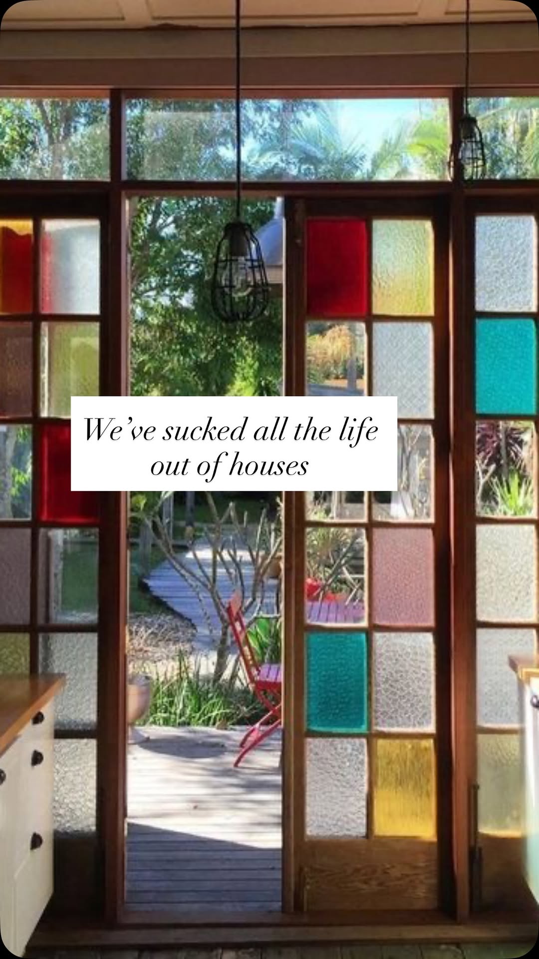 2.9M22.5×Creator lists unconventional home designs@lilswalty · Rapid Fire Listicle
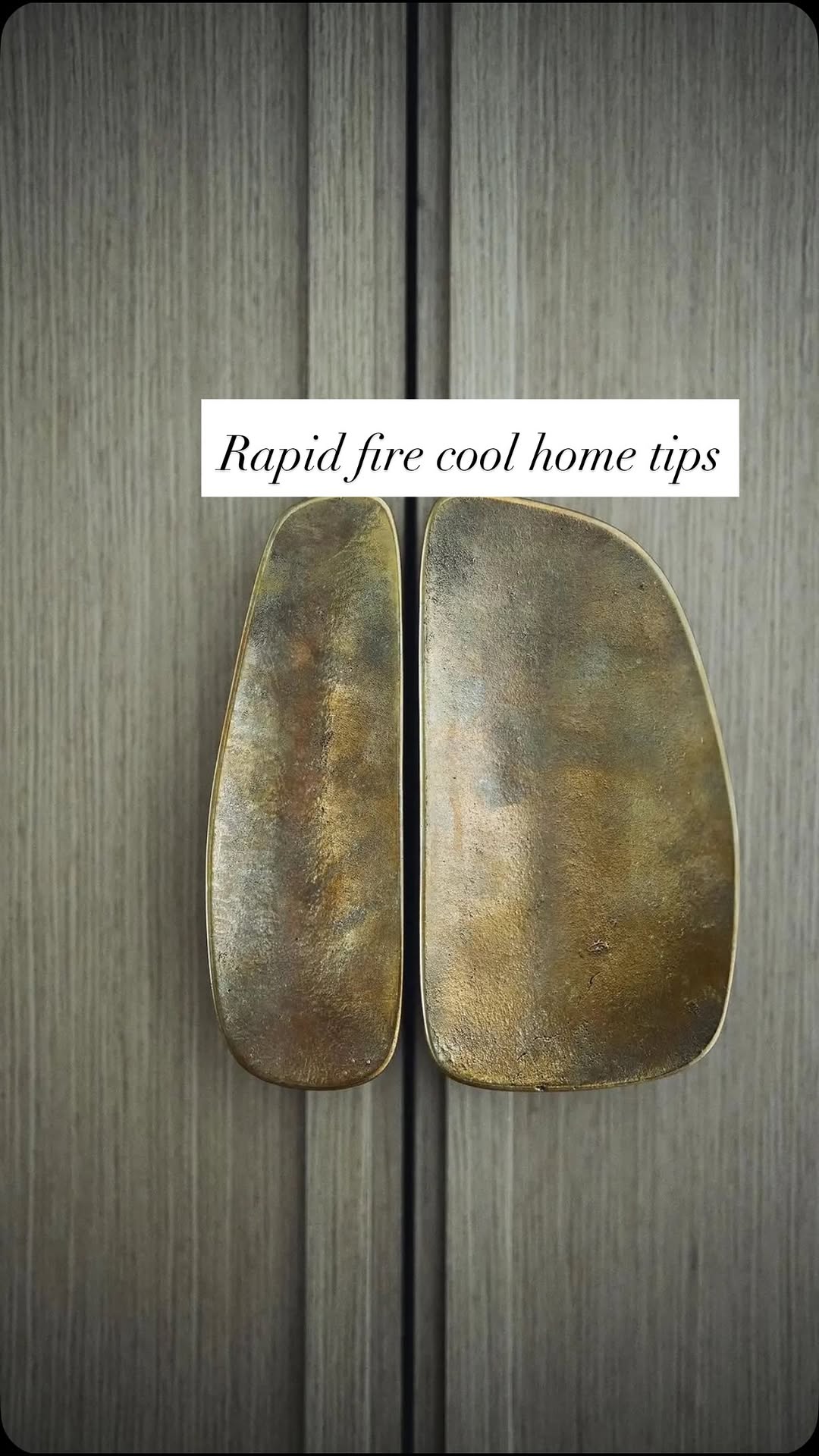 810.9K3.4×Rapid fire opinionated design tips@lilswalty · Rapid Fire Listicle
 1M5.3×List of nostalgic home features@lilswalty · Rapid Fire Listicle
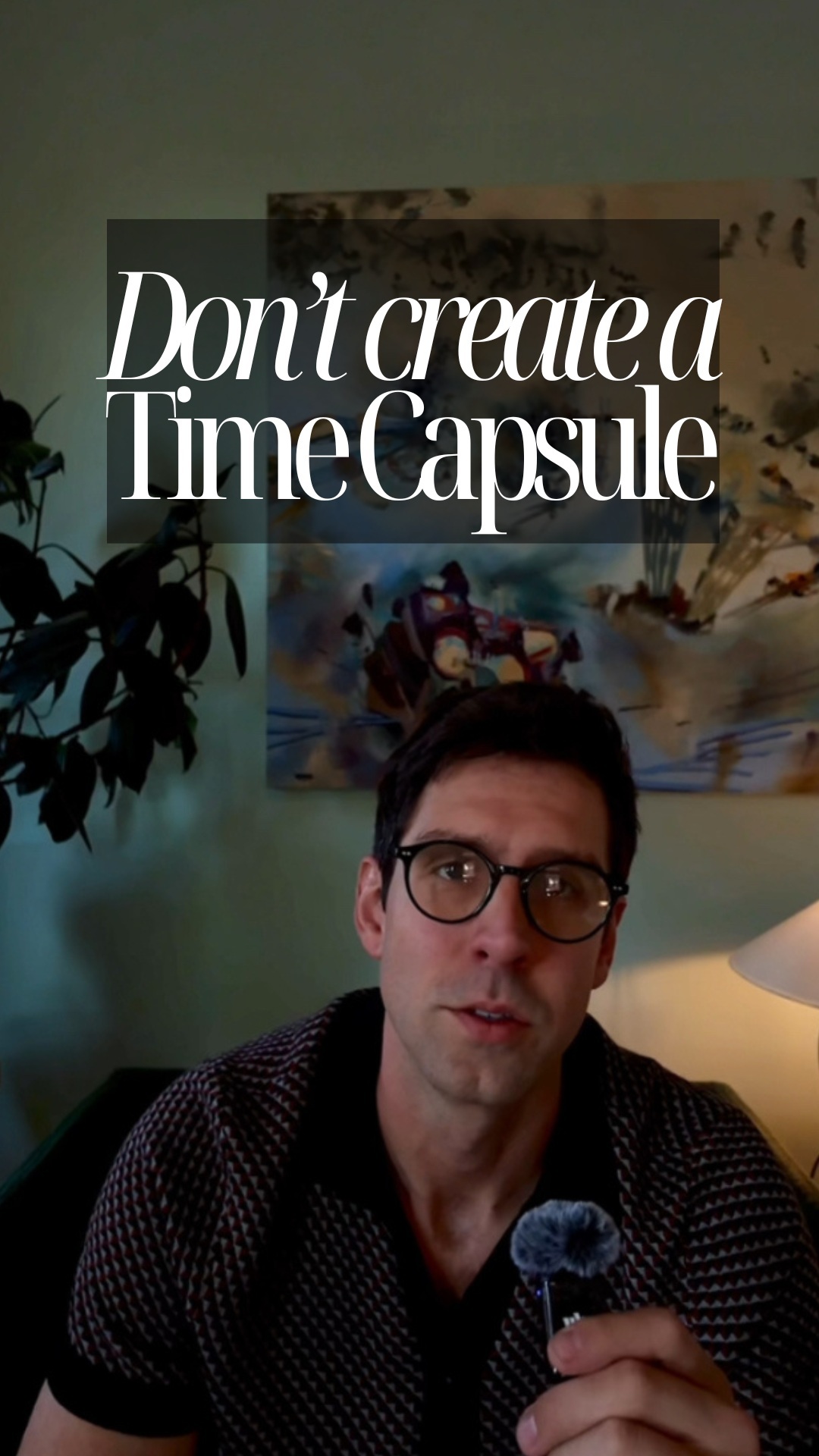 588.7K7×Why furnishing a home with only new trendy pieces is a mistake@hansloreidesign · Explainer
 444.1K1.7×Rapid fire list of design pet peeves@lilswalty · Rapid Fire Listicle
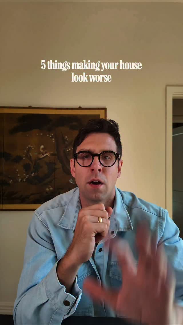 1.4M60.2×Explains five common design mistakes@hansloreidesign · Rapid Fire Listicle
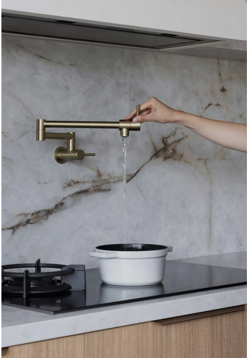 750.5K12.7×Designer lists things to throw out@mrphoenixgrey · Anti-Recommendation List
[04]
[05]
What stops the scroll in the first 3 seconds
Title hook · 50%
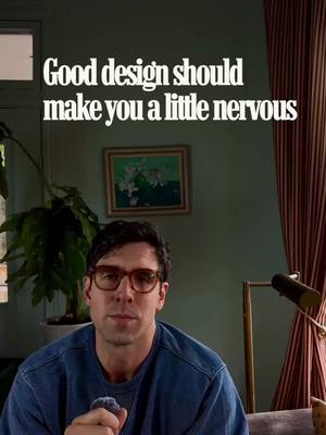
Good design should make you a little nervous
Verbal hook · 45%
Good design should make you a little nervous.
Visual hook · 5%
The creator is filmed in a moody, well-lit interior setting with curated decor, including a houseplant, framed art, and striped curtains, which immediately establishes his design authority.
[07]
The promise the opener makes, and how the video pays it back
Hook
A counter-intuitive or provocative thesis statement that challenges a commonly held belief within a niche, presented as a rule.
Payoff
The creator restates the initial thesis, reframing it as a reassuring principle for the viewer to adopt ('if you're a little nervous, it's probably a good sign'), thus completing the argument loop and providing a memorable takeaway.
[08]
The structural pattern this video runs on
Framework
The Contrarian Upgrade
To establish authority and a unique perspective by systematically replacing common, 'safe' choices with provocative, 'superior' alternatives across a series of related examples, framed by a single contrarian thesis.
The Thesis Declaration
The creator states the core, contrarian philosophy of the video ('Good design should make you a little nervous') as a guiding rule for the viewer.
The Commonplace Gauntlet
A rapid-fire series of examples where a ubiquitous, low-effort standard is identified and immediately contrasted with a superior, more daring alternative.
The Identity Peak
The creator makes an explicit, personal comparison between their choices and the mainstream ('While many are... I'm considering... We are not the same'), creating a strong 'us vs. them' dynamic and elevating their authority.
The Mundane Transformed
The thesis is applied to the most utilitarian or overlooked element of the topic (a toilet) to prove the philosophy's comprehensive power and applicability.
The Trend Condemnation
The creator dismisses an entire popular trend ('the bathroom spa era') and presents their preferred alternative as the necessary evolution, positioning them as a forward-thinker.
Good Design should make you a little nervous: Episode 3
title · beginning
Good design should make you a little nervous
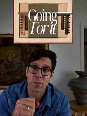
Good design should make you a little nervous. Episode three. You could stand a go for it a little more in your house. Why in 2025 high end new construction homes are we still putting plastic in the walls when there are so many excellent light switch option? We want some heavy metal dimmers. We want some mother of pearl push buttons for that satisfying click. I love lampshades, but you know what there's not enough of? Cast iron clematis sconces, or maybe something red. Remember better it's on or off, it's a sculpture, not just a light. While many are considering which faux stone planner to select for their fall moms, I'm considering purchasing this nineteen tier concrete flock of deer for the garden. We are not the same. You know what's not exciting in a bathroom? A white toilet. You know what would make you a little nervous? A rich wood toilet best, the old money throne. Also, black toilets. So great. I did this in my house and I would do it again. We've been in the bathroom spa era for far too long and the world is craving contrast tile. Just a tile baseboard, one of my favorite tricks in a bathroom. We have more fun with the art we select for our home. Why are we buying cheap prints with fake wood when Charlene down the street is getting rid of her husband's nautical paraphernalia? Finally, we live in a world of infinity fonts and yet almost zero bravery when it comes to address numbers. The good ones are out tier, I promise. You just gotta look for them. Dazzle your mailman. Remember, if you're a little nervous, it's probably a good sign.