@hansloreidesign
Instagram · Graphic Yap
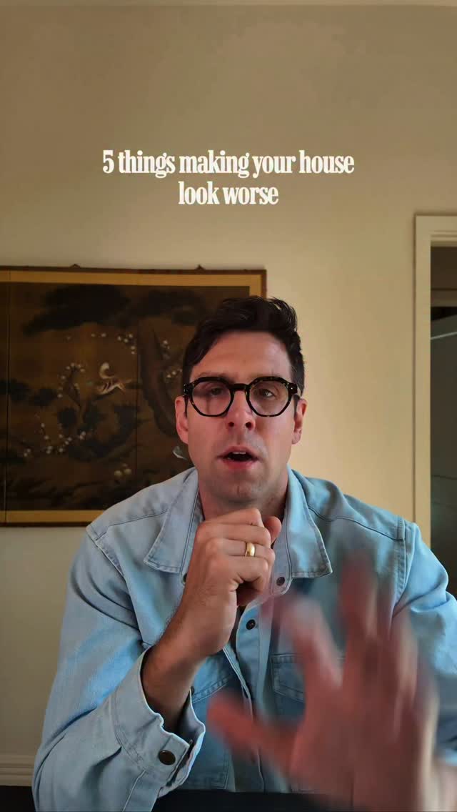
@hansloreidesign Are any of these 5 silently wreaking havoc on your home?

@hansloreidesign
Instagram · Graphic Yap
@hansloreidesign Are any of these 5 silently wreaking havoc on your home?
Performance
Video #44968 · Graphic Yap
[01]
The creator presents a list of five common interior design mistakes that make a house look worse. For each point, he first shows an image of the mistake, explains why it's a design flaw, and then presents images of effective solutions. The five points covered are: dark walls meeting a stark white ceiling, mismatched light bulb color temperatures, LED strip fixtures, exposed electrical cords, and art hung too high.
[02]
[03]
 82.5KInterior design mistakes and fixes@mrphoenixgrey · Good vs Bad
 444.1K1.7×Rapid fire list of design pet peeves@lilswalty · Rapid Fire Listicle
 750.5K12.7×Designer lists things to throw out@mrphoenixgrey · Anti-Recommendation List
 201.3K13×Contrasting boring vs bold design.@hansloreidesign · Rapid Fire Listicle
 1M12.5×Explains design tip with photos@hansloreidesign · Tutorial / How To
 810.9K3.4×Rapid fire opinionated design tips@lilswalty · Rapid Fire Listicle
 334.5K1.1×Problem-solution guide for apartment decorating@nick_lloyd_ · Tutorial / How To
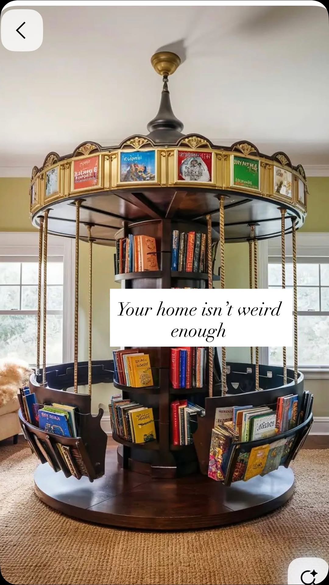 741.2K5×Critiquing boring decor with weird alternatives@lilswalty · Rapid Fire Listicle
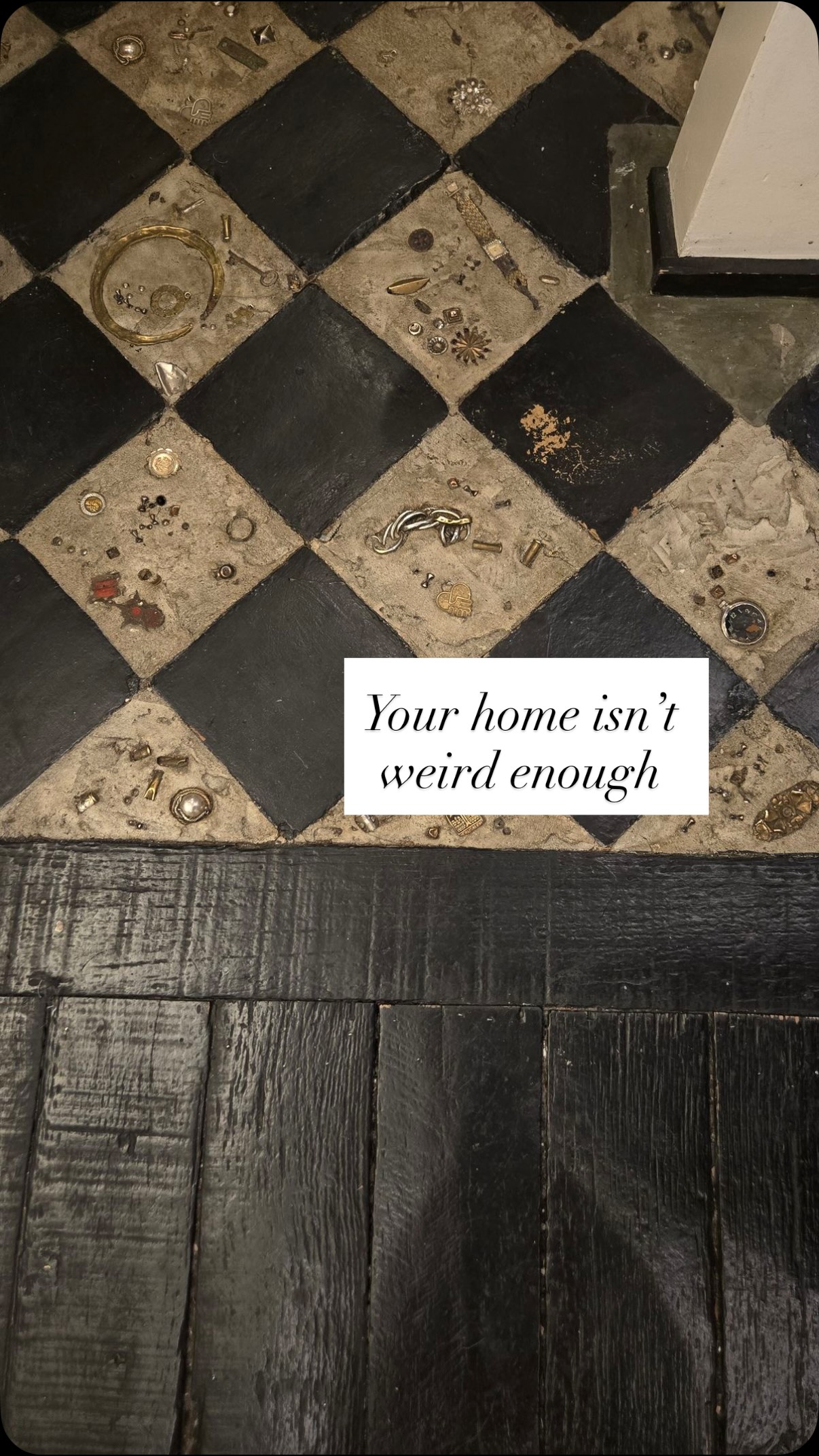 1M4.2×List of weird home design alternatives@lilswalty · Rapid Fire Listicle
 301.8K64.5×Creator lists overrated home features.@felipe.freig · Rapid Fire Listicle
 650.3K61.1×Interior design hot take yap@taylordonoghuee · Hot Take
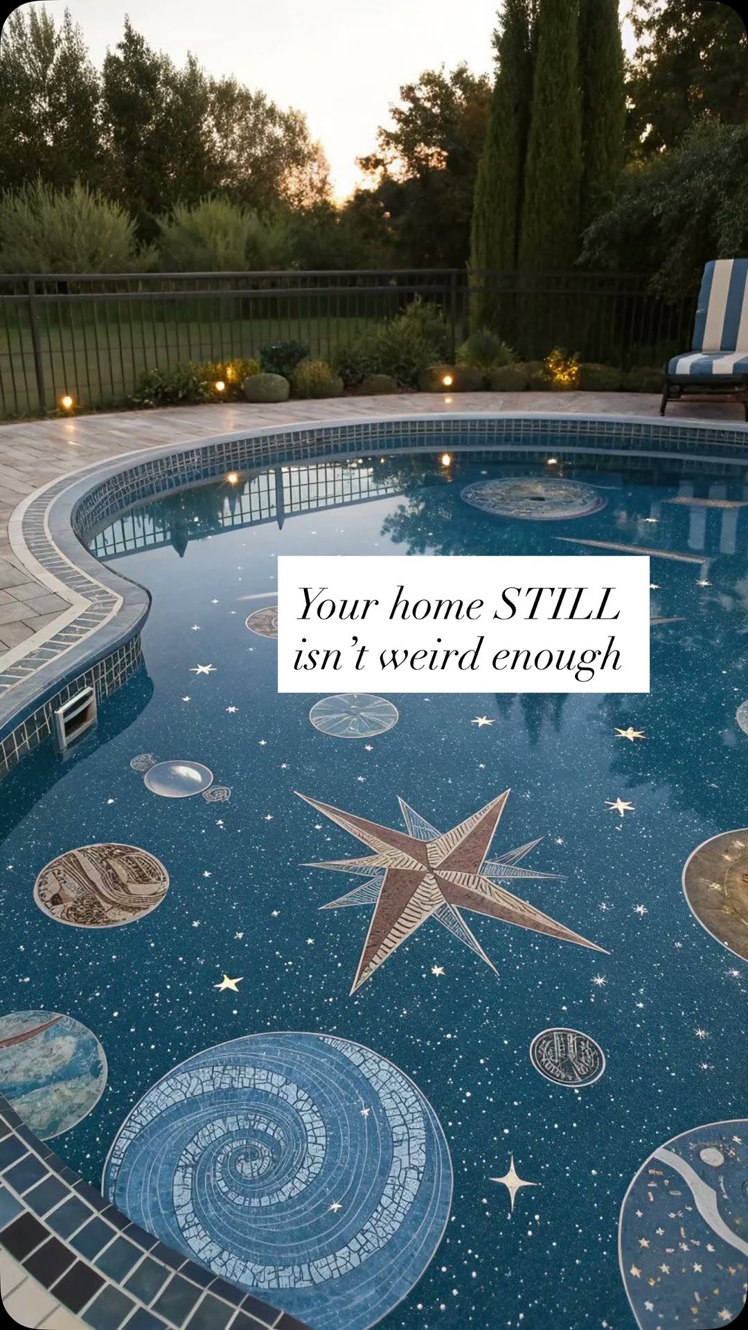 663.8K2.6×Contrasting boring vs. weird homes@lilswalty · Rapid Fire Listicle
[04]
[05]
What stops the scroll in the first 3 seconds
Title hook · 50%
5 things making your house look worse
Verbal hook · 45%
Five things making your house look worse.
Visual hook · 5%
The creator holds up his hand with five fingers extended, visually reinforcing the 'five things' list format of the video.
[06]
Steal this for your own video
things making your look worse
[07]
The promise the opener makes, and how the video pays it back
Hook
A numbered, negative premise that promises to reveal hidden flaws in the viewer's life or environment, creating an immediate hook of self-interest and insecurity.
Payoff
A simple, direct closing that thanks the viewer, reinforcing the creator's helpful and authoritative persona without a hard sell.
[08]
The structural pattern this video runs on
Framework
The Problem/Solution Gauntlet
A rapid-fire listicle that identifies common, often unnoticed, mistakes within a specific domain and provides immediate, actionable solutions, validated by visual 'before and after' evidence.
The Foundational Fix
Addresses the first and often largest-scale problem, establishing credibility by tackling a significant issue first.
The Vibe Corrector
Transitions from a structural issue to an atmospheric one, showing how subtle changes can alter the entire feel of a space or situation.
The Taste Mandate
Delivers a strong, subjective judgment on a common trend or choice, positioning the creator as a confident arbiter of taste.
The Detail Discipline
Focuses on a small, often-overlooked detail that has a disproportionately large negative impact, highlighting the creator's expertise.
The Rule of Thumb Reveal
Concludes the list by providing a specific, memorable, and quantitative rule, giving the viewer a highly actionable and easy-to-remember takeaway.
Are any of these 5 silently wreaking havoc on your home?
title · beginning
5 things making your house look worse
Five things making your house look worse. Dark walls or wallpaper running right up into a stark white ceiling. No crown molding, very harsh transition. We can soften this by adding a little crown. Even better, we can paint the crown and the ceiling a complimentary color to the wall, or we just paint the whole room one color. Next is different color temperature light bulbs and fixtures. Lighting is half the battle in design, so if you can just align the lighting in your house, it's a huge step forward. Next is LED strip fixtures. This is a hard no for me. I don't wanna see that bright white strip. This is a worse, not tron. Next is exposed quartz. You or an adult find a practical way to deal with this. We're so used to seeing ugly stuff in modern life that a lot of times we don't even notice it, but it makes a huge difference if you find a way to hide this. Finally, your art is probably hung too high. Almost everyone does this and it's throwing off the balance of the room rank making the walls feel disproportional. The vast, vast majority of art should be hung where the center of the artwork is at eye level about 60 inches from the floor. I hope this is all helpful. Thank you for watching.