Post caption
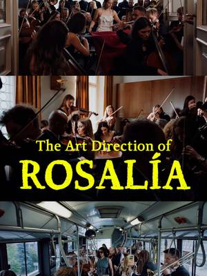
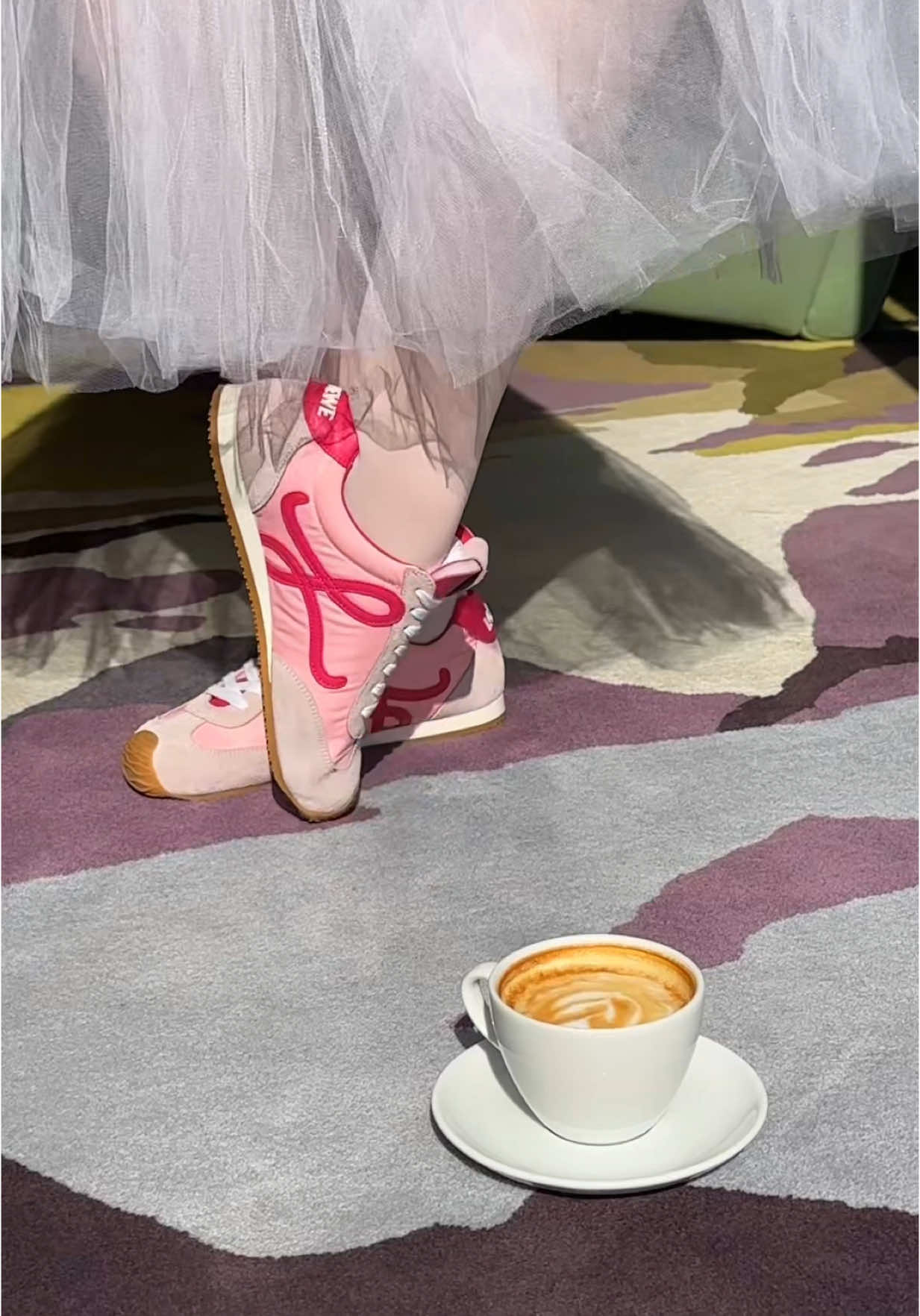
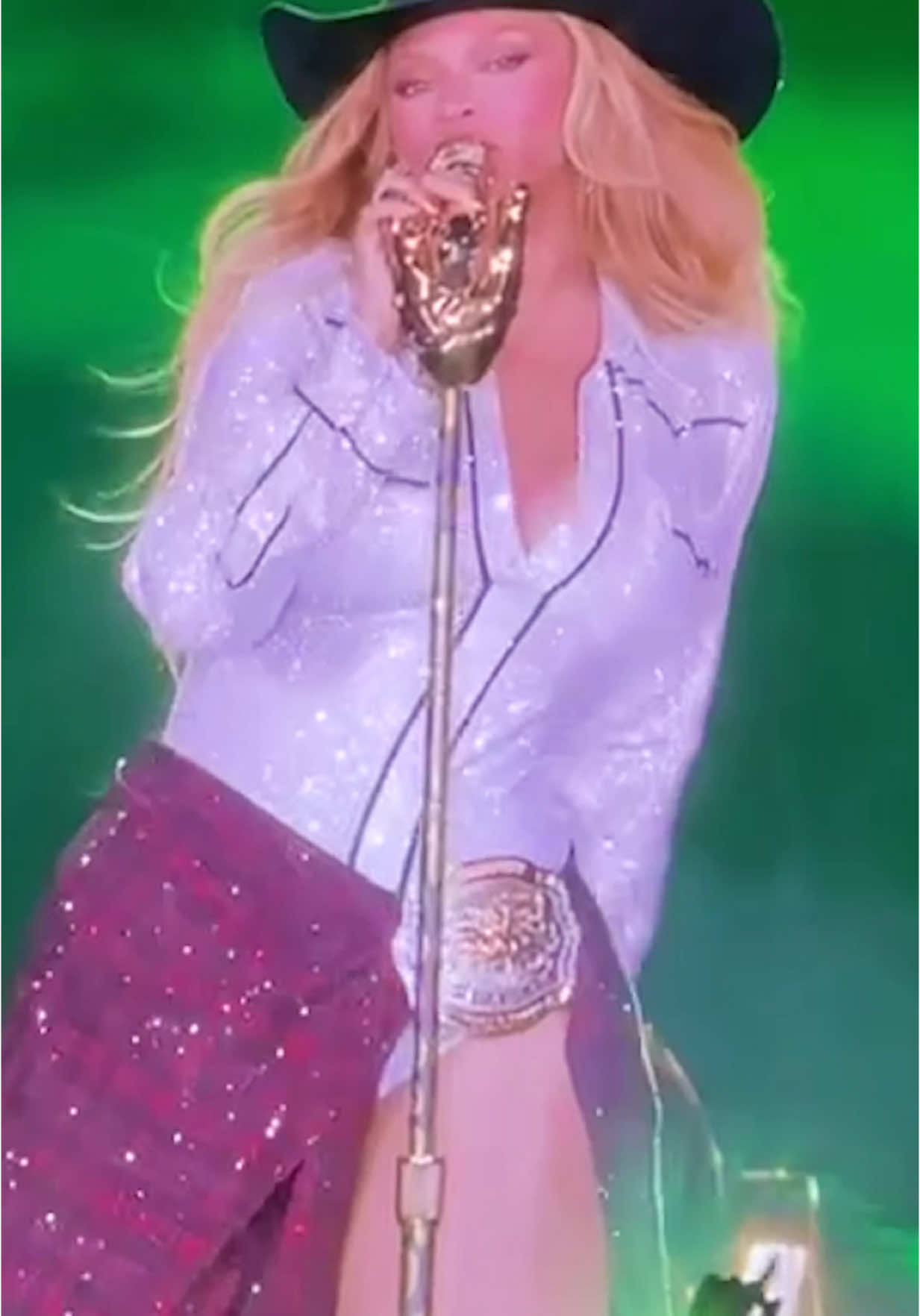
A symphony of anxiety portrayed beautifully 🤌 // I have to admit I’m a little out of my depths with this one. I don’t speak German or Spanish. I’m not as familiar with Rosalía, and the Easter eggs planted into the sets are endless. But I was CAPTIVATED! This was only released last week, but you can already scroll the interpretations endlessly on Reddit. For me, the most obvious creative principle here is CONTRAST. Not just contrasting color or size. But contrasting subjects. The team created so much tension with the mix of languages, scenes, situations, textures. It’s a masterclass that goes beyond graphic principles into storytelling. What have I missed??
Transcript
This is art direction. Burghein, one of the most exclusive clubs in the world and also Brasilia's latest single in music video. A perfect example of one of the most universal creative principles, contrast. Contrast is about bringing clearly disparate subjects together, whether it's production design, color, photography, cinematography. In this case, we watch as her anxiety is personified by an orchestra, crammed into scenes where they don't belong yes also lit naturally like it's meant to be, high art shoved into the mundane, that's contrast. More literal contrast would emphasize this with color or stark lighting but contrast can be more abstract. The scene, the subjects themselves create tension when contradictions are forced to live better. Masterfully done by the team at Canada. Yes, a production company based in Barcelona. I actually worked with them on one of my first TV commercials. Director Nicolas Mendez co founded Canada. I'm assuming most of these visual concepts can be attributed to the combined talent of production designer Andy Kelly, director of photography Max Better, the director and of course Rosalia herself. What are your thoughts on this?