Video #48637 · Split screen
Creator critiques public transit designfrom @ryanselvy
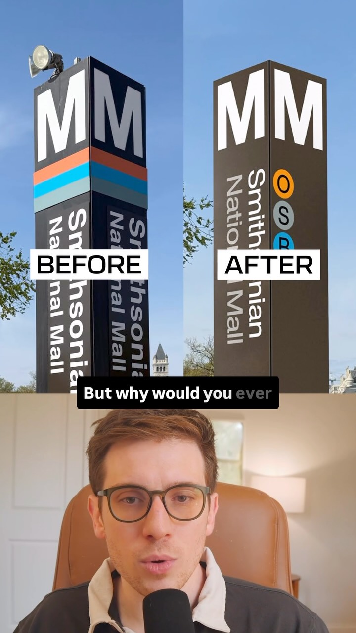
The creator critiques the redesign of the DC Metro's station pylons by presenting a 'before' and 'after' comparison. He argues that the original design with its wrap-around color band was superior for wayfinding because it was visible from all angles, whereas the new design with lettered circles is only visible from the side, making it less functional. He concludes by humorously mocking the transit authority's claim of thorough testing, showing an image of someone using a VR headset for the 'test'.
- 1Present a negative change
- 2Explain the original's value
- 3Expose the new version's flaw
- 4Reveal an absurd justification
ConceptsGood vs BadBreakdownCase Study Breakdown
ElementsSplit ScreenAnnotation OverlayImage OverlayText OverlayJump CutGraphic Overlay
[05]
Hook analysis
What stops the scroll in the first 3 seconds
Title hook
But why would you ever
Verbal hook
But why would you ever get rid of this?
Visual hook
A clear side-by-side comparison of a 'BEFORE' and 'AFTER' design for a public transit sign, immediately establishing a visual conflict and the video's core topic.
[07]
Hook and payoff
The promise the opener makes, and how the video pays it back
Hook
A direct 'Before vs. After' visual comparison paired with a rhetorical question expressing disbelief ('But why would you ever...?'), immediately establishing a conflict and a critical stance.
Payoff
A humorous, shareable visual that validates the narrator's critique by exposing the absurdity of the process behind the flawed decision, leaving the viewer with a feeling of cynical amusement.
[08]
Narrative framework
The structural pattern this video runs on
Framework
The Critique & Punchline
To deconstruct a seemingly illogical change by first establishing the superiority of the original, then exposing the new version's critical flaw, and finally delivering a humorous punchline that undermines the justification for the change.
- 1
The Original's Eulogy
To explain the functional elegance and user-centric benefits of the 'Before' version, establishing it as the superior design and framing its replacement as a loss.
- 2
The New Version's Autopsy
To methodically break down the specific, critical user experience failure of the 'After' version, proving the narrator's initial thesis that the change made things worse.
- 3
The Corporate Defense Setup
To introduce the official justification for the change ('Tested before rollout'), creating narrative tension and setting up an expectation that will be subverted.
- 4
The Absurdist Punchline
To reveal a comical or ironic visual (the VR headset test) that completely undermines the official justification, providing a humorous payoff and cathartic resolution to the critique.
Themes
- Design critique
- User experience
- Functionality over aesthetics
- Public infrastructure
Techniques
- Comparative analysis
- Commentary
- Satire
Post caption
The DC Metro is getting some signage updates. It’s looking to add some accessibility and cost cutting measures, but some of it feels …less accessible? The graphic design of transit design isn’t easy. But I feel like UX design requires navigational information to never be subtle. When I’m walking around a city I’m unfamiliar with, I want everything as big as possible. A lot of the design updates are making things smaller and visible from less vantage points. The pylon becomes more accessible by introducing letters for folks who can’t see the same spectrum of color, but why not just add letters to the wrap around band?
#urbanplanning #transitdesign #graphicdesign
Text overlays
contextual · beginning
BEFORE
contextual · beginning
AFTER
title · beginning
But why would you ever
title · beginning
Why are they making it
contextual · beginning
The DC Metro
informational · middle
Tested before rollout
Transcript
Better why would you ever get rid of this? Why are they making it worse? DC better, like a rank around indicator with a color so that no matter what angle you are approaching this pylon from, you're able to see what it is. Now with this updated one, if you're coming from a certain direction, like I... Even if this is on the other side of that, like if you're coming in from head on, you're not gonna be able to tell what line it is until you turn around the corner. But they did say they're like, we best it before rollout and they have this man in a headset and you can see that he's going through like a virtual experience. That's just funny.