@aka__vinnie
Instagram · Skit
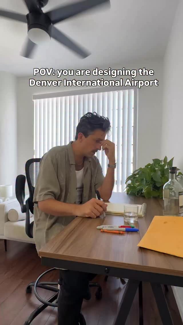
@aka__vinnie time to design another airport #denver #día #urbanplanning #colorado #lax

@aka__vinnie
Instagram · Skit
@aka__vinnie time to design another airport #denver #día #urbanplanning #colorado #lax
Performance
Video #5651 · Skit
[01]
The creator plays the role of a stressed architect designing the Denver International Airport. After reviewing a bizarre, occult-themed mood board, he satirically incorporates its dark elements into the airport's design, sketching out features like its remote location, confusing layout, gargoyles, and the infamous demonic blue horse statue, all while narrating his absurd creative process.
[02]
[03]
 4M1.7×Comedic skit designing LAX airport@aka__vinnie · Skit
 575K242.7×Satirical design of an airport@aka__vinnie · Satirical Expertise
 474KComedic skit designing terrible airport@aka__vinnie · Skit
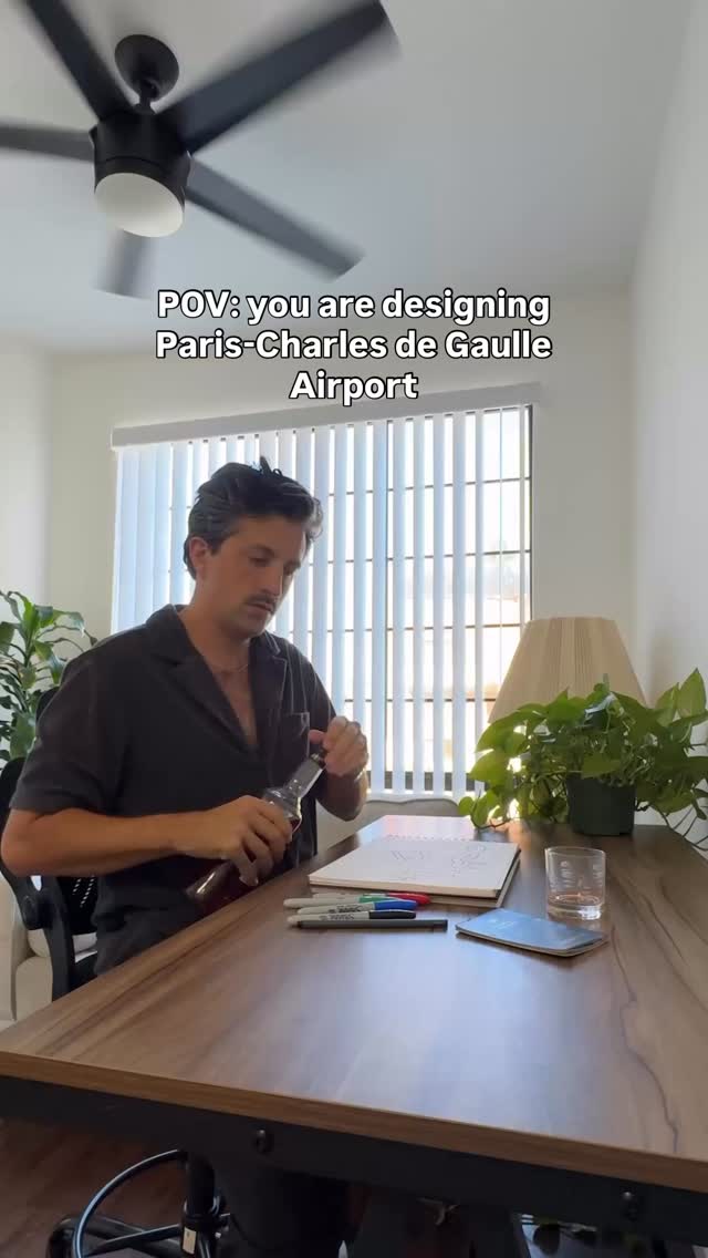 207.2KSatirical design of Paris airport@aka__vinnie · Satirical Expertise
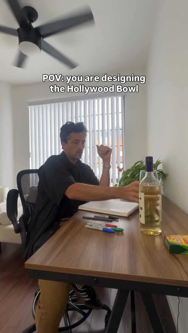 914.6KArchitect satirically designs Hollywood Bowl@aka__vinnie · Skit
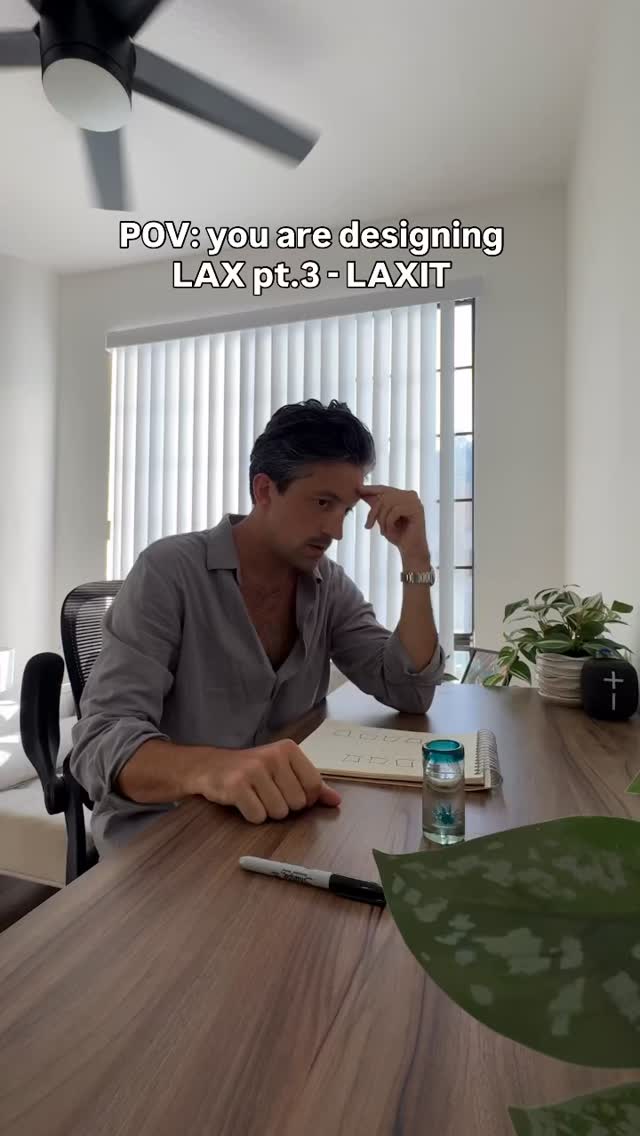 473.7KSatirical airport design process explanation@aka__vinnie · Satirical Advice
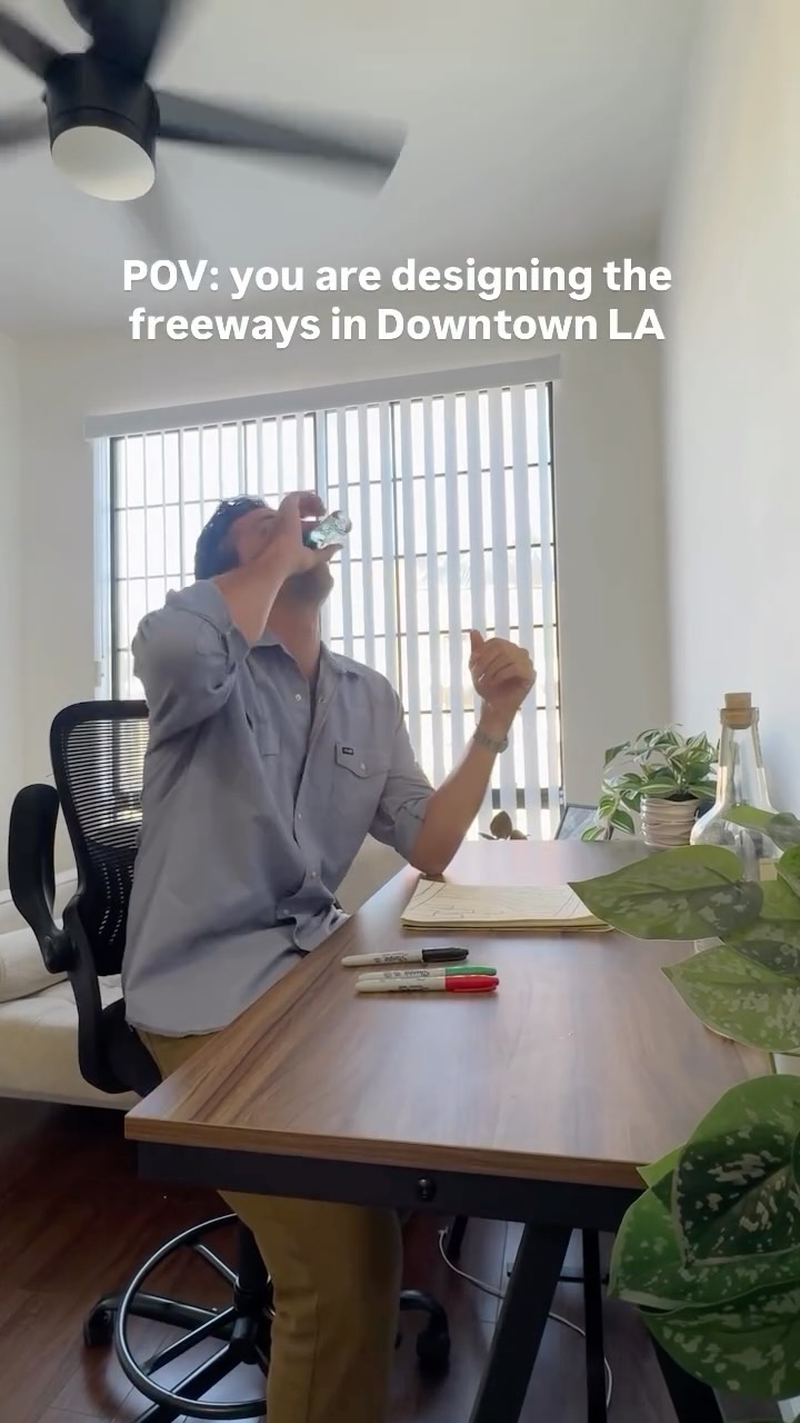 2MComedic skit on bad freeway design@aka__vinnie · Skit
 1.7MSatirical design process for parking lot@aka__vinnie · Skit
 388.4KSatirical LA apartment design process@aka__vinnie · Skit
 462.1K198.3×Satirical urban planning design process@aka__vinnie · Satirical Expertise
 1.5MComedic skit about city design@aka__vinnie · Skit
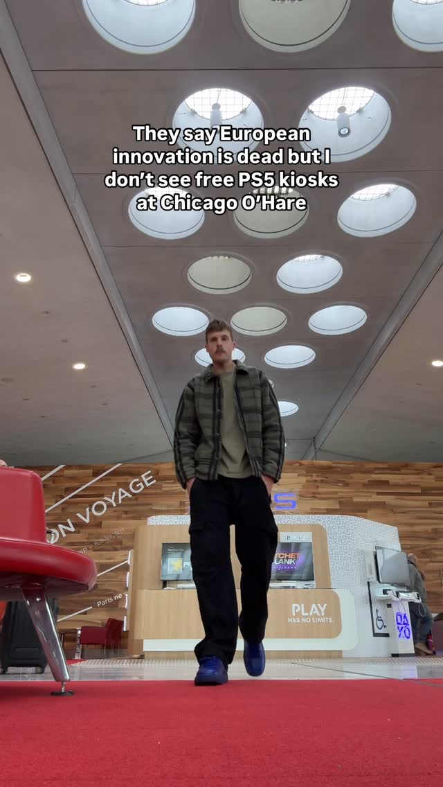 70.7KComparing airport amenities via text@orenmeetsworld · Trendjacking
[04]
[05]
What stops the scroll in the first 3 seconds
Title hook · 35%
POV: you are designing the Denver International Airport
Verbal hook · 50%
Why would you agree to design another fucking airport?
Visual hook · 15%
A man sits at a desk looking stressed and overwhelmed, with his hand on his forehead, immediately conveying a relatable sense of work frustration.
[07]
The promise the opener makes, and how the video pays it back
Hook
Establish a 'Point of View' scenario where the viewer is tasked with a difficult or frustrating creative project, immediately voicing reluctance and setting a comedic, cynical tone.
Payoff
The creator unveils the final, most infamous feature of the product, justifying it with language that is the complete opposite of its actual effect, and declaring the flawed creation 'perfect.'
[08]
The structural pattern this video runs on
Framework
The Absurd Origin Story
A comedic 'Point of View' narrative that reverse-engineers a famously flawed or bizarre real-world thing, attributing its creation to a reluctant creator working from a set of sinister or nonsensical instructions.
The Reluctant Acceptance
The creator begrudgingly accepts the task, questioning their own decision-making while setting low expectations for the outcome.
The Initial Absurd Solution
The creator proposes a first, comically terrible idea that highlights the core problem in an exaggerated way, establishing the project's flawed trajectory.
The Sinister Mandate
The creator consults external 'guidelines' or 'inspiration' which are revealed to be nonsensical, bizarre, or vaguely evil. This becomes the justification for all subsequent bad choices.
The Literal Translation of Chaos
The creator begins to systematically and literally interpret the absurd guidelines, translating them into the foundational aesthetic and structural elements of the final product.
The Engineered Inconvenience
The design process shifts from aesthetics to user experience, with features being intentionally designed to be confusing or difficult, all while being framed with positive-sounding but ironic justifications.
The Ominous Detail Integration
A specific, strange detail from the initial guidelines is integrated into a mundane part of the design, creating a moment of jarring, comedic horror.
time to design another airport #denver #día #urbanplanning #colorado #lax
title · throughout
POV: you are designing the Denver International Airport
Why would you agree to design another fucking airport? Whatever. I did one, you got this. How hard could this be? Okay. So if Denver is here, how about we put the airport over here in fucking Kansas or something? I don't know. I should take a look at this mood board the developers sent. Alright. What is what is this? Fuck. Okay. I think I understand. The exterior of the airport will look like teepees, and the interior will look like the construction of a highway. Travelers can access one of three terminals via this convenient monorail system, and once they exit, I guess they can begin their two and a half mile death march to their gate. You can have this cool carousel at baggage claim for ski and snowboard equipment and that'll be the perfect place for the, gargoyles. Finally, let's welcome travelers to the airport with a symbol of safety and tranquility to calm their nerves. Perfect. This is perfect. This is perfect.