@imsteviesells
Instagram · Talking Head Edit
@imsteviesells Ugliest G-Shock ever? 🥴 @imsteviesells #watch #gshock #watchdesign #watchcollector

@imsteviesells
Instagram · Talking Head Edit
@imsteviesells Ugliest G-Shock ever? 🥴 @imsteviesells #watch #gshock #watchdesign #watchcollector
Performance
Video #10159 · Talking Head Edit
[01]
The creator presents a duct-taped ball as a G-Shock prototype, explains the history of the shock-resistant design inspired by a bouncing ball, reveals the new G-A-V01 watch, details its unique magnetic hands technology using visual aids, and concludes with his appreciation for the design's backstory.
[02]
[03]
 1M2.5×Man reviews radial engine watch@imsteviesells · Product Showcase
 891.2K109.1×Driver watch recommendations and breakdown@flock_mfg · Breakdown
 1.8M1.3×Reviewing a controversial buttonless watch@imsteviesells · Review
 2.9M6.3×Modding classic Casio into smartwatch@imsteviesells · Tutorial / How To
 7.1M25.5×Making a tennis ball that grunts@pablo.rochat · Process
 1.3M11.9×Hacking a Fitbit for watches@thespenceryan · Quest Recap
 1.5MComedic invention reveal and demo@frankeinvents · Satirical Product Pitch
 2.5M5.9×Interviewer asks celebrity about watch@itsdanielmac · Street Interview
 395.7KCreator demos functional tiny TV@imsteviesells · Product Showcase
 8.2M34.7×Tech solves pro surfing problem@helloapple · Case Study Breakdown
 3.3M6.5×Luxury watch gender reveal unboxing@alvuwki · Surprise Reveal
 4.6M865.2×Product demo of ankle watchband@solacebands · Product Promo
[04]
[05]
What stops the scroll in the first 3 seconds
Verbal hook · 55%
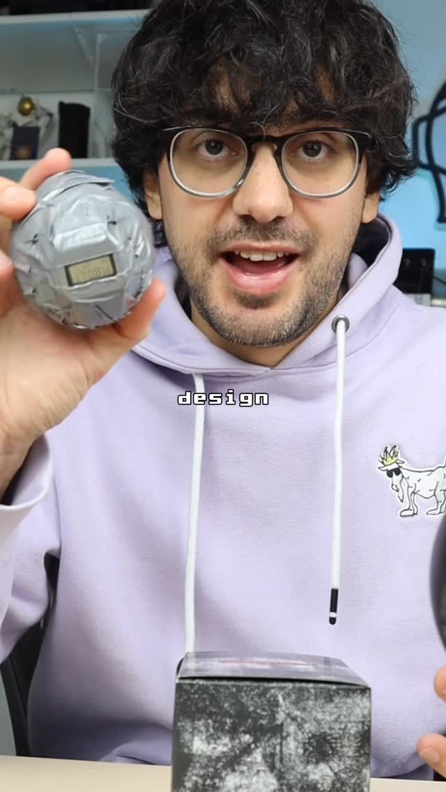
Worst g shock watch prototype apparently looked something like this.
Visual hook · 45%
Creator holding a ball made of gray duct tape with a digital watch face taped to the front, resembling a crude DIY project.
[07]
The promise the opener makes, and how the video pays it back
Hook
The Origin Visualization: A physical demonstration of the primitive, crude concept that inspired the product, creating immediate visual curiosity.
Payoff
The Contextualized Verdict: A final opinion that shifts from surface-level judgment to informed respect based on the new knowledge.
[08]
The structural pattern this video runs on
Framework
The Contextual Redemption Arc
Transforming viewer confusion into appreciation by revealing the hidden history, engineering constraints, and lore behind a polarizing design.
The Polarizing Reveal
Unveiling the actual product while immediately acknowledging its divisive or 'ugly' reputation to validate viewer skepticism.
The Engineering Conflict
Highlighting a specific technical challenge (e.g., size vs. durability) that makes this design difficult to achieve.
The Innovation Solution
Explaining the unique mechanism or structural change required to solve the conflict, adding intellectual value.
The Lore Expansion
Revealing the brand's fictional backstory or marketing narrative to add a layer of whimsy or depth.
Ugliest G-Shock ever? 🥴 @imsteviesells #watch #gshock #watchdesign #watchcollector
contextual · middle
2 others in my collection :)
contextual · middle
from what I understand lol...
contextual · end
Looks friendly...
Worst g shock watch prototype apparently looked something like this. The designer saw a girl bouncing a ball at a playground and the idea was to put a watch movement inside a structure like a ball that would protect it from shocks. Obviously, this isn't the design that stuck best I'm excited because this new g shock apparently was heavily inspired by this original design. Okay. So this is the g a v zero one and a lot of people are calling this the ugliest g shock they've ever seen. Rank. This is absolutely huge. It looks like it was made by aliens or something. Now I was doing some research on this watch and one of the major differences between this g shock and others besides its over the top look is the hands. Most g shocks have fairly small analog hands that are by default kind of impact resistant. The issue when you make them bigger is that that resistance goes down. So apparently on this watch, they had to use a completely new structure with magnetic hands. There's also a storyline that goes along with this watch. It starts with a taped rubber ball g shock prototype which morphs into this creature that seeks adventures full of creativity and friendship. At first when I saw this watch, I was really confused. Best after learning about why they made it, I can respect it. Offer more peace.