@house.of.ag
Instagram · Split screen
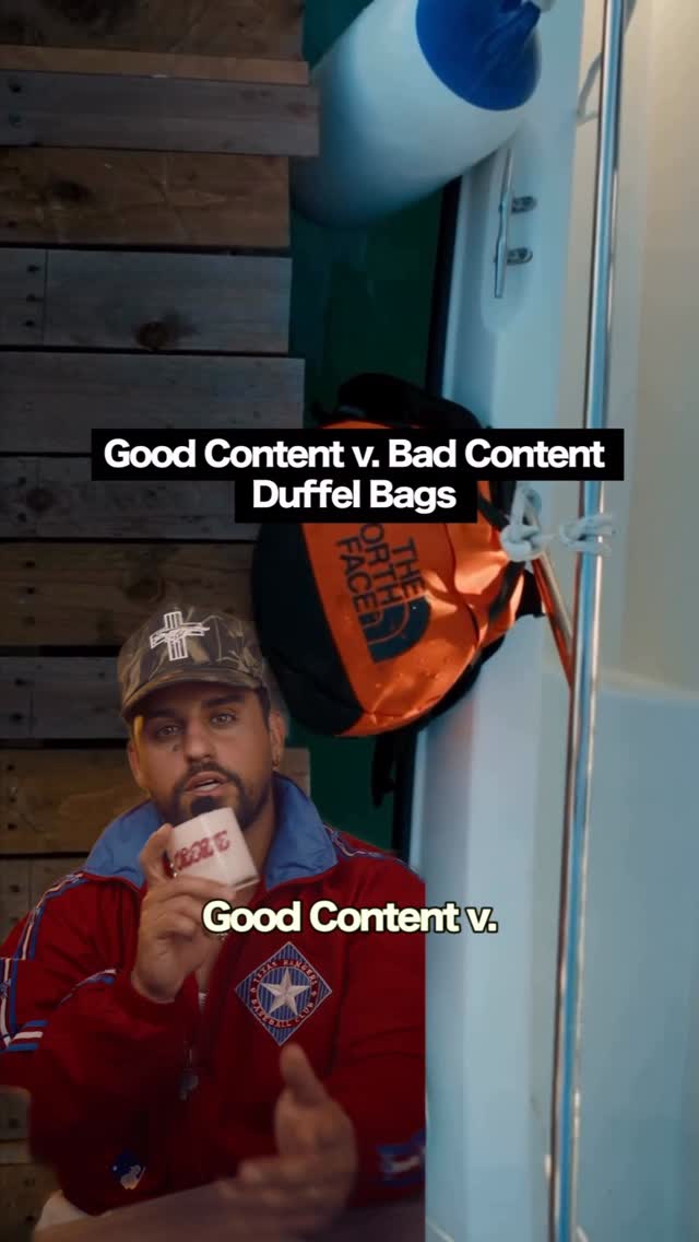
@house.of.ag Is it good content or is it bad content: duffle bag edition #content #socialmediastrategy #socialmediagrowth

@house.of.ag
Instagram · Split screen
@house.of.ag Is it good content or is it bad content: duffle bag edition #content #socialmediastrategy #socialmediagrowth
Performance
Video #13388 · Split screen
[01]
The creator analyzes and compares the content strategies of two duffel bag brands. He first breaks down a North Face video as 'good content,' highlighting its effective creative direction, visual hooks, art direction, and sound design. He then contrasts this with Bellroy's 'bad content,' critiquing it for being too product-centric, templatized, and lacking a central reason for consumers to follow the brand.
[02]
[03]
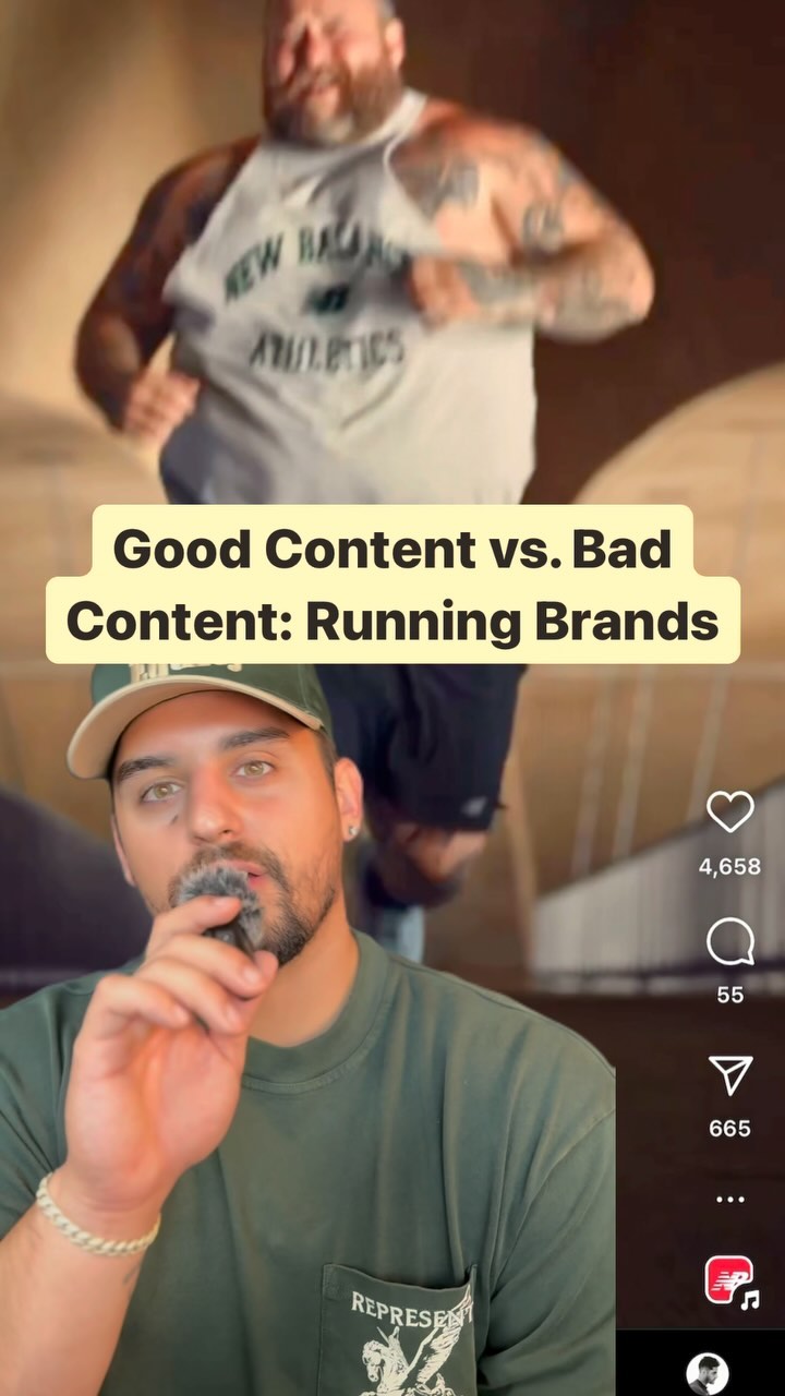 1.1M12.7×Running brands ranked by content strategy@house.of.ag · Good vs Bad
 972.1K10.9×Running brands compared on content marketing quality@house.of.ag · Good vs Bad
 727.6K4.8×Rapid fire backpack brand reviews@calebulf · Rapid Fire Listicle
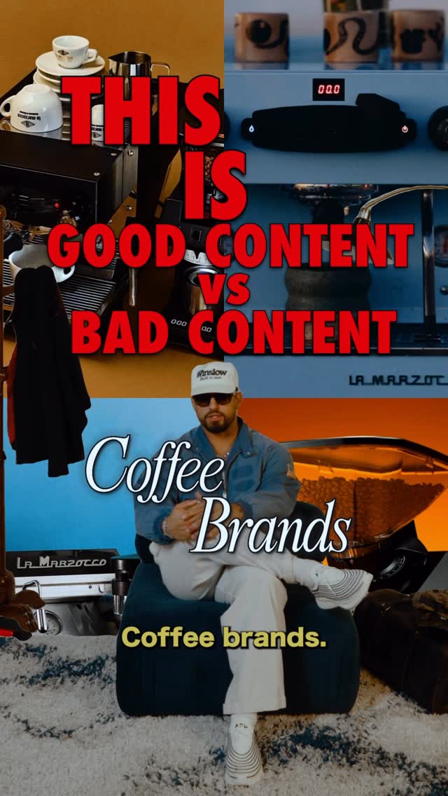 172.4K1.9×Comparing good vs bad content@house.of.ag · Good vs Bad
 977.3KRapid fire luggage brand reviews@orenmeetsworld · Rapid Fire Listicle
 613.8K3.6×Rapid fire luggage brand reviews@calebulf · Rapid Fire Listicle
 1.6M5.2×Rating mattress brands as genuine product buys or overpriced marketing@orenmeetsworld · Rapid Fire Listicle
 161.1K2.9×Expert analyzes menswear brand content strategies@house.of.ag · Case Study Breakdown
 869.3K17×Breaking down a brand's campaign@clayton.chambrs · Case Study Breakdown
 124.2K4.4×Streetwear brand review and critique@readytowearfiend · Breakdown
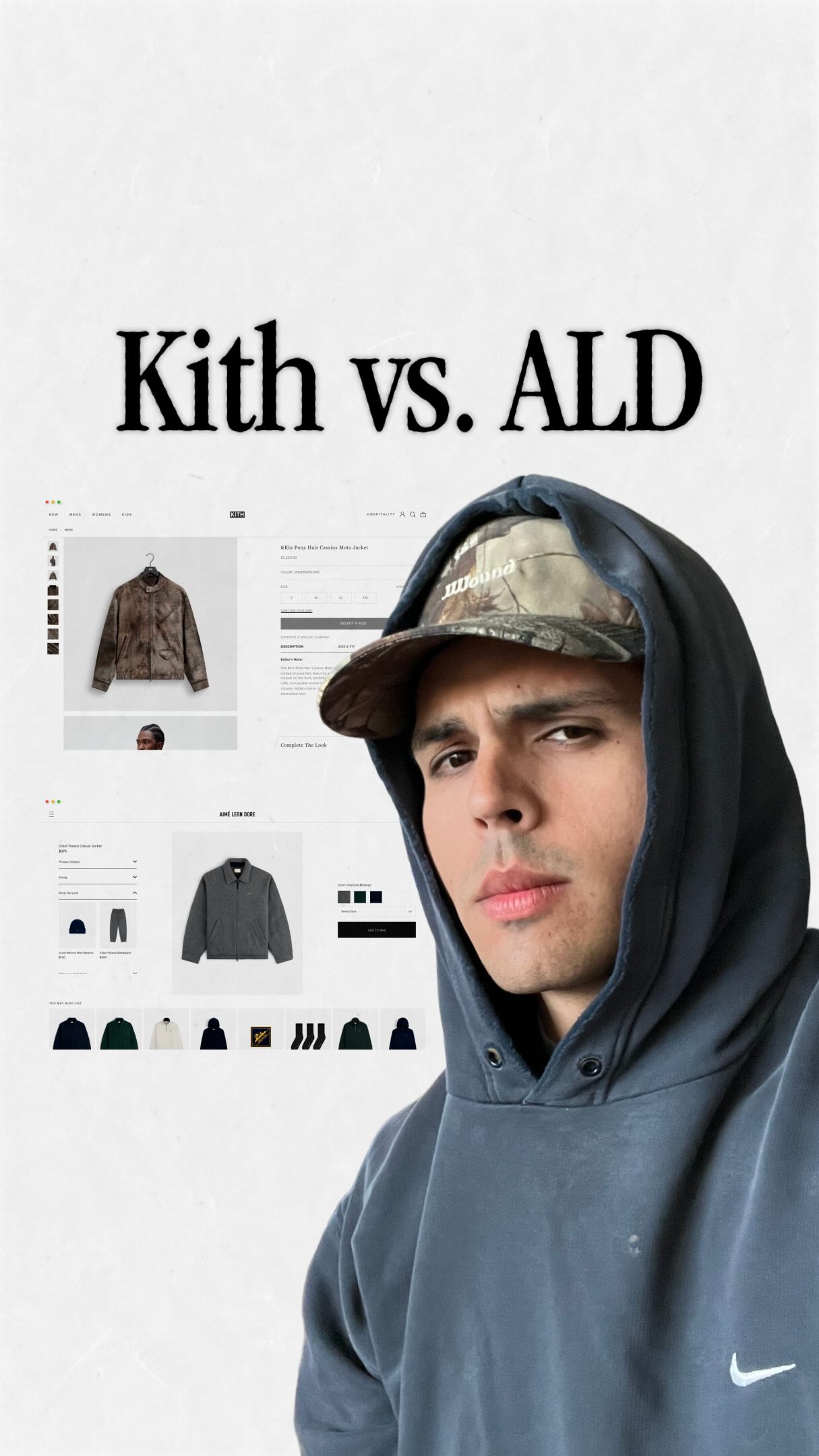 409.9K40.9×Brand web design comparison breakdown@shovel.studio · Breakdown
 1.5MRapid fire brand worthiness comparison@your_finance_brother · Rapid Fire Listicle
[04]
[05]
What stops the scroll in the first 3 seconds
Title hook · 50%
Good Content v. Bad Content Duffle Bags
Verbal hook · 40%
Is good content or bad content, duffle bags.
Visual hook · 10%
A picture-in-picture shot of the creator overlaid on a visually interesting scene of an orange North Face bag hanging on a boat, creating immediate visual layering and context.
[06]
Steal this for your own video
Good v. Bad :
[07]
The promise the opener makes, and how the video pays it back
Hook
A direct declaration of a binary judgment ('Good v. Bad Content') applied to a specific product category ('Duffel Bags'), immediately establishing the video's premise and stakes.
Payoff
The final beat delivers the core strategic insight, explaining the fundamental difference in approach between the two examples and providing a transferable lesson about brand building.
[08]
The structural pattern this video runs on
Framework
The Exemplar vs. Cautionary Tale Framework
To establish a standard of excellence by deconstructing a successful example ('Good Content'), and then use that established criteria to critique a less effective example ('Bad Content'), ultimately teaching a core strategic principle.
The Gold Standard Presentation
Introduce the 'good' example and validate its quality with a social proof metric (e.g., 'racked up over 2 million views'), positioning it as an authoritative case study.
The Success Principle Breakdown
Systematically deconstruct the 'good' example into distinct, named principles (e.g., 'Creative Direction', 'Visual Hook', 'Art Direction', 'Sound Design'), explaining the function and impact of each component with visual evidence.
The Comparative Pivot
Explicitly transition from the positive case study to the negative one, re-engaging the viewer for the second half of the comparison.
The Failure Analysis
Critique the 'bad' example by identifying 2-3 core strategic flaws (e.g., 'product-centric', 'templatized', 'no reason to follow'), which often serve as the inverse of the success principles previously established.
The Concluding Principle
Deliver the final, overarching lesson by contrasting the fundamental philosophies of the two examples (e.g., building brand love vs. driving transactions), providing a clear takeaway for the audience.
Is it good content or is it bad content: duffle bag edition #content #socialmediastrategy #socialmediagrowth
title · beginning
Good Content v. Bad Content Duffel Bags
contextual · beginning
Good Content v.
contextual · beginning
Bad Content
informational · beginning
Creative Direction
informational · beginning
Visual Hook
informational · middle
Art Direction
Is good content or bad content, duffle bags. So first better start with an immaculate video from North Face and why it racked up over 2,000,000 views. So first is the creative direction which tier, it's putting the bag in a scenario where other bags would tear. But the first shot is key and this is the visual hook which starts with the bag getting ran over which is the most scroll stopping shot in this video. Then it transitions to the bag getting dragged on gravel rank continuous shots that create this holy shit reaction. But the next key element is the art direction. In this video, North Face uses a lot of contrast to make the product pop from moody and cool scenes like this with the contrast of the orange duffel bag to really make it pop within this setting. Then you have this satisfaction factor of using nothing but sound design to really bring this story to life. So you not only see it, but you hear it too. Then let's compare it to a brand like Bellroy, and there's really three things I dislike about their content strategy. Number one being, everything is product centric, focusing on the features. First, the use cases, the problem solving, the differentiation, and the elements I would get somebody to believe in the bag and brand. The second is it feels templatized. It feels like Canva templates for every single day of the week without considering what works and what doesn't. The third is there's no central reason to follow. Even if I love the brand rank I bought all their products, there's no central value that calls me to follow the brand because it's more focused on getting me to continue to buy versus getting me to continue to fall in love with the brand even more.