@hansloreidesign
Instagram · Greenscreen Talking Head

@hansloreidesign Everything - cars, homes, appliances, furniture - looks better when they use simple defined shapes #interiordesign #architecture #cars #homedesign

@hansloreidesign
Instagram · Greenscreen Talking Head
@hansloreidesign Everything - cars, homes, appliances, furniture - looks better when they use simple defined shapes #interiordesign #architecture #cars #homedesign
Performance
Video #1425 · Greenscreen Talking Head
[01]
The creator presents a design thesis that simple, defined shapes are aesthetically superior to complex, over-engineered designs. He supports this argument by visually comparing old versus new cars and traditional versus modern homes, framing simple designs as relatable and cheerful while criticizing complex ones as aggressive and formless. He concludes by offering a simple test for good design—"Can a kid draw it?"—and then pivots to a call-to-action for his weekly email newsletter.
[03]
 3.9M6.7×Before and after design fixes@createwithalena · Rapid Fire Listicle
 488.5KGet the look design tutorial@alyssaanselmo_ · Tutorial / How To
 210.3K10.5×Comparing design with and without vibe@hansloreidesign · Hot Take
 54K1.1×Explaining a website design transformation@pixeldesignlab · Before/After Transformation
 307.1K1.1×Explaining the art direction of everything@orenmeetsworld · Breakdown
 207.9K9.5×Creator explains visual ideas framework@jason_swet · Opportunity Explainer
 107.3KReasons to finish design projects@hansloreidesign · Breakdown
 580.6K2.6×Creator breaks down web design trends@deathtostock · Breakdown
 550.7K1.6×Showing design combination synergy@createwithalena · Rapid Fire Listicle
 162.4K1.9×Explains how to trust design instincts@hansloreidesign · Explainer
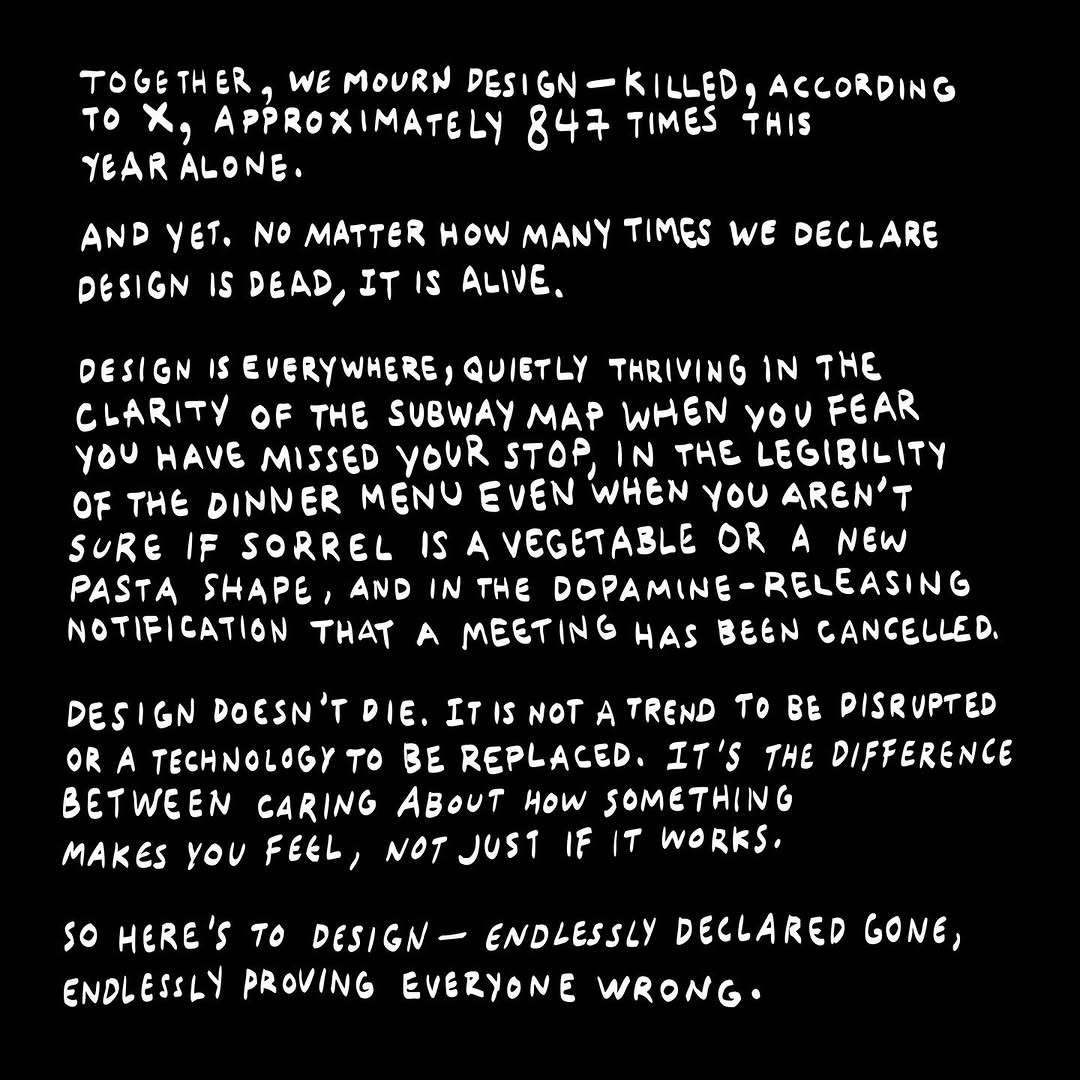 513.4K14×Text manifesto on design's resilience.@figma · Brand Manifesto
 1.2M163.9×Analyzing a viral design brand's success@davidkylechoe · Case Study Breakdown
[04]
[05]
What stops the scroll in the first 3 seconds
Title hook · 25%
ALMOST
Verbal hook · 60%
Almost everything looks better with simple defined shapes.
Visual hook · 15%
The video opens on an aesthetically pleasing shot of a white, stucco-style house with clean lines and orange-trimmed windows against a bright blue sky, immediately establishing the video's theme of design and architecture.
[06]
Steal this for your own video
Almost every looks better when you follow this .
[07]
The promise the opener makes, and how the video pays it back
Hook
A broad, universal proclamation that presents a strong opinion as an objective fact, immediately engaging the viewer's agreement or disagreement.
Payoff
A call to action that frames a subscription or follow as an invitation to a community of like-minded individuals who appreciate this specific type of analysis, with a clear, low-friction instruction.
[08]
The structural pattern this video runs on
Framework
The Heuristic Proof
To establish a subjective design principle as a universal truth by demonstrating its validity through a series of 'good vs. bad' comparisons across multiple categories, culminating in a simple, memorable rule of thumb for the viewer.
The Universal Proclamation
State the core thesis in a single, confident sentence that applies to a wide range of subjects.
The Primary Case Study
Introduce the first domain (e.g., cars) where the thesis will be tested, grounding the abstract idea in a concrete example.
The Idealized Example
Showcase an example that perfectly embodies the thesis, using positive, simple, and emotionally resonant descriptors (e.g., 'simple, relatable, cheerful').
The Flawed Counter-Example
Showcase a contrasting example that violates the thesis, using critical and negative descriptors (e.g., 'formless blobs,' 'aggressive').
The Binary Showdown
Directly juxtapose the 'good' and 'bad' examples with simple text overlays and pose a direct question to the audience to force a choice and drive engagement.
The Principle's Expansion
Broaden the argument by applying the same thesis to a second, distinct domain (e.g., homes), proving its versatility and reinforcing the initial point.
The Architectural Indictment
Present the 'bad' example from the new domain, reinforcing the negative pattern and adding a psychological critique (e.g., 'working out their ego issues').
The Golden Heuristic
Conclude the argument by distilling the entire thesis into a simple, portable, and memorable test or rule that provides a tangible takeaway for the viewer (e.g., 'Can a kid draw it?').
Everything - cars, homes, appliances, furniture - looks better when they use simple defined shapes #interiordesign #architecture #cars #homedesign
title · beginning
ALMOST
title · beginning
BETTER WITH SIMPLE DEFINED SHAPES,
contextual · middle
HAPPY AND SIMPLE.
contextual · middle
OVER ENGINEERED.
informational · middle
CAN A KID DRAW IT?
call-to-action · end
MY WEEKLY EMAIL, AND I WILL SEND YOU A LINK TO SUBSCRIBE.
Almost everything looks better with simple defined shapes. Whether it's cars, homes, appliances, or furniture. Most old cars have clearly defined simple shapes, basically rectangles and circles. They look like how a kid would draw a car, simple, relatable, and cheerful. But most new cars are formless blobs designed to look aggressive, over engineered, and without a defined shape, happy and simple, aggressive and over engineered. Which do you like better? It's the same thing with homes. A lot of new homes are over engineered, just trying to make a statement. Whereas simple homes with defined shapes are just better looking and not trying to publicly work out their ego issues. So a good test for design might be, can a kid draw it? This is the kind of nerdy stuff we talk about in my weekly email. Just comment email and I will send you a link to subscribe. Thanks so much for watching.