The creator begins by questioning the unique, illustrative design of the new Hermès website, using it as a hook to introduce a broader shift towards 'anti-slop' design. She then structures the video as a listicle, breaking down three key web design trends: Morphing (immersive, full-height scrolling), Modularity (puzzle-like, adaptive layouts), and Monochrome (single-hue color treatments). For each trend, she provides multiple visual examples from real brands and offers a corresponding free website template that viewers can get by commenting a specific keyword, before concluding with a final recap of the calls-to-action.
Post caption
Web design is getting a lil freakyyyyyy.
We made three usable templates for you to create your own designs – comment LOTUS for modularity, BUTTERFLY for morphing, or DOGGY STYLE for monochrome 🪷🦋🐶
Vote for your fav trend below:
Transcript
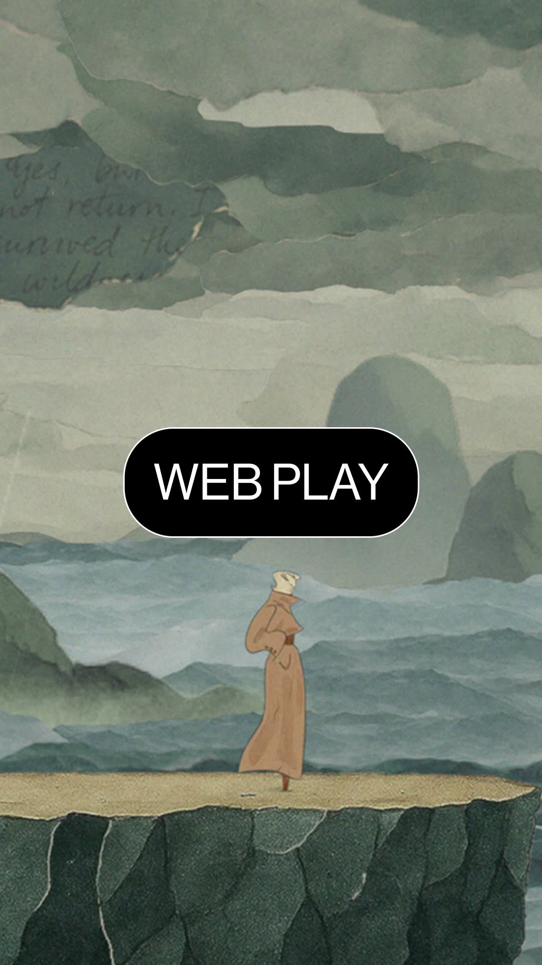
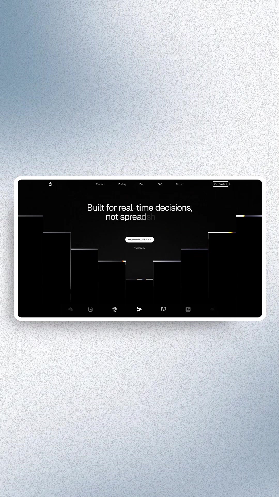
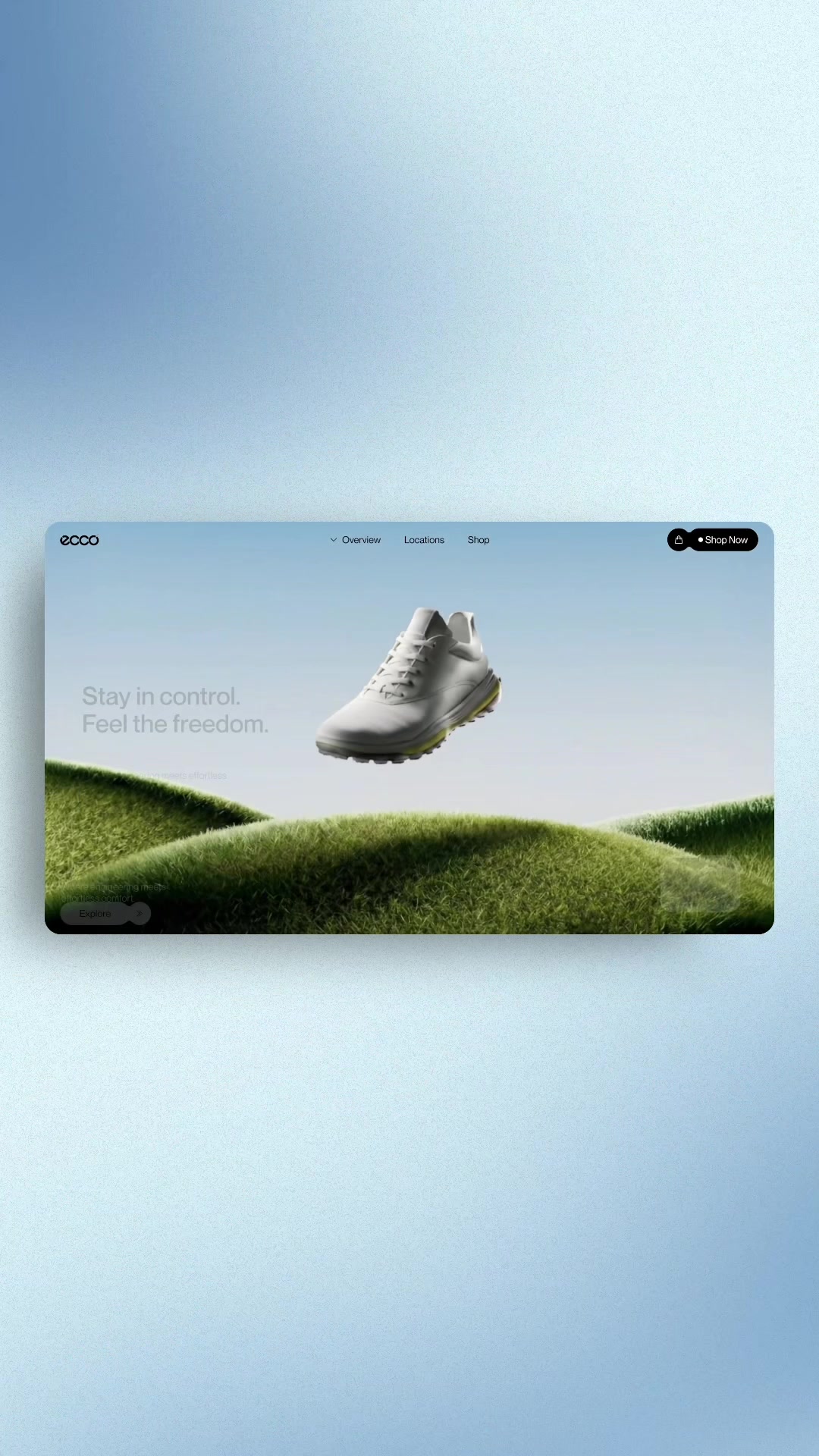
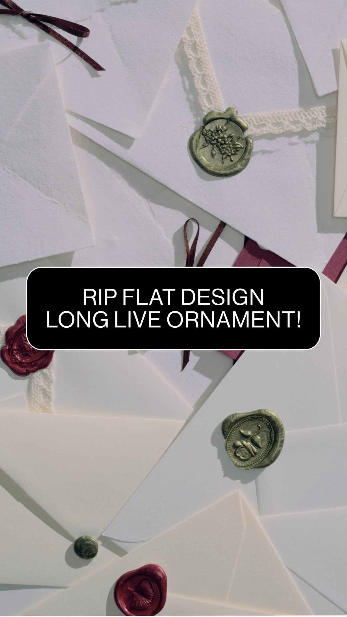
What is going on in the new Hermes website? Hand drawn animations welcoming you to the site and illustrations replacing category shots and the folk symbolism obscuring the products. Remember when we said design was going anti slop in 2026? We're already seeing it redefine online experiences, with brands leaning into human craft, pre modern storytelling, and natural symbolism. Max Mara was so early to this. But this isn't the only big shift happening online. Let's talk about three web design trends gaining traction this year. Number one, morphing. Flat scrolling is out for the year. Designers are opting for more immersive formats instead. Full height images and videos are increasingly becoming standard paired with morphing transitions between sections. Lightship really did this beautifully. By the way, you can get this template for free by commenting better below. Number two, modularity. Predictable grids are also being reconsidered. Designers are building modular, pastel like layouts that feel adaptive and flexible. Interactivity shows up through multi column scrolls, hover reveals, and expanding modules. Yep. We also made this free template with our visuals coming lotus for access. Number three, monochrome. Finally, designers are leaning into full monochrome treatments using a single hue across the entire interface and pushing it as far as it rank go. Layouts are expanded through gradients, overlays, tier, and texture variations, letting the color drive the mood and establish a strong visual identity. And you guessed it, we also made this template. Visuals are ours, common doggy style to get it. One last no, all of these web design approaches experiment with new ways of structuring experience. They also benefit from adaptable versions to remain usable across different needs. So keep that in mind as you build for 2026. Here's a cheat sheet one last time.