@greatadviceforshittypeople
Instagram · Carousel
@greatadviceforshittypeople All the shittiest summer advice

@greatadviceforshittypeople
Instagram · Carousel
@greatadviceforshittypeople All the shittiest summer advice
Performance
Video #36107 · Carousel
[01]
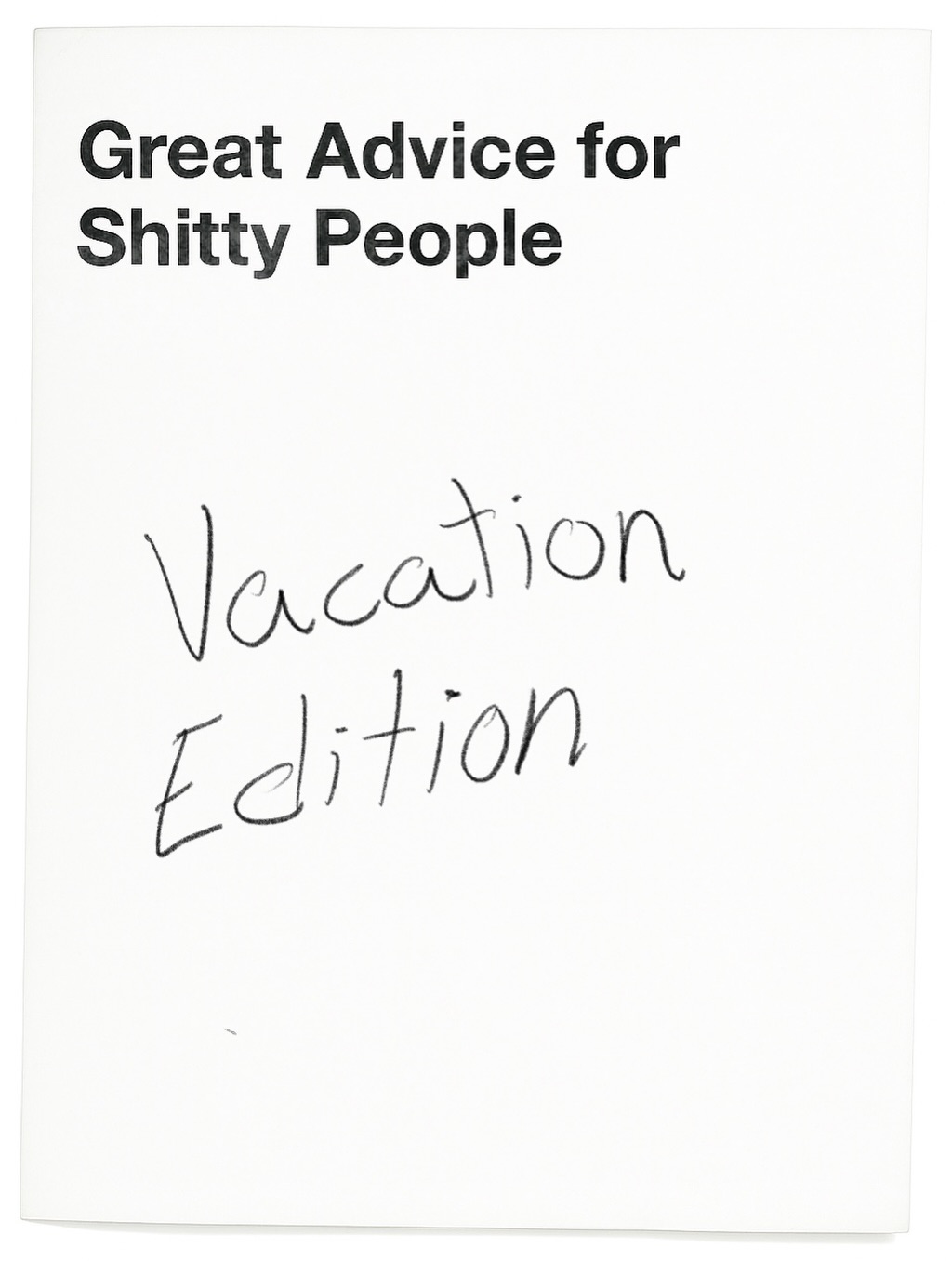
The photo displays what appears to be the cover of a satirical guide titled 'Great Advice for Shitty People', with 'Vacation Edition' handwritten below. The purpose is to use humor and a provocative title to engage the audience and establish a comedic, ironic tone for the content.
[02]
[03]
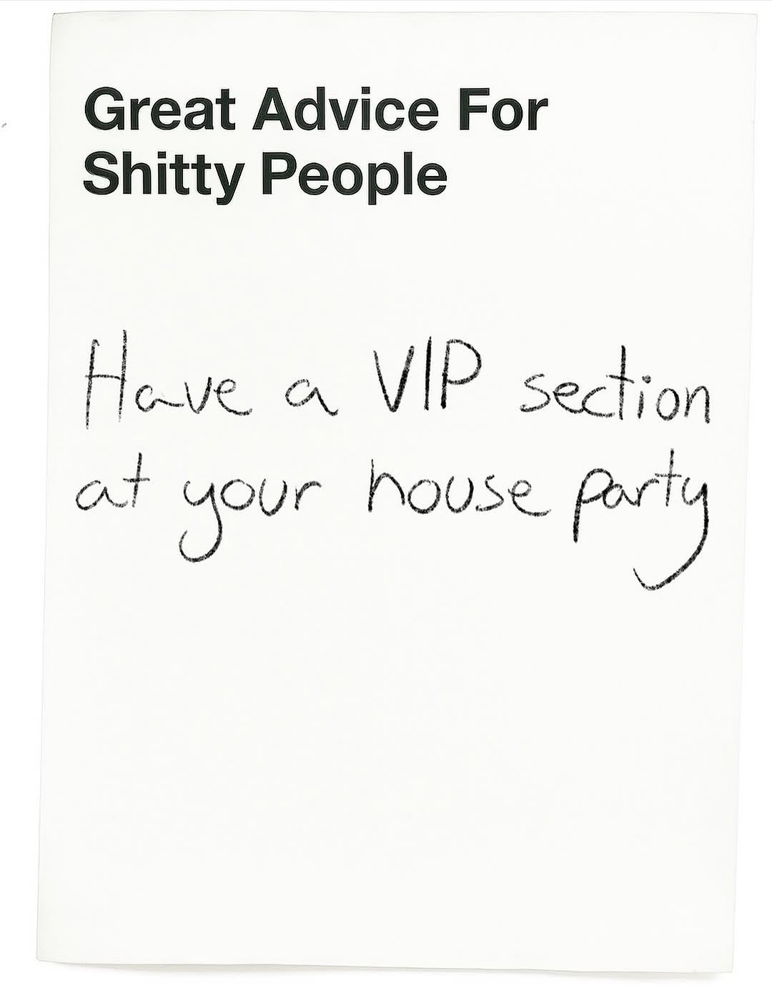 782.2KSatirical advice on a card@greatadviceforshittypeople · Satirical Advice
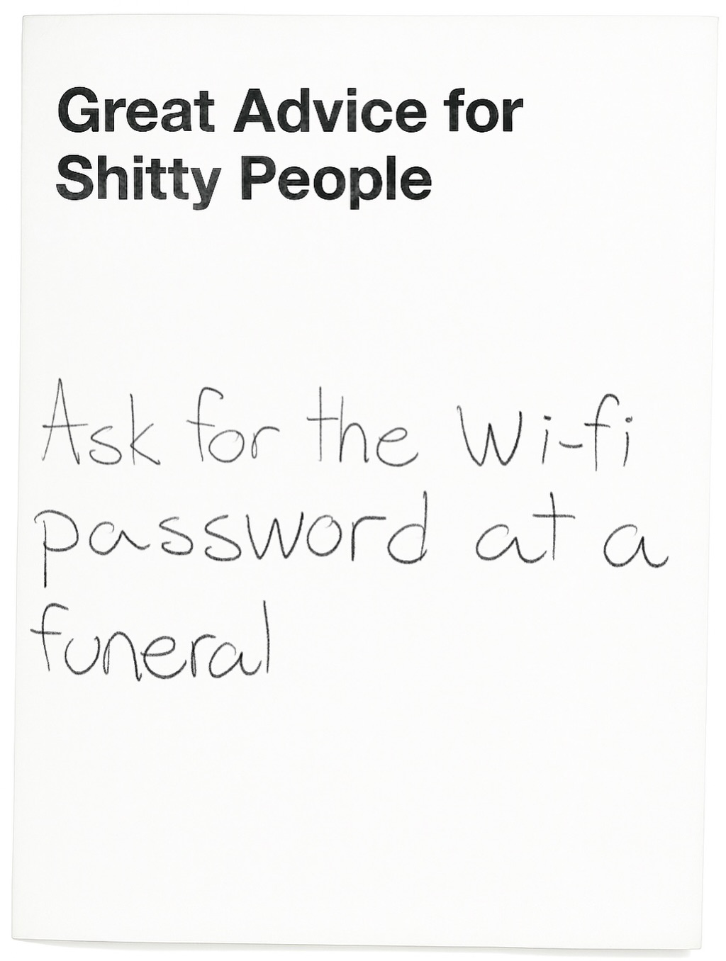 312.2KSatirical advice on a white background@greatadviceforshittypeople · Satirical Advice
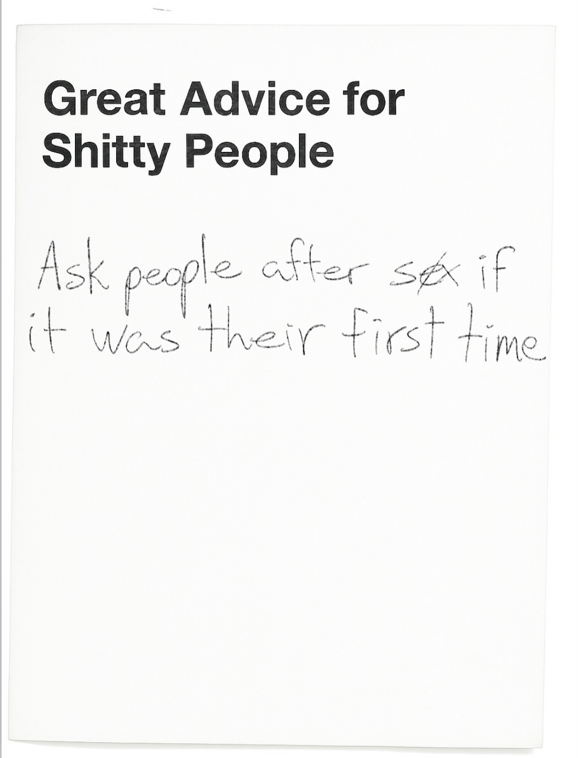 669.7KSatirical bad advice on paper@greatadviceforshittypeople · Satirical Advice
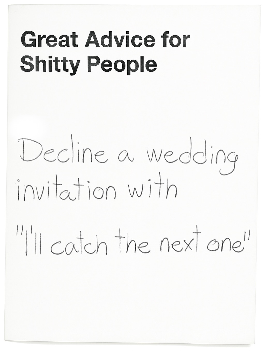 508.2KSatirical advice on declining weddings@greatadviceforshittypeople · Satirical Advice
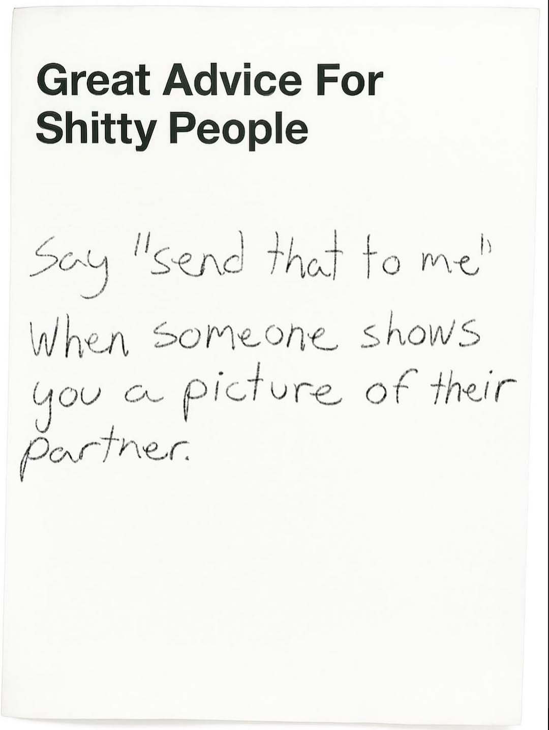 1.1MSatirical advice for shitty people@greatadviceforshittypeople · Satirical Advice
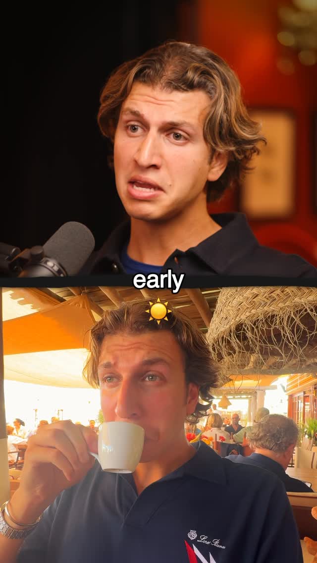 752.7KSatirical guide to beach club etiquette@gstaadguy · Breakdown
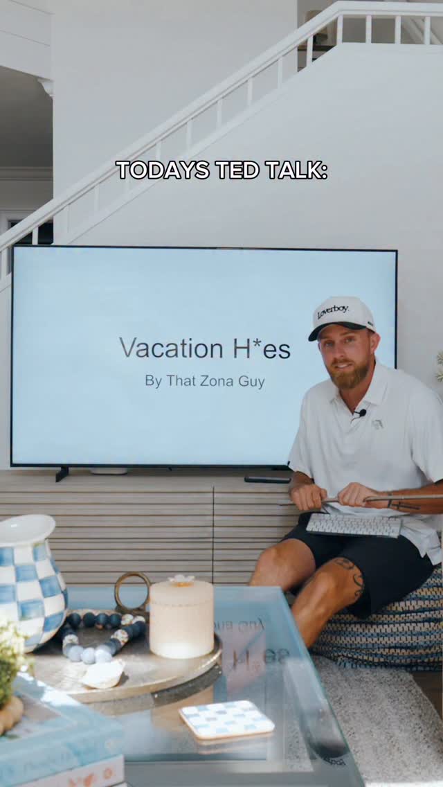 232.5K3.5×Satirical TED Talk on dating@thatzonaguy · Satirical Expertise
 1.2M3.5×Satirical list of bad travel advice@gstaadguy · Satirical Advice
 1.2M119.3×Ironic list of unhealthy habits@couldbaret · Satirical Advice
 468.4K1.5×Satirical business advice monologue performance@goodworkmb · Satirical Expertise
 263K7.4×Satirical presentation on spring break@thatzonaguy · Satirical Advice
 13M1×Snobby character lists dating red flags@gstaadguy · Archetype Performance
[04]
[05]
What stops the scroll in the first 3 seconds
Title hook · 55%
Great Advice for Shitty People
Verbal hook · 40%
All the shittiest summer advice
Visual hook · 5%
The visual hook is the stark contrast between the clean, bold, sans-serif font of the main title and the casual, handwritten script of the subtitle. This juxtaposition creates immediate visual interest and signals a satirical, informal tone.
[06]
Steal this for your own video
The for
[07]
The promise the opener makes, and how the video pays it back
Hook
The entire slide functions as the hook. It establishes a high-concept premise and then immediately grounds it in a specific, relatable context, using visual contrast between fonts to create a compelling and self-contained statement.
Payoff
As a single-slide piece, the payoff is the generation of immediate intrigue that encourages the viewer to read the caption, engage with the post, or anticipate future content in the series. It functions as a complete and effective title card.
[08]
The structural pattern this video runs on
Framework
The Juxtaposed Premise
This framework uses a single slide as a title card to create a powerful hook. It juxtaposes a bold, formally-typed, high-concept series title with a specific, informally-handwritten thematic qualifier. The visual and tonal contrast between the two text elements generates immediate intrigue and clearly defines the content's brand and specific topic.
The Brand Proclamation
The first text element uses a clean, bold, printed font to establish the overarching, attention-grabbing identity or series concept. It acts as the formal, high-level brand statement.
The Humanizing Qualifier
The second text element uses a contrasting, informal (e.g., handwritten) style to narrow the broad concept to a specific, relatable theme or 'edition'. This makes the premise feel immediate, personal, and less generic.
All the shittiest summer advice
title · photo_0
Great Advice for Shitty People
contextual · photo_0
Vacation Edition