A brand marketer analyzes the leaked FIFA World Cup 2026 brand guide, explaining the purpose of a brand manual and walking through its key components. He covers core assets, typography, logo usage rules, and sponsor integration guidelines, using the FIFA document as a prime example of excellent brand management. He concludes by showing real-world applications of the branding inside a stadium to emphasize the level of detail required to manage a global brand.
Post caption
Hey Babe, Wake Up- FIFA’s World Cup Brand Guide just dropped.
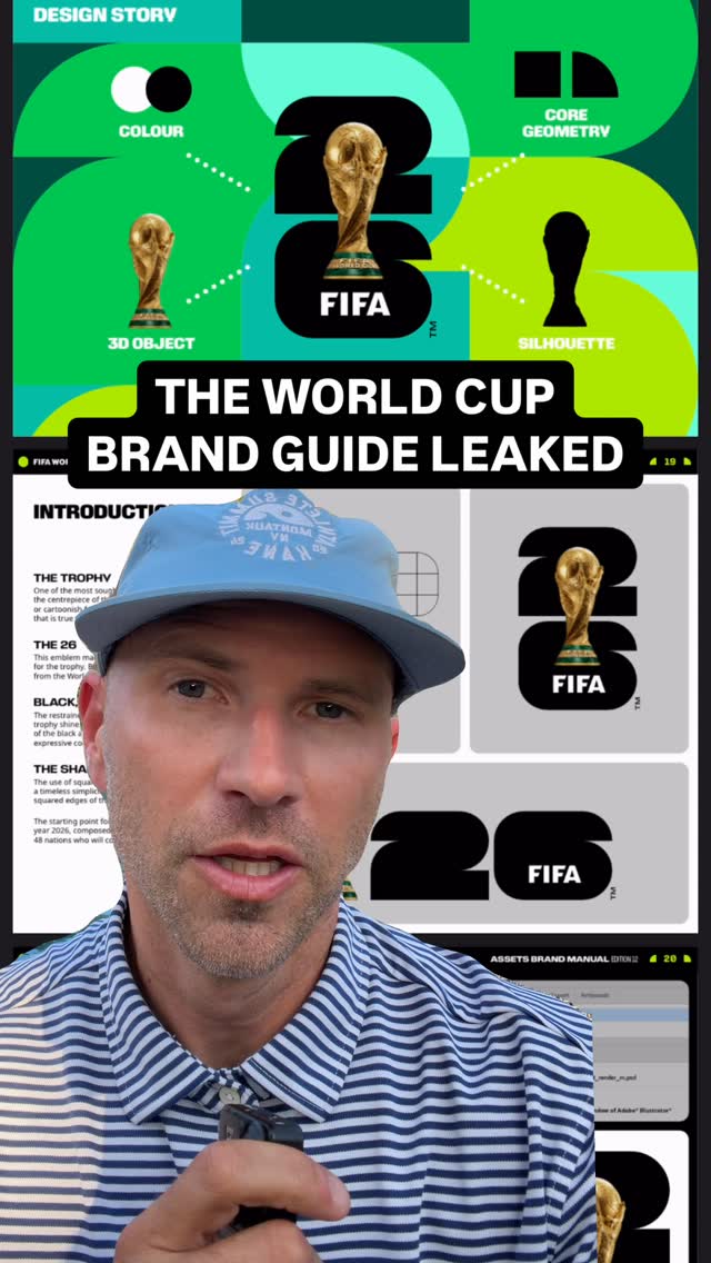
If you’ve ever wanted to know what a Brand Guide, Brand Manual or Visual Center looks like- here’s a great example of one!
FIFA might be everyone’s enemy right now for trying to sell, but their Brand team (& whatever agency) did great work here.
#WorldCup #FIFA
Transcript
The World Cup's over, and everybody hates FIFA, but I love their brand guidelines. Let's go through the World Cup's brand manual because this is a great example. A brand manual, brand guidelines, or a visual center is a big document, in this case, about 200 pages, of how your brand should look and feel and show up in the market in very specific ways. And as a brand marketer, these bring me great joy. I think this is what accountants feel like when everything numbers out to tier, but I digress. Let's look at some of the highlights from a beautiful visual center that spanned the entire globe. First, we ground ourselves in the core assets tier. The trophy, which is very coveted. The 26 for 2026. The black, white, and gold, which are the foundational colors, and then the shapes. They give you very tactical examples of how to use this in Illustrator files, and they remind you of the parameters here. First, you may not have access to utilize these assets. But if you do, you have to follow the brand manual, and then you have to seek and submit this for approval before you produce the materials. Let's say you're a vendor who's producing the massive signage that goes outside the stadium, producing concession signs or an apparel tent over here that sells merch. You have to know how to utilize the marks in a way that the brand sees fit. They show us how that should be used if there is just one line, FIFA World Cup. If there are two lines, FIFA World Cup. And if there are three lines, how to lock it up with the logo. Not only that, but we have multiple language options as well. We have a custom font that was made for the FIFA World Cup twenty twenty tier, and we've got so many options in thin, light, regular, medium, bold, and black, which is truly appreciated if you're trying to make materials for an event like this. They show us how the trophy assets are utilized and mocked up with different colors and mocked up with all the different countries. And last better certainly not least, how to utilize this with sponsors. So they show you what are these logo strips, where they can be used and how, and even what the media backdrop strip should look like in different context. This may seem like overkill, but this is what it takes to manage a global brand that stays really premium. You wanna control how it shows up in the market, and these guides are super helpful. This is really well done. If you know who the agency is, let me know below. And if it seems like overkill, just remember, clear is kind.