@lukas.mullen
Instagram · Greenscreen Talking Head

@lukas.mullen Shoutout Dave Boss

@lukas.mullen
Instagram · Greenscreen Talking Head
@lukas.mullen Shoutout Dave Boss
Performance
Video #39243 · Greenscreen Talking Head
[01]
The creator presents a historical analysis of NFL graphic design, contrasting the artistic, illustrated magazine covers from the 1960s-80s with today's standardized, corporate-style graphics. He explains how the league's creative direction shifted from decentralized team-based art to a unified style under creative director Dave Boss, and concludes by arguing for a return to more creative and less 'soulless' design in modern sports promotion.
[02]
[03]
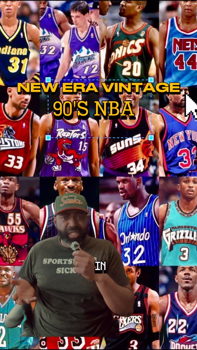 366.4K94.3×Explaining 90s NBA branding strategy@gamedaygrails · Breakdown
 172.9K43.8×Critiquing running brand marketing aesthetics@lukas.mullen · Case Study Breakdown
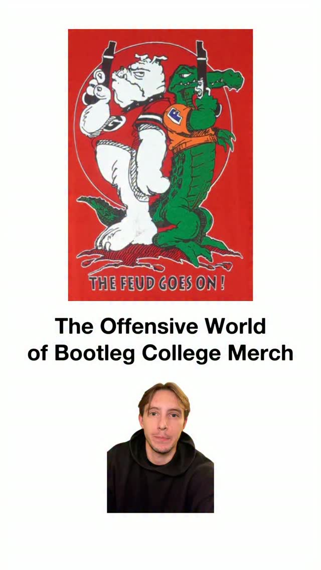 640.7K181.1×Comparing old vs new merch@lukas.mullen · Nostalgia Highlight
 1.9MCommentary on vintage football photos@allegiategym · Nostalgia Highlight
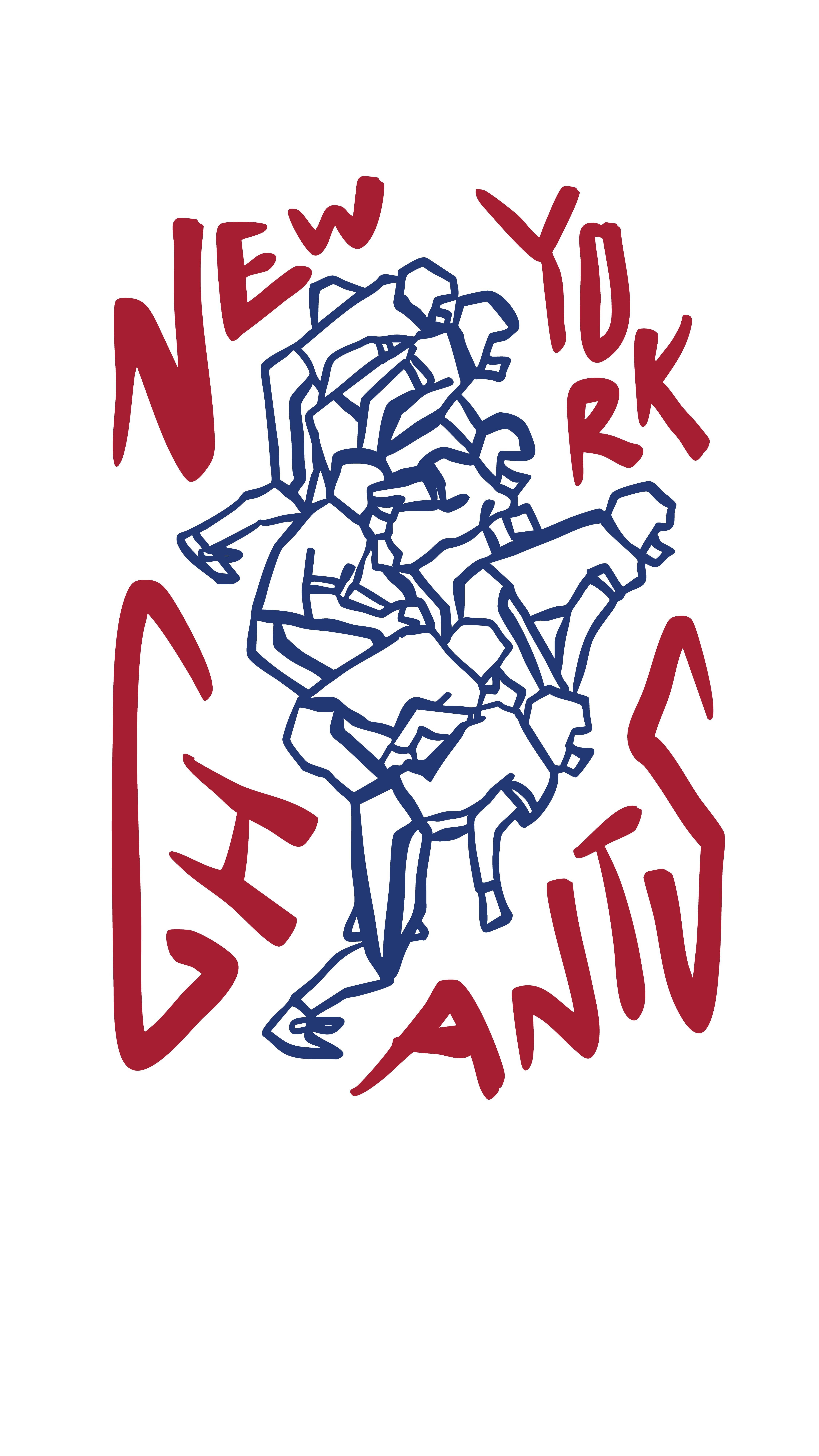 345KCreator designs hypothetical NFL merch@kweinbydesign · Hypothetical Case Study
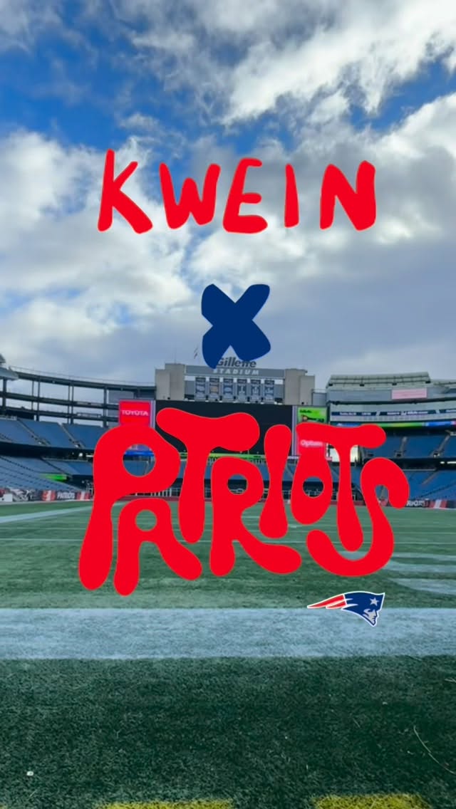 466.5K1.2×Creator documents journey to dream job@kweinbydesign · Journey Documentation
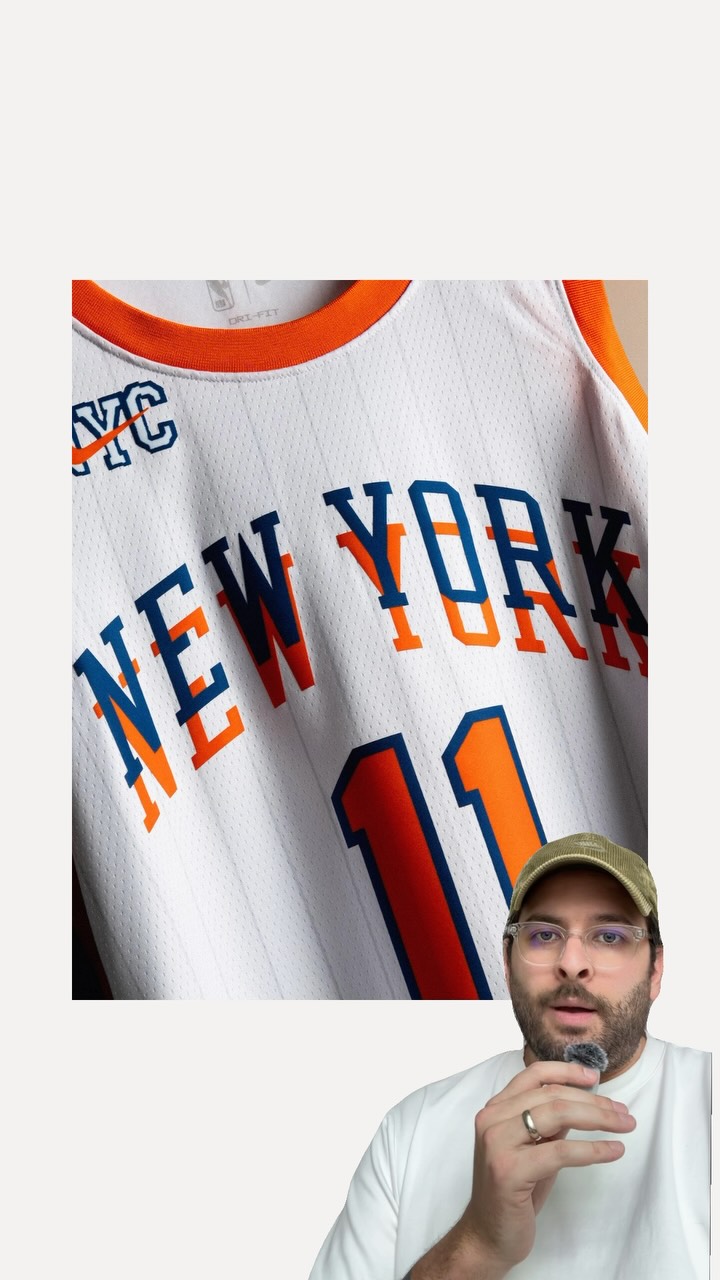 158KAnalyzing sports creative director trend@janfeterman · Case Study Breakdown
 2.1M2.6×Designing NFL merch to get hired@kweinbydesign · Journey Documentation
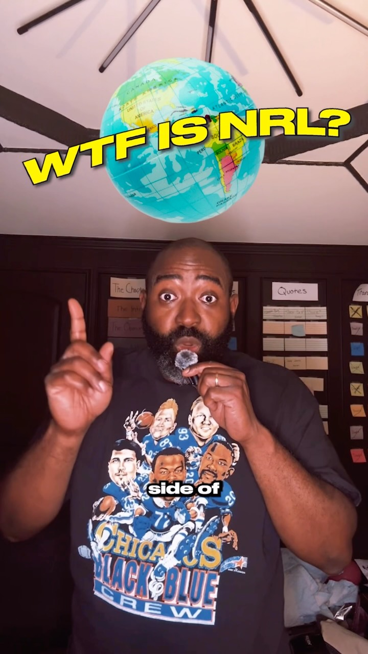 149.3K41.4×Explaining foreign league jersey culture@gamedaygrails · Opportunity Explainer
 103.4K26.2×Analyzing a soccer club's rebrand@lukas.mullen · Case Study Breakdown
 534.2K1.3×Design process and final product reveal@kweinbydesign · Origin Story
 86.7K1.1×Explaining an athlete branding case study@sportsmarketing_ · Case Study Breakdown
[04]
[05]
What stops the scroll in the first 3 seconds
Title hook · 25%
The Golden Age of NFL Graphic Design
Verbal hook · 60%
NFL graphic design used to look like museum level art, but today it looks like ads for a corporate tech conference.
Visual hook · 15%
A visually striking, illustrated vintage magazine cover featuring a large red cardinal, contrasted with a small overlay of the speaker in the bottom corner.
[06]
Steal this for your own video
used to look like , but now it looks like .
[07]
The promise the opener makes, and how the video pays it back
Hook
A provocative 'Then vs. Now' comparison that frames the past as artistically superior and the present as soulless or corporate, immediately establishing a strong thesis.
Payoff
A nuanced call to action that doesn't demand a full return to the past but advocates for reintroducing the lost quality into the modern context, leaving the viewer with a thoughtful resolution.
[08]
The structural pattern this video runs on
Framework
The Golden Age Lament
Argue that a creative or qualitative peak was reached in the past due to a specific set of circumstances, and that modern efficiency or standardization has led to a decline, culminating in a plea for a return to former principles.
The Original State
Establishes the initial, often chaotic or decentralized, conditions before the 'golden age' and introduces the problem that necessitated a change (e.g., the need for standardization).
The Architect of an Era
Introduces the key figure, event, or innovation that served as the catalyst for change, ushering in a period of high quality.
The Apex Showcase
Provides a rapid montage of compelling visual or auditory evidence from the peak era to prove the initial thesis and celebrate the 'golden age'.
The Modern Decline
Contrasts the peak era with the current, less-inspired state, attributing the decline to over-standardization or the loss of the original vision.
Shoutout Dave Boss
title · beginning
The Golden Age of NFL Graphic Design
NFL graphic design used to look like museum level art, but today it looks like ads for a corporate tech conference. Back in the sixties, all NFL creative was split individually among the tier, which is cool, but when you're trying to build an international media empire, it helps to have things standardized. So in came Dave Boss, legendary NFL creative director. He gave us the Pro Gameday magazine, which is instantly recognizable from these painted collages on the cover, which were all commissioned by by well known artists at the time. Over the years, NFL graphics have been slowly infested by soulless brand guidelines. I'm not saying we need to bring this back, but it would be cool to bring a little creativity when we're promoting the biggest league in the world.