Viral Hooks
Trending short videosFootball player jersey font mistake analysis.
C

@classicfootballshirts

Instagram · Carousel
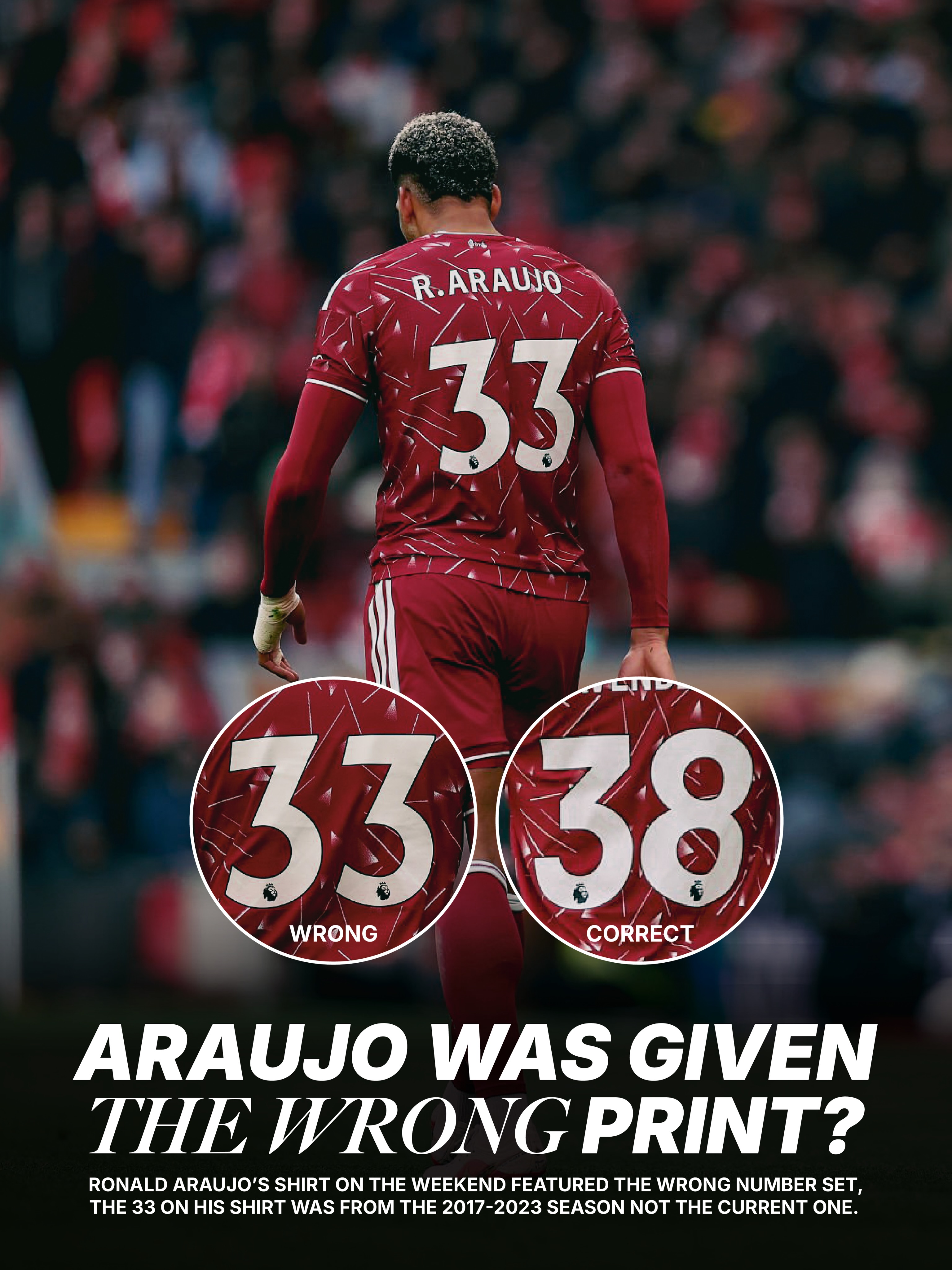
@classicfootballshirts 𝑾𝑹𝑶𝑵𝑮 𝑭𝑶𝑵𝑻 𝑭𝑶𝑹 𝑨𝑹𝑨𝑼𝑱𝑶? 🤔 Ronald Araujo’s shirt on the weekend featured the numbers from the 2017-2023 font, not the current one. Why? We’re not entirely sure. But we love any shirt irregularities like this. That shirt is now a collectors item 👀 Great spot by @whatthekit.official

View original on Instagram

The edit1 shot · 17 text
Shots Text

Performance

Views
886.7K
Likes
59.1K
Comments
127
Engagement
6.7%
Outlier
29.6×

Video #47941 · Carousel

Football player jersey font mistake analysis.from @classicfootballshirts

[01]

Overview

This is a multi-slide carousel post that investigates and explains a printing error on football player Ronald Araujo's jersey. It uses a series of photos and graphics to compare the incorrect font used on his shirt with the correct current season's font, providing historical context and detailed design comparisons.

[02]

Simple outline

  1. 1Hook with a visual anomaly
  2. 2Isolate and compare the discrepancy
  3. 3Provide historical context for the error
  4. 4Deliver an expert-level breakdown

[03]

Related videos

[04]

Classification

Format
Concepts
BreakdownEditorial CarouselStrange but True
Elements
Text OverlayGraphic OverlaySide-by-Side Visual AidTemplated Graphic Layout

[05]

Hook analysis

What stops the scroll in the first 3 seconds

Title hook · 50%

ARAUJO WAS GIVEN THE WRONG PRINT?

Verbal hook · 30%

𝑾𝑹𝑶𝑵𝑮 𝑭𝑶𝑵𝑻 𝑭𝑶𝑹 𝑨𝑹𝑨𝑼𝑱𝑶? 🤔

Visual hook · 20%

A central image of a football player's back with two large, contrasting circular callouts labeled 'WRONG' and 'CORRECT', creating immediate visual conflict and curiosity about the error.

[06]

Hook template

Steal this for your own video

[SUBJECT] WAS GIVEN THE WRONG [ITEM]?

  • — THE NEW iPHONE WAS GIVEN THE WRONG LOGO?
  • — THIS BRIDE WAS GIVEN THE WRONG DRESS?
  • — OUR TEAM WAS GIVEN THE WRONG BRIEF?

[07]

Hook and payoff

The promise the opener makes, and how the video pays it back

Hook

The Anomaly Hook (Slide 1): Immediately presents a mystery by highlighting a visual discrepancy with a provocative question. It uses direct visual aids (circles, labels like 'WRONG'/'CORRECT') to make the problem instantly understandable and intriguing, compelling the user to swipe for the explanation.

Payoff

The Definitive Reference (Slide 7): The narrative concludes with a comprehensive, high-value asset that serves as the ultimate proof. This is typically a chart, a full set comparison, or a complete guide that summarizes the core findings in a visually clean, easily shareable format, leaving the audience with a tangible piece of knowledge.

[08]

Narrative framework

The structural pattern this video runs on

Framework

The Forensic File

This framework identifies a subtle, overlooked error or anomaly within a niche topic. It then guides the audience through a step-by-step investigation, presenting evidence, providing context, and culminating in an expert-level breakdown that establishes authority and provides high-value, shareable information.

  1. 1

    The Problem Isolation (Slide 2)

    This beat dedicates a full slide to magnifying the 'wrong' element. It provides a concise, text-based explanation of *why* it's incorrect, solidifying the initial claim from the hook.

  2. 2

    The Control Comparison (Slide 3)

    This beat introduces a 'correct' example as a control group. By showing the proper version, it creates a direct A/B comparison that clarifies the error and validates the creator's observation.

  3. 3

    The Historical Precedent (Slides 4-5)

    This beat adds depth and credibility by providing historical context. It shows past examples of the 'incorrect' element being used in its proper context, proving it's not a random mistake but a misplaced artifact. This rewards the viewer with insider knowledge.

  4. 4

    The Technical Deep-Dive (Slide 6)

    This beat transitions from simple observation to expert analysis. It uses an infographic or diagram to break down the technical specifications and design rationale behind the correct and incorrect versions, elevating the content from a simple observation to an educational explanation.

Themes

  • attention to detail
  • sports memorabilia
  • design analysis
  • brand consistency

Techniques

  • text overlay
  • graphic callouts
  • comparative analysis
  • archival imagery

Trends

  • niche analysis
  • deep-dive content
  • fact-checking

Post caption

𝑾𝑹𝑶𝑵𝑮 𝑭𝑶𝑵𝑻 𝑭𝑶𝑹 𝑨𝑹𝑨𝑼𝑱𝑶? 🤔 Ronald Araujo’s shirt on the weekend featured the numbers from the 2017-2023 font, not the current one. Why? We’re not entirely sure. But we love any shirt irregularities like this. That shirt is now a collectors item 👀 Great spot by @whatthekit.official
Text overlays

  • title · photo_0

    ARAUJO WAS GIVEN THE WRONG PRINT?

  • informational · photo_0

    33 WRONG

  • informational · photo_0

    38 CORRECT

  • contextual · photo_0

    RONALD ARAUJO'S SHIRT ON THE WEEKEND FEATURED THE WRONG NUMBER SET, THE 33 ON HIS SHIRT WAS FROM THE 2017-2023 SEASON NOT THE CURRENT ONE.

  • title · photo_1

    WRONG NUMBER.

  • informational · photo_1

    THE 33 USED FOR ARAUJO'S SHIRT WERE FROM THE PREVIOUS FONT USED IN THE PREMIER LEAGUE, THE NUMBERS ARE MUCH SHARPER AND POINTIER THAN THE CURRENT DESIGN.

  • title · photo_2

    CORRECT NUMBER.

  • informational · photo_2

    AS YOU CAN SEE HERE ON RYAN GRAVENBERCH'S SHIRT, WHICH FEATURED THE CORRECT NUMBER 3, THE DESIGN HAS MORE STRAIGHT EDGES.

  • informational · photo_3

    THE INCORRECT FONT STYLE WAS ACTUALLY USED IN 2017 UNTIL 2023 AS SEEN HERE ON JOEL MATIP AND XHERDAN SHAQIRI'S KITS DURING THE 2018/19 SEASON.

  • informational · photo_4

    ANOTHER EXAMPLE IN THE 2020/21 SEASON WHERE YOU SEE THE MUCH SHARPER AND POINTIER FONT USED.

  • title · photo_5

    HERE IS HOW THE TWO FONTS COMPARE IN STYLE.

  • informational · photo_5

    Increase in number height from 230mm to 250mm

  • informational · photo_5

    Larger lion logo increases brand awareness

  • informational · photo_5

    Bigger negative spaces aid readability from distance

  • informational · photo_5

    Font is bolder and more impactful

  • contextual · photo_6

    2017-2023

  • contextual · photo_6

    2023-

Football player jersey font mistake analysis. | Viral Hooks