Viral Hooks
Trending short videosExplaining three graphic design tricks
F

@fakeplasticbrands

Instagram · Speaker address

@fakeplasticbrands Honestly, I have no background in graphic design, most of my process comes from making endless mood boards on Pinterest whilst streaming anything David Attenborough narrates in the background.

View original on Instagram

The edit1 shot · 4 text
Shots Text

Performance

Views
829.3K
Likes
58K
Comments
131
Engagement
7%
Outlier
11.9×

Video #17417 · Speaker address

Explaining three graphic design tricksfrom @fakeplasticbrands

[01]

Overview

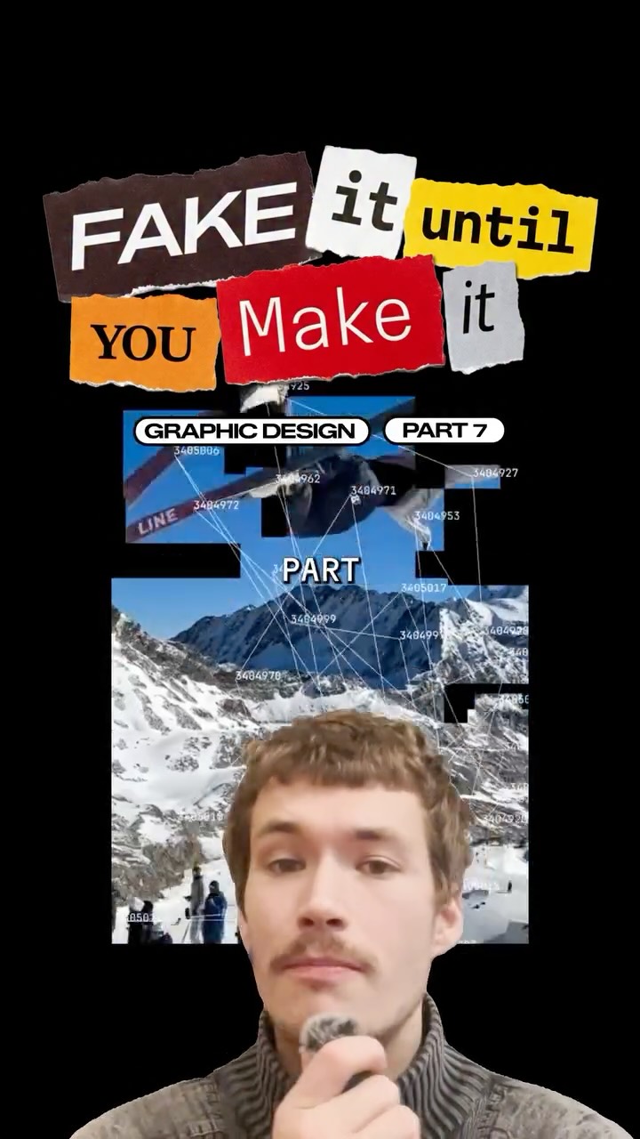
The creator presents a tutorial on graphic design, framed as 'Fake it til you make it.' He shares three specific tips to enhance designs: first, adding micro-graphics like packaging info for depth; second, mixing thin serif and bold sans-serif fonts to fill layouts; and third, tearing and spreading photos across the canvas to create dynamic compositions, illustrating each with visual examples.

[02]

Simple outline

  1. 1State the 'shortcut' premise
  2. 2Give first actionable tip
  3. 3Give second actionable tip
  4. 4Give final actionable tip

[03]

Related videos

[04]

Classification

Concepts
Tutorial / How ToRapid Fire Listicle
Elements
Series Title CardJump Cut

[05]

Hook analysis

What stops the scroll in the first 3 seconds

Title hook · 50%

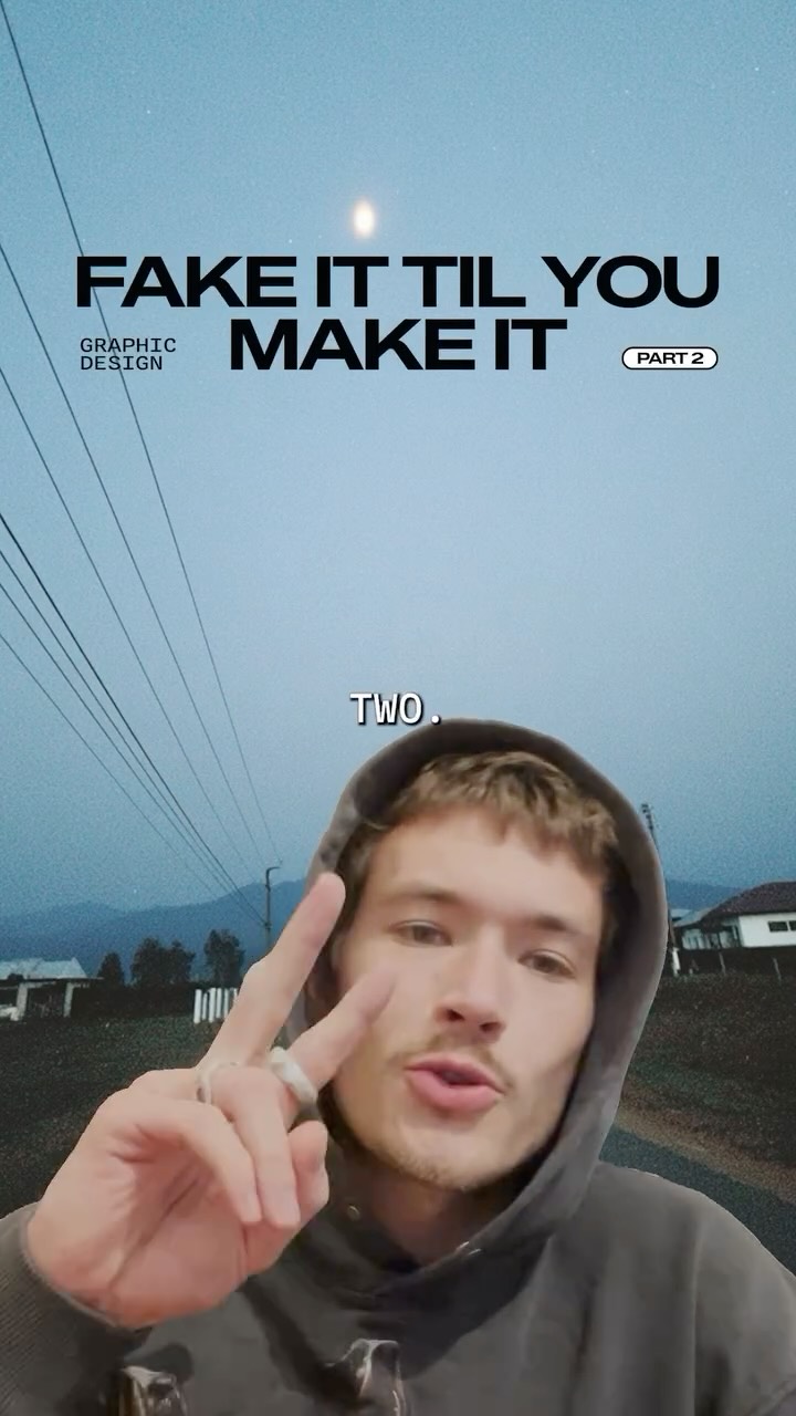
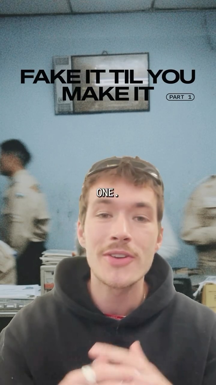
FAKE IT TIL YOU MAKE IT

Verbal hook · 35%

Fake it till you make it, episode one, graphic design.

Visual hook · 15%

A direct-to-camera shot of the speaker with a dynamic, motion-blurred background of an office-like setting, immediately overlaid with a bold title graphic.

[06]

Hook template

Steal this for your own video

FAKE IT TIL YOU MAKE IT: [skill or field]

  • — FAKE IT TIL YOU MAKE IT: PHOTOGRAPHY
  • — FAKE IT TIL YOU MAKE IT: INTERIOR DESIGN
  • — FAKE IT TIL YOU MAKE IT: PUBLIC SPEAKING

[07]

Hook and payoff

The promise the opener makes, and how the video pays it back

Hook

A thematic title card and verbal announcement that establishes the series, the topic, and the core premise of achieving expertise through simple shortcuts.

Payoff

The payoff is the cumulative acquisition of knowledge. The final tip concludes the list, leaving the viewer equipped with a set of immediately applicable skills.

[08]

Narrative framework

The structural pattern this video runs on

Framework

The Expert Shortcut Framework

Presenting a series of simple, actionable "hacks" or techniques that allow a beginner to quickly achieve a professional-looking result in a specific field, framed under a relatable "fake it 'til you make it" premise.

  1. 1

    The Detail Illusion

    Presents the first technique, focusing on adding small, complex-looking details to create an immediate sense of depth and professionalism.

  2. 2

    The Contrast Principle

    Presents the second technique, focusing on combining two opposing styles (e.g., fonts, colors, textures) to easily create a dynamic and visually interesting result.

  3. 3

    The Deconstruction Method

    Presents the final technique, which involves breaking apart a single core element and rearranging its pieces to fill the space and create a complex, dynamic composition.

Themes

  • Design hacks
  • Creativity
  • Professionalism

Techniques

  • Listicle format
  • Visual examples

Trends

  • Short-form educational content

Post caption

Honestly, I have no background in graphic design, most of my process comes from making endless mood boards on Pinterest whilst streaming anything David Attenborough narrates in the background.

Text overlays

  • title · beginning

    FAKE IT

  • title · beginning

    FAKE IT TIL YOU MAKE IT

  • contextual · beginning

    PART 1

  • contextual · beginning

    GRAPHIC DESIGN

Transcript

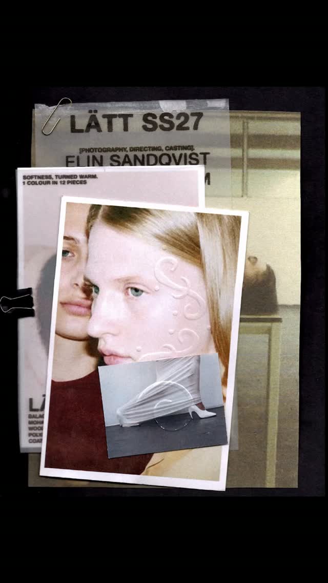
Fake it till you make it, episode one, graphic design. Add micro graphics to everything. Drop subtle brand hints, coordinates, old school packaging info. It instantly adds depth, texture, and the illusion of meaning to the canvas. Number two, mix random fonts. When designing with typography, this is the easiest way to fill a layout. My favorite combination is thin serif fonts with bold sans serif fonts. And finally, spread your photos around the frame. Once you have a photo for your layout, tear it into pieces and spread it across the canvas. This is a smart way to create a dynamic layout when you only have one photo to work with.

Explaining three graphic design tricks | Viral Hooks