@fakeplasticbrands
Instagram · Greenscreen Talking Head
@fakeplasticbrands Best way to level up your creative taste is by browsing Pinterest whilst watching old cinema. I call it taste maxing.

@fakeplasticbrands
Instagram · Greenscreen Talking Head
@fakeplasticbrands Best way to level up your creative taste is by browsing Pinterest whilst watching old cinema. I call it taste maxing.
Performance
Video #17404 · Greenscreen Talking Head
[01]
The creator presents a rapid-fire list of four unconventional graphic design tips, starting with using aggressive borders and complementary colors, moving to embracing empty space and tiny fonts, then advocating for non-premade typography using real objects, and finally encouraging the use of hand-drawn elements. Each tip is visually illustrated with a series of relevant design examples shown in the background.
[02]
[03]
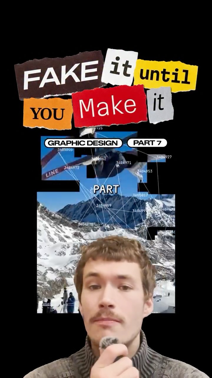 146.3K4.2×Rapid fire graphic design tips@fakeplasticbrands · Rapid Fire Listicle
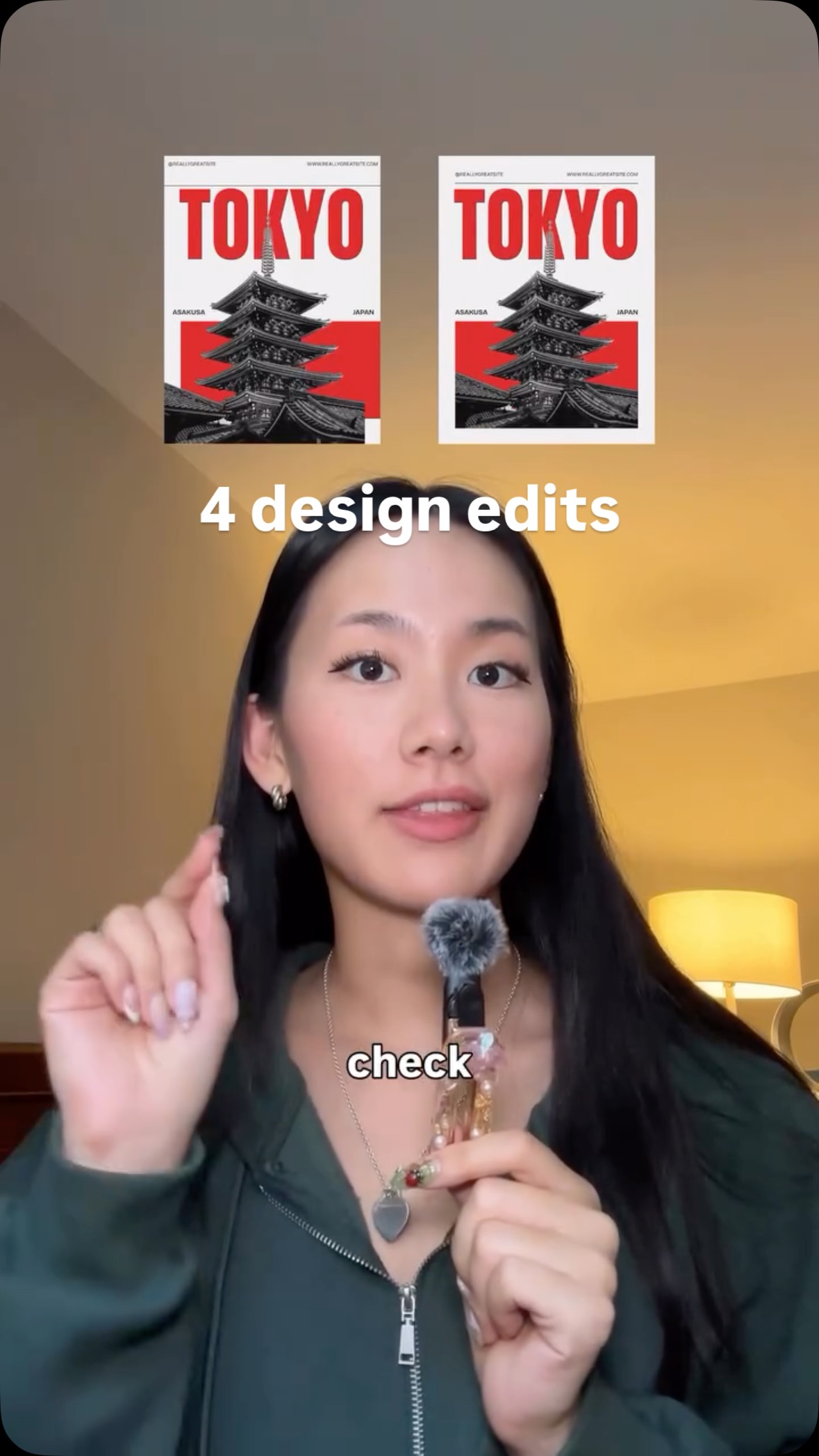 808.8K2.9×Rapid fire graphic design fixes@createwithalena · Rapid Fire Listicle
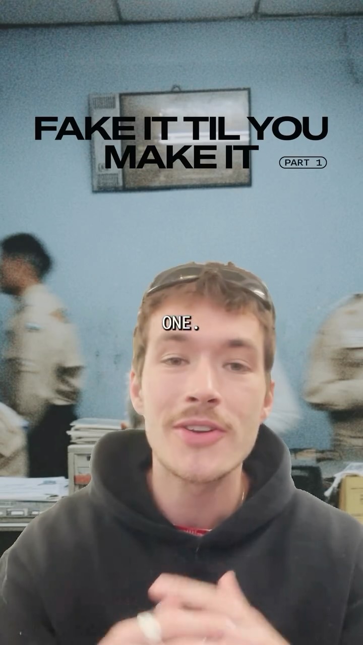 829.3K11.9×Explaining three graphic design tricks@fakeplasticbrands · Tutorial / How To
 3.9M6.7×Before and after design fixes@createwithalena · Rapid Fire Listicle
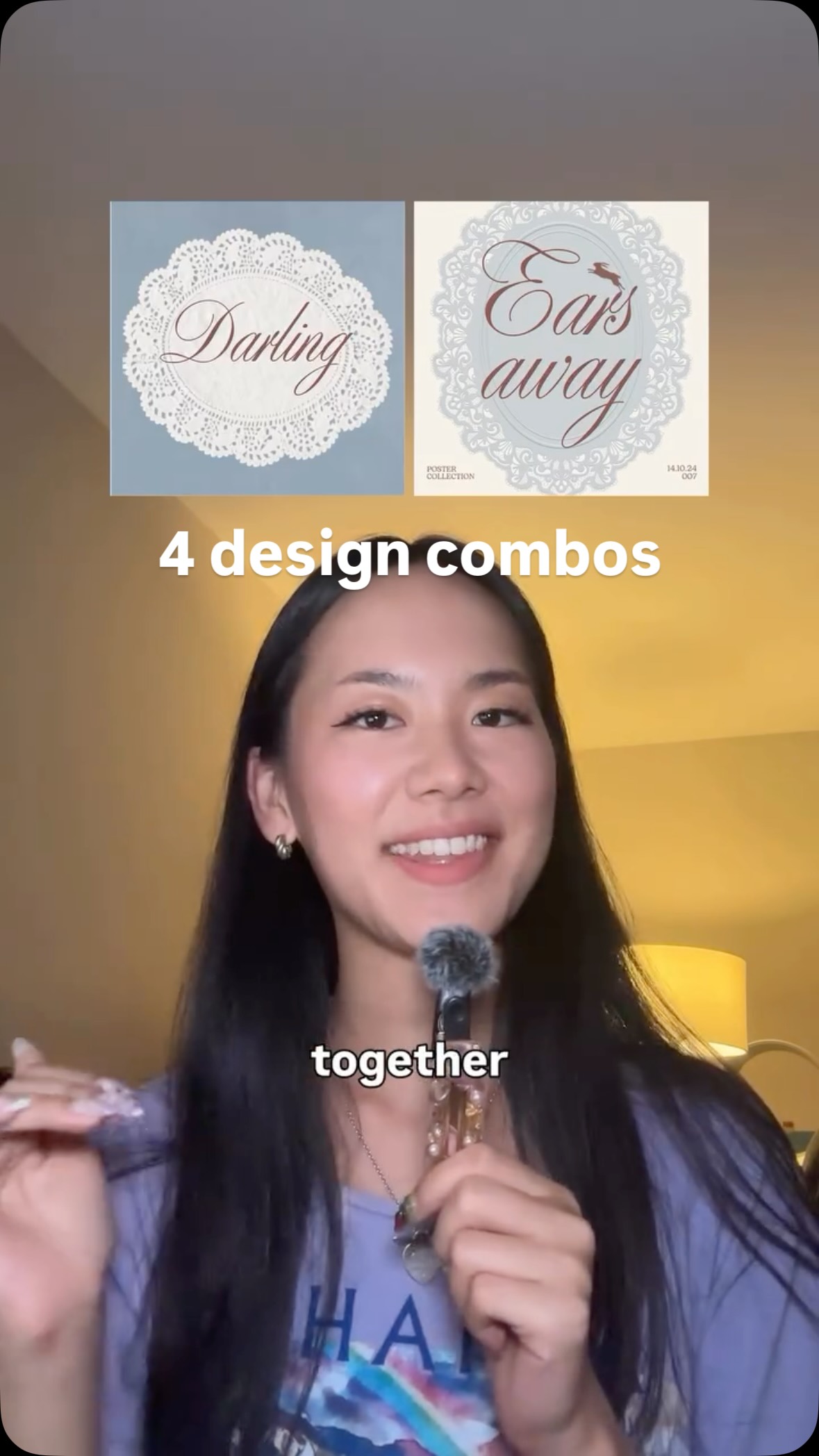 550.7K1.6×Showing design combination synergy@createwithalena · Rapid Fire Listicle
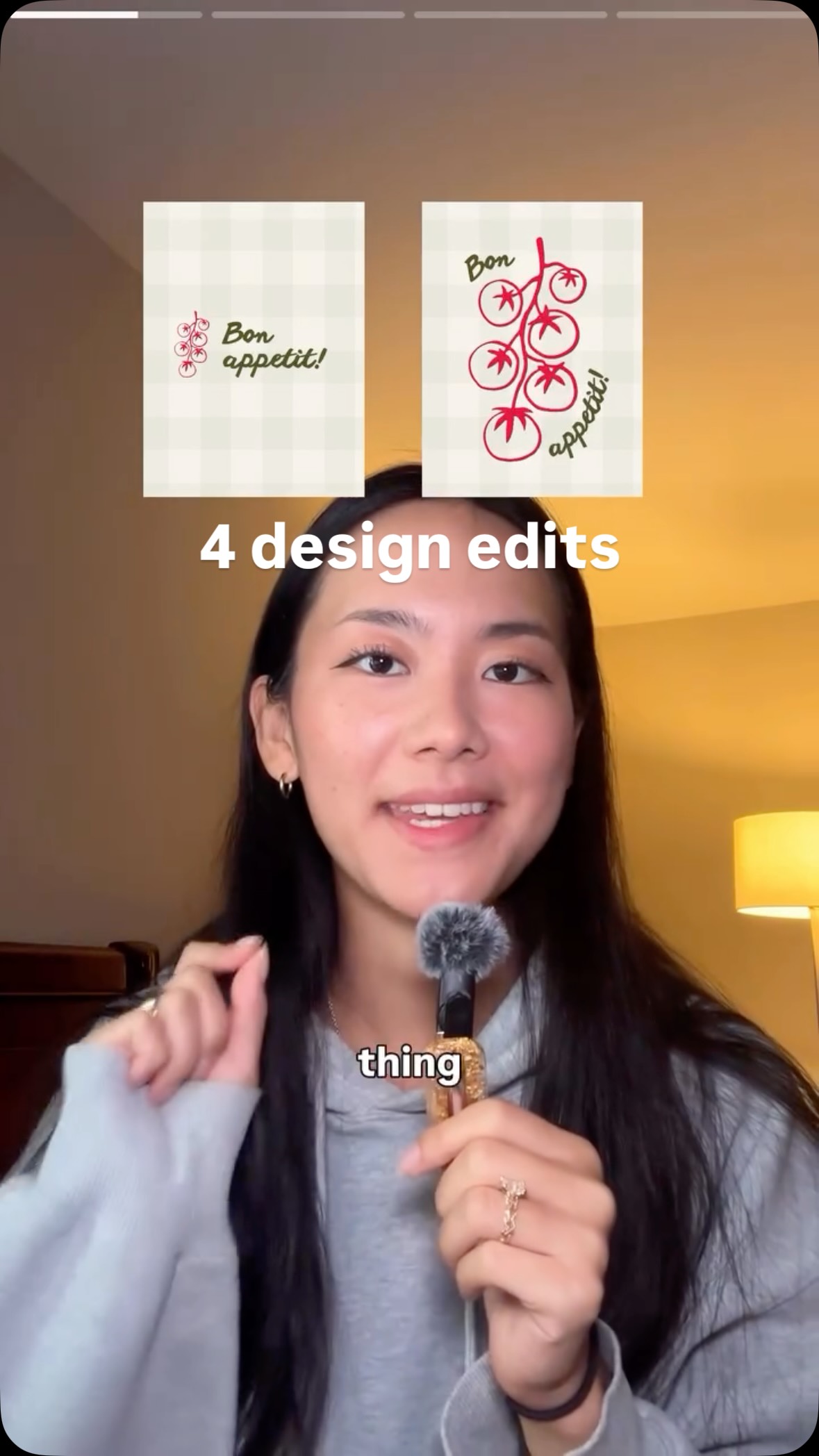 939.9K13.3×Before and after design tips@createwithalena · Before/After Transformation
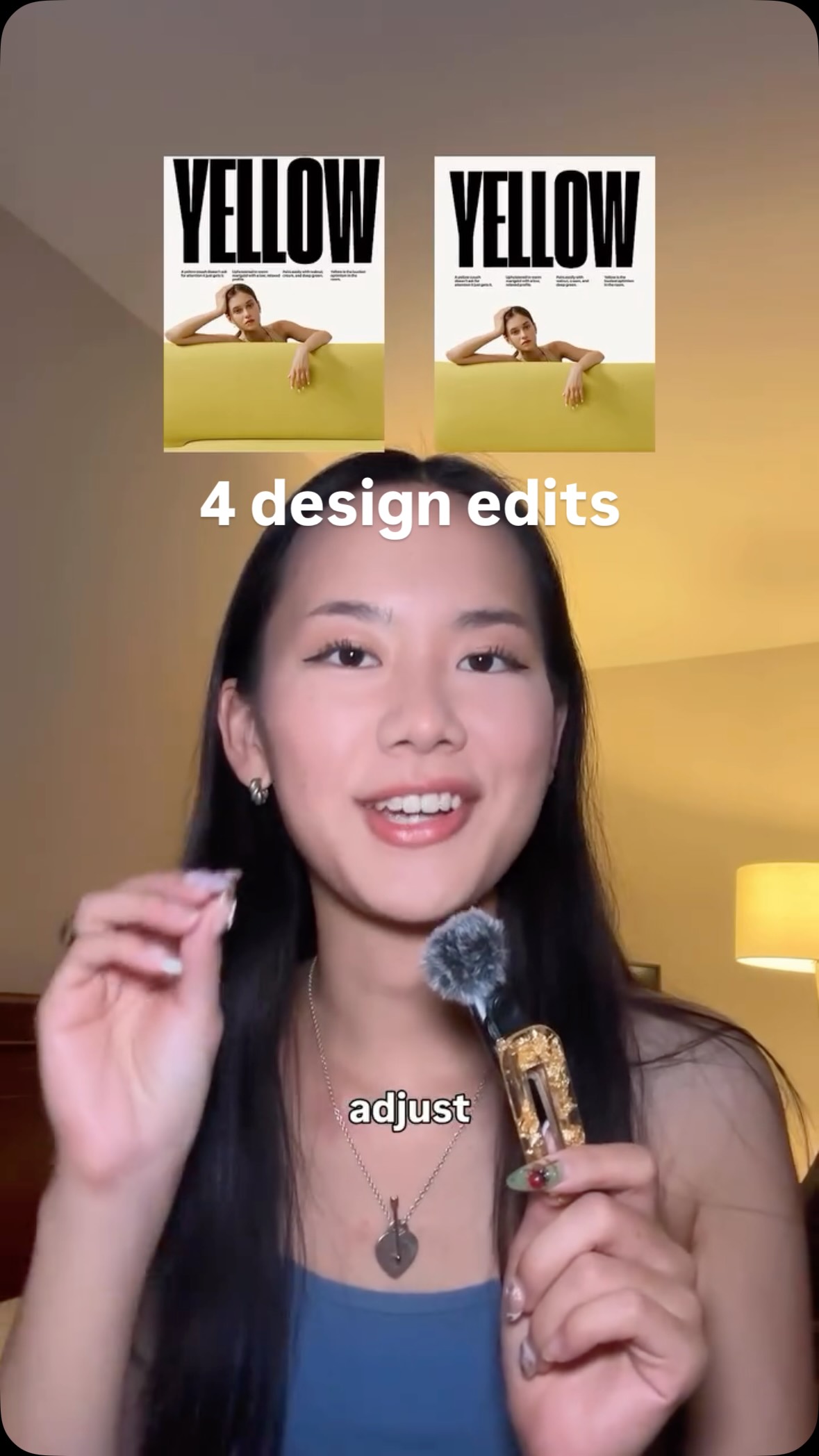 477.4KProblem, then quick design fix@createwithalena · Rapid Fire Listicle
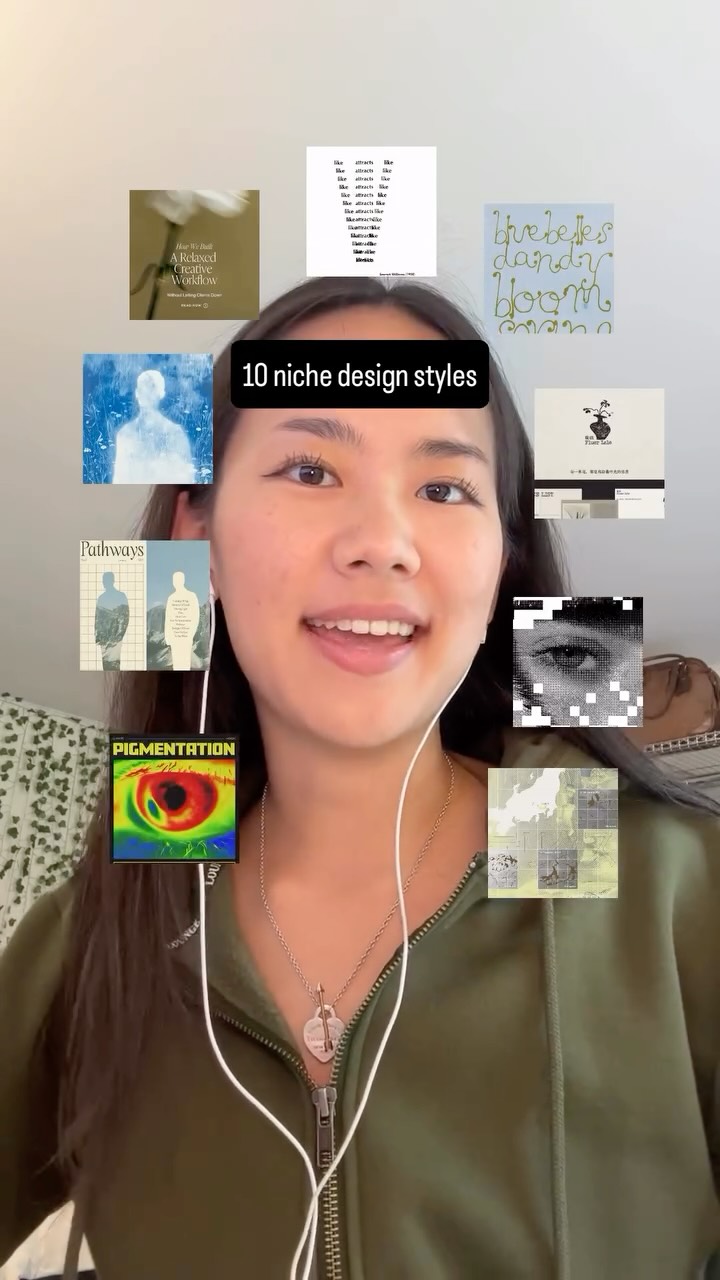 771.1K5.8×Rapid-fire list of design styles@createwithalena · Rapid Fire Listicle
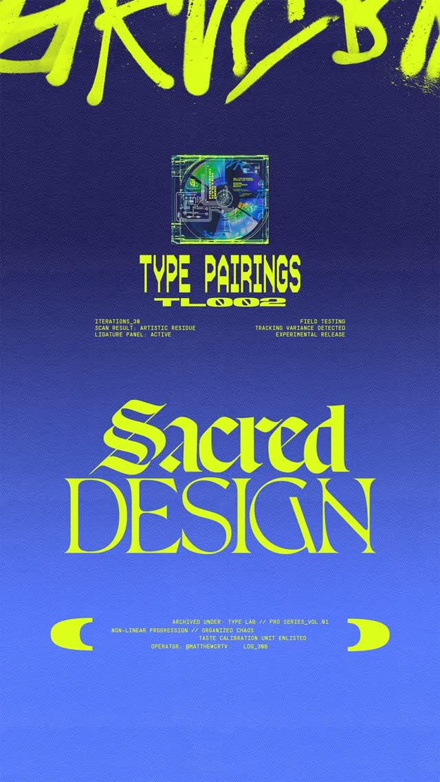 57.2KRapid fire font pairing showcase@matthewcrtv · Rapid Fire Listicle
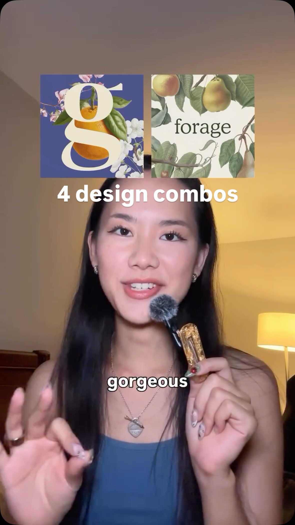 600.9K2×Showcasing powerful design combinations@createwithalena
 586.4K7.4×Showcasing synergistic design combinations@createwithalena · Rapid Fire Listicle
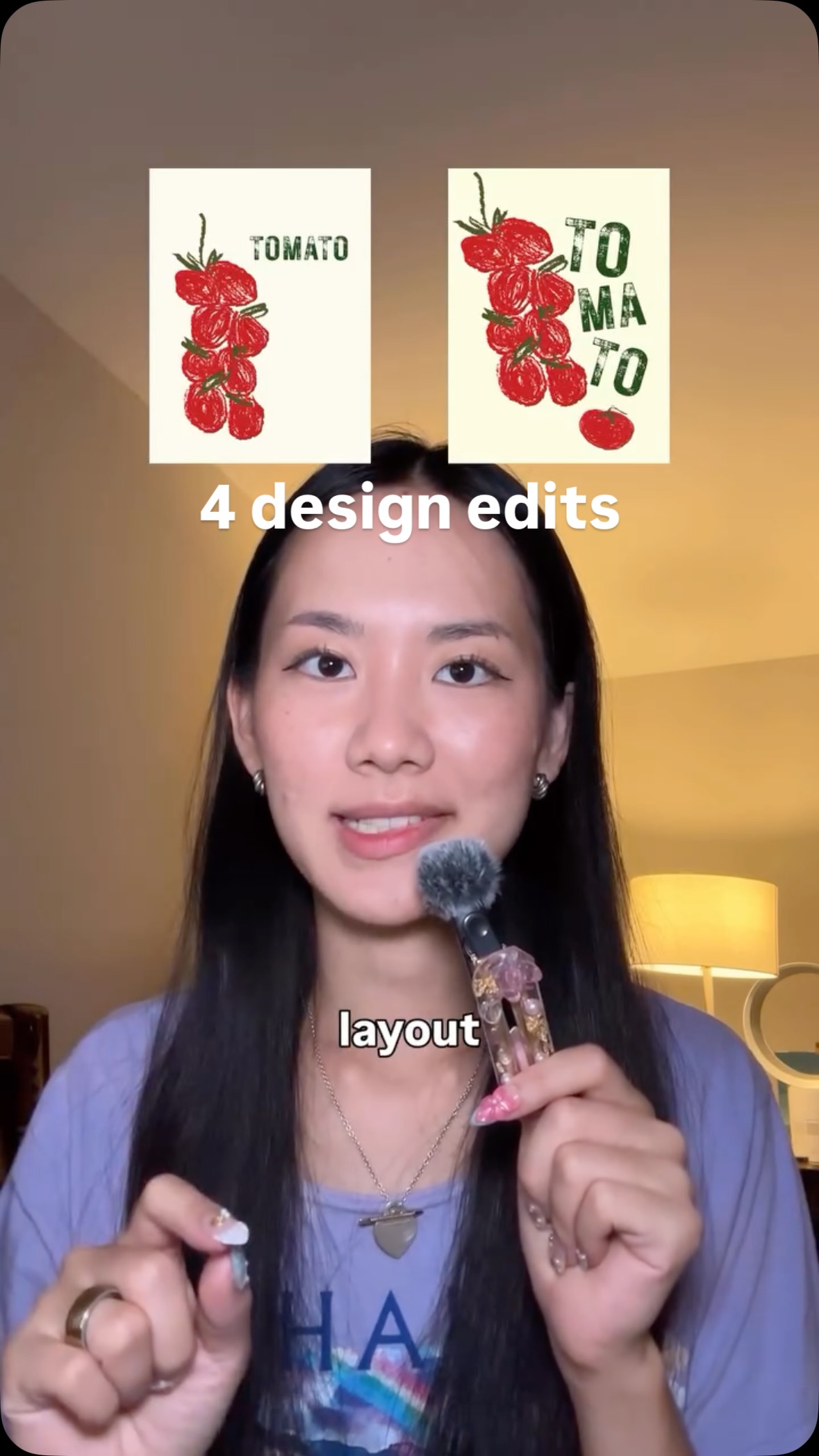 5.3M17.8×Before and after design fixes@createwithalena · Good vs Bad
[04]
[05]
What stops the scroll in the first 3 seconds
Title hook · 55%
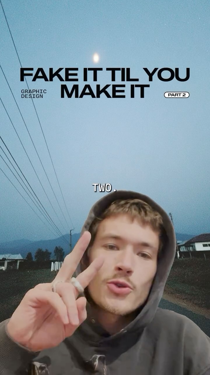
FAKE IT TIL YOU MAKE IT
Verbal hook · 25%
Fake it till you make it. Graphic design part two.
Visual hook · 20%
A speaker is overlaid on a moody, atmospheric image of a road at dusk with a bright light in the sky, creating an immediate aesthetic.
[06]
Steal this for your own video
FAKE IT TIL YOU MAKE IT: PART
[07]
The promise the opener makes, and how the video pays it back
Hook
A direct-to-camera title card and verbal announcement that establishes the video's topic and positions it as part of a series, creating immediate context.
Payoff
The final beat defines the spectrum of potential aesthetic outcomes that can be achieved by following these rules, giving the viewer a clear name and goal for the style they've learned.
[08]
The structural pattern this video runs on
Framework
The Counter-Intuitive Rulebook
A rapid-fire presentation of unconventional, numbered rules for achieving a specific aesthetic, where each rule is immediately validated by a montage of compelling visual examples.
The Framing Mandate
The first numbered rule is presented as an aggressive, direct command, setting a tone of confident authority and establishing the unconventional nature of the advice.
The Strategic Void Mandate
The second rule focuses on the unconventional use of negative space and micro-scale elements, challenging traditional principles of readability and balance.
The Anti-Template Mandate
The third rule advocates for rejecting pre-made assets in favor of unique, physical, or extreme creation methods, emphasizing originality over convenience.
The Imperfection Mandate
The fourth rule champions a raw, low-fidelity aesthetic, reframing traditionally negative qualities like 'ugly' or 'messy' as desirable and intentional stylistic choices.
Best way to level up your creative taste is by browsing Pinterest whilst watching old cinema. I call it taste maxing.
title · beginning
FAKE IT TIL YOU MAKE IT GRAPHIC DESIGN PART 2
contextual · beginning
TWO.
informational · beginning
USE
informational · beginning
BORDERS
informational · middle
AGGRESSIVELY
informational · middle
A COLOR COMPLEMENTARY
branding · middle
coolors
contextual · middle
TWO
informational · middle
DON'T
informational · middle
OF THE SPACE.
informational · middle
MAKE YOUR FONT
informational · middle
SO WHO SEES SQUINT.
informational · middle
LINES AND SHAPES
contextual · middle
THREE
informational · middle
USE BUT A
informational · middle
CREATING WITH OBJECTS
informational · middle
SUNBURNED YOUR
contextual · end
FOUR
informational · end
ELEMENTS,
informational · end
THE UGLIER
informational · end
DRAW OR DRAW A PENCIL.
informational · end
BALANCE WITH AND
informational · end
SOMETHING EUROTRASH OR QUIRKY.
Fake it till you make it. Graphic design part two. Use cutouts and borders aggressively to frame your subject. Choose a color complimentary to the image. I like to use this website too. Don't be afraid of empty space. Lots of it. Make your font tiny no anyone who sees it needs to squint. The goal here is to create abstract lines and shapes that pull your viewers in. Three, use anything but a premade font, whether that's creating typography with real objects or getting someone sunburned to write your message. Four, hand drawn elements. The uglier, the better. Draw with your mouse or better yet, draw with a pencil, take a picture, and overlay it to wherever you want it. Balance this with some clean best. And depending on what you've drawn, you end up with something euro rank or cute and quirky.