@createwithalena
Instagram · Speaker address
@createwithalena Which ones is the most helpful for you? [graphic design, design tips, graphic design tips, branding design]

@createwithalena
Instagram · Speaker address
@createwithalena Which ones is the most helpful for you? [graphic design, design tips, graphic design tips, branding design]
Performance
Video #41988 · Speaker address
[01]
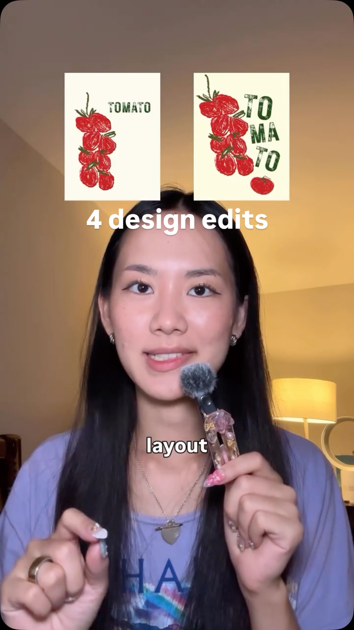
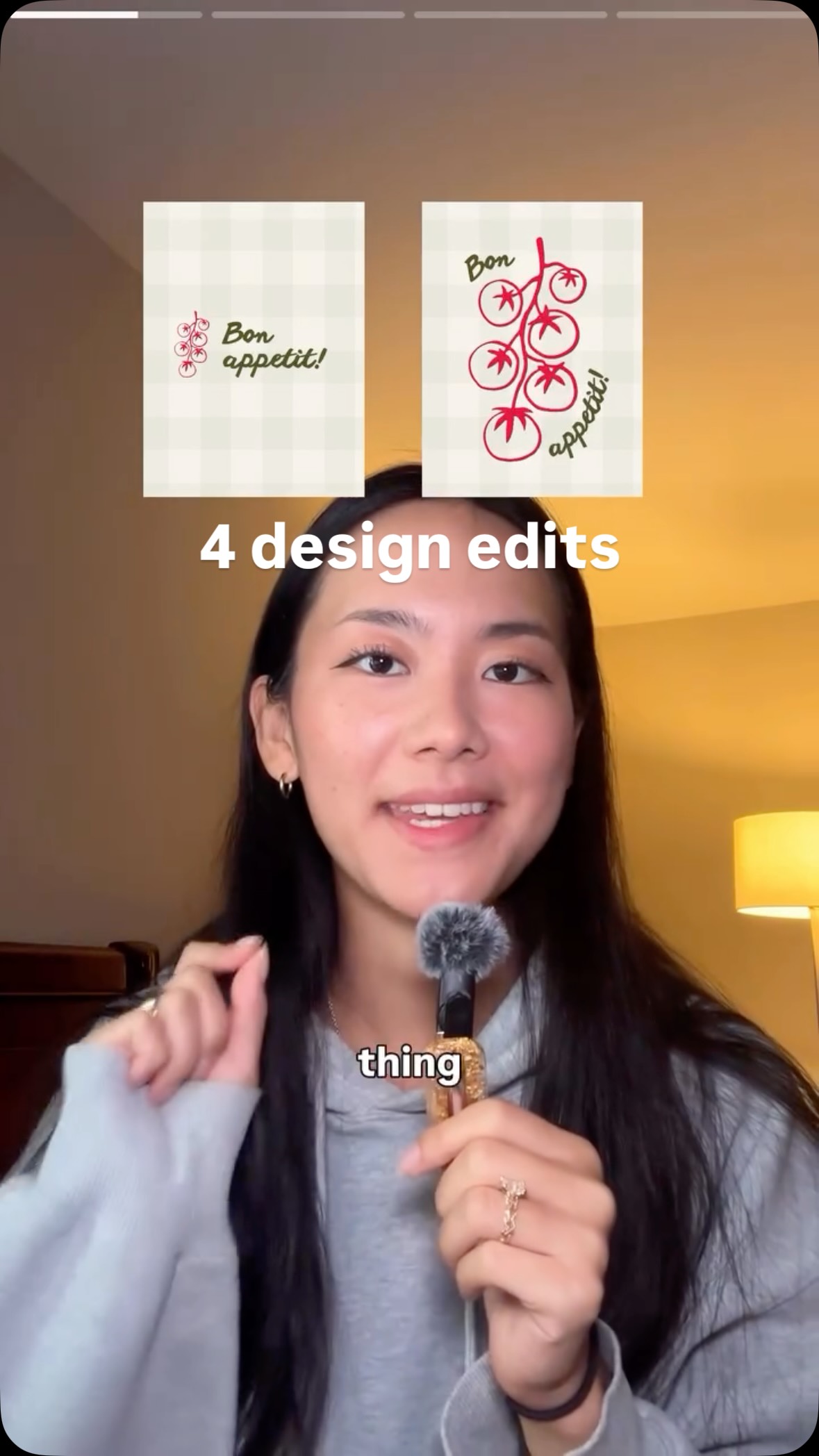
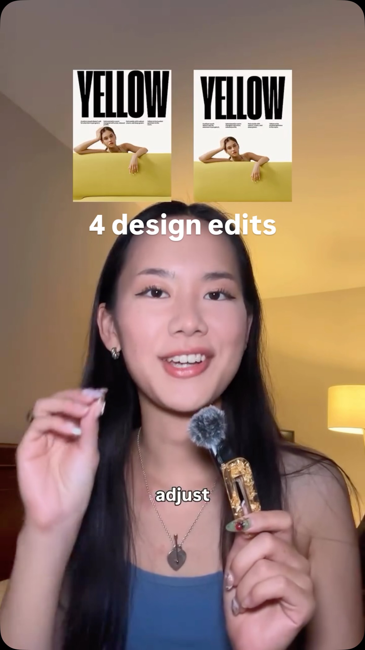
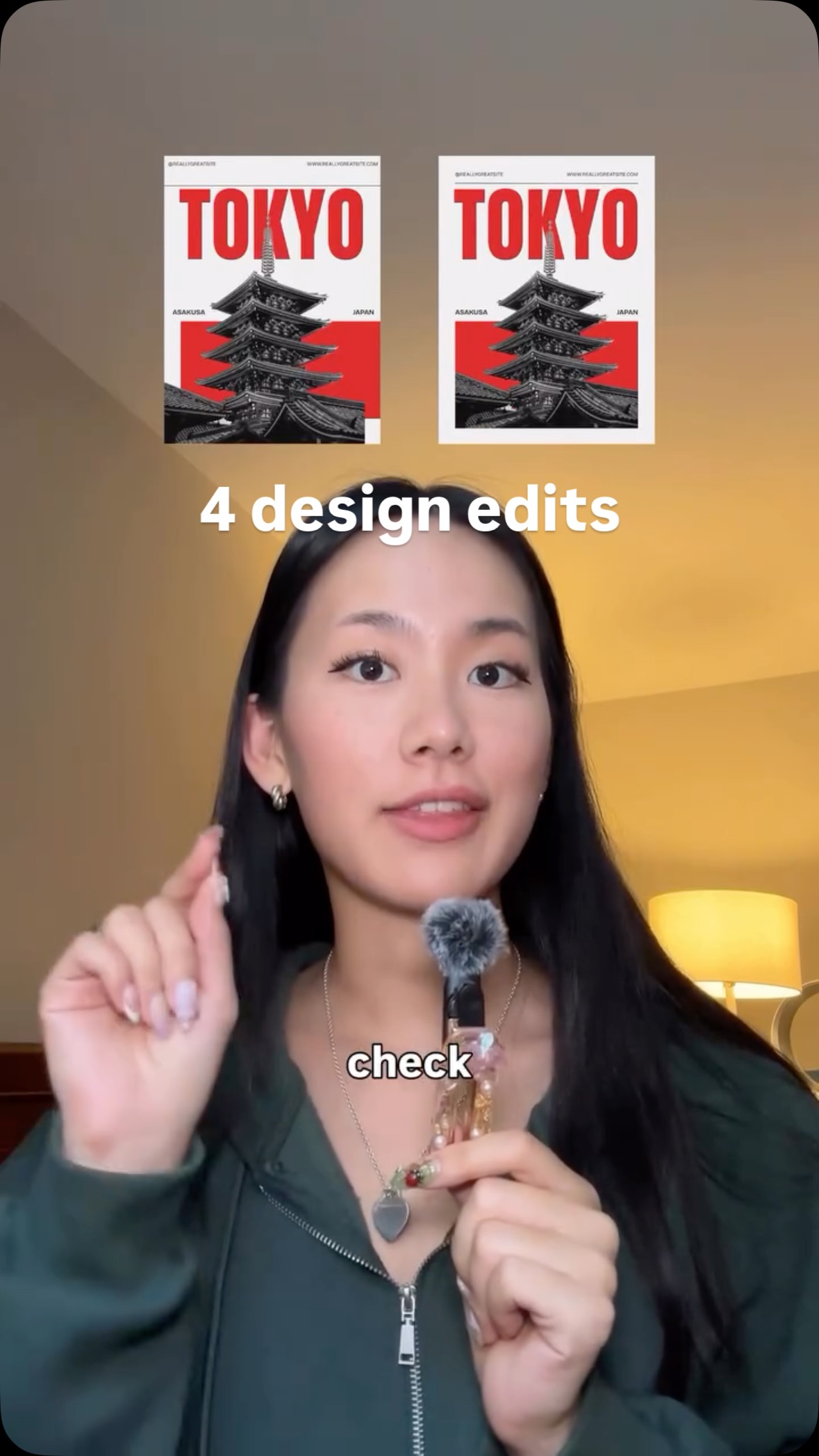
A creator, using a makeup brush as a prop microphone, presents four common graphic design problems and their solutions. For each problem—'boring,' 'doesn't stand out,' 'plain,' and 'no focal point'—she shows a 'before' image and then an improved 'after' version, explaining the fix, such as adjusting the layout, exaggerating scale, adding details, and using contrast.
[02]
[03]
 939.9K13.3×Before and after design tips@createwithalena · Before/After Transformation
 477.4KProblem, then quick design fix@createwithalena · Rapid Fire Listicle
 3.9M6.7×Before and after design fixes@createwithalena · Rapid Fire Listicle
 808.8K2.9×Rapid fire graphic design fixes@createwithalena · Rapid Fire Listicle
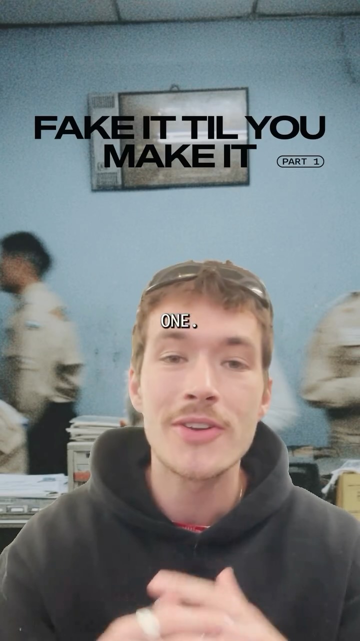 829.3K11.9×Explaining three graphic design tricks@fakeplasticbrands · Tutorial / How To
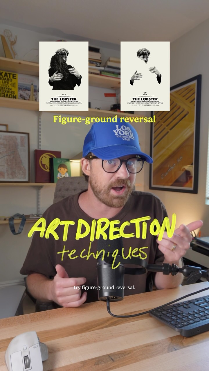 112.6K18.3×Explaining three art direction techniques@jason_swet · Rapid Fire Listicle
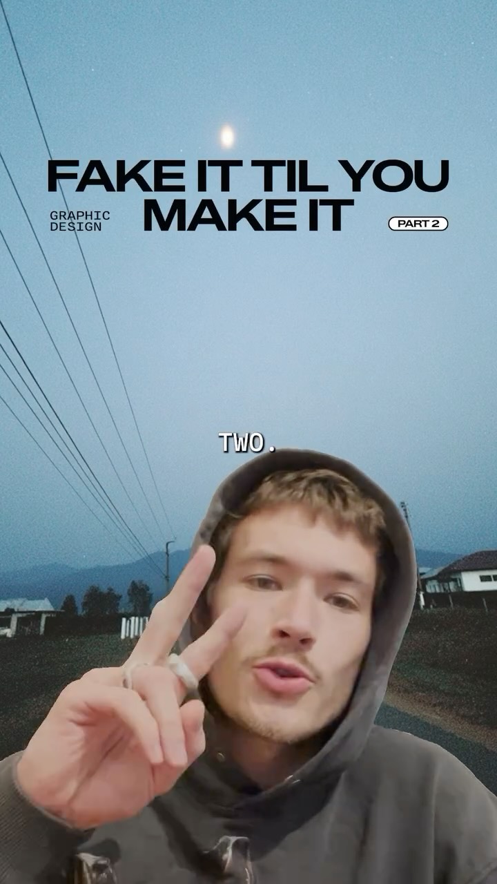 1.3M18.4×Rapid fire graphic design tips@fakeplasticbrands · Rapid Fire Listicle
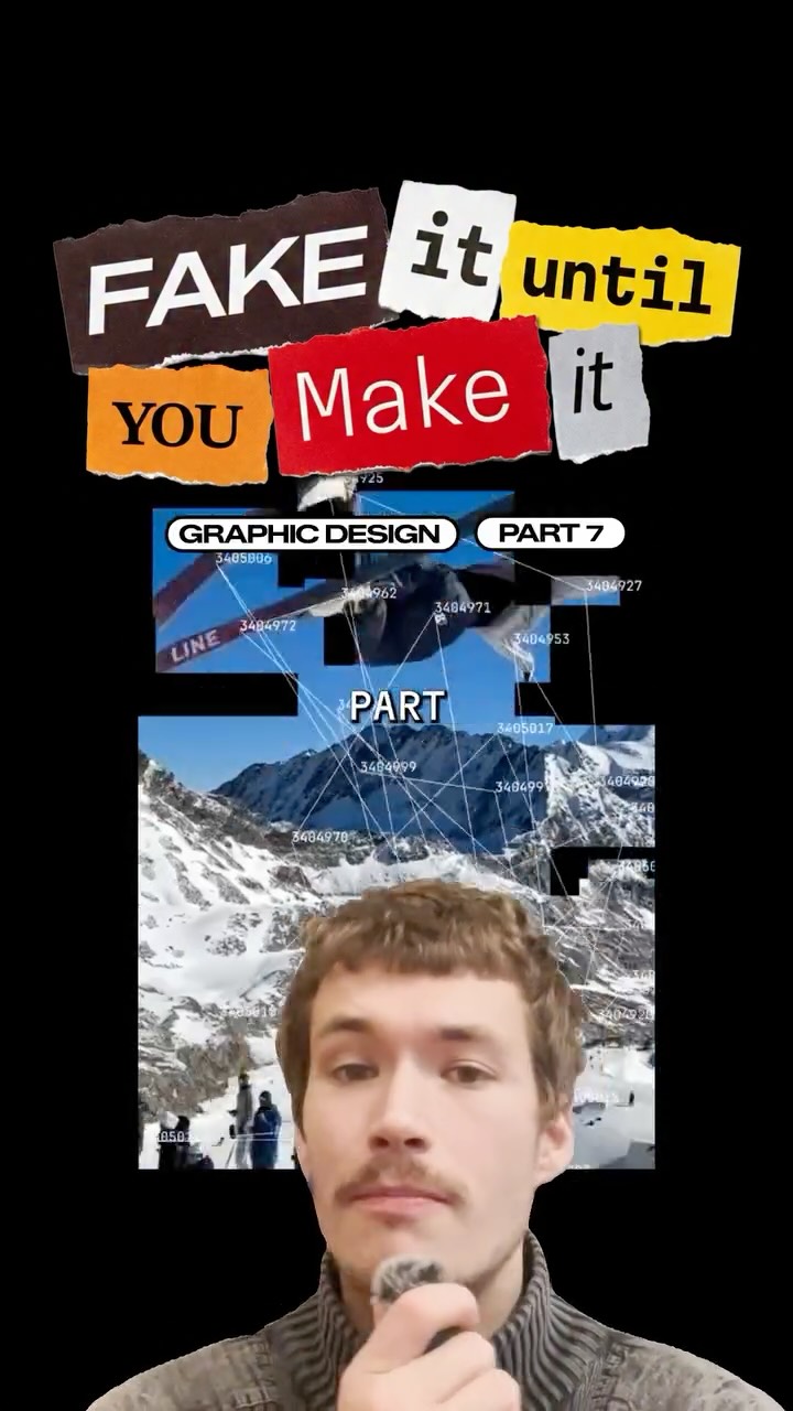 146.3K4.2×Rapid fire graphic design tips@fakeplasticbrands · Rapid Fire Listicle
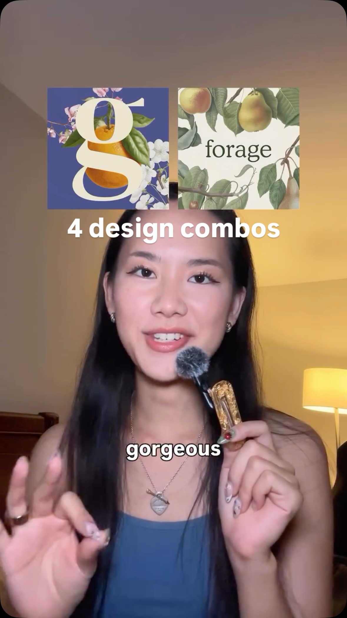 600.9K2×Showcasing powerful design combinations@createwithalena
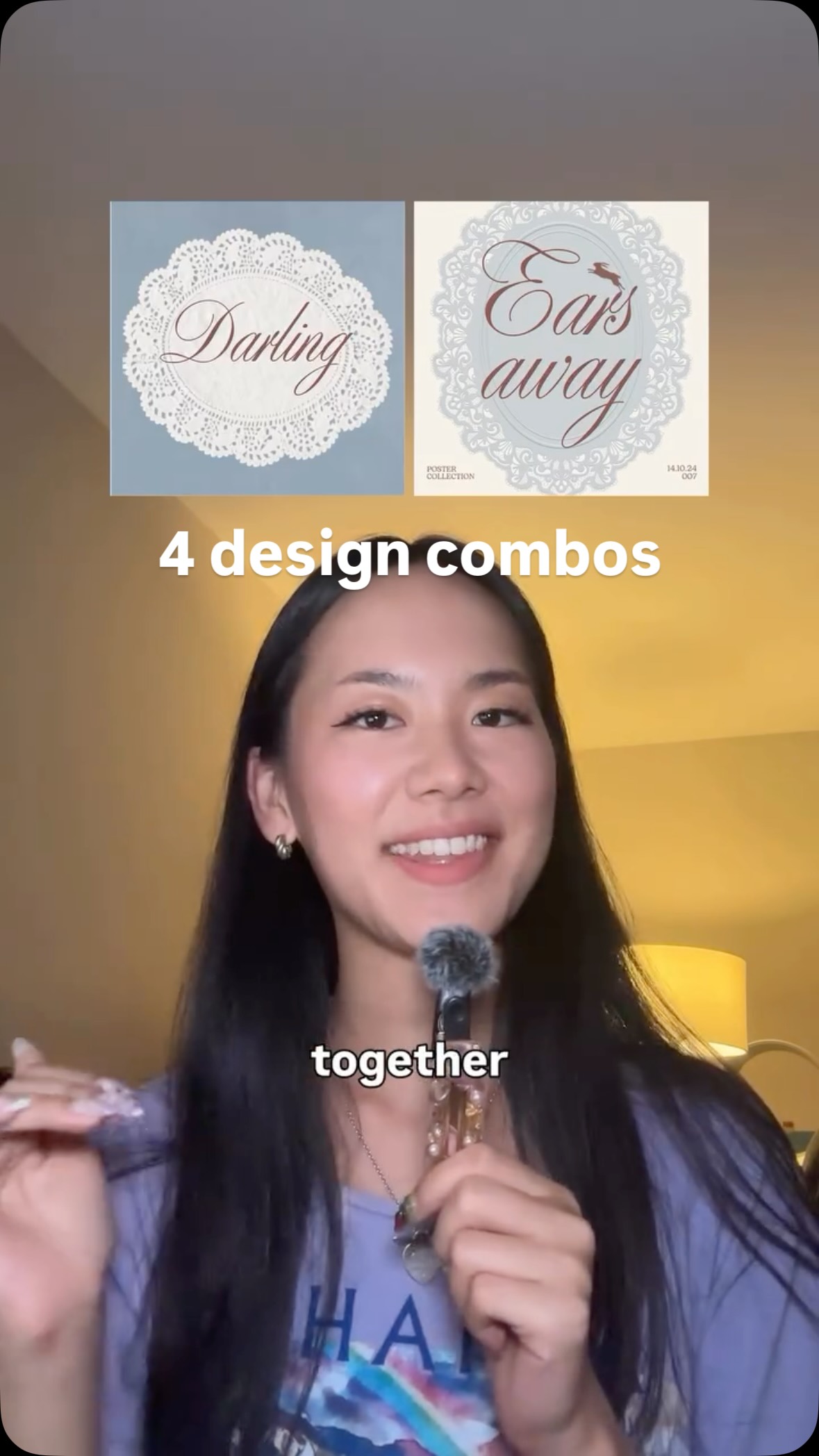 550.7K1.6×Showing design combination synergy@createwithalena · Rapid Fire Listicle
 274.1K1.1×Fixing common website design mistakes@pixeldesignlab · Before/After Transformation
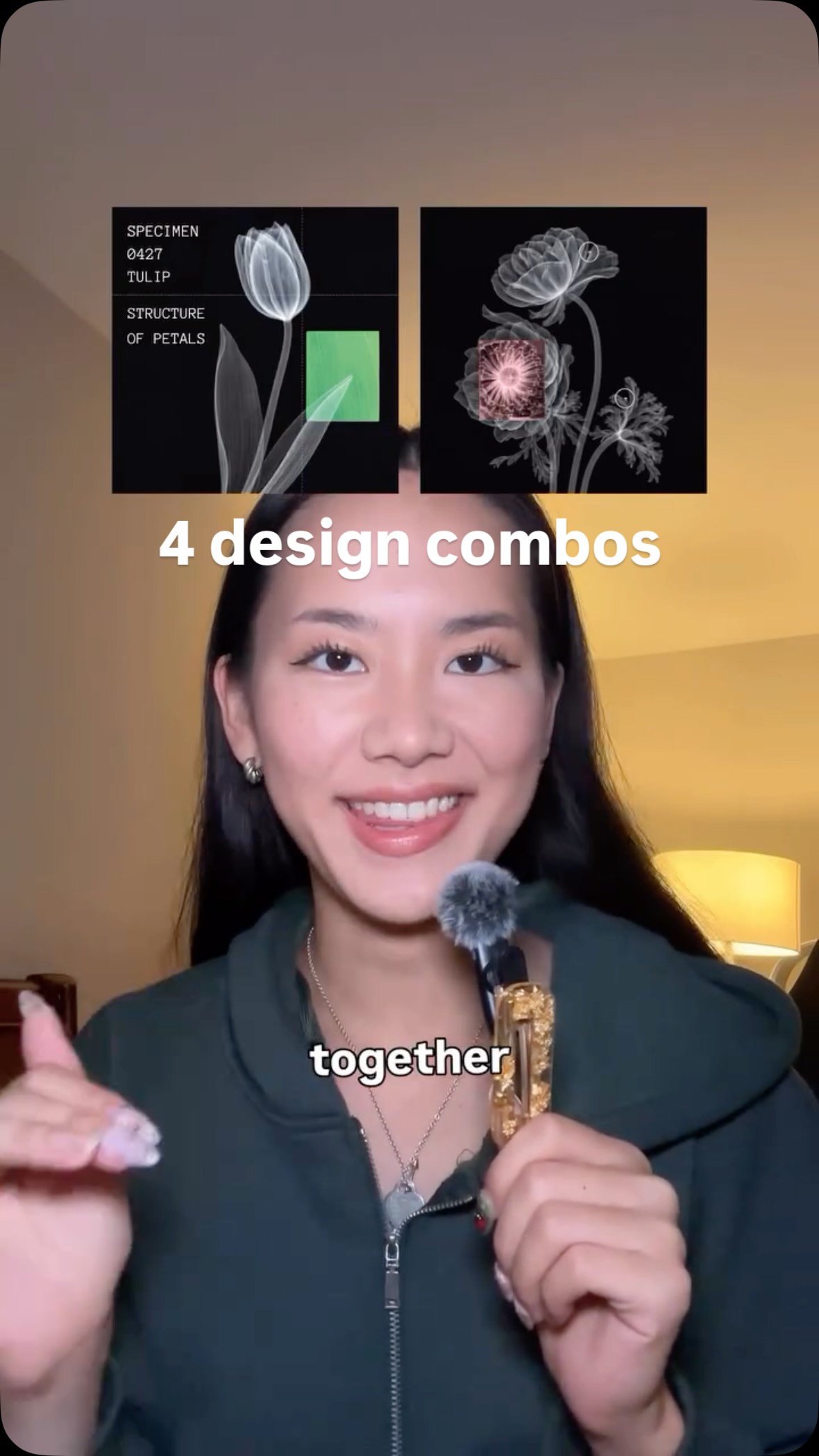 849K2.3×Combining design elements for inspiration@createwithalena
[04]
[05]
What stops the scroll in the first 3 seconds
Verbal hook · 65%
It looks boring.
Visual hook · 35%
Creator holds a fluffy makeup brush to her mouth like a microphone and points upwards, using an unusual prop to create immediate visual interest.
[06]
Steal this for your own video
It looks —here’s how to fix it.
[07]
The promise the opener makes, and how the video pays it back
Hook
The video begins immediately with the first problem statement, instantly hooking viewers who recognize the issue. The ASMR-style audio acts as a secondary sensory hook.
Payoff
A brief, encouraging sign-off that concludes the rapid-fire lesson and reinforces the creator's helpful persona.
[08]
The structural pattern this video runs on
Framework
The Diagnostic & Prescription
A rapid-fire series of common problems, each paired with a simple, actionable solution, demonstrated through a quick 'before and after' visual transformation. This creates a satisfying loop of problem identification and immediate resolution.
The Layout Fix
Establishes the core problem/solution format by addressing a fundamental issue (boring layout) with a direct command (adjust layout).
The Scale Fix
Escalates the principle by moving from arrangement to emphasis, addressing the problem of being unnoticeable with a more dramatic solution (exaggerate scale).
The Detail Fix
Shifts focus to refinement, tackling the feeling of 'plainness' by adding nuanced elements, demonstrating a deeper level of expertise.
The Contrast Fix
Introduces a more abstract concept (focal point) and solves it with a classic design principle (contrast), solidifying the creator's authority.
Which ones is the most helpful for you? [graphic design, design tips, graphic design tips, branding design]
It looks boring. Adjust the layout. It doesn't stand out. Exaggerate the scale. It feels plain. Add more details. No focal point. Use contrast. Happy designing.