Viral Hooks
Trending short videosCreator reviews F1 driver websites
J

@joshfromyolkk

TikTok · Split screen

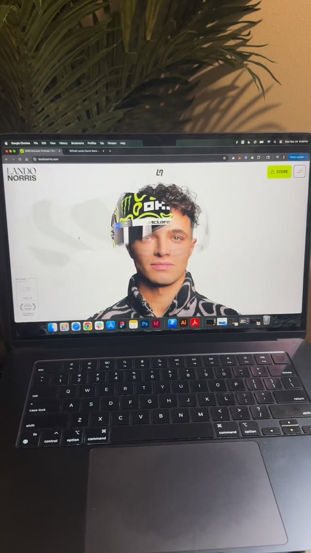
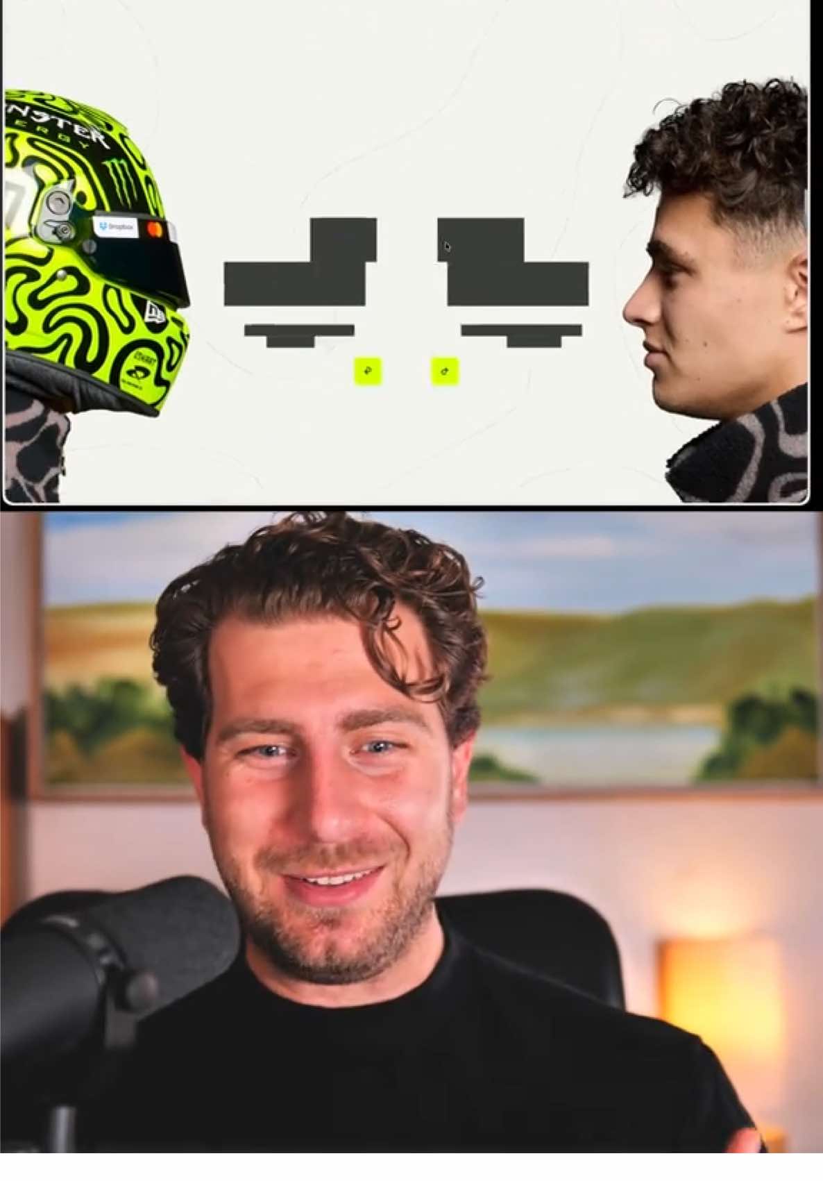
@joshfromyolkk Insane. Lando Norris this site is insane! Also who paid?.. Asking for a friend 👀 Earlier this year we saw Charles Leclerc drop his ultra-slick site - beautiful, elegant, refined. But Lando’s? This one’s just wild. It’s energy. It’s speed. It’s pure GSAP-fuelled chaos 🧨 done right! Lando Norris [.com] made by @OFF+BRAND. 🤯 Here’s why it’s a banger ↓ 🏎️ The scroll choreography – Text, stats, and 3D visuals all move in sync. Every reveal feels timed to the millisecond. 💚 The colour choice – That vibrant yellow-green glow is bold. Unexpected for McLaren orange, but it works. Feels personal and sharp. 📊 On-track stats done right – Hover states, fastest laps, results, race locations - all delivered with purpose. It’s beautiful and genuinely useful. It’s a full-blown brand experience for one man! Super interest who built it (?) + I'm also interest who paid?! Half of me loves exploring design, the other half businesses and it's just as intriguing to understand the mechanics behind commissioning a site like this! McLaren led... Need to one up Charles 😂 🌐 Lando Norris [.com] #WebDesign #Formula1 #F1 #LandoNorris #WebsiteInspiration

View original on TikTok

The edit1 shot · 0 text
Shots3:02

Performance

Views
607.7K
Likes
46.3K
Comments
211
Engagement
7.6%
Outlier
85.1×
Length · 17 Oct 2025
3:02

Video #33138 · Split screen

Creator reviews F1 driver websitesfrom @joshfromyolkk

[01]

Overview

The creator provides an enthusiastic and detailed review of Formula 1 driver Lando Norris's new website. He scrolls through the site, highlighting its dynamic animations, interactive features, and bold design choices, such as the helmet hall of fame and 3D track visualizations. Throughout the review, he compares Lando's site favorably to Charles Leclerc's more elegant site and unfavorably to Lewis Hamilton's static and 'boring' site, using them as benchmarks to praise the modern, engaging user experience of Norris's platform.

[02]

Simple outline

  1. 1Proclaim subject's excellence
  2. 2Showcase impressive details
  3. 3Contrast with inferior competitor
  4. 4Reaffirm superior status

[03]

Related videos

[04]

Classification

Concepts
BreakdownGood vs BadReview
Elements
Screen RecordingPicture-in-Picture

[05]

Hook analysis

What stops the scroll in the first 3 seconds

Verbal hook · 35%

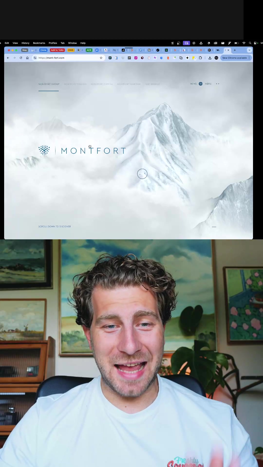
Earlier in the year we got Charles Leclerc, now Lando Norris's website.

Visual hook · 65%

A split-screen view showing a vibrant, lime-green website loading screen on top and the creator's smiling, engaged face on the bottom, creating immediate visual contrast and human interest.

[06]

Hook template

Steal this for your own video

A split-screen showing [bold visual stimulus] on top and your [reaction framing] on the bottom instantly signals [implied comparison or verdict] before a word is spoken.

  • — A split-screen showing a neon-green luxury sneaker drop page on top and a wide-eyed, leaning-in creator face on the bottom instantly signals this release is worth stopping for.
  • — A split-screen showing a wildly animated fast-food chain rebrand website on top and a grinning, nodding creator on the bottom instantly signals approval before the review even begins.
  • — A split-screen showing a celebrity's chaotic, color-saturated merchandise store on top and a visibly impressed creator face on the bottom instantly signals this is not what anyone expected.

[07]

Hook and payoff

The promise the opener makes, and how the video pays it back

Hook

A bold, superlative statement that immediately establishes the subject's high quality and introduces a point of comparison to create intrigue.

Payoff

A concluding summary that restates the initial superlative claim, now presented as a proven fact, leaving the audience with a clear and decisive judgment.

[08]

Narrative framework

The structural pattern this video runs on

Framework

The Comparative Takedown

To prove the exceptional quality of a primary subject by first showcasing its impressive features in detail, and then amplifying its perceived value by contrasting it against a deliberately chosen, inferior competitor.

  1. 1

    The High-Energy Showcase

    A rapid, enthusiastic tour of the subject's most visually striking aspects to establish an initial 'wow' factor and justify the hook's bold claim.

  2. 2

    The Granular Proof

    A slower, more detailed examination of specific features, interactions, or components to add substance and technical credibility to the initial emotional reaction.

  3. 3

    The Functional Deep Dive

    Demonstrating the subject's practical utility and purpose-driven design, proving it's not just aesthetically pleasing but also effective and well-conceived.

  4. 4

    The Foil

    Introducing a competing or alternative subject that is framed as clearly inferior, using it as a benchmark to make the primary subject appear even more exceptional by direct comparison.

Themes

  • Modern web design
  • Athlete branding
  • User experience
  • Interactivity

Techniques

  • Website teardown
  • Comparative review
  • Enthusiastic delivery

Post caption

Insane. Lando Norris this site is insane! Also who paid?.. Asking for a friend 👀 Earlier this year we saw Charles Leclerc drop his ultra-slick site - beautiful, elegant, refined. But Lando’s? This one’s just wild. It’s energy. It’s speed. It’s pure GSAP-fuelled chaos 🧨 done right! Lando Norris [.com] made by @OFF+BRAND. 🤯 Here’s why it’s a banger ↓ 🏎️ The scroll choreography – Text, stats, and 3D visuals all move in sync. Every reveal feels timed to the millisecond. 💚 The colour choice – That vibrant yellow-green glow is bold. Unexpected for McLaren orange, but it works. Feels personal and sharp. 📊 On-track stats done right – Hover states, fastest laps, results, race locations - all delivered with purpose. It’s beautiful and genuinely useful. It’s a full-blown brand experience for one man! Super interest who built it (?) + I'm also interest who paid?! Half of me loves exploring design, the other half businesses and it's just as intriguing to understand the mechanics behind commissioning a site like this! McLaren led... Need to one up Charles 😂 🌐 Lando Norris [.com] #WebDesign #Formula1 #F1 #LandoNorris #WebsiteInspiration

Transcript

Earlier in the year we got Charles Leclerc, now Lando Norris's website. This is insane. The whole way through the website is just art everywhere, crazy art as well. No I am absolutely lit about this website. It is awesome. I can't wait to show you even more pages because it's just doing everything. I love this little helmet unveil. Like the page just keeps going with like banger stuff. Look at those cards, how they pop out tier. Go and follow on social media where I know he's big. The menu drops down, and it's got these pages on track and off track, transition better. It's really cool as well because we've got this gorgeous three d best tier. Unveiling stuff, there's 40 podiums here with this lovely worst of mouse hover and cards, I didn't see that before actually. But I love this tier. It shows the track in a second. Go on, let me show you the track. This is cool, isn't it? Look at that tier. This must be like some, I don't know, video or something like that, but look at this transition better. It's just beautiful everywhere. And it keeps going as well like these upcoming schedules. If I go onto here and go calendar, love this page as well. So informative in such a, like, entertaining way. All the races that have better, some incredible photos as you hover on them, and the great information as well. Like like, it makes it obvious. Where did he finish? Fastest lap. When was the race? Where was it? It's just super cool. I haven't ever clicked it. Okay. If you click it, it takes you to the track. That makes a lot of sense. And then he has, like, all results. It's just a great overview. I haven't really explored off track, so let's let's do it. We've got a little bit of racquetball. I've Good. Honestly, I've worst what these are. The difference between paddle and racquetball, I have no idea. But this is cool. Best of sideways scrolling, bit of golf shots in tier, the card again. Let's see that card. Does it pop out a second time? Oh, it's cool though, isn't it? It is so cool. What a website. Earlier in the year, as I said, we got Charles Leclerc's one, which is also absolutely beautiful in a different way. It's a bit more elegant through it, but still just like, just insane. But you compare it to like a site like Lewis', and Lewis, like you're looking awesome tier, like, you know, rank never fault you there. But good, it's like such a boring website. It doesn't even like stop the scroll, and then you've just got these four links. And like good at what these chaps are doing. This, I land on this, I'm like Rank, yeah, just just insane. Lando's website, just beautiful. It's incredible where we can get with animation instill such a incredible package. Absolutely love it. I bet there's a thousand things I just haven't even seen on this site that I love. Really, really, really cool. Landonorris.com.

Creator reviews F1 driver websites | Viral Hooks