Viral Hooks
Trending short videosDesigner redesigns influencer's boring website
P

@pixeldesignlab

TikTok 路 Split screen

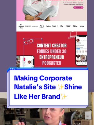
@pixeldesignlab This is my obsession 馃槄馃敟 I came accross @CorporateNatalie website and it didn鈥檛 feel right, it didn鈥檛 match the vibe of Natalie鈥檚 brand 馃 so I had to redesign it 馃槄 Natalie, if you see this, I鈥檓 a big fan 馃槃馃馃徏 #redesign #uxdesigner #uxdesign #webdesigner #webdesign #designer #uidesign #uidesigner #website #websitedesign #businesswebsite

View original on TikTok

The edit1 shot 路 5 text
Shots Text1:13

Performance

Views
61K
Likes
3.3K
Comments
82
Engagement
5.5%
Length 路 20 Aug 2024
1:13

Video #5355 路 Split screen

Designer redesigns influencer's boring websitefrom @pixeldesignlab

[01]

Overview

The creator critiques the current website of influencer "Corporate Natalie," identifying issues with branding, layout, and user journey. She then explains her vision for a redesign, showcasing her process through screen recordings and revealing a new, more vibrant and professional homepage concept that better reflects the influencer's brand and credibility.

[02]

Simple outline

  1. 1Identify a public flaw
  2. 2Establish subject's importance
  3. 3Showcase the expert fix
  4. 4Reveal the improved result

[03]

Related videos

[04]

Classification

Concepts
Hypothetical Case StudyBefore/After Transformation
Elements
Screen RecordingText OverlayB-Roll Cutaway

[05]

Hook analysis

What stops the scroll in the first 3 seconds

Title hook 路 45%

Making Corporate Natalie's Site Shine Like Her Brand

Verbal hook 路 50%

This website looks DIY and boring.

Visual hook 路 5%

A split-screen view showing the creator speaking at the bottom and a static image of the 'before' website being critiqued at the top.

[07]

Hook and payoff

The promise the opener makes, and how the video pays it back

Hook

A bold, critical judgment of a publicly available asset, immediately establishing a problem and the creator's confident perspective.

Payoff

The visual presentation of the transformed asset, providing a satisfying resolution to the initial problem and a clear demonstration of the creator's value.

[08]

Narrative framework

The structural pattern this video runs on

Framework

The Expert Redesign

To establish authority by identifying a flaw in a high-status subject's work, demonstrating a superior solution, and revealing a satisfying transformation.

  1. 1

    The Value Proposition

    A clear statement of how the identified problem will be solved, promising a specific, desirable outcome for the viewer to anticipate.

  2. 2

    The Credibility Gap

    Establishes the high status, success, or importance of the subject, creating narrative tension by highlighting the disconnect between their status and the identified flaw.

  3. 3

    The Expert Diagnosis

    A detailed breakdown of the specific reasons why the asset is flawed, using professional language to build the creator's authority and justify the need for a fix.

  4. 4

    The Strategic Vision

    Outlines the specific goals and principles that will guide the solution, framing the upcoming transformation not just as an aesthetic change but as a strategic improvement.

  5. 5

    The Transformation Reveal

    The visual payoff where the 'before' is replaced by the 'after,' demonstrating the creator's skill and delivering on the initial promise.

  6. 6

    The Expert's Caveat

    A concluding statement that qualifies the work shown, often by explaining the deeper complexity of the field. This reinforces the creator's expertise and manages audience expectations.

Themes

  • brand consistency
  • user experience
  • professionalism
  • visual identity

Techniques

  • screen recording
  • before and after
  • expert critique

Trends

  • creator economy
  • personal branding

Post caption

This is my obsession 馃槄馃敟 I came accross @CorporateNatalie website and it didn鈥檛 feel right, it didn鈥檛 match the vibe of Natalie鈥檚 brand 馃 so I had to redesign it 馃槄 Natalie, if you see this, I鈥檓 a big fan 馃槃馃馃徏 #redesign #uxdesigner #uxdesign #webdesigner #webdesign #designer #uidesign #uidesigner #website #websitedesign #businesswebsite

Text overlays

  • title 路 beginning

    Making Corporate Natalie's Site Shine Like Her Brand

  • contextual 路 beginning

    CORPORATE HUMOR & CAREER INSIGHTS

  • contextual 路 middle

    CONTENT CREATOR FORBES UNDER 30 ENTREPRENEUR PODCASTER

  • contextual 路 middle

    LET'S CROSS SOME HR BOUNDARIES

  • contextual 路 end

    PUBLIC SPEAKING

Transcript

This website looks DIY and boring. So I'm gonna show you how we can make it, like, million times more appealing and user friendly for potential business collaborations. By the way, this is corporate Natalie, super funny content creator and entrepreneur. Recently, she made it onto Forbes under 30 list, and she has over 1,800,000 followers on socials. Her website deserves the same level of fame. So first of all, I think her website is missing branding. I don't see any clear strategy behind it, nothing unique. And most importantly, the layout is poor. The content on the website is in place very strategically because you need to go through each page to get the complete image of who Natalie is, like, what she does. And trust me, most people won't do that. We get bored very quickly. I wanted her site to be bright, friendly, but still professional with bold typography and these cute illustrations. My goal was to build trust, highlight what she does, and showcase her credibility leaving that, like, friendly, nice, positive impression. And, of course, it's not done yet. This is just the beginning of the homepage, but you can get the idea. And, also, all of this is just a hypothesis and guesswork because creating really effective, good, visually appealing website requires a full strategy. And this is just the UI, just the tip of of the iceberg.