Viral Hooks
Trending short videosWebsite redesign before and after
P

@pixeldesignlab

TikTok · Greenscreen Talking Head

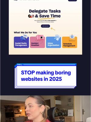
@pixeldesignlab Your website doesn’t have to be utopic 3D fully animated at all, BUT it helps if it’s not boring 😄 What do you think about this redesign? #webdesign #webdesigner #uxdesigner #uxdesign #redesigns #website #websitedesign #websiteredesign #figma

View original on TikTok

The edit1 shot · 4 text
Shots Text1:29

Performance

Views
130.1K
Likes
7K
Comments
120
Engagement
5.5%
Outlier
1.7×
Length · 6 Jan 2025
1:29

Video #5351 · Greenscreen Talking Head

Website redesign before and afterfrom @pixeldesignlab

[01]

Overview

The creator critiques a virtual assistant company's website homepage, pointing out specific design flaws like wasted space in the header, poor information hierarchy, an unbalanced banner, and generic stock photos. She then presents her own redesign, explaining her choices to create a clearer, more engaging, and visually appealing user experience. She details her new layout, color palette, and focus on highlighting key services immediately to better capture audience attention.

[02]

Simple outline

  1. 1Identify common problem
  2. 2Critique bad example
  3. 3Introduce new approach
  4. 4Reveal improved version
  5. 5Explain winning strategy

[03]

Related videos

[04]

Classification

Concepts
Good vs BadHypothetical Case Study
Elements
Screen RecordingText Overlay

[05]

Hook analysis

What stops the scroll in the first 3 seconds

Title hook · 45%

You lose interest on your website

Verbal hook · 35%

You lose your audience interest the moment they land on your website if your homepage is boring.

Visual hook · 20%

A split screen showing the speaker on the bottom and a screen recording of a website on top, with a large red 'X' drawn across the website, immediately signaling a critique or problem.

[06]

Hook template

Steal this for your own video

You lose [audience type] the moment they see your [asset type] — here's why.

  • — You lose potential clients the moment they see your proposal — here's why.
  • — You lose followers the moment they see your profile page — here's why.
  • — You lose job offers the moment they see your resume — here's why.

[07]

Hook and payoff

The promise the opener makes, and how the video pays it back

Hook

State a high-stakes, relatable problem that the target audience fears, immediately positioning the video as a valuable solution.

Payoff

Conclude by framing the solution as the definitive answer for a specific, desirable goal, cementing the creator's authority and leaving the viewer with a clear, actionable takeaway.

[08]

Narrative framework

The structural pattern this video runs on

Framework

The Expert Redesign Blueprint

To establish authority by identifying common flaws in a subject ('the before'), deconstructing them with expert analysis, and presenting a superior alternative ('the after') with clear justification for the improvements.

  1. 1

    The Pain Point Premise

    Frame a common issue as a critical failure point ('You lose interest if...'), creating immediate relevance and a sense of urgency for the viewer.

  2. 2

    The Forensic Takedown

    Present a 'before' example and systematically critique its flaws from multiple angles (e.g., structural, messaging, aesthetic). This builds tension, demonstrates expertise, and creates a desire for a solution.

  3. 3

    The Strategic Bridge

    Articulate a core principle or strategic shift that will underpin the coming solution. This acts as a transition from identifying problems to building the solution.

  4. 4

    The 'After' State Reveal

    Unveil the redesigned 'after' example. This serves as the primary visual payoff, providing immediate gratification and a stark contrast to the flawed original.

  5. 5

    The Winner's Rationale

    Break down the 'after' example, explaining the specific, strategic choices that make it superior. This validates the solution, educates the audience, and reinforces the creator's expertise.

Themes

  • User Experience
  • Visual Hierarchy
  • Brand Communication
  • Conversion Optimization

Techniques

  • Critique and Redesign
  • Before and After
  • Problem-Solution Framing

Post caption

Your website doesn’t have to be utopic 3D fully animated at all, BUT it helps if it’s not boring 😄 What do you think about this redesign? #webdesign #webdesigner #uxdesigner #uxdesign #redesigns #website #websitedesign #websiteredesign #figma

Text overlays

  • title · beginning

    You lose interest on your website

  • title · beginning

    if your homepage is boring

  • informational · middle

    What do you do? How can you help me? choose you? book you?

  • informational · end

    highlight your most important services right away here.

Transcript

You lose your audience best the moment they land on your website if your homepage is boring. This section is unnecessarily wide. It's taking up way too much space on the screen, and I don't think your address, especially if you're not a local business, needs to be so prominent. Tier same with your phone number, I would move both to the footer. This clears up the area and allows us to focus on something far more important, and that's your message. What do you do? How can you help me? Why should I choose you? And where can I book you? And this kind of a banner isn't answering any of that. It looks super unbalanced and DIY, especially on mobile. You can tell it's just an image, and this is the most important part of your website. And then the worst thing, my favorite, you can do is to continue by welcoming people to your page with a headline like this. It's really unnecessary. You need to realize that you're speaking to your people, and you don't have that much time to convince them why they should choose you. I assume that you don't have your own photos yes. That's why I think you yes those from the photo bank, but they feel inconsistent. So I decided rather to focus on shapes, colors, fonts, and three d graphics to grab the attention and tell a story. So I would highlight your most important services right away tier. Visually, I kept the main brand colors, the yellow and blue, but I balanced them with a pastel blue and pink to make them feel fresher, friendlier, more fun. But, of course, everything depends on branding, strategy, your target audience, and goals. But if the brief is to design a home page for a virtual company in a playful, vibrant, and simple way, this is what I would do.

Website redesign before and after | Viral Hooks