Viral Hooks
Trending short videosWebsite team section design review
J

@joshfromyolkk

TikTok · Split screen

@joshfromyolkk This websites homepage team section scores an absolute 10/10 ⭐! The concept is just 👌 - The website won Awwwards SOTD back in June 2024 - Fruitful #webflow #gsap #awwwards #sotd #siteoftheday #yolkk #websitedesigns #webflowdesigner #webdesignerslife #webdesigner #uxui #ux #ui #webpages #webdesigninspiration

View original on TikTok

The edit1 shot · 0 text
Shots1:52

Performance

Views
183.9K
Likes
9.5K
Comments
157
Engagement
5.3%
Length · 26 Mar 2025
1:52

Video #5346 · Split screen

Website team section design reviewfrom @joshfromyolkk

[01]

Overview

The creator provides a detailed review and analysis of the 'fruitful.com' website, focusing specifically on its interactive team section. He demonstrates the hover effects and video pop-ups, explains why this design is effective for building trust, and contrasts it with a more traditional example to highlight its superiority.

[02]

Simple outline

  1. 1Isolate brilliant example
  2. 2Demonstrate layered functionality
  3. 3Explain strategic purpose
  4. 4Contrast with lesser version
  5. 5Declare inspirational value

[03]

Related videos

[04]

Classification

Concepts
BreakdownShowcaseSplit Screen Explainer
Elements
Screen RecordingPicture-in-Picture

[05]

Hook analysis

What stops the scroll in the first 3 seconds

Verbal hook · 30%

Just look at this bit here. Look at these hover effects.

Visual hook · 70%

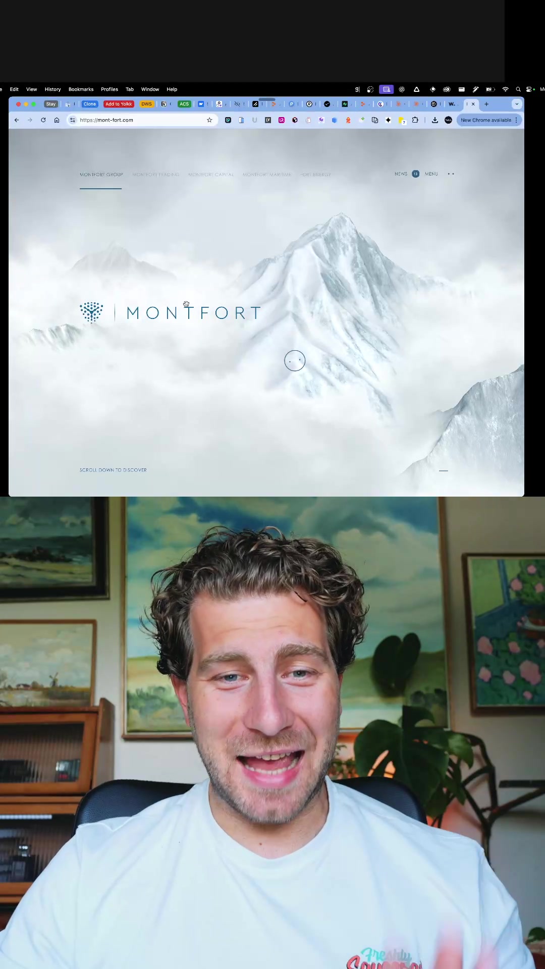
A screen recording shows a cursor activating interactive hover effects on a website's team photos, while the speaker appears in a picture-in-picture window with an excited facial expression.

[06]

Hook template

Steal this for your own video

Screen-record yourself hovering over [interactive feature] on [digital product], with your [reaction expression] in a picture-in-picture window.

  • — Screen-record yourself hovering over a before-and-after image slider on a skincare brand’s website, with your amazed expression in a picture-in-picture window.
  • — Screen-record yourself hovering over a recipe card that reveals ingredient substitutions on a cooking app, with your intrigued expression in a picture-in-picture window.
  • — Screen-record yourself hovering over a portfolio project that opens a mini case study on a freelancer’s site, with your excited expression in a picture-in-picture window.

[07]

Hook and payoff

The promise the opener makes, and how the video pays it back

Hook

An immediate, high-energy emotional reaction to a specific, isolated element, creating an instant curiosity gap about its perceived excellence.

Payoff

The creator validates the viewer's time by confirming the element's high value and framing it as a practical, inspirational takeaway for the audience's own endeavors.

[08]

Narrative framework

The structural pattern this video runs on

Framework

The Case Study Showcase

To isolate a single, exceptionally well-executed element, demonstrate its superiority through layered reveals and comparison, and explain its strategic brilliance to establish it as a new standard of excellence.

  1. 1

    The Interactive Reveal

    A step-by-step demonstration of the element's functionality, revealing its complexity and cleverness in successive layers to build engagement and prove the initial claim of quality.

  2. 2

    The Strategic Context

    Providing the 'why' behind the 'what' by explaining the broader goal or business model the element is designed to serve, giving it purpose beyond simple aesthetics.

  3. 3

    The Thesis Declaration

    Explicitly stating the core argument for why this specific execution is a masterclass, directly connecting the design's function to the strategic business goal.

  4. 4

    The Comparative Benchmark

    Introducing a competent but less-inspired alternative to serve as a foil, which by contrast elevates the primary example from 'good' to 'exceptional' and validates the creator's judgment.

  5. 5

    The Inspirational Mandate

    Concluding with a personal, emphatic statement of admiration and declaring the element's value as a source of inspiration for future work, solidifying its status as a benchmark.

Themes

  • User Experience
  • Brand Humanization
  • Interactive Design

Techniques

  • Screen Recording
  • Picture-in-Picture

Trends

  • Website Teardown
  • Design Review

Post caption

This websites homepage team section scores an absolute 10/10 ⭐! The concept is just 👌 - The website won Awwwards SOTD back in June 2024 - Fruitful #webflow #gsap #awwwards #sotd #siteoftheday #yolkk #websitedesigns #webflowdesigner #webdesignerslife #webdesigner #uxui #ux #ui #webpages #webdesigninspiration

Transcript

Just look at this bit here. Look at these hover effects. I love this. So this is like a a such a cool way to jazz up a little team section. And when you click on it, it pops up with a little video of each of them. And they've all got this little funny little awkward intro, and then it goes into the real thing. It's just so cleverly done. So let's refresh the page. This is fruitful.com. It automatically redirects you to this landing page, and they're basically personal finance advisers. It's a subscription model, and you get your own personal finance adviser. And I love this hero section with these little videos. So cool. Comes down. But really, all I wanna talk about is this little bit here. I just think it's no, so better. You know, highlighting the team or, like, feeling comfortable about moving to the next step. I mean, this is you're literally being introduced to a personal adviser. And so many businesses are like this, you know, where they're they're gonna be introduced to a team member that really works closely with them. And it's just such rank interesting way of doing it. I mean, I was I worst with this firm DWS Legal, and we were experimenting with this new homepage here. And this is a lovely way to have the team and and you hover over them and these pop up. It's no, so, so nice. But this, you know, with the videos That was really and the little part where it's, like, has this little funny introduction, then it introduces you properly. Thank you. It's just no, so clever. I just I really, really think that that is something that I've gotta use, going forward. The whole website's cool. To be honest, this little part here doesn't really work very well, but this part's cool. I love how they do, quarterly subscriptions rather than just monthly and annual. Pretty cool way to to break it up. But anyway, I'll leave it there. Effectively, I just love that little tier section. I thought it was no, so clever. Very, very cool. Fruitful.com.


Website team section design review | Viral Hooks