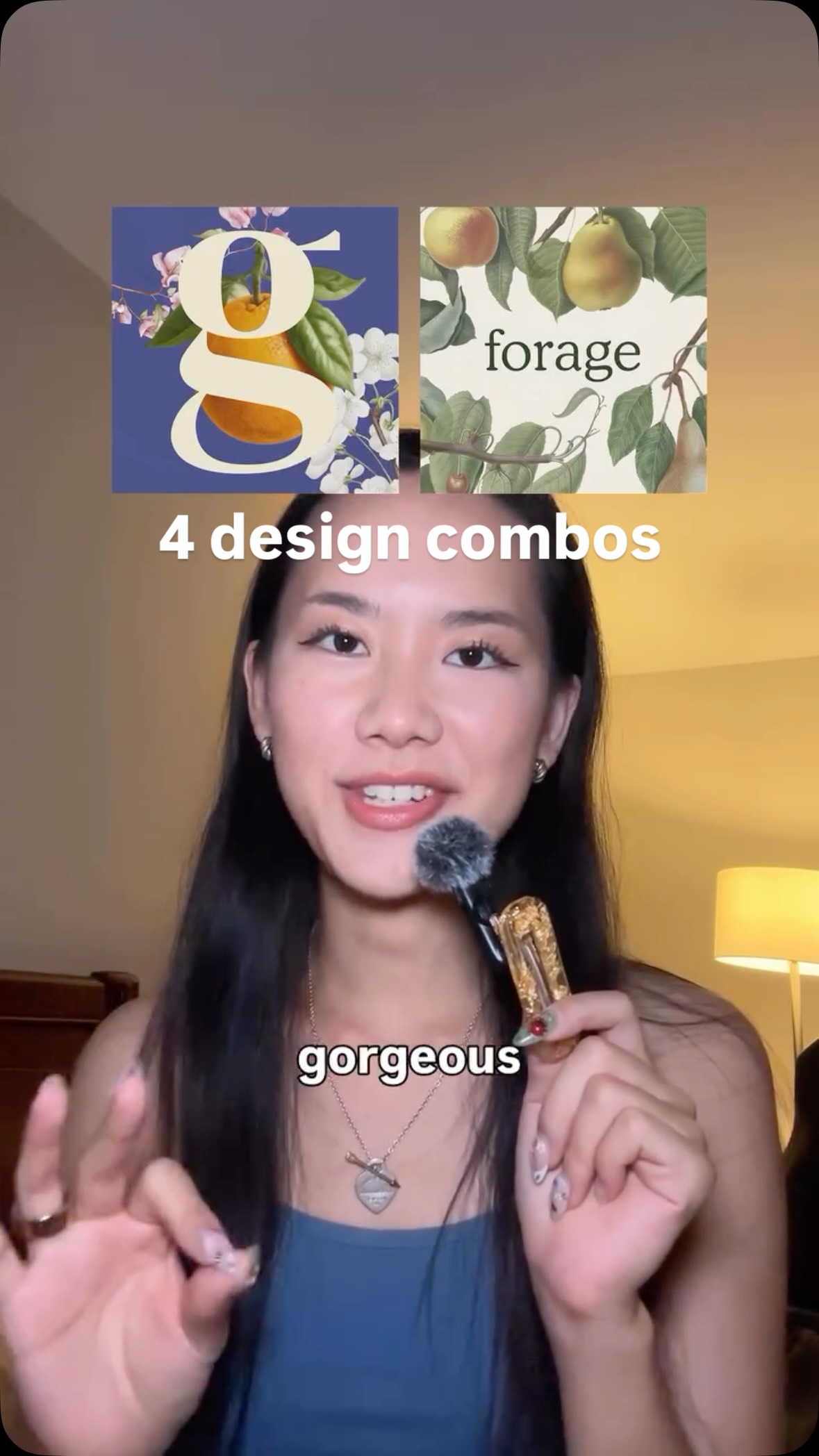
A graphic designer presents and analyzes three of her favorite color combinations: electric violet and deep brown, metallic red and silver, and rosy pink with cream. For each combination, she shows multiple design examples, explains the emotional and aesthetic feelings they evoke, and connects them to personal associations like nature, fantasy books, and Parisian cafes. She concludes by showcasing a personal wedding invitation design that utilizes a bold, saturated color palette.
Transcript
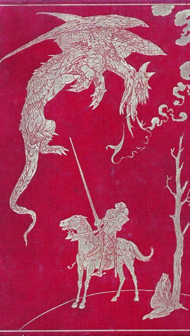
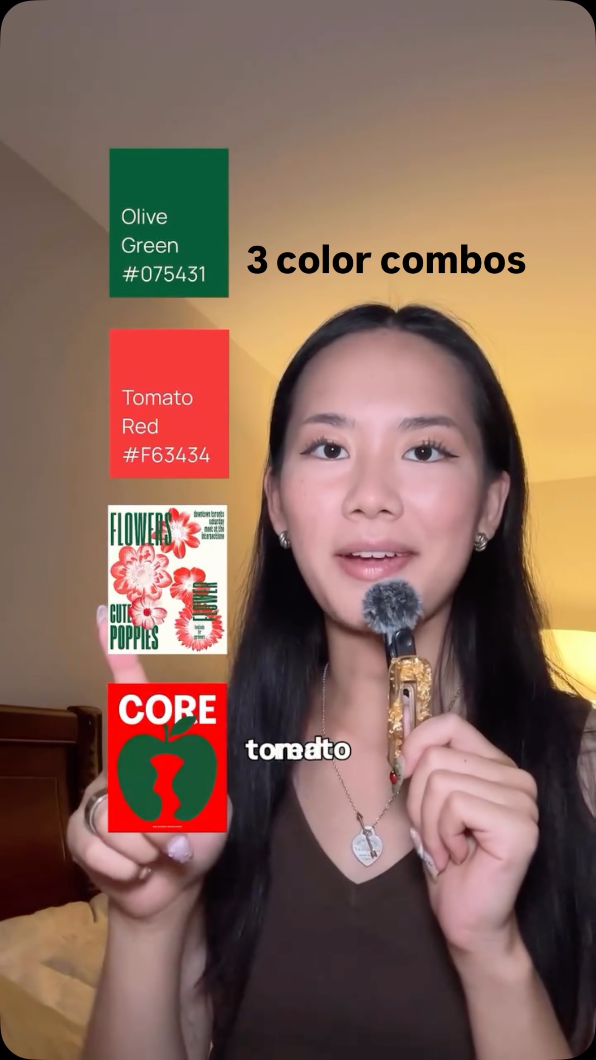
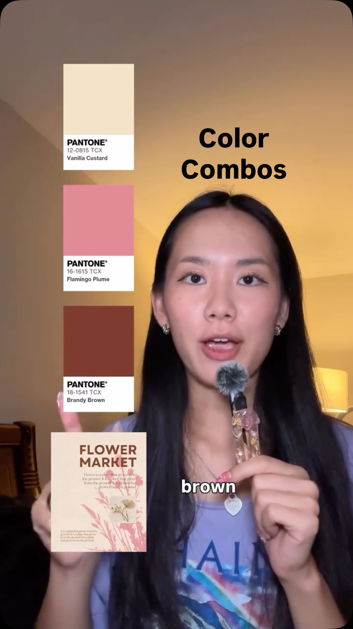
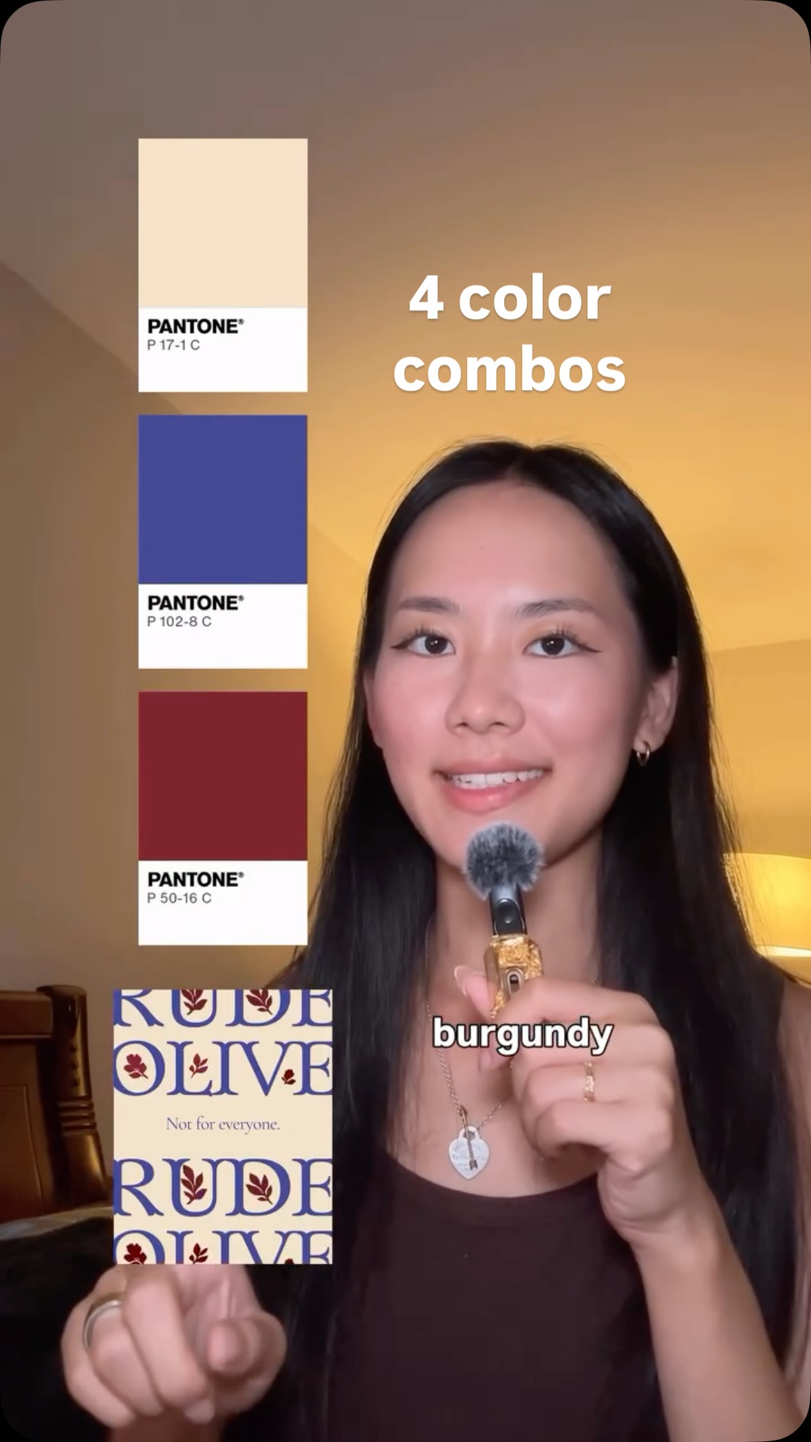
Playful, elegant, nostalgic, delicious. I'm an artist and a graphic designer, and I wanna show you some of my favorite color combinations lately. Let's start off strong with this electric violet and deep brown maroon. It has this gorgeous fuzzy halo effect. When they come better, the legibility can be quite low. It has this magical aura. The violet reminds me of that color in nature, like in the morning glory flower that you can barely look at. It's almost like our eyes can't process the depth and richness of that shade. Best is the sort of thing I wanna jump into and swim around in, and I'm seeing a lot more of them in design. Okay. Next up, we have this metallic red and silver. It can come in all forms. It can come as just a solid gray, or it can be this blended brushed chrome. It reminds me of these old fancy book covers that had foil stamping on the red linen binding. Anytime you're using silver or chrome, something shiny like that, it comes with a techno futurism. It's like a motorcycle, a spacecraft, something industrial. And when you combine it with that red, a deep red can go a bit romantic. A bright red can be sort of alarming, attention grabbing. Either way, the combination I find to be memorable, beautiful, and sort of dangerous. And as you know, I'm biased. I love silver, and I love red. And next we have this rosy pink with cream and black. This isn't a hot hot rank. This is a soft Parisian cafe sign that's been fading in the sun for a decade. What else do you say about this pink better than it's very lovely? And when you combine it with a softened cream, not something so harsh and white, but something buttery whipping cream, it's very gentle and almost antiquated. To me, this is the color palette of good best. Beautiful stationery, a boutique hotel, an art book, a museum better. And one last thing for good measure, here's a design I created this past week for my friend's wedding. I wanted a really opinionated saturated system that isn't traditional wedding. I brought in some brown to this green, so it's sort of an almost offensive chartreuse with this bright blue moon and this orange and pink that are both deeply saturated, rank, and potent. And when you combine them all with a nice black stroke for legibility, Tier was really happy with how this came out. Rank for watching.