@niki.aroca
Instagram · Graphic Yap
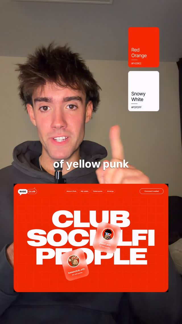
@niki.aroca Use two quiet colors and let the loud color do the work #business #entrepreneur #design #webdesign #agency

@niki.aroca
Instagram · Graphic Yap
@niki.aroca Use two quiet colors and let the loud color do the work #business #entrepreneur #design #webdesign #agency
Performance
Video #49073 · Graphic Yap
[01]
The creator demonstrates the power of using a single 'loud' accent color in design. He presents three different website design mockups, each initially using a simple two-color palette. For each example, he then introduces a third, vibrant accent color to show how it dramatically improves the design's visual interest and directs the viewer's eye, concluding by stating the general design principle: 'Use two quiet colors and let the loud color do the work.'
[02]
[03]
 3.1M17.7×Explains branding color ratio rule@iamnicorojas · Buying List
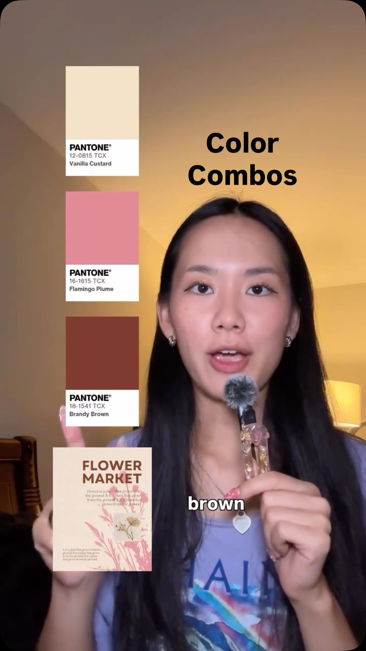 2.6M7.3×Rapid fire design color palettes@createwithalena · Rapid Fire Listicle
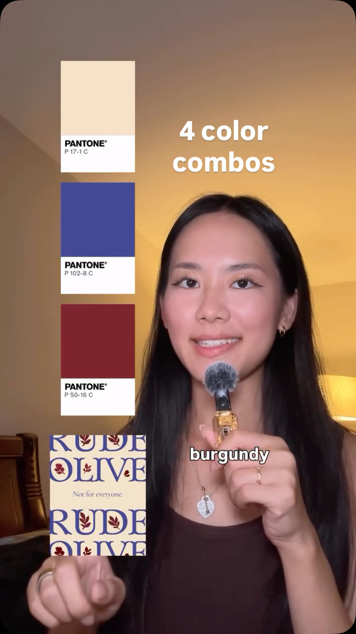 1.1M10.2×Rapid fire color combination examples@createwithalena · Rapid Fire Listicle
 621.1K14.1×Rapid fire color palette ideas@createwithalena · Rapid Fire Listicle
 776.2K2.1×Rapid-fire color combination list@createwithalena · Rapid Fire Listicle
 739.5K11.8×Rapid fire color palette ideas@createwithalena · Rapid Fire Listicle
 881.3K14×Rapid fire color palette suggestions@createwithalena · Rapid Fire Listicle
 221.6K2.4×Creator explains aesthetic color tips@victoriamorse · Tutorial / How To
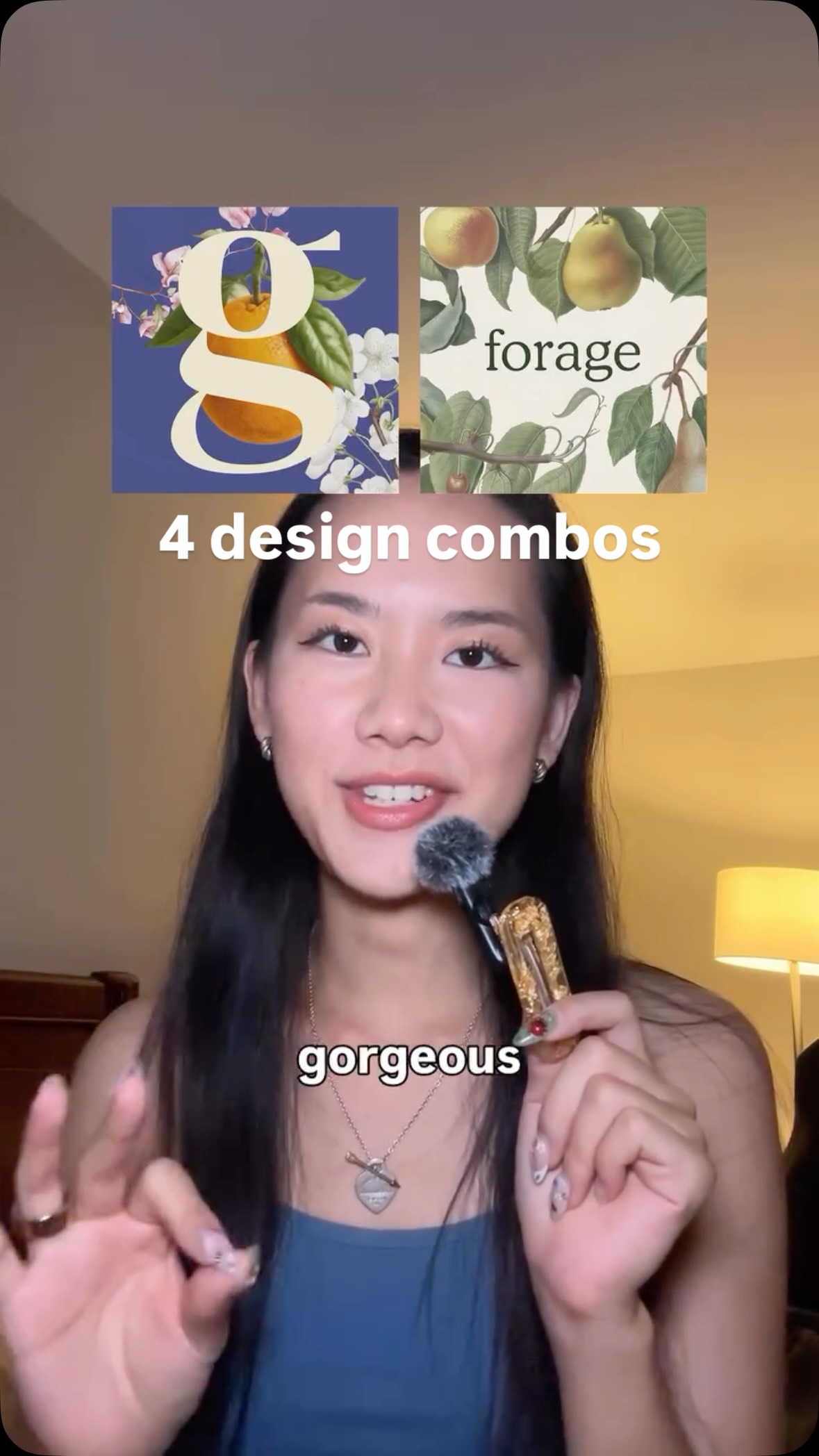 600.9K2×Showcasing powerful design combinations@createwithalena
 255K23.7×Designer explains favorite color combinations@madeleinevoge · Breakdown
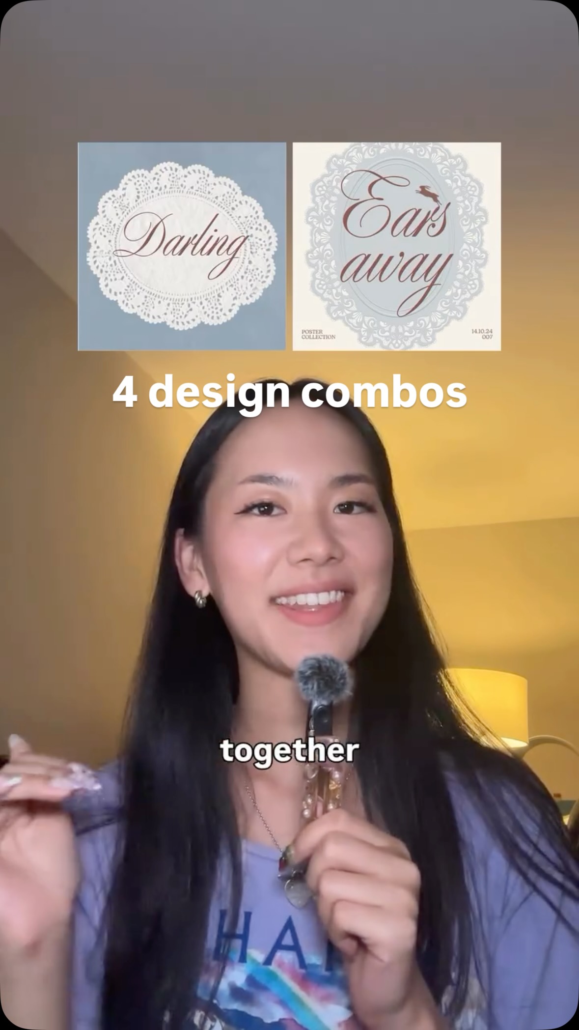 550.7K1.6×Showing design combination synergy@createwithalena · Rapid Fire Listicle
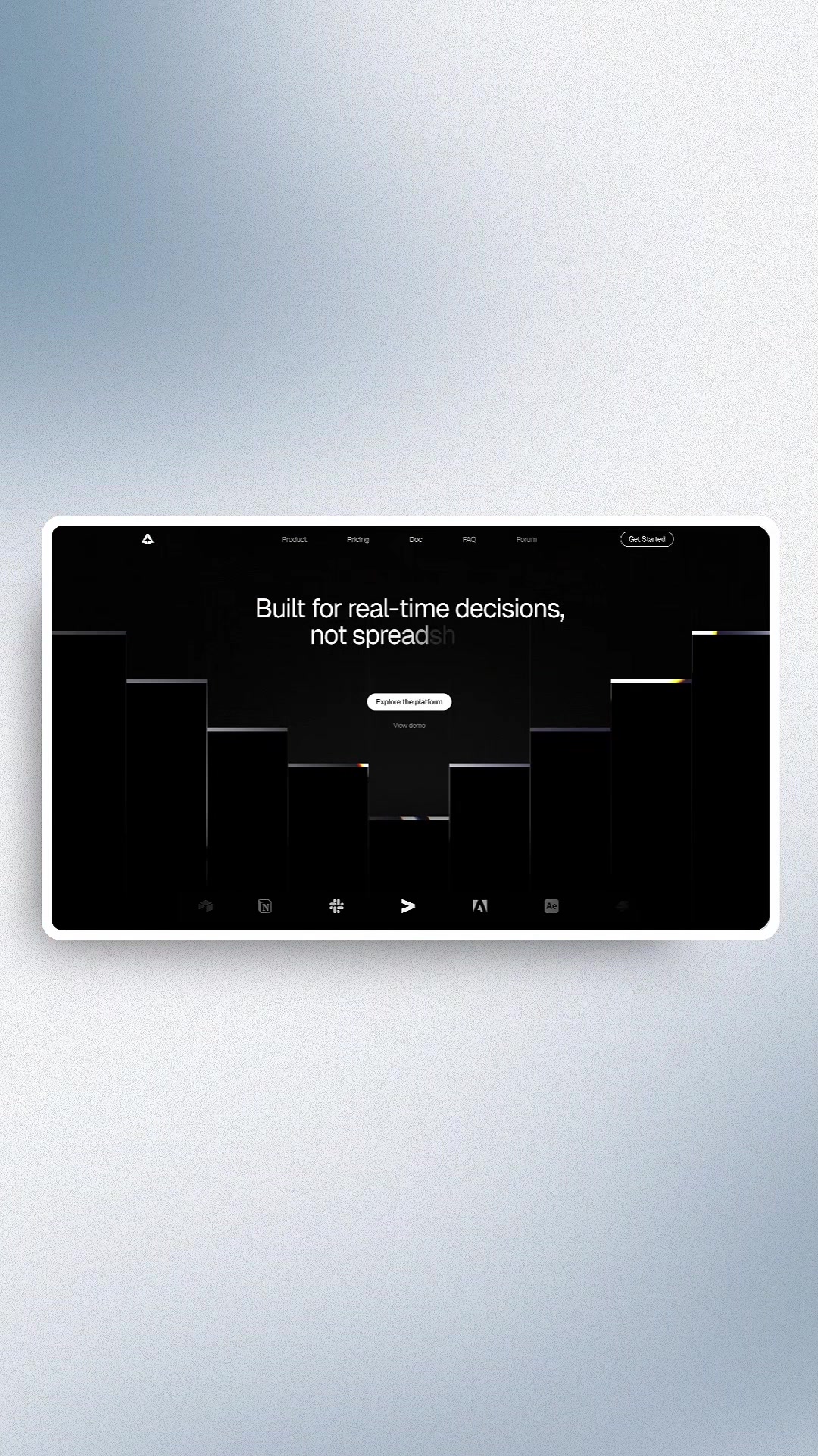 5M1601.7×Hook to visual design montage@marcelodesignx · Inspo Lookbook
[04]
[05]
What stops the scroll in the first 3 seconds
Verbal hook · 80%
Sky blue and cloudy white.
Visual hook · 20%
The creator points his index finger upwards, and a blue color swatch graphic animates into view directly above his fingertip, creating an interactive and attention-grabbing visual effect.
[06]
Steal this for your own video
and . Now watch what happens when I add .
[07]
The promise the opener makes, and how the video pays it back
Hook
The video begins immediately with the first example, presenting an acceptable two-part combination and posing a rhetorical question to establish it as a satisfactory but incomplete baseline.
Payoff
After proving the concept through multiple examples, the creator explicitly states the universal rule or principle that governs the transformations, providing a clear, actionable takeaway for the viewer.
[08]
The structural pattern this video runs on
Framework
The 'Good to Great' Transformation
To demonstrate a simple, repeatable principle by showing a series of 'before' and 'after' scenarios. Each example starts with an acceptable baseline, which is then dramatically elevated by the introduction of a single, high-contrast 'disruptor' element.
The Demonstration Gauntlet
A rapid-fire series of three examples, each following the exact same micro-pattern to build a strong, memorable case for the final principle. The repetition reinforces the concept and makes it feel universally applicable.
Use two quiet colors and let the loud color do the work #business #entrepreneur #design #webdesign #agency
informational · beginning
Sky Blue #009AF7
informational · beginning
Cloudy White #F0F0F0
informational · beginning
Amber Red #EC0F35
title · beginning
WE GROW CREATORS, NOT JUST NUMBERS
informational · middle
Red Orange #F42802
informational · middle
Yellow Punk #D3FC00
title · middle
#CLUB SOCIALFI PEOPLE
informational · middle
Sapphire Blue #0E0C9C
informational · middle
Neon Jade #9DFD8D
title · middle
Skip the Hold Music.
call-to-action · end
Follow
Sky blue and cloudy white. Looks clean, right? Best add a little bit of amber red, no look where your eyes go. Red orange and snowy white. Nothing wrong with it. But one touch of yellow rank, now it's something worth stopping for. Sapphire blue and ocean blue. You'd think it's finished. But add a bit of neon jade, now try imagining it without it. Use two quiet colors and let the loud color do the work. Follow for more.