@createwithalena
Instagram · Speaker address
@createwithalena Which design combo will u try for ur next project? 👇 [graphic design, design tips, freelance designer, brand design, design inspiration]

@createwithalena
Instagram · Speaker address
@createwithalena Which design combo will u try for ur next project? 👇 [graphic design, design tips, freelance designer, brand design, design inspiration]
Performance
Video #42154 · Speaker address
[01]
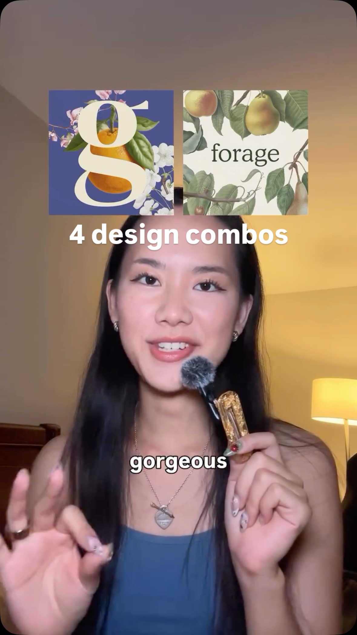
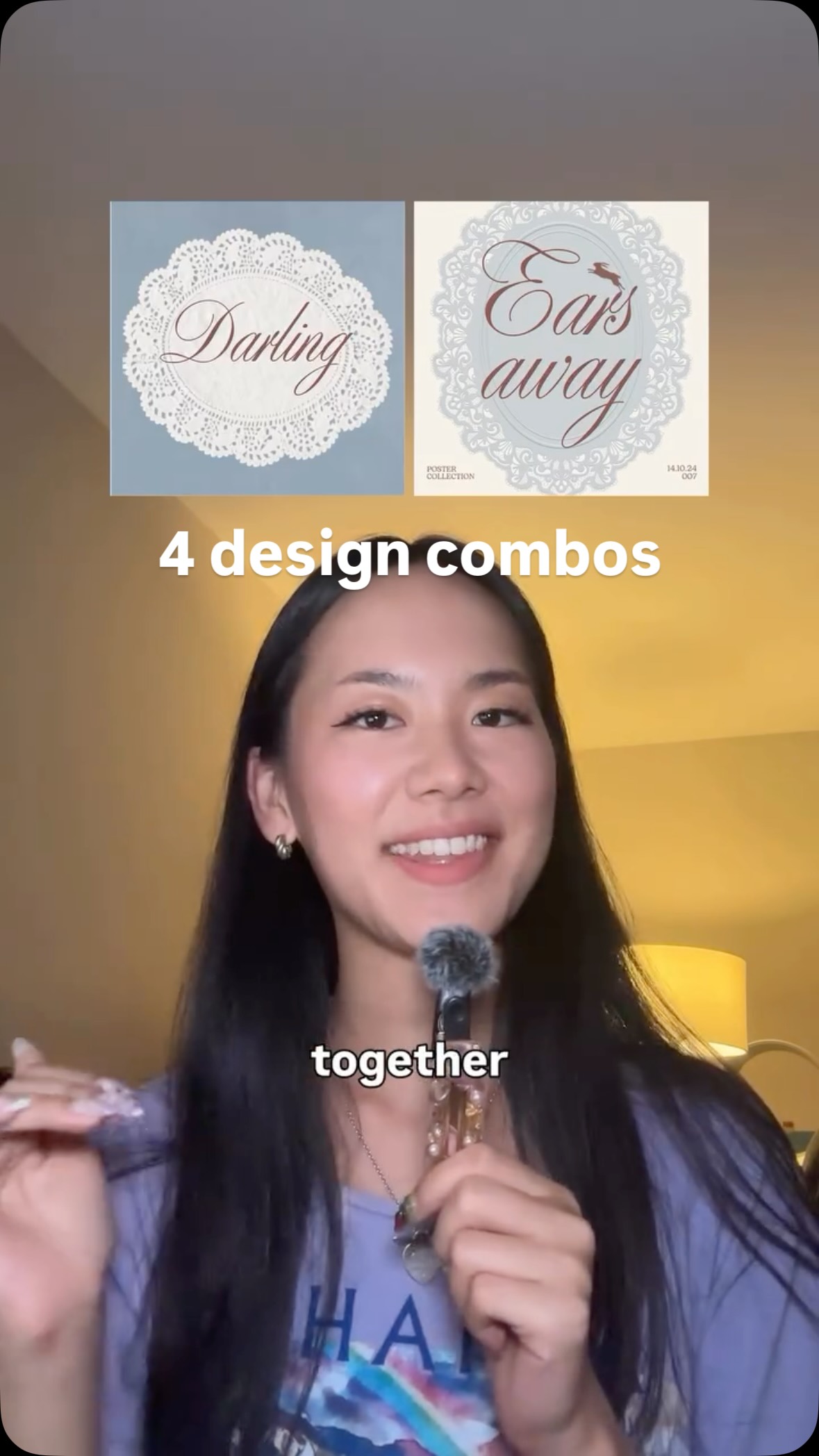
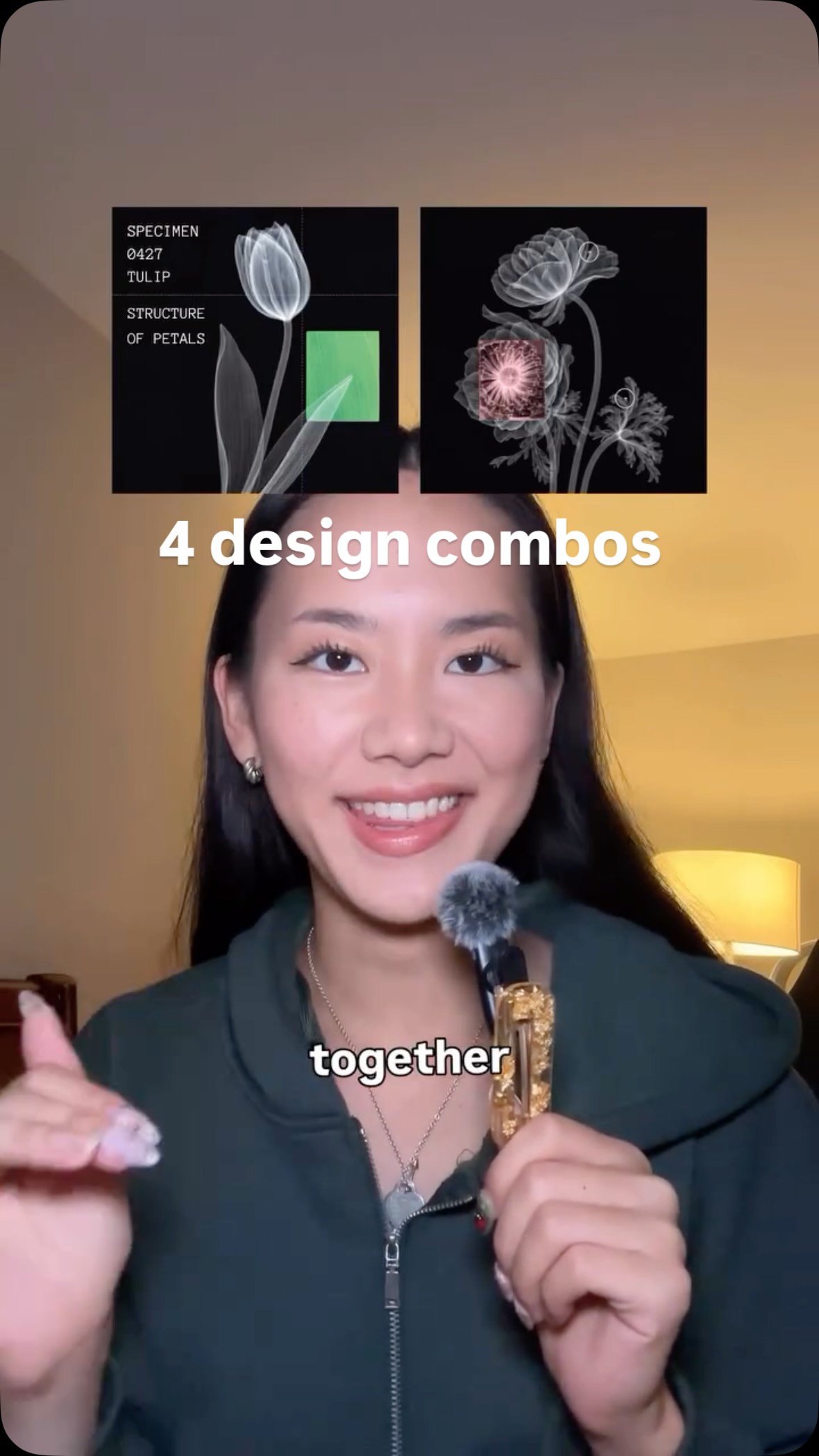
The creator presents four different design combinations, following a consistent pattern for each. She first introduces two separate design elements (like 'fruit' and 'serif font') as being merely 'alright' on their own, then showcases examples of them used together to create a much more powerful ('gorgeous' or 'sick') result, concluding with a final montage of the successful pairings.
[02]
[03]
 550.7K1.6×Showing design combination synergy@createwithalena · Rapid Fire Listicle
 849K2.3×Combining design elements for inspiration@createwithalena
 586.4K7.4×Showcasing synergistic design combinations@createwithalena · Rapid Fire Listicle
 57.2KRapid fire font pairing showcase@matthewcrtv · Rapid Fire Listicle
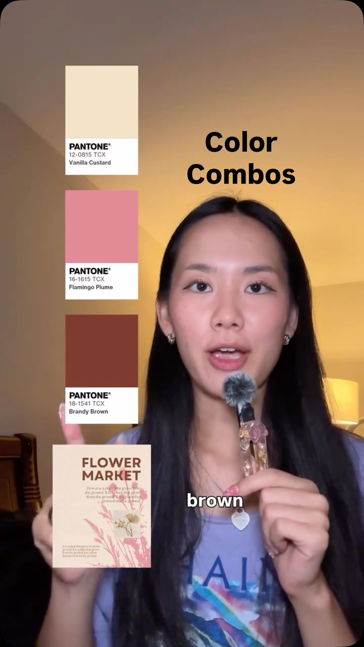 2.6M7.3×Rapid fire design color palettes@createwithalena · Rapid Fire Listicle
 3.9M6.7×Before and after design fixes@createwithalena · Rapid Fire Listicle
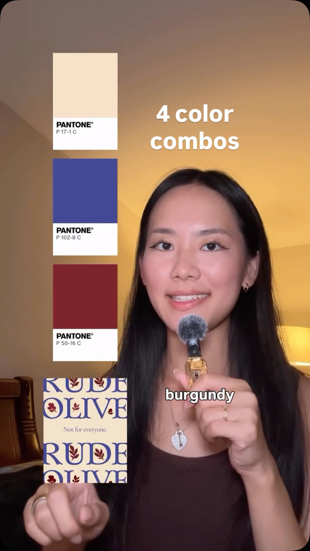 1.1M10.2×Rapid fire color combination examples@createwithalena · Rapid Fire Listicle
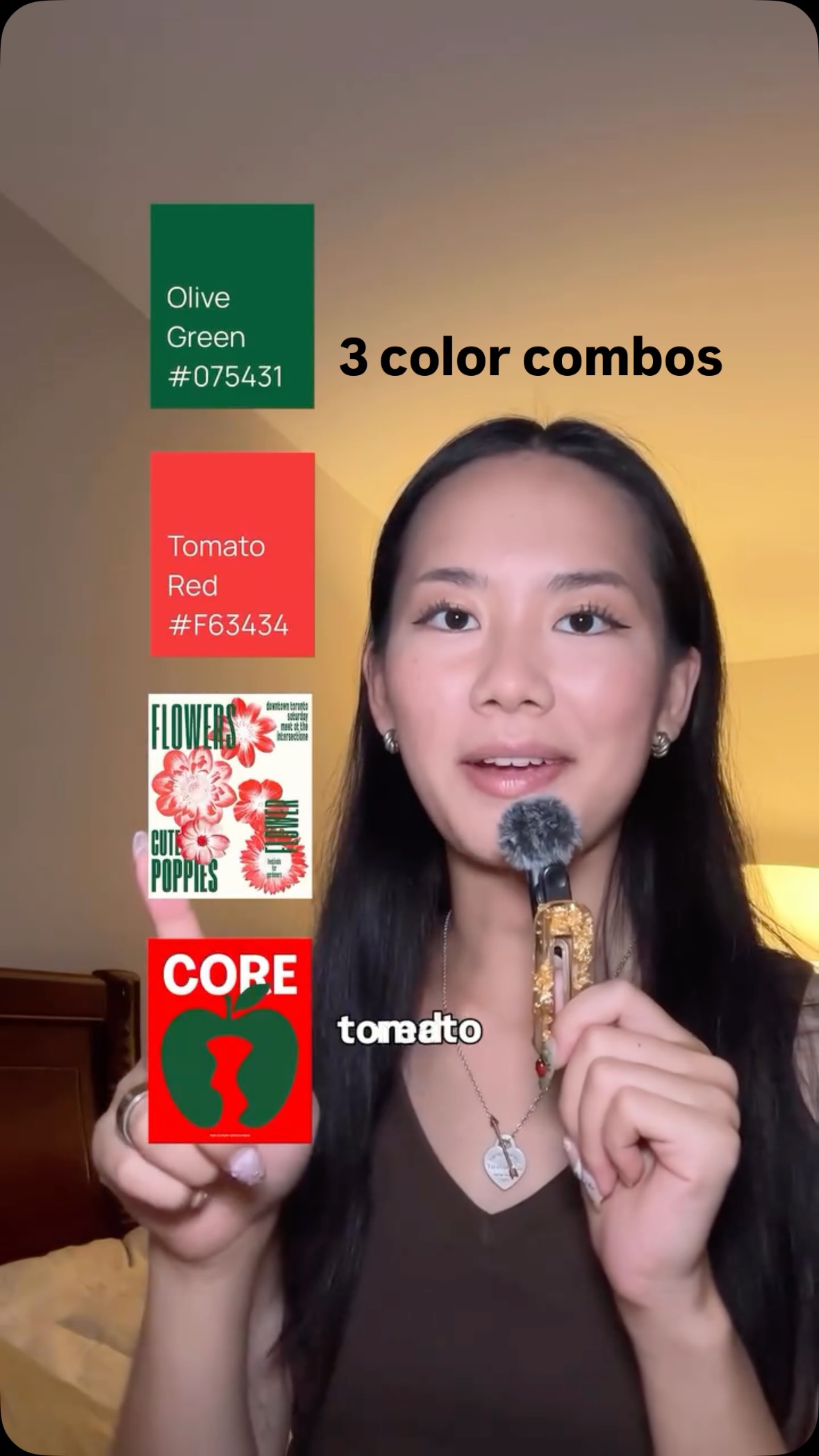 776.2K2.1×Rapid-fire color combination list@createwithalena · Rapid Fire Listicle
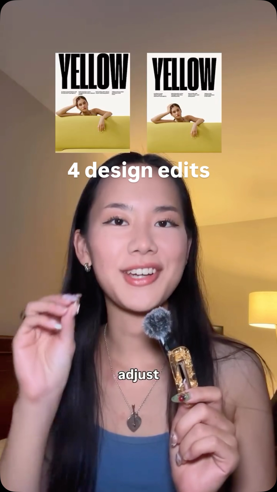 477.4KProblem, then quick design fix@createwithalena · Rapid Fire Listicle
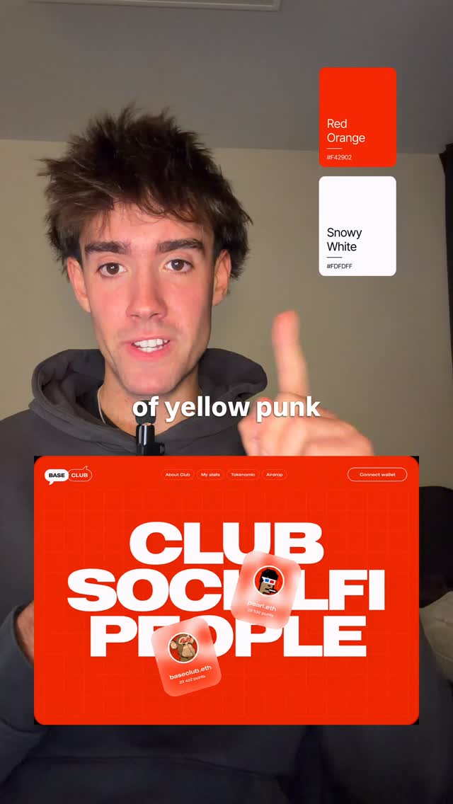 3.2MDesign principle with visual examples@niki.aroca · Good vs Bad
 1.3M18.4×Rapid fire graphic design tips@fakeplasticbrands · Rapid Fire Listicle
 255K23.7×Designer explains favorite color combinations@madeleinevoge · Breakdown
[04]
[05]
What stops the scroll in the first 3 seconds
Verbal hook · 65%
Fruit and serif font are alright,
Visual hook · 35%
The creator points to an empty space above her head, and an image of an orange with a leaf appears, creating a simple but engaging visual effect.
[06]
Steal this for your own video
and are alright, but wait until you see them together.
[07]
The promise the opener makes, and how the video pays it back
Hook
An immediate, no-context presentation of the first element, forcing the viewer to watch to understand the pattern.
Payoff
A brief, conclusive sign-off that provides a sense of closure and goodwill, leaving the viewer with the core message.
[08]
The structural pattern this video runs on
Framework
The Synergy Showcase
Demonstrating that combining two individually adequate elements creates a result that is exponentially better, using a repetitive 'Good + Good = Great' formula.
First Synergy Proof
Establishes the core formula by introducing two individual components, rating them as 'alright,' and then revealing their 'gorgeous' combined form.
Second Synergy Proof
Reinforces the formula with a new pair of elements, proving the concept's validity by transforming 'okay' components into a 'sick' combination.
Third Synergy Proof
Maintains the established rhythm and builds viewer trust in the pattern, turning 'nice' individual elements into an 'interesting' pairing.
Fourth Synergy Proof
Provides a final, satisfying repetition of the core logic, elevating 'cool' components into another 'sick' result, solidifying the video's thesis.
Which design combo will u try for ur next project? 👇 [graphic design, design tips, freelance designer, brand design, design inspiration]
contextual · beginning
Fruit
contextual · beginning
serafond
contextual · beginning
together,
contextual · beginning
gorgeous
contextual · beginning
and
contextual · beginning
together,
contextual · beginning
sick
contextual · middle
vector
contextual · middle
packaging
contextual · middle
together,
contextual · middle
interesting
contextual · middle
Food
contextual · middle
backlit
contextual · middle
together,
contextual · middle
sick
contextual · end
designing
Fruit and serif font are alright, but together, they're so gorgeous. Gradients and shapes are okay, but together, they're sick. Flat vector and packaging are nice, but together, they're interesting. Food and backlit lighting are cool, but together, they're sick. Happy designing.