Post caption
watching a movement find its look, and the ripple effects through branding across categories - the seed oil free, make america healthy again shift is one of the most interesting currently, but the problem lurking beneath the core health and responsibility principles of many of the brands here is how quickly the rabbit hole online go from helpful to crazy - but that’s another video
Transcript
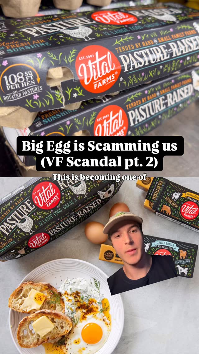
Make America Healthy Again and the Cultural Wave It Road are one of the most successful propaganda operations of our time. Let's talk about watching a movement find its aesthetic. America is on a seed oil free, back to the earth weighted vest tier, but this movement's aesthetics are by nature grassroots, rank printed labels, and based iconography. A culture that rose out of mimetics. A DM'd carousel between bros. I must live a certain way. Worst recognized visual of these brands before this year was probably Raw Farms Raw Milk. But now Ballerina Farms is bringing bad wife iconography to CPG. Subtle better effective aproncore. My most recent tallow fry pickup was from Maddie Matheson's Maddie's Patties. Tier a mouthful. A sister company to Matheson Good Co's Great Depression Maxing. And now we see this rebrand from colostrum company, Equip, that matches good design systems American nostalgia illustration and block serifs with a distinct absence of white or black. It encapsulates this movement well and feels like a real aesthetic change versus something like cowboy colostrum in the end of line best gen, the form of the primary colors, farm illustration, nature photos, rank excellent serif and rank combo, a mimetic statement, the anti made in a lab green bag or tub, a backlash to Soylent slop. Designers should start studying Remington and Wyeth because