@staffroomtalks
TikTok · Greenscreen Talking Head
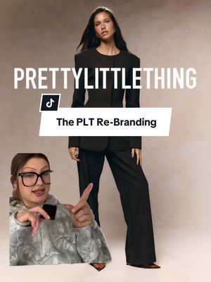
@staffroomtalks Our take on the Pretty Little Thing re-branding🧐 What do you think of this? #marketingagency #marketing #rebranding #prettylittlething #plt

@staffroomtalks
TikTok · Greenscreen Talking Head
@staffroomtalks Our take on the Pretty Little Thing re-branding🧐 What do you think of this? #marketingagency #marketing #rebranding #prettylittlething #plt
Performance
Video #5788 · Greenscreen Talking Head
[01]
A marketing professional analyzes PrettyLittleThing's recent rebranding by presenting a numbered breakdown of four key mistakes. She argues that the brand is ignoring its core consumer, mismatching price with quality, copying competitors, and executing a flawed design rollout. The creator uses screenshots of the brand's old and new websites and social media to support her critique, concluding that the rebrand alienates their existing customer base.
[02]
[03]
 912.6K16.1×Critiquing luxury brand marketing failures@orenmeetsworld · Breakdown
 69.7KBrand expert analyzes Kylie's rebrand@kiramackenz · Case Study Breakdown
 106.7KExpert critiques Cracker Barrel rebrand@orenmeetsworld · Expert Rate/Rank
 1.9MCreator critiques Apple's brand strategy@annakatehart · Hot Take
 1.3MAnalyzing the millennial brand aesthetic@eugbrandstrat · Breakdown
 265.8K198.2×Brand's controversial profit strategy explained@alexgreifeld · Case Study Breakdown
 568.9K3.9×Marketing rebrand critique and suggestion@girlbosstown · Case Study Breakdown
 161.1K2.9×Expert analyzes menswear brand content strategies@house.of.ag · Case Study Breakdown
 1.5M1.1×Comedic skit announces product launch@nudeproject · Skit
 409.9K40.9×Brand web design comparison breakdown@shovel.studio · Breakdown
 1.1M12.7×Running brands ranked by content strategy@house.of.ag · Good vs Bad
 566.6K15×Cosmetic developer explains where drugstore dupes beat high-end makeup@themarlenastell · Anti-Recommendation List
[04]
[05]
What stops the scroll in the first 3 seconds
Title hook · 55%
THE DOWNFALL OF PRETTY LITTLE THING
Verbal hook · 40%
Pretty Little Thing just made a huge mistake with their rebranding.
Visual hook · 5%
A split-screen composition showing the creator in a picture-in-picture overlay on top of a screenshot of the PrettyLittleThing Instagram profile, immediately establishing a commentary format.
[07]
The promise the opener makes, and how the video pays it back
Hook
A dramatic, high-stakes declaration that a well-known entity has made a major error, immediately creating intrigue and a desire to see the proof.
Payoff
A final, direct question to the audience, inviting them to participate in the judgment and share their own opinions, thereby converting passive viewing into active engagement.
[08]
The structural pattern this video runs on
Framework
The Expert Takedown
Systematically deconstructing a subject's failure by presenting a numbered list of 'mistakes,' each supported by visual evidence and expert commentary, to prove a central negative thesis.
The Authority Claim
The creator quickly establishes their credibility or expertise on the subject, framing the subsequent analysis as an informed critique rather than a simple opinion.
The Core Conflict Visualization
A stark 'before vs. after' comparison is presented to visually establish the central problem or change being critiqued, making the thesis instantly tangible.
The Numbered Gauntlet
A series of numbered points (the 'mistakes') are presented sequentially. This forms the main body of the video, where the argument is built piece by piece using a repeating micro-pattern.
The Final Evidence
A single, powerful piece of visual evidence is presented that encapsulates the overall failure, serving as an undeniable concluding proof point.
Our take on the Pretty Little Thing re-branding🧐 What do you think of this? #marketingagency #marketing #rebranding #prettylittlething #plt
title · beginning
THE DOWNFALL OF PRETTY LITTLE THING
informational · middle
Mistake #1: Ignoring their Consumer
informational · middle
Mistake #2: Price vs Quality
informational · middle
Mistake #3: Copying the Competition
informational · end
Mistake #4: The New Design
Little thing just made a huge mistake with better rebranding. Hi. My name is Val. I work at a marketing agency, and here's where I think they went wrong. Okay. So if you don't already know, no little thing used to look like this, and now they look like this. Mistake number one. It's a clear example of a brand prioritizing their own goals, their own KPIs, and not listening to their consumer. The PLT girl that I know, she wants a cute little going out top, a cute little crop top, some summer dresses. To rebrand is giving better, corporate girl, mature. That's just not their consumer. What even is this outfit it's giving Dune? It's pretty obvious that this rebrand came from higher up in the company. They wanted to do their rebrand, told marketing, just do it. Their tagline is the style source for every kind of it girl, but it's pretty obvious they're only targeting one type of girl. Mistake number two, the prices. This jacket is $265, and it's 95% polyester. Really trying to position themselves as more mature, more luxurious, they're made out of the same materials. It's just priced higher. Mistake number three, trying to keep up with their competitors. Companies do this all the time. When they rebrand, they end up alienating their consumer. Mistake number four, tier new branding. They marketed this rebrand as a legacy moment. It's just cursive font and burgundy. Groundbreaking. Also, the people that were sent PR before the rebranding received it after the rebrand, and it was in their old packaging. You can't go from this to this and expect to target the same consumer. What do you guys think?