Viral Hooks
Trending short videosFixing card case design flaw
C

@craighillcompany

Instagram · Show and Tell

@craighillcompany Unleash your potential. The swoop-down lid on our Summit Card Case doesn't intersect the internal volume, allowing you to use every cubic inch for whatever you want. So, what would you put in here?

View original on Instagram

The edit1 shot · 2 text
Shots Text1:14

Performance

Views
4.9M
Likes
100.4K
Comments
395
Engagement
2.1%
Outlier
1.1×
Length · 18 Apr 2025
1:14

Video #19410 · Show and Tell

Fixing card case design flawfrom @craighillcompany

[01]

Overview

The creator demonstrates a design flaw in a card case prototype where the lid collides with the contents. They walk through two failed iterations—moving the pivot and shrinking the lid—explaining why each didn't work, before revealing the final 'swoop-down' solution that balances function and aesthetics.

[02]

Simple outline

  1. 1Visualize mechanical failure
  2. 2Test obvious solution
  3. 3Reveal hidden drawbacks
  4. 4Present final synthesis
  5. 5Show finished product

[03]

Related videos

[04]

Classification

Concepts
Origin StoryBehind The ScenesProduct Showcase
Elements
Physical Product DemonstrationVoiceover
Account

[05]

Hook analysis

What stops the scroll in the first 3 seconds

Verbal hook · 35%

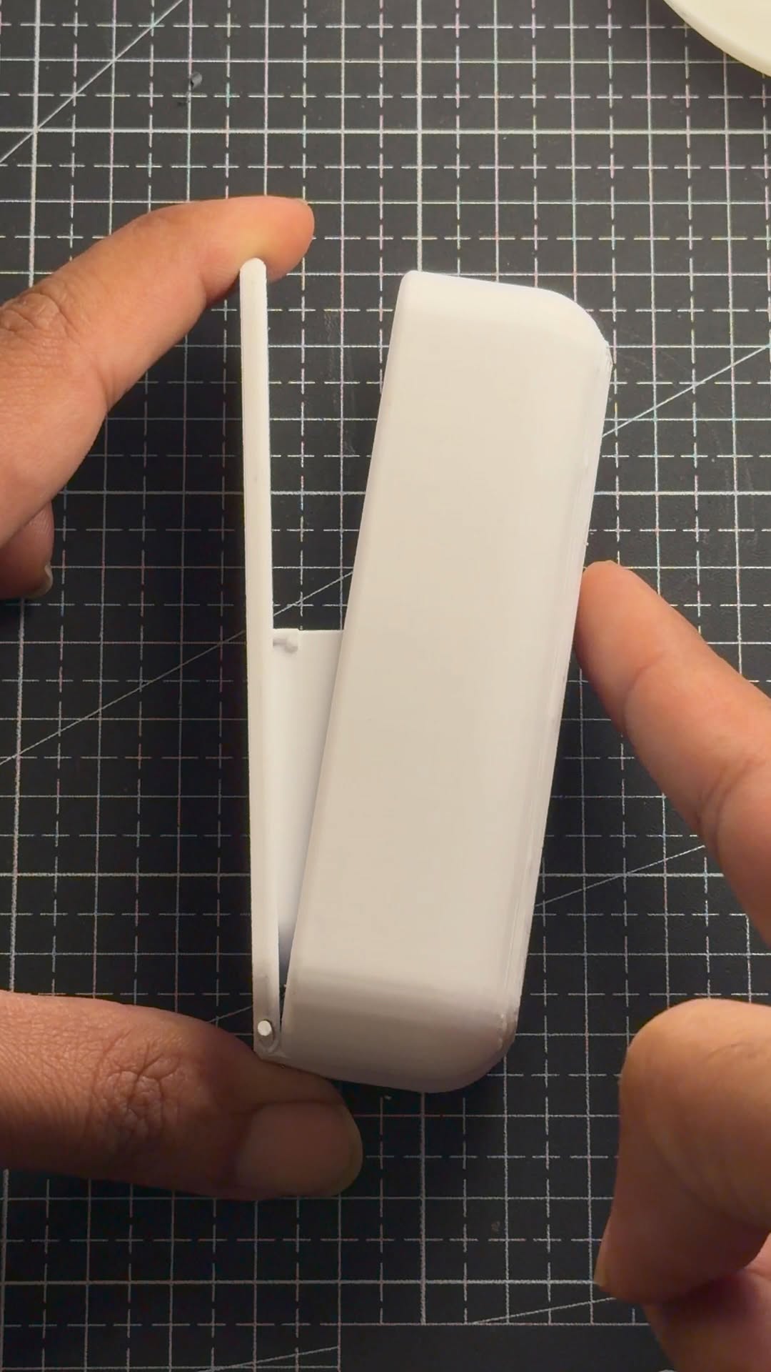
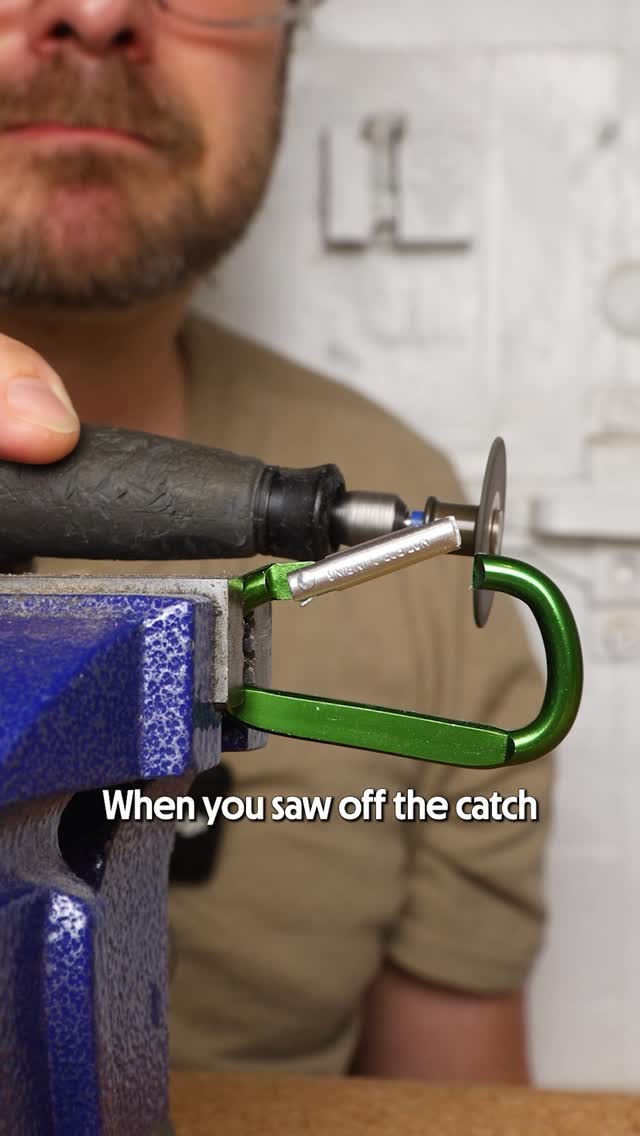
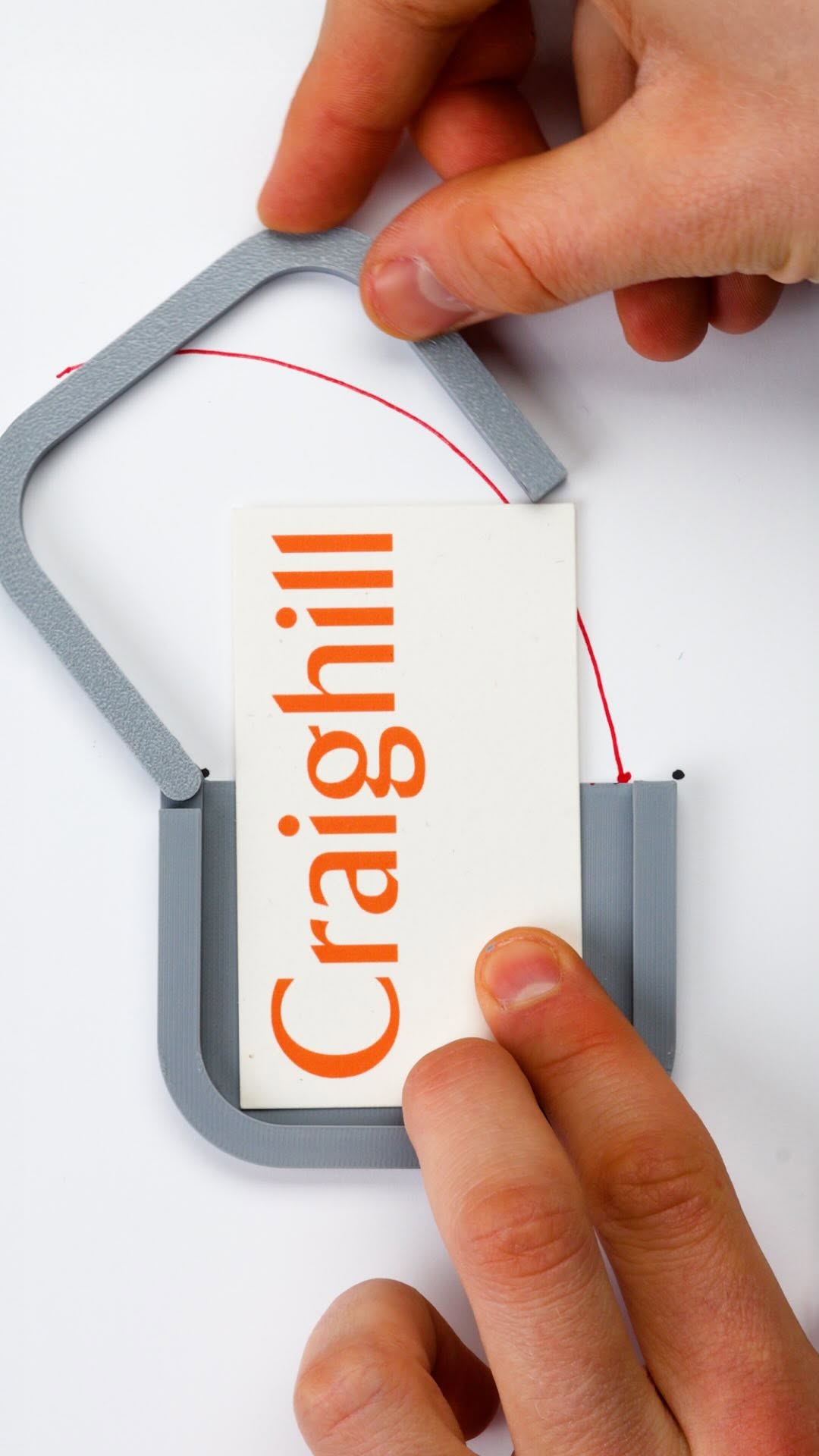
The path that this front lip traces collides with the interior volume that you're storing, that's a problem.

Visual hook · 65%

A close-up demonstration of a 3D printed prototype part moving and physically colliding with a red line or object, visually illustrating the design flaw immediately.

[06]

Hook template

Steal this for your own video

Close-up: move [product component] until it visibly collides with [the thing it needs to accommodate], instantly revealing the [design flaw].

  • — Close-up: move a laptop hinge until it visibly collides with the display cable, instantly revealing the clearance flaw.
  • — Close-up: move a kitchen drawer until it visibly collides with the cabinet handle, instantly revealing the spacing flaw.
  • — Close-up: move a stroller folding joint until it visibly collides with the storage basket, instantly revealing the fitment flaw.

[07]

Hook and payoff

The promise the opener makes, and how the video pays it back

Hook

The Visual Constraint: Using a marker to physically draw a collision path on a prototype, making an invisible mechanical problem immediately tangible.

Payoff

The Material Transformation: Transitioning from the rough 3D-printed prototype to the polished final metal product to anchor the theoretical design journey in a premium reality.

[08]

Narrative framework

The structural pattern this video runs on

Framework

The Iterative Design Arc

Demonstrating value by visually proving why the final design is the only logical solution to a series of mechanical and usability constraints.

  1. 1

    The Strawman Solution

    Implementing the most obvious, logical fix (moving the hinge) to show why the 'easy' answer is insufficient.

  2. 2

    The Usability Gap

    Critiquing the strawman solution to reveal secondary problems (accessibility and aesthetics) that the audience wouldn't have considered.

  3. 3

    The Hybrid Unlock

    Introducing the final design concept as a synthesis that resolves the initial mechanical flaw without triggering the secondary usability issues.

  4. 4

    The Logic Check

    Validating the new design with the same visual test used in the hook (the red line), proving the problem is solved.

Themes

  • Problem solving
  • Iterative design
  • Functionality vs Aesthetics

Techniques

  • Demonstration
  • Comparison
  • Storytelling

Trends

  • Design process reveal
  • Satisfying mechanics

Post caption

Unleash your potential. The swoop-down lid on our Summit Card Case doesn't intersect the internal volume, allowing you to use every cubic inch for whatever you want. So, what would you put in here?

Text overlays

  • branding · middle

    Craighill

  • contextual · middle

    Idea three

Transcript

The path that this front lip traces collides with the interior volume that you're storing, that's tier problem. We can't do that. We gotta change it. Let's move it all the way to the top 100%. That solved the problem. You're not colliding with that interior volume at all. There's two drawbacks to that. When you have that opening so high up, your cards are basically fully seated all the way inside. You kinda have to, like, dump out all your cards and pull one out and then put the rest back in. And the second one is having this, like, really proportionally small lid. It just doesn't look very good. Idea three, which is, like, a blend of these two ideas, maintaining that hinge in the top corner, but then dragging that front edge of the lid all the way down. It stays fully outside of the interior volume, so it's never gonna intersect with the cards. What happens on top of that, in the open position, so much of your card is no exposed, and so you bad easily grab a single card, not to, like, dump them all out. We realized that, like, actually only a small scoop is totally enough to be able to access your cards. It still has that full clearance that it provides around your cards. We also just thought it looks kinda cool. So this is the arrangement that we decided to carry forward into the final design. Anything that's small and insignificant, you can carry in here. People put all sorts of things in here. You can put whatever you want. We're not your parents.

Fixing card case design flaw | Viral Hooks