@frontoffice.co
TikTok · Yap
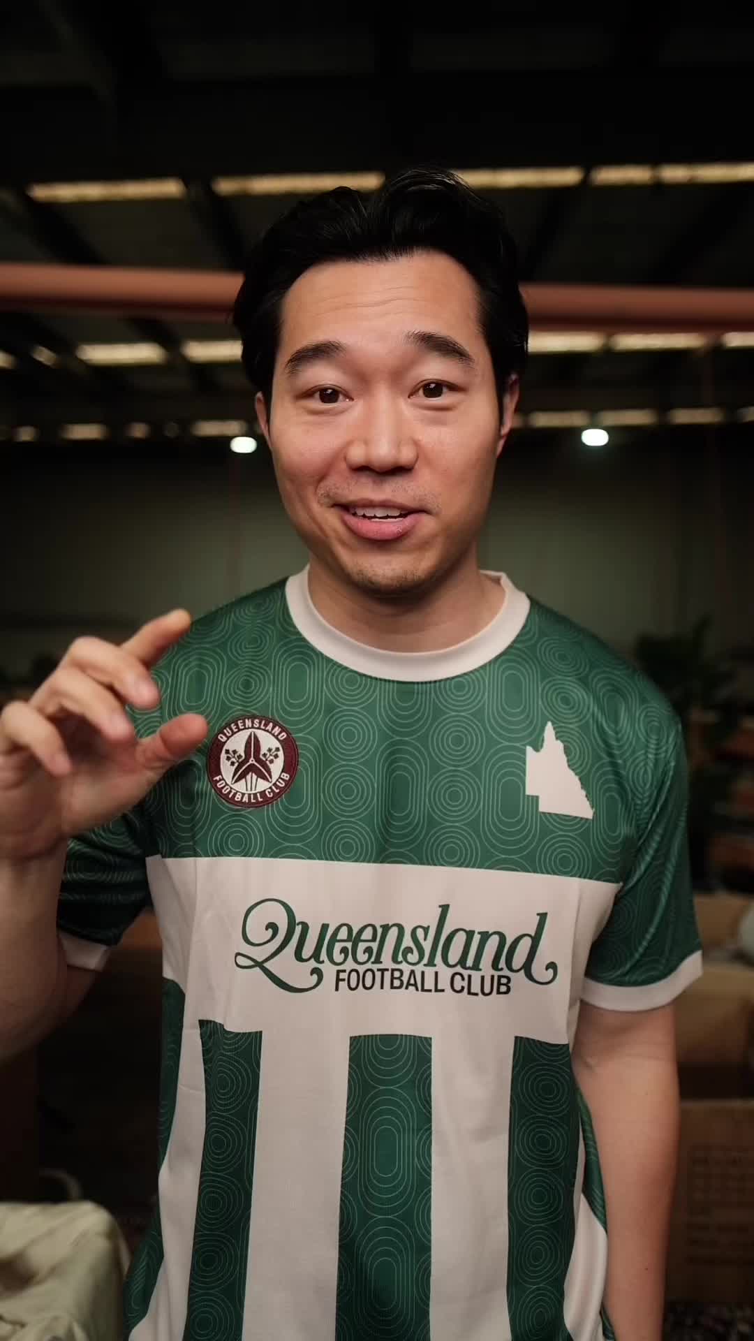
@frontoffice.co Designing the QFC ‘Jailhouse’ jersey, based on the Port Adelaide Wharf/Prison Bar guernsey #sportswear #SmallBusiness #melbournefashion #aussierules #footballkits

@frontoffice.co
TikTok · Yap
@frontoffice.co Designing the QFC ‘Jailhouse’ jersey, based on the Port Adelaide Wharf/Prison Bar guernsey #sportswear #SmallBusiness #melbournefashion #aussierules #footballkits
Performance
Video #2394 · Yap
[01]
The creator explains the historical rivalry between two Australian football teams, Collingwood and Port Adelaide, over their black and white striped jerseys. He details the origin and design significance of Port Adelaide's historical jersey, then reveals how he created his own 'Queensland Football Club' jersey as a tribute, explaining his creative choices and showing the final product.
[02]
[03]
 149.3K41.4×Explaining foreign league jersey culture@gamedaygrails · Opportunity Explainer
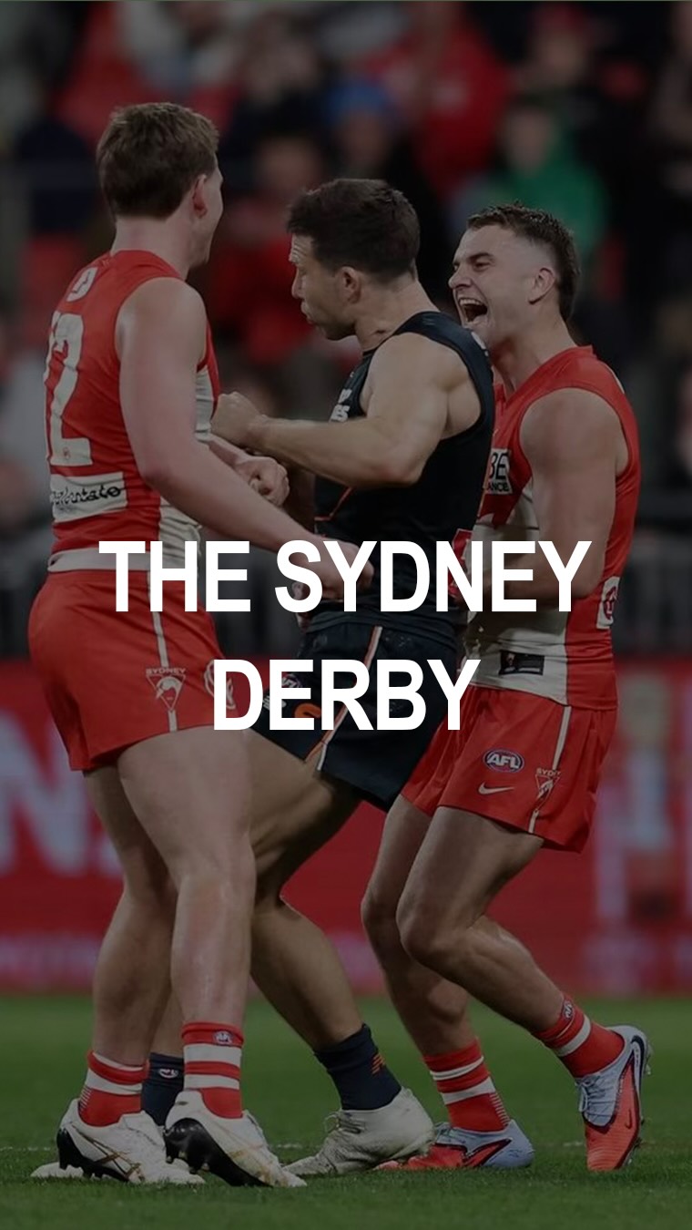 111.6K11×Rival sports team history breakdown@gsnwilliams · Breakdown
 157.7K43.2×Process of elimination team choice@gamedaygrails
 161.2K12.1×Creator commentary on athlete fashion@gsnwilliams · Breakdown
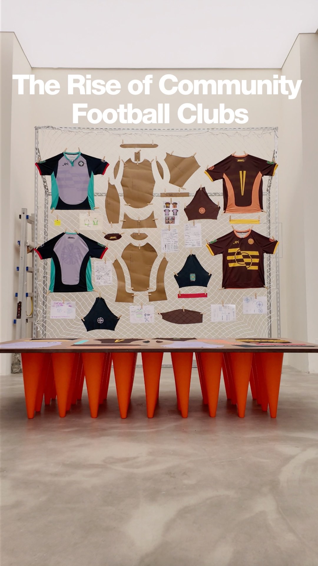 52.8K1.8×Football community fashion pop-up showcase@yaw_majesty · Brand Showcase
 148.2K40.6×Creator gets expert help picking team@gamedaygrails · Skit
 173.8K2×Analyzing rebrand and proposing alternative@sportsmarketing_ · Case Study Breakdown
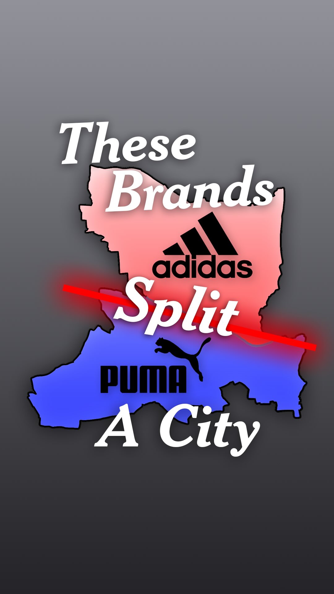 187.8KSibling rivalry creates two brands@alextwma · Origin Story
 471.8K137×NFL graphic design history lesson@lukas.mullen · Breakdown
 89.5K1.7×Explaining a uniform's brand story@jordanrogers · Origin Story
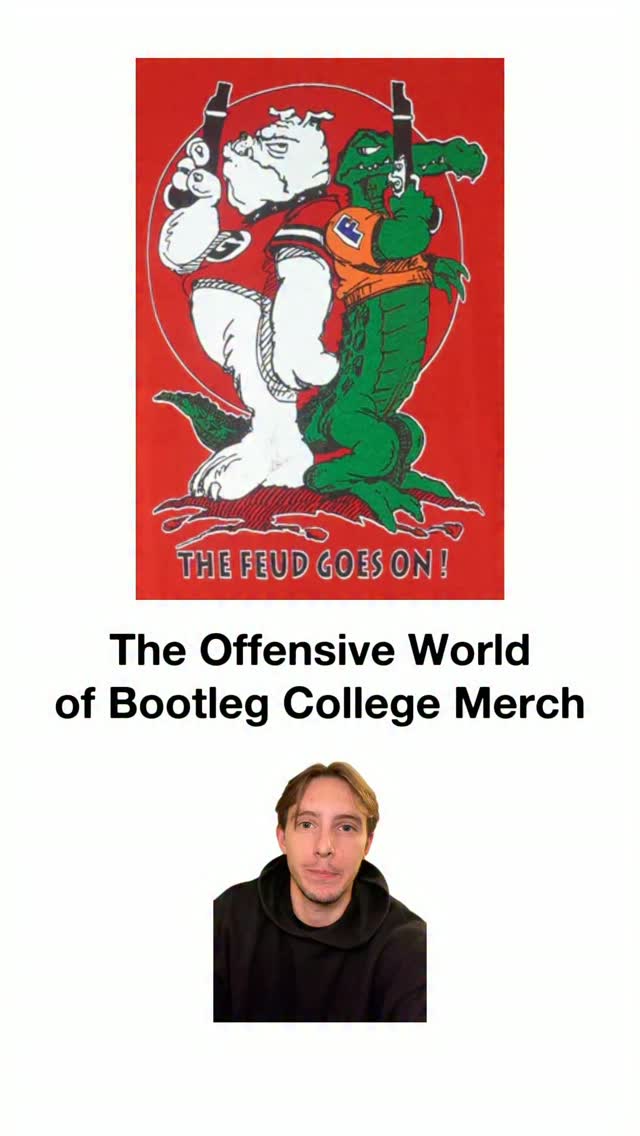 640.7K181.1×Comparing old vs new merch@lukas.mullen · Nostalgia Highlight
 371.4KBrand founder explains rip-off irony@frontoffice.co · Origin Story
[04]
[05]
What stops the scroll in the first 3 seconds
Verbal hook
This is the story behind this jersey.
Visual hook
A direct-to-camera shot of the creator wearing the jersey he is about to discuss, holding his hand up to the camera to begin his story.
[07]
The promise the opener makes, and how the video pays it back
Hook
The Artifact Hook: The creator shows the final product and explicitly states they will tell its origin story, creating an immediate mystery and a clear narrative promise.
Payoff
The Final Reveal: The creator physically puts on and showcases the finished product, fulfilling the hook's promise and presenting the creation as the tangible, satisfying conclusion to the historical story.
[08]
The structural pattern this video runs on
Framework
The Historical Tribute Blueprint
Using a niche historical conflict or forgotten story as the inspiration and justification for creating a new product. The product is framed as the satisfying resolution to the historical narrative.
The Core Conflict Setup
Establishes two opposing forces within a niche and the central point of contention between them. This creates a simple, relatable 'underdog vs. establishment' dynamic.
The 'Actually...' Pivot
Introduces a surprising historical fact that complicates the initial narrative. This demonstrates expertise, adds a layer of intrigue, and makes the viewer feel they are learning insider information.
The Lost Heritage Justification
Explains the meaningful symbolism and thoughtful design behind the 'losing' side's original concept, building emotional investment and justifying its importance.
The Creator's Thesis
The creator states a personal judgment on the conflict, aligning the audience with their perspective and setting up their own creative intervention as a necessary resolution.
The Project Reframe
Connects the grand historical narrative to the creator's personal project, explaining how it evolved into a meaningful tribute, thereby elevating the product's significance.
The Design Deconstruction
Breaks down the specific creative choices made to adapt the historical concept, showing how the creator's own brand identity was merged with the original inspiration.
Designing the QFC ‘Jailhouse’ jersey, based on the Port Adelaide Wharf/Prison Bar guernsey #sportswear #SmallBusiness #melbournefashion #aussierules #footballkits
This is the story better this jersey. So Collingwood are a huge football team. They play in Melbourne, and they wear black and white striped jerseys. Kinda like Juventus, kinda like Knox County, Newcastle, blah blah blah. Melbourne, they feel like they own the black and white jersey. There's this other club called Port Adelaide. Now tier play in Adelaide. And they've been wearing historically, they've been wearing that black and white jersey as well. And when they joined the national competition in '97, they were worst of compelled to change their jersey to appease Collingwood. This is the basis of the fight. And to provide context, the average person doesn't really care. But when I took a look at it, the history is actually quite interesting. Port Adelaide didn't always wear the black and white jersey. Wikipedia. Prior to nineteen o two, they were wearing a magenta jersey. They only swapped to black and white after they found that they were having trouble finding dyes that would last because they would rub off during the course of a game. Pretty interesting textile history anyway. So they swapped to a black and white, and they were going to wear until 1996. The design of the Port Adelaide jersey is actually quite nice really. It's got this horizontal bar and then these vertical straps that come from that. And that is to reflect the, the wharf and the pylons in the Worst Of Adelaide. And visually, it makes sense. It makes sense for the town. It makes sense for the history. I think it's a shame that they don't get to wear it. Okay. So I must admit, what started off as a bit of a project to make my next jersey a bit of a piss take of this argument between these two clubs has turned out to be a bit of a tribute project towards this Port Adelaide historical jersey. I think it's a cool way to introduce people from overseas into our Australian football history. So I've just taken my club colors and transposed that onto that Port Adelaide shape. So I've still got the horizontal bad, added in a subtle pattern to the background. But instead of the Worst Of Adelaide, what defines my club is that it's not a real club. I'm not even sure what type of football we play. To reflect that, I've got these kind of vague athletic shapes. I've got rings that represent a rank, like a track and field. I've good, like, a circular rings that kind of look like round cricket ovals. And the cream and green is something that reflects my club's colors. Tier it is. I think it looks quite nice. There you go.