Post caption
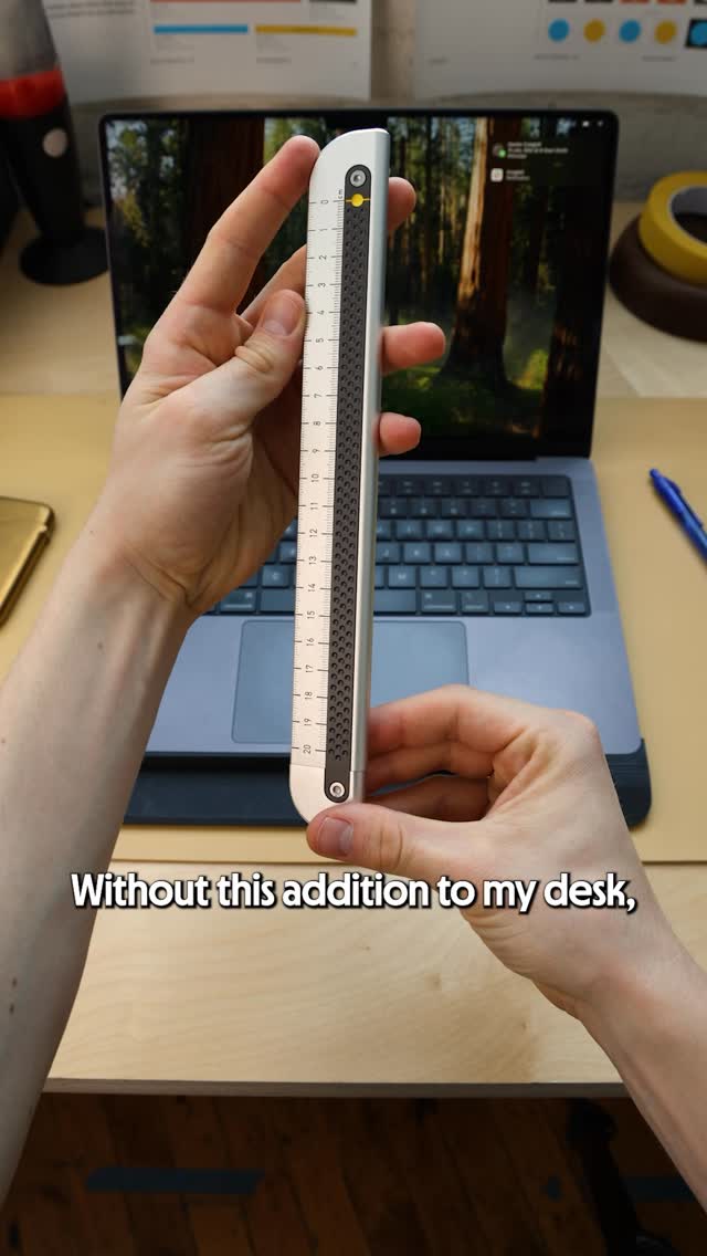
The ideal measuring device for us didn't exist, so we designed a new one. The Metrolog has the right balance of precision, functionality, and beauty, to make it our go-to 90 percent of the time when we need to take a measurement. We use it everyday and hope it can find a place in your practice too.
Let us know what you think below.
Transcript
Without this addition to my desk, if I see something on my computer and I'm trying to understand the actual dimensions, I typically would have to reach for a set of calipers, but they're overkill for 95% of the thing, and they don't really feel at home on my my desk. Obvious alternative to that is just a normal straight edge drawer, which serves a lot of the functions that we need for quick reference. It also adds in some additional functionality, and it looks tight and clean. But when I have this on my desk, I end up missing the calipers. We wanted to to pull the elements of these two tools better. Started with needing to nail the functionality. We're gonna make a careful incision on this straight edge ruler. You suddenly have this ability for that head to slide up and down, and you create this opening, these jaws. We took this basic construction and brought this rail architecture. It allows most of the additional functionality that you good with a pair of calipers. It also adds in being able to use it as a straight edge to cut, to grease a piece of paper. Now that we have like the basic functionality, we had to think about units of measurement. We have to straddle both imperial and metric worlds. The very simple decision that we made was to put metric on one side and imperial on the other. The additional feature that we discovered, the indicator line, could actually be used as a conversion tool. If I'm looking at a dimension, I can actually just flip it around and see what the indicator line is pointing to on the imperial side. Love that detail. Better up the final phase of the design process to make it an attractive best. We can actually start by looking at the indicator dot. We ended up taking inspiration from film cameras, a physically etched out shape, and then it's filled with ink. We like the way that that physical dot looked so much that we ended up continuing that as a pattern up the entire face of the rail, provide a little bit of texture and grip. And my I think favorite detail, different pit patterns on the imperial and the metric sides of tier chips always align with the graduations on the side that you're looking at. Taken all together, it did satisfy exactly what we were looking for. Right balance of a few different functionalities tier it looks like a considered attractive tool that I wanna have at my desk. It's like the product in our catalog that we reach for the most frequently. A reminder to obsess over the details, go beyond maybe what is necessary or expected. If we're gonna spend our time on earth making things, we should make them as good as we can make them.