@shwinnabegobrand
Instagram · Greenscreen Talking Head
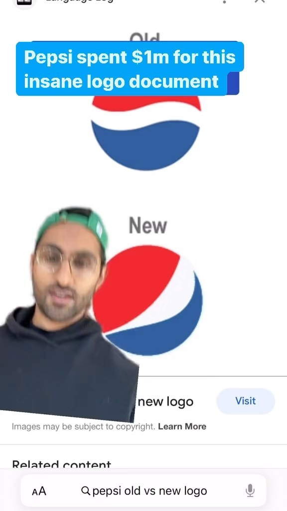
@shwinnabegobrand Pepsi spent $1m on this document which goes down in history as one of the wildest logo/rebrand decks of all time - on this week of FaF

@shwinnabegobrand
Instagram · Greenscreen Talking Head
@shwinnabegobrand Pepsi spent $1m on this document which goes down in history as one of the wildest logo/rebrand decks of all time - on this week of FaF
Performance
Video #38633 · Greenscreen Talking Head
[01]
The creator explains that Pepsi spent $1 million on a simple logo change, then reveals the absurdly complex design document created to justify it. He walks the viewer through several pages, sarcastically mocking the pseudo-scientific concepts like 'universal design principles,' 'perimeter oscillations,' 'gravitational pull,' and the 'Pepsi Universe.' He concludes by emphasizing the ridiculousness of the extensive document for a minor visual tweak.
[02]
[03]
 446.3K1.8×Designer pitches hypothetical Pepsi campaign@spaceboycole · Hypothetical Case Study
 261.7K4.2×Creator pitches fictional Cheetos merchandise.@spaceboycole · Hypothetical Case Study
 668.2K257×Creator reports on brand marketing stunt@migo_beer · Headlines
 749.3K55.9×Funny branding meeting skit@thisjamescoker · Skit
 685.9K218.7×Explains discontinued beer can failure@migo_beer · Case Study Breakdown
 821.7K2.4×Designer pitches color-changing Coors merch@spaceboycole · Hypothetical Case Study
 161.9K6.6×Exposing brand changes after buyout@zephzoid · Investigative Breakdown
 974.1K3.5×Creator explains brand positioning using a water bottle price comparison@mofe_ade · Breakdown
 123.5KRapid fire branding news roundup@orenmeetsworld · Rapid Fire Listicle
 600.6K52.8×Brand policy critique with evidence@santacruzpaleo · Conspiracy Breakdown
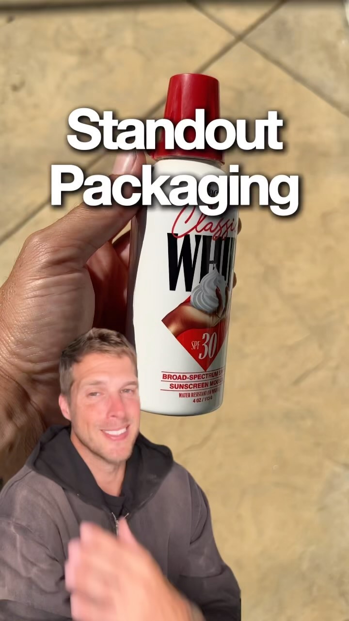 672.5K4×Creator reviews unique product packaging.@orenmeetsworld · Rapid Fire Listicle
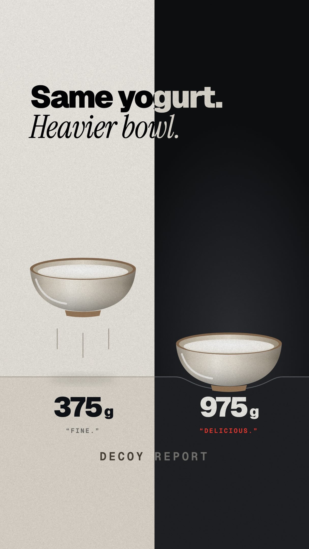 170.6K2×Explains psychology of product weight@decoyreport · Case Study Breakdown
[04]
[05]
What stops the scroll in the first 3 seconds
Title hook · 55%
Pepsi spent $1m for this insane logo document
Verbal hook · 30%
Pepsi paid over a million dollars just to change this logo from the old logo to the new logo.
Visual hook · 15%
A split-screen style visual showing the 'Old' and 'New' Pepsi logos, with the creator positioned in the middle, immediately establishing the video's core comparison.
[06]
Steal this for your own video
spent for
[07]
The promise the opener makes, and how the video pays it back
Hook
The Outrageous Premise. Present a shocking fact or statistic about a subject that seems disproportionate to the outcome (e.g., high cost for a minor change), creating an immediate curiosity gap.
Payoff
The Full-Circle Judgment. Return to the simple initial subject from the hook, re-contextualizing it with the absurd journey. Deliver a final, concise, and relatable judgment on the initial premise.
[08]
The structural pattern this video runs on
Framework
The Absurdity Audit
To deconstruct an official or formal document/process, revealing its inherent absurdity by escalating through its most ridiculous claims to justify a simple or questionable outcome.
The Grandiose Foundation
Reveal the first piece of evidence, which attempts to ground the subject in a deep, important, or historical context that feels like a significant overreach.
The Jargon Deconstruction
Showcase a section that uses overly technical or complex language and translate it into a simple, unimpressive action, exposing the jargon as a facade.
The Unnecessary Complexity
Present a blueprint, schematic, or process that is incredibly detailed, highlighting the disparity between the effort shown and the simplicity of the final product.
The Baffling Rationale
Show a piece of the justification that is confusing, arbitrary, or nonsensical, where the intended meaning is lost in its own abstraction.
The Metaphysical Escalation
Uncover a claim that leaps into an unrelated, grandiose field (e.g., science, philosophy, physics), pushing the justification beyond the realm of reason.
The Cosmic Punchline
Reveal the most extreme and absurd claim, one that scales the subject to a universal or cosmic level, serving as the peak of the ridiculousness.
Pepsi spent $1m on this document which goes down in history as one of the wildest logo/rebrand decks of all time - on this week of FaF
title · beginning
Pepsi spent $1m for this insane logo document
Pepsi paid over a million dollars just to change this logo from the old logo to the new logo. What's truly insane is the document that went along with it. Look at this. Universal design principles. As you can see, a bunch of increasingly large and small circles with somewhat meaningless timelines here dating all the way back from 3,000 BC to 2009. You have the Mona Lisa, Leonardo da Vinci's Vitruvian Man. Kind of setting the stage of something monumental is about to be presented here. Okay. Tracing the Pepsi DNA. Perimeter oscillations. Okay, this is just just drawing circles around all of this stuff. This is love I love when graphic designers point to the golden ratio. It's like, okay, the golden ratio is cool. This is just an insane sheet, though. You would think this is a schematic for, like, building some, like, serious work of engineering. Okay. Here you start to see the new logo. I actually like this right column. I think it's like, okay, cool. You show this, like, extensibility of the logo and a variety of things. You have this I, multiple points of view, one best, this arbitrary set of degrees. I'm not even sure what's being communicated here. Creation of the logo identity, gravitational pull, typical light path, gravitational pull of Pepsi, Pepsi proposition in the Pepsi aisle, relativity of time and space. What the You this last slide is unreal. Light years, Pepsi, galaxy, Pepsi worse. It's like a PHE document in quantum mechanics best to pitch this logo change of making it horizontal to, like, slightly vertical. Nuts. They paid a million dollars for that.