Viral Hooks
Trending short videosGraphic art for Radiohead album analysis
S

@sambience1205

Instagram · Carousel
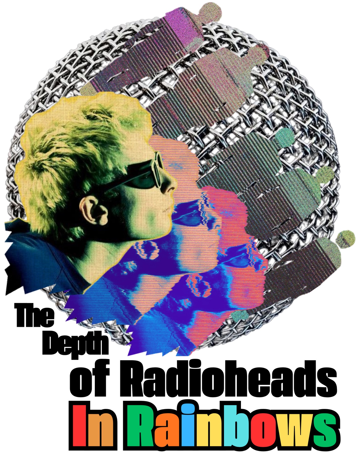
@sambience1205 In Rainbows feels like the result of an entire careers worth of experience for the band Radiohead. After finishing their contract with EMI following Hail to the Thief, the band was completely free. They had no label pressure, no commercial expectations, just total creative freedom. And they used that freedom to release In Rainbows in one of the most radical ways the music industry had ever seen: a pay-what-you-want model where fans could decide what the album was worth to them. At the time, for a band as influential and popular as Radiohead, it completely challenged the traditional record label system and changed the conversation around how music could be distributed. But what makes In Rainbows truly special is the music itself. In many ways, it feels like a culmination of everything the band had explored across their earlier records. The emotional weight and songwriting depth of OK Computer, the sonic experimentation of Kid A, and the textural complexity they continued refining in later projects all come together here in a way that feels incredibly balanced and intentional. The album is intricate without being overwhelming, experimental without losing warmth. Tracks feel organic, intimate, and deeply human, with Thom Yorke’s writing often reflecting on love, anxiety, vulnerability, and connection in a way that feels both personal and universal. Each song feels like an abstract painting with every texture and every sound having a purpose. Over time, In Rainbows has only become more timeless. It stands not just as one of Radiohead’s most beautiful records, but as proof that when artists are given complete creative freedom, they can produce something truly timeless. #radiohead #thomyorke #bestband #bestartist #music

View original on Instagram

The edit1 shot · 1 text
Shots Text

Performance

Views
186.5K
Likes
12.4K
Comments
44
Engagement
6.7%

Video #42274 · Carousel

Graphic art for Radiohead album analysisfrom @sambience1205

[01]

Overview

This is a single-image graphic design post that acts as a cover for a detailed written analysis of Radiohead's album 'In Rainbows'. The artwork features a collage of a person's profile with glitch effects, vibrant colors, and bold typography, visually representing the album's depth and complexity discussed in the caption.

[02]

Simple outline

  1. 1Arrest attention with visuals
  2. 2Declare the central theme
  3. 3Drive to caption for depth

[03]

Related videos

[04]

Classification

Format
Concepts
Editorial CarouselArtistic Homage
Elements
Text OverlayDigital CollageRetro Aesthetic

[05]

Hook analysis

What stops the scroll in the first 3 seconds

Title hook · 35%

The Depth of Radioheads In Rainbows

Verbal hook · 10%

In Rainbows feels like the result of an entire careers worth of experience for the band Radiohead.

Visual hook · 55%

A visually complex and colorful digital collage with a retro, glitch-art aesthetic. The layered portraits, vibrant typography, and contrasting textures create a striking composition that immediately signals a creative and in-depth analysis of the subject.

[07]

Hook and payoff

The promise the opener makes, and how the video pays it back

Hook

The entire first (and only) slide serves as the hook. It combines a stylized, high-effort visual with a bold text overlay that functions as a title or thesis statement, compelling the user to stop and read the caption for the full story.

Payoff

The payoff is intentionally withheld from the visual sequence and is delivered entirely within the caption. The slide's purpose is to build anticipation for this textual payoff, encouraging a deeper engagement with the post.

[08]

Narrative framework

The structural pattern this video runs on

Framework

The Cover Page Framework

This framework uses a single, high-impact slide as a 'cover page' for a detailed text-based analysis delivered in the caption. The slide's role is to stop the scroll with compelling visuals and frame the topic with a concise, declarative text overlay, creating intrigue that drives the audience to the caption for the full narrative.

  1. 1

    The Thematic Proclamation

    This single beat presents the central argument or topic of discussion as a title. It establishes the subject and the analytical perspective, functioning as the cover of an in-depth article.

Themes

  • Music history
  • Artistic freedom
  • Album analysis
  • Creative expression

Techniques

  • Digital collage
  • Color manipulation
  • Layering
  • Typography

Trends

  • Retro graphic design
  • Editorial Instagram posts

Post caption

In Rainbows feels like the result of an entire careers worth of experience for the band Radiohead. After finishing their contract with EMI following Hail to the Thief, the band was completely free. They had no label pressure, no commercial expectations, just total creative freedom. And they used that freedom to release In Rainbows in one of the most radical ways the music industry had ever seen: a pay-what-you-want model where fans could decide what the album was worth to them. At the time, for a band as influential and popular as Radiohead, it completely challenged the traditional record label system and changed the conversation around how music could be distributed. But what makes In Rainbows truly special is the music itself. In many ways, it feels like a culmination of everything the band had explored across their earlier records. The emotional weight and songwriting depth of OK Computer, the sonic experimentation of Kid A, and the textural complexity they continued refining in later projects all come together here in a way that feels incredibly balanced and intentional. The album is intricate without being overwhelming, experimental without losing warmth. Tracks feel organic, intimate, and deeply human, with Thom Yorke’s writing often reflecting on love, anxiety, vulnerability, and connection in a way that feels both personal and universal. Each song feels like an abstract painting with every texture and every sound having a purpose. Over time, In Rainbows has only become more timeless. It stands not just as one of Radiohead’s most beautiful records, but as proof that when artists are given complete creative freedom, they can produce something truly timeless. #radiohead #thomyorke #bestband #bestartist #music
Text overlays

  • title · photo_0

    The Depth of Radioheads In Rainbows

Graphic art for Radiohead album analysis | Viral Hooks