@staffroomtalks
TikTok · Talking Head Edit
@staffroomtalks Take it from an email marketing expert: yes, @rhode skin’s emails really are THAT good 🤌🏼✨ #marketingagency #emailmarketing #emailmarketingtips #strategy #newsletters #marketing

@staffroomtalks
TikTok · Talking Head Edit
@staffroomtalks Take it from an email marketing expert: yes, @rhode skin’s emails really are THAT good 🤌🏼✨ #marketingagency #emailmarketing #emailmarketingtips #strategy #newsletters #marketing
Performance
Video #5829 · Talking Head Edit
[01]
The creator presents a detailed case study on the email marketing strategy of the skincare brand Rhode. She breaks down the analysis into seven key points, including minimalistic design, mobile optimization, copywriting, scarcity tactics, sensory experience, user-generated content, and themed launches, using screen-captured examples of Rhode's emails as B-roll to illustrate each point. She concludes by asking viewers to suggest other brands for future analysis.
[02]
[03]
 119.5K1×Hypothetical brand marketing case study@brian_blum · Hypothetical Case Study
 402.2K54.1×Showcasing top email marketing examples@wellcopymax · Case Study Breakdown
 71.8K2.9×Creator analyzes Hailey Bieber's strategy@kiramackenz · Case Study Breakdown
 94.8K11.2×Brand strategy breakdown from transcript@kiramackenz · Case Study Breakdown
 1.2M2.4×Marketing breakdown of viral product@kiramackenz · Case Study Breakdown
 497.6K75.1×Marketing teardown and redesign example@wellcopymax · Hypothetical Case Study
 464.8K162.8×Marketing case study breakdown video@levysky.marketing · Case Study Breakdown
 280KGreenscreen marketing campaign strategy breakdown@sailawaymedia · Case Study Breakdown
 225K3.9×Breakdown of aspirational carousel strategy@house.of.ag · Case Study Breakdown
 204KShowcasing custom client appreciation gifts@lashed.bylisa · Brand Showcase
 103.5KBreakdown of five influential running brand marketing campaigns@orenmeetsworld · Breakdown
 257.2K23.6×Analyzing a brand's marketing strategy@orenmeetsworld · Case Study Breakdown
[04]
[05]
What stops the scroll in the first 3 seconds
Title hook · 55%
CASE STUDY: Rhode's Email Marketing
Verbal hook · 25%
Talk about Rhodes email marketing.
Visual hook · 20%
A medium close-up of the speaker addressing the camera directly while holding a product, set against a visually interesting brick wall background. The direct address and product prop create immediate focus and context.
[07]
The promise the opener makes, and how the video pays it back
Hook
A title card and opening line that frames the video as an authoritative 'Case Study' on a specific, popular subject, promising insider analysis.
Payoff
A direct call-to-action that invites the audience to suggest topics for future analyses, creating an engagement loop and positioning the creator as a go-to resource.
[08]
The structural pattern this video runs on
Framework
The Expert Deconstruction
A systematic breakdown of a subject's success factors, presented as an expert-led case study. Each point is stated, explained, and then proven with visual evidence to establish authority and provide high-density value.
The Aesthetic Foundation
Establishes the subject's core visual identity and design philosophy as the first pillar of success.
The Accessibility Mandate
Addresses the critical technical execution required for the modern consumer experience, proving competence.
The Voice & Tone Persona
Transitions from visual and technical aspects to the subject's communication style and brand personality.
The Psychological Trigger
Introduces a classic marketing tactic that leverages consumer psychology (e.g., FOMO) to drive immediate action.
The Sensory Appeal
Demonstrates how the subject uses digital media to evoke a physical or sensory experience, creating a deeper connection.
The Social Proof Engine
Highlights the strategy of using community validation and third-party content to build trust and authenticity.
The Cohesive Campaign
Shows how all previous principles are integrated into a unified, themed strategy for a specific event or launch.
Take it from an email marketing expert: yes, @rhode skin’s emails really are THAT good 🤌🏼✨ #marketingagency #emailmarketing #emailmarketingtips #strategy #newsletters #marketing
title · beginning
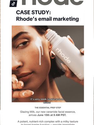
CASE STUDY: Rhode's Email Marketing
informational · beginning
1. MINIMALISTIC DESIGN
informational · beginning
2. MOBILE OPTIMIZATION
informational · middle
3. COPYWRITING TECHNIQUES
informational · middle
4. URGENCY/SCARCITY
informational · middle
5. SENSORY EXPERIENCE
informational · middle
6. USER GENETATED CONTENT
informational · end
7. THEMED LAUNCHES
contextual · middle
FEELS LIKE: Thick glaze that glides on smoothly
contextual · middle
SMELLS LIKE: A lick of salted caramel gelato
Talk about Rhodes email marketing. First up is their minimalistic design. It's very sleek, simple, and on rank, like tier product packaging. It's not too cluttered. Mobile optimization is key, and Rhodes emails are mobile optimized. You can easily go onto your desktop or your phone and scroll through tier emails. And they're copied. It's very engaging, personal, and relatable, so you kind of feel like you're getting an email from Haley herself. They also use urgency and scarcity tactics, like using words like limited stock or back in stock, restock to make you want to purchase the product right now. FOMO is real, people. As a beauty brand, they do a really great job at showcasing the texture of their products throughout their emails. As consumers, you wanna know how a skincare product is gonna feel on your skin, and No does a really great job at capturing that experience. This bad, like, a sensory layer to their communications. Also really important to include a lot of user generated content throughout your marketing tactics, and No does a really good job reviews and testimonials and real people using tier product. This not only boosts your customers trust in your brand, but it also encourages your subscribers to post their own reviews and testimonials. When Rhode launches a new product, they often introduce this corresponding color that matches the theme of the product, and they use this within their email campaigns. During the launch of their pocket blushes, they changed the template to include this different good logo at the top, which had a bunch of pink around it. While for the pineapple refresh cleanser launch, they started to include this vibrant yellow accent color throughout their campaigns, creating a cohesive and visually appealing experience. Let us know what brands you'd like us to analyze next.