Viral Hooks
Trending short videosFixing Pringles overly minimal logo design
T

@thebrandonshepherd

Instagram · Greenscreen Talking Head

@thebrandonshepherd I rebranded Pringles to fix its minimal design. . . . . . #branding #design #graphicdesign #logo #brand #logodesigner #graphicdesigner #designer #creative #brandidentity #logodesign #freelance #logos #illustrator #typography #logodesigns #logotype #freelancedesigner #logoinspiration #brandidentity #brandingdesign #brandinginspiration #packagedesign #packagingdesign #packaging #tutorial

View original on Instagram

The edit1 shot · 4 text
Shots Text

Performance

Views
2.3M
Likes
279.2K
Comments
1.6K
Engagement
12.2%
Outlier
3×

Video #11474 · Greenscreen Talking Head

Fixing Pringles overly minimal logo designfrom @thebrandonshepherd

[01]

Overview

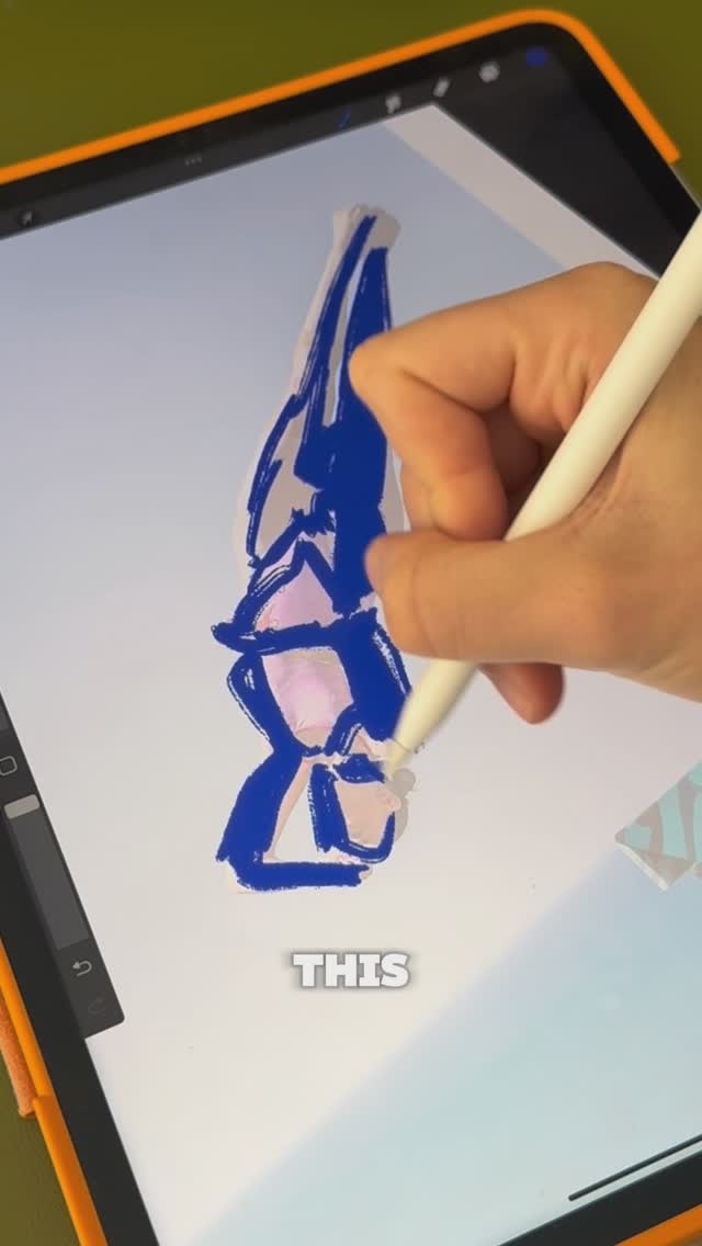
The creator redesigns the Pringles logo to address its minimal style by illustrating a full body for the mascot, adding detailed shading, and creating 3D typography. He uses reference images like a ringmaster and the Monopoly man to transform the character into a showman, explaining his design choices and techniques throughout the process.

[02]

Simple outline

  1. 1Critique current design
  2. 2Establish visual concept
  3. 3Illustrate character details
  4. 4Apply professional shading
  5. 5Reveal final transformation

[03]

Related videos

[04]

Classification

Concepts
Before/After TransformationProcessTutorial / How To
Elements
Image OverlaySpeed RampingVoiceover

[05]

Hook analysis

What stops the scroll in the first 3 seconds

Title hook · 45%

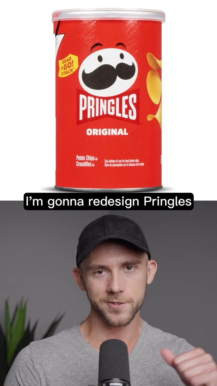
I'm gonna redesign Pringles

Verbal hook · 40%

Gonna redesign Pringles to fix its overly minimal style.

Visual hook · 15%

A standard Pringles can is shown, followed by the logo being isolated and humorously compared to a plain egg.

[07]

Hook and payoff

The promise the opener makes, and how the video pays it back

Hook

The Fix-It Declaration: Immediately states the subject and the specific problem (e.g., over-minimalism) that the creator intends to solve.

Payoff

The Character Arc Reveal: Unveils the final result, contrasting the new 'personality' of the design against the 'soulless' original.

[08]

Narrative framework

The structural pattern this video runs on

Framework

The Corrective Redesign

Identifying a perceived flaw in a popular subject (usually 'too simple' or 'boring') and executing a complex, skill-based transformation to 'fix' it, narrated with technical insight.

  1. 1

    The Visual Diagnosis

    Analyzes the current design's specific visual failure (e.g., 'egg with a mustache') and establishes a new thematic archetype (e.g., 'Ring Leader') to guide the fix.

  2. 2

    The Concept Synthesis

    Demonstrates the initial drafting phase by merging the original subject with external references to create a new silhouette.

  3. 3

    The Detail Restoration

    Systematically re-introduces complexity and specific features that were lost in the original version, narrating the artistic choices.

  4. 4

    The Authority Insert

    Breaks the narrative flow to deliver a specific, high-value technical tip (e.g., color theory advice) that establishes the creator's expertise.

  5. 5

    The Brand Integration

    Transforms standard branding elements (like logos or text) into integrated parts of the illustration's geometry (e.g., the bow tie becoming the logo).

  6. 6

    The Composition Assembly

    Places secondary elements and atmospheric details to unify the design into a finished product.

Themes

  • Maximalism vs Minimalism
  • Brand Identity
  • Creative Process

Techniques

  • Vector Illustration
  • Shading
  • Typography design

Trends

  • Logo redesign challenges
  • Fixing corporate minimalism

Post caption

I rebranded Pringles to fix its minimal design. . . . . . #branding #design #graphicdesign #logo #brand #logodesigner #graphicdesigner #designer #creative #brandidentity #logodesign #freelance #logos #illustrator #typography #logodesigns #logotype #freelancedesigner #logoinspiration #brandidentity #brandingdesign #brandinginspiration #packagedesign #packagingdesign #packaging #tutorial

Text overlays

  • title · beginning

    I'm gonna redesign Pringles

  • contextual · beginning

    to fix its overly minimal style.

  • contextual · middle

    PRINGLES

  • contextual · end

    ORIGINAL

Transcript

Gonna redesign Pringles to fix its overly minimal style. Now Pringles did used to look cool, but now it's basically just an egg with a mustache. To fix that, I'm gonna break apart the new logo, so we can give our boy here a body. The L logo always did remind me of kinda like a circus ringleader, so I'm gonna use this cool cat as a reference for an illustration I'm gonna do later. Let's just change this whip into a cane and borrow an arm from the Monopoly Rank, which happens to be better Pringle's twin, by the way. And as for the illustration, I'm gonna keep the head shape the same, but put a little more detail into tier stash. We'll bring back his iconic hair, which so many people thought were actually his eyebrows. Then I'll just finish up the suit and his hands. Give him a little color. Now I wanna shade him like a lot of other famous mascots. So we'll start with some no. And a little tip for you, blue shadows tend to look much better on white than gray ones. Now let's just soften these up a tad and add a rim light around the whole character. A little highlight on the hair rank some shine on the jacket. And then I'll replace this bow tie with a bigger version of the best. Beef it up a bit, make it yellow, and give it some bevels. To get a three d look, I'm gonna extrude that text out on each side and finish it up with some extra shine to make it look gold. Let's get that supporting text in on tier, and I'm gonna use the empty spots around the can to place the actual potato chips. Finally, we can finish off with a really cool spiral background, and just like that, we've turned our little egg head into a showman ready to dazzle the chip world.

Fixing Pringles overly minimal logo design | Viral Hooks