@designwithnabi
Instagram · 10 Shot
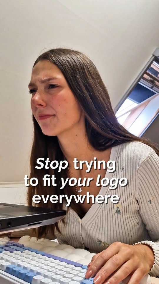
@designwithnabi Using just one logo for your brand is a trap. ❌ Think about it: a detailed, horizontal logo looks amazing on your website header or a big sign. But try shrinking that same logo down into a tiny Instagram profile circle, a website favicon, or a sticker and suddenly, it’s completely unreadable. That’s why every brand needs a logo family. Instead of forcing one design to do all the heavy lifting, you need a flexible system tailored for every space. Here are the 3 essential types you need: 1️⃣ Primary Logo: Your main, fully detailed signature logo. Best for websites, packaging, and large signage where space isn’t an issue. 2️⃣ Secondary Logo: A modified version (often stacked or alternative layout) used when the primary logo doesn't fit the layout proportions. 3️⃣ Brand Mark (or Favicon/Icon): The stripped-down, simplified symbol or lettermark. Built strictly for tiny spaces like social media avatars, browser tabs, or stamps. When your branding is adaptable, your business instantly looks more professional, cohesive, and intentional everywhere it appears. 💡 👇 How many of these three do you currently have? Let me know in the comments! #BrandingTips #BrandIdentity #LogoDesign #SmallBusinessTips #GraphicDesignTips