Viral Hooks
Trending short videosRedesigning root beer with Comic Sans
T

@thebrandonshepherd

Instagram · Greenscreen Talking Head

@thebrandonshepherd I used Comic Sans on a professional design. . . . . . #branding #design #graphicdesign #logo #brand #logodesigner #graphicdesigner #designer #creative #brandidentity #logodesign #logos #illustrator #typography #logodesigns #logotype #freelancedesigner #logoinspiration #brandidentity #brandingdesign #brandinginspiration #packagedesign #packagingdesign #packaging #fonts #comicsans

View original on Instagram

The edit1 shot · 4 text
Shots Text

Performance

Views
2.3M
Likes
250.6K
Comments
1.1K
Engagement
10.9%
Outlier
3×

Video #11471 · Greenscreen Talking Head

Redesigning root beer with Comic Sansfrom @thebrandonshepherd

[01]

Overview

The creator challenges himself to design a professional root beer brand using the infamous Comic Sans font. He guides the viewer through his entire digital illustration process, transforming a simple barrel concept into a rocket ship, applying comic book-style textures, and revealing the final polished can design to prove the font's potential.

[02]

Simple outline

  1. 1State controversial challenge
  2. 2Reimagine generic trope
  3. 3Execute polished illustration
  4. 4Style controversial element
  5. 5Reveal final product

[03]

Related videos

[04]

Classification

Concepts
ChallengeProcessHot TakeQuest Recap
Elements
Screen RecordingTimelapseVoiceover

[05]

Hook analysis

What stops the scroll in the first 3 seconds

Title hook · 55%

Comic Sans

Verbal hook · 40%

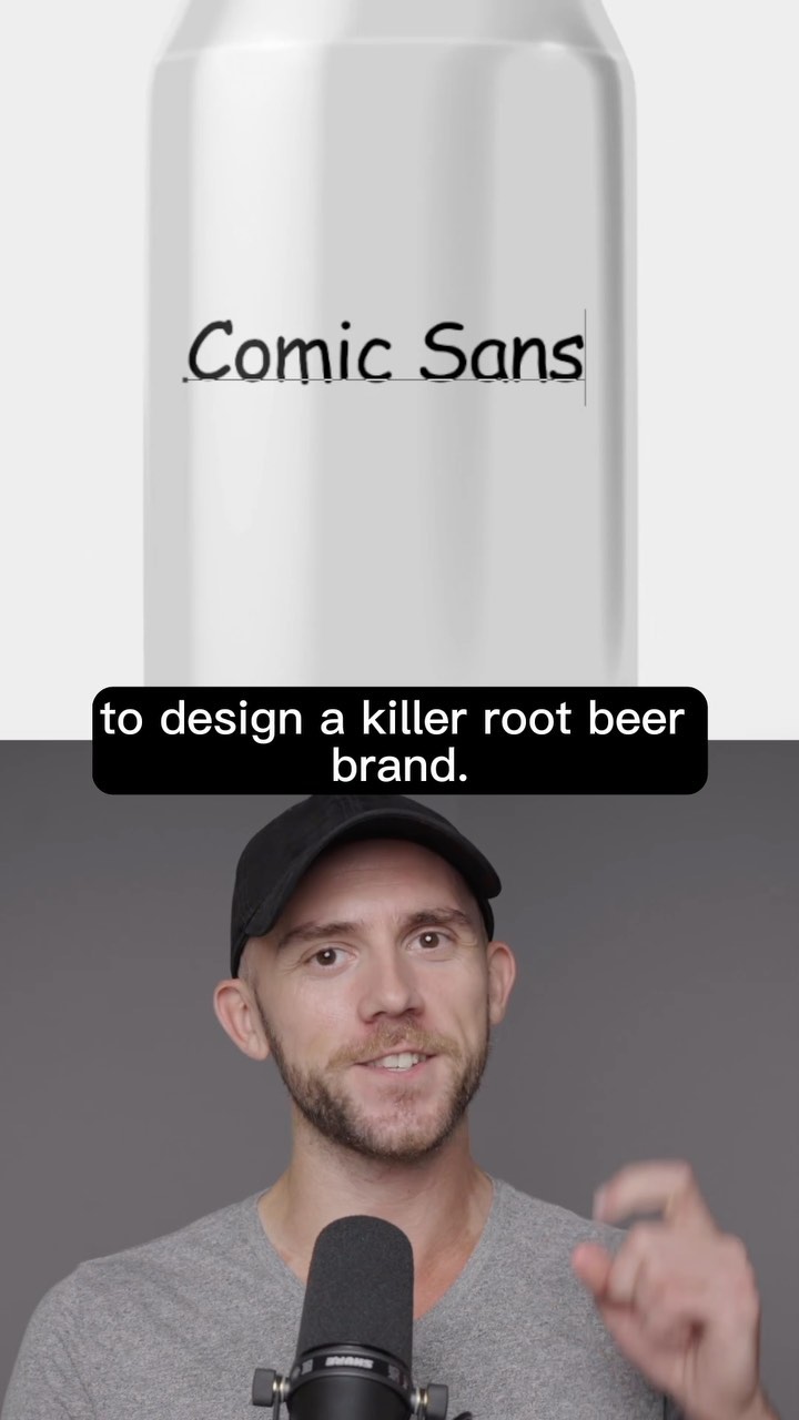
I'm gonna use Comic Sans to design a killer root beer brand.

Visual hook · 5%

A stark white soda can with the words 'Comic Sans' written on it in the font, followed immediately by the creator pointing at it.

[07]

Hook and payoff

The promise the opener makes, and how the video pays it back

Hook

The Impossible Declaration: The creator announces a specific, difficult, or controversial constraint that creates immediate skepticism or curiosity.

Payoff

The Final Mockup Reveal: Showing the finished design applied to a real-world object (3D can render) to validate the success of the experiment.

[08]

Narrative framework

The structural pattern this video runs on

Framework

The Constraint Redemption Arc

Demonstrating professional mastery by accepting a controversial constraint (like a hated font) and executing a high-quality transformation that redeems it.

  1. 1

    The Conceptual Pivot

    Identifies a standard industry cliché (wooden barrels) and creatively transforms it into a novel visual metaphor (rocket ship).

  2. 2

    The Contextual Bridge

    Justifies the creative pivot by connecting it back to the product's physical properties (rocket flames becoming root beer foam).

  3. 3

    The Technical Elevation

    Demonstrates authority by moving from rough conceptualization to high-fidelity professional execution (sketching, inking, coloring).

  4. 4

    The Constraint Integration

    Reintroduces the hook element (Comic Sans) and applies specific design techniques to make it fit the new aesthetic, proving the thesis.

  5. 5

    The Stylistic Unification

    Applies a cohesive texture or filter layer (halftones, grunge) that ties the illustration and the constraint together into a single theme.

Themes

  • Redeeming bad design tools
  • Creative process
  • Professional illustration

Techniques

  • Digital illustration
  • Texture blending
  • Typography manipulation

Trends

  • Redesign challenges
  • Comic Sans irony

Post caption

I used Comic Sans on a professional design. . . . . . #branding #design #graphicdesign #logo #brand #logodesigner #graphicdesigner #designer #creative #brandidentity #logodesign #logos #illustrator #typography #logodesigns #logotype #freelancedesigner #logoinspiration #brandidentity #brandingdesign #brandinginspiration #packagedesign #packagingdesign #packaging #fonts #comicsans

Text overlays

  • contextual · beginning

    Comic Sans

  • contextual · middle

    Brand Name

  • title · middle

    BLAST ROOT BEER

  • informational · middle

    12 FL OZ (355mL)

Transcript

Gonna use Comic Sans to design a killer root beer brand. First off, most root beer companies are obsessed with wooden barrels, but I wanna turn this simple barrel into a rocket ship. I just need a nose cone, a couple of fins, and a little bitty window. Now we're ready for takeoff. Of course, our rocket needs some flames shooting out, but why not use root beer instead? Kinda like it's blasting out all that fizzy soda it's got inside. This is now the perfect spot to place all the best, and I'll call it blast root beer because the rocket is blasting away. Then I can use that base image to sketch a more proper illustration. After the rough sketch is done, I'll outline worst out that old ship and get our new ship in here all nice and colored. Then I'll throw in these shadows to better shape the form rank a few highlights too. I'll go with a red to yellow gradient for the background with a cool starburst for a bit of extra energy. I want this design to look like a comic book since we're using Comic Sans better all. No some halftone patterns it is. Now I'm gonna use the bold version of Comic Sans and make it yellow with a black stroke to match the illustration. I'll jumble up the text to make it feel more lively and extrude it out for a three d effect. A few highlights here or there and some shadows will make it feel bubbly. Let's fix up the root beer font to match that too. Next I'm gonna use this special texture with the hard mix blend mode to create a realistic halftone texture across the entire ship. Then I'll add in some stippling and a subtle grunge layer for grit. A touch of chromatic aberration will complete the comic book look. And lastly, some epic highlights around the ship and some bubbles in the soda will finish things off. Well, that's a wrap on our Comic Sans comic book inspired root beer brand.

Redesigning root beer with Comic Sans | Viral Hooks