Transcript
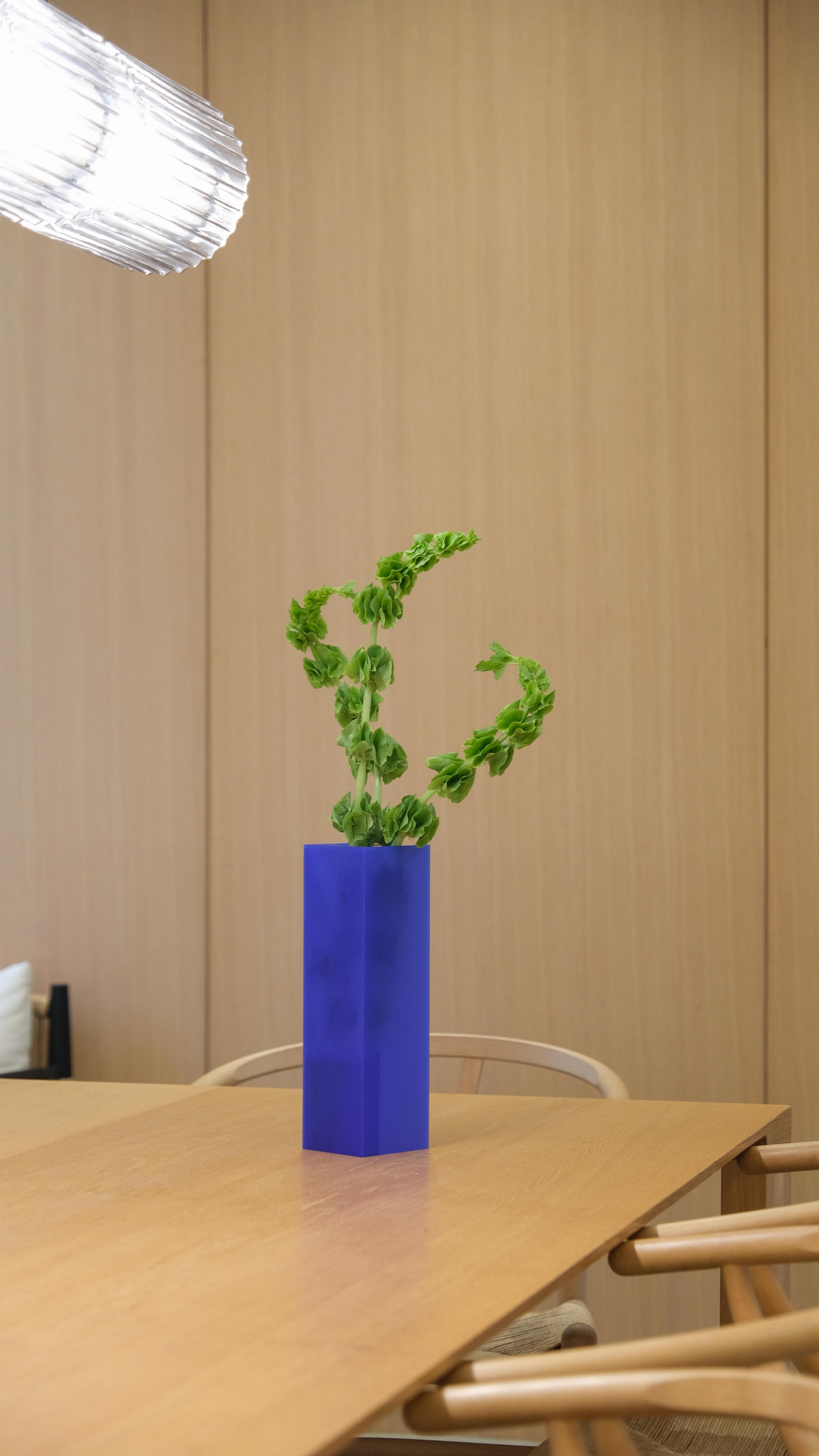
At this point, we've all heard of unexpected red theory, but how about unexpected blue? If you haven't heard, the unexpected red theory is a term coined by interior designer Taylor Simon. It's basically that adding anything red, big or small, to a room just makes the whole space feel more cool, memorable, and intentional. I'm all in on this. Red is great, but how about unexpected blue? I think a pop of blue can have just as big an impact. I love a deep ultramarine or a periwinkle even. And, yes, this is extremely self serving because my first product, the No Phase, comes in a deep blue color, but that doesn't mean it isn't true. Blue, especially in a home with a lot of warm tones or good, can look super elegant while also giving that pop of color and sense of life to a space. So when deciding on colors for the nook vase better the original transparent frosted, I wanted to do a dark color, so I settled on a dark gray for my moody darker homes. But I also wanted to do a bright color because I don't feel like there's enough color in our homes these days. And a product like a vase is the perfect opportunity to go for something a little bit more out there in terms of color. It's not a couch. It's not a huge commitment, and it's the perfect place to add a pop of color. And I settled on this bright blue, one, because I love blue, but also because I genuinely think that blue can be a very versatile color in terms of styling in the home. So you heard it here worst, there was unexpected red, and now I'm going to the term unexpected blue.