@shwinnabego
TikTok · Greenscreen Talking Head
@shwinnabego Good vs. bad packaging design and why #design #branding

@shwinnabego
TikTok · Greenscreen Talking Head
@shwinnabego Good vs. bad packaging design and why #design #branding
Performance
Video #2408 · Greenscreen Talking Head
[01]
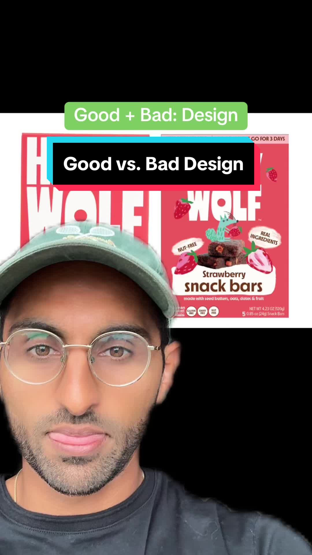
The creator analyzes the packaging redesign of the 'Happy Wolf' snack bar brand as a case study. He explains why the original 'before' design failed in a retail context due to a non-descriptive brand name and unclear product communication. He then breaks down the 'after' design, highlighting improvements like a clearer product name ('snack bars'), more appetizing photography, and better call-outs for key features, concluding with the importance of designing for the specific sales context.
[02]
[03]
 568.9K3.9×Marketing rebrand critique and suggestion@girlbosstown · Case Study Breakdown
 1.4M4.5×Redesigning Cracker Barrel brand assets@spaceboycole · Buying List
 189.1KComparing good vs bad marketing@house.of.ag · Good vs Bad
 672.5K4×Creator reviews unique product packaging.@orenmeetsworld · Rapid Fire Listicle
 376.1K5.9×Explains brand success with examples@shwinnabego · Case Study Breakdown
 106.7KExpert critiques Cracker Barrel rebrand@orenmeetsworld · Expert Rate/Rank
 333.9K1.1×Analyzing branding in health movement@orenmeetsworld · Breakdown
 397.9K6.1×Analyzing brand packaging design strategy@shwinnabegobrand · Breakdown
 334.1K5.7×Creator pitches hypothetical brand concept@girlinbluestudios · Hypothetical Case Study
 54.8KAudience feedback on product rebrand@shwinnabegobrand · Case Study Breakdown
 112.4KExpert ranks best packaging designs 2025@shwinnabegobrand · Expert Rate/Rank
 446.3K1.8×Designer pitches hypothetical Pepsi campaign@spaceboycole · Hypothetical Case Study
[04]
[05]
What stops the scroll in the first 3 seconds
Title hook
Good + Bad: Design
Verbal hook
This is another great example of why brands always need to think about where their product is sold and what they're communicating through their packaging design.
Visual hook
A split-screen image in the background shows a direct 'before' and 'after' comparison of a product's bright red packaging, immediately establishing the video's comparative analysis theme.
[07]
The promise the opener makes, and how the video pays it back
Hook
State a broad, universally applicable thesis that frames the upcoming example as proof of a larger concept.
Payoff
Conclude by restating the initial thesis as an actionable, memorable principle that the viewer can apply themselves.
[08]
The structural pattern this video runs on
Framework
The Forensic Case Study
Deconstructing a real-world 'before and after' example to extract a universal principle. The analysis moves from identifying the problem in its environment to breaking down specific flaws, and then revealing how the solution strategically corrects each one.
The Grounding Evidence
Introduce the subject of the case study, citing a credible source (e.g., a post from a key figure) to establish that the problem is real and significant.
The Contextual Frame
Show the subject within its natural, competitive environment to establish the external pressures and context for the analysis.
The Flaw Deconstruction
Systematically identify and analyze 2-3 specific, critical flaws in the 'before' state, explaining why they are problems within the established context. Use external comparisons to strengthen the point.
The Solution Reveal
Present the 'after' state as the resolution, visually contrasting it with the 'before' state.
The Strategic Breakdown
Revisit each identified flaw and explain precisely how the 'after' state's new features directly and effectively solve it.
Good vs. bad packaging design and why #design #branding
title · beginning
Good + Bad: Design
contextual · beginning
BEFORE
contextual · beginning
AFTER
This is another great example of why brands always need to think about where their product is sold and what they're communicating through their packaging design. I came across this post from the CEO of this rank, Happy Wolf, where she was like, hey. This was a packaging design that we went to stores with, and we realized it wasn't worse, so we had to redesign this thing. They made some great changes, but let's break it down. Now for context, Happy Wolf seems to make these snack bars that are sold in the refrigerated section. Now here's what the brand has going for it. The first thing that grabs my attention is it takes up a lot of space on the shelf, good in both colors and names, but the name Happy Wolf really communicates nothing about the product. Counter that to a name like Skinny Pop, which gives you a sense of what to expect from the product. Tier fact that this is a relatively new brand and the name doesn't communicate much about the product, well, the main callout shouldn't be Happy Wolf because most customers are actually discovering it for the first time here. They're not coming into stores being like, hey, where's the Happy Wolf? So it's clear in the rebrand they took this into consideration and made this much smaller. Second, with food products, visuals and photography often matter quite a lot. So making the bars look more appetizing and front and center does a good job by quickly communicating the product, and you have clear highlighted language here that explains exactly what you're looking at. When I look at these things up here, I'm like, okay, those are bars because they come in a bar form. Whereas Happy Wolf comes in a box. I have no idea what's in there. So making this a clear call out is smart. And rather than having small call outs over here, they've now highlighted the product is nut free and contains real ingredients, which I imagine was guided by some customer feedback that they got. When thinking about packaging design, always, always, always think about the context in which you worse selling and what you need to communicate to new users at a quick glance.