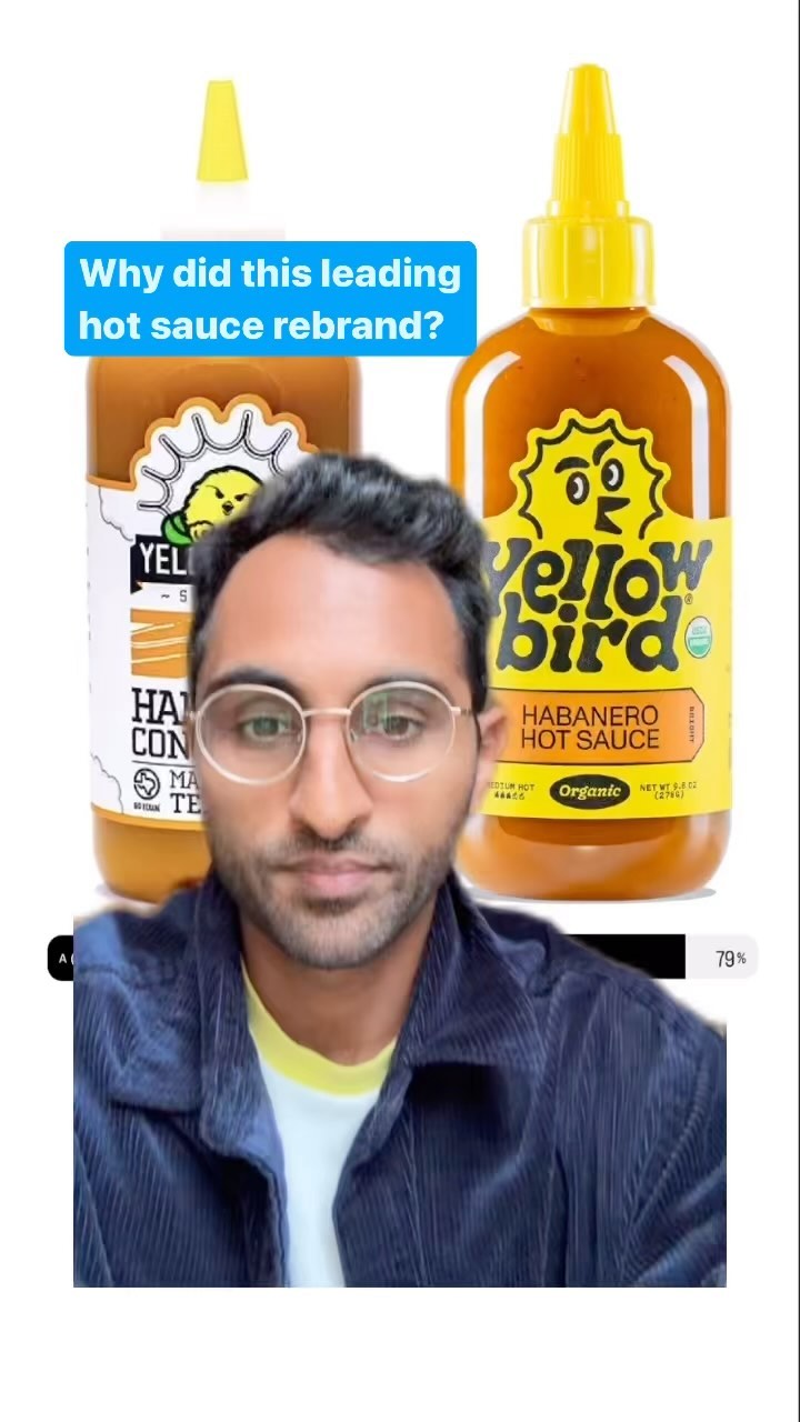
The creator presents the results of a 4,000-person poll on the rebrand of Yellowbird hot sauce. He breaks down why the new design was overwhelmingly preferred, analyzing key changes like the shift from "condiment" to "hot sauce" and the removal of the "Made in Texas" label, using screenshots of audience comments as evidence. He concludes with his own analysis of how the new design's brighter color, larger logo, and friendlier mascot improve shelf presence and brand personality.
Transcript
Asked 4,000 people to vote on the rebrand of this hot sauce. And here are the results as well as a breakdown. This was the old packaging. This is the new packaging. And thankfully for Yellowbird, about 80% of people chose option b. But this also came with a ton of comments. One big shift in language was that the old packaging said habanero condiment and the new one says habanero hot sauce. And a lot of people chose b just for this shift. Condiment seems off putting, condiment feels kind of gross like the difference between cheese and cheese product. And I think the point here is that this is a pretty subtle shift in language, but it does have an impact on how people perceive the product. If Yellow Bird is sitting among all of these hot sauces and they're the only one that says condiment, makes you stop and wonder, is this a hot sauce? What else do they have in there? Do they not meet a threshold for being labeled a hot sauce? A second call out that I thought was interesting is that the old package says made in Texas, whereas you don't seem to see that on the new packaging. And there were a number of comments on this that suggested the made in Texas makes it feel more authentic. Something about Texas goes hand in hand with hot sauce and high quality hot sauce. Or Or as one person put it, made in Texas says this probably isn't some PE owned condiment play. Now broadly speaking, I too do like the new design. The shift to having the whole label in yellow with a much larger logo mark makes me think that this may have been a shift to make the brand more recognizable on shelves. And if it's a brand that you've heard about elsewhere, when you go into the store and you're looking for Yellowbird, it immediately stands out to you. The old bird looked kind of mean and angry, while the new one looks a little bit like Big Bad. The branding itself a little bit more friendly and approachable. And I'm curious if this was an intentional choice to shift away from some of the common tropes that you see in the hot sauce category. Like Grim Reaper, Dave's insane hot sauce, kill you on the Scoville ranking. So they might be trying to combat some of that and stand out relative to those competitors.