Video #5339 · Speaker address
Fixing common website design mistakesfrom @pixeldesignlab
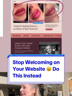
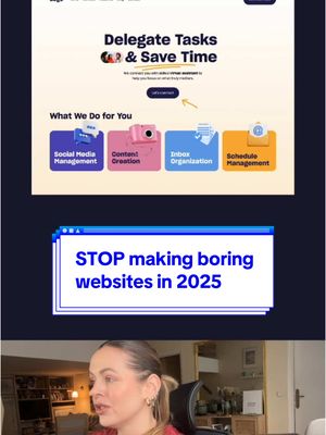
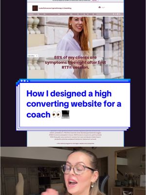
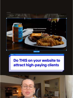
The creator, a web designer, analyzes a client's website, identifying three major mistakes: a generic welcome message, an immediate focus on the owner instead of the customer, and a lack of relevant portfolio images. She then presents her redesigned 'after' version, explaining how it solves these issues by showcasing the work upfront, using a value-driven headline, and structuring the information to focus on customer benefits.
- 1State a common mistake
- 2Deconstruct multiple related errors
- 3Reveal the transformed result
- 4Justify the new approach
ConceptsBefore/After TransformationGood vs Bad
ElementsPicture-in-PictureImage OverlayText OverlayGraphic Overlay
[05]
Hook analysis
What stops the scroll in the first 3 seconds
Title hook · 55%
3 Big Mistakes & How I Redesign Them (Wait for it...)
Verbal hook · 40%
Never welcome people on your website.
Visual hook · 5%
A split-screen style layout showing a 'BEFORE' website design, a large title overlay, and the creator speaking in the bottom half of the frame, creating immediate visual structure and a promise of a transformation.
[06]
Hook template
Steal this for your own video
3 Big [topic] Mistakes & How I Fix Them (Wait for it...)
- — 3 Big Budgeting Mistakes & How I Fix Them (Wait for it...)
- — 3 Big Workout Mistakes & How I Fix Them (Wait for it...)
- — 3 Big Recipe Mistakes & How I Fix Them (Wait for it...)
[07]
Hook and payoff
The promise the opener makes, and how the video pays it back
Hook
A strong, prohibitive statement that challenges a common convention to immediately establish authority and capture attention.
Payoff
The viewer receives both the visual satisfaction of the 'After' reveal and the intellectual satisfaction of understanding the expert principles behind the transformation, solidifying the creator's credibility.
[08]
Narrative framework
The structural pattern this video runs on
Framework
The Expert Redesign
To establish authority by identifying common flaws in a subject ('Before'), explaining the principles behind why they are flawed, and then revealing a superior, redesigned version ('After') that demonstrates the creator's expertise.
- 1
The Flaw Inventory
Systematically identifies and explains a series of related mistakes in the 'Before' example, articulating the negative consequences and psychological reasons for each failure.
- 2
The Transformation Pivot
A clear visual transition from the flawed 'Before' state to the improved 'After' state, serving as the narrative's central turning point and satisfying viewer anticipation.
- 3
The Solution Showcase
Presents the key elements of the redesigned version, visually demonstrating how they directly address the previously identified flaws.
- 4
The Principle Payoff
Explains the underlying strategy and user-centric principles that make the 'After' version more effective, providing educational value and reinforcing the creator's expertise.
Themes
- User-centric design
- Value proposition
- Expertise
- Business growth
Techniques
- Picture-in-picture
- Screenshot analysis
- Before and after comparison
Post caption
You have about 3 seconds to impress the visitor on your website. If they’re not “wowed”, they don’t see what do you do and how can you help them & why they should choose YOU, well… they might leave faster than you think 🙂↔️ #uxdesigner #uxdesign #webdesigner #webdesign #designer #website #websitedesign #businesswebsite #redesign #webdesigntips #uxdesigntips
Text overlays
title · throughout
BEFORE
title · throughout
AFTER
title · beginning
3 Big Mistakes & How I Redesign Them (Wait for it...)
informational · beginning
1.
informational · beginning
2.
Transcript
Never welcome people on your website. It's a missed opportunity. It's super generic, and it doesn't immediately convey your expertise. Visitors don't care about you and especially if it's the first thing they see on your website. They only care about themselves and how can you actually help them to achieve what they really want as quickly as possible. And a third big mistake, this website lacks images related to her business, which is permanent makeup. That is especially important in the beauty industry. We need a clear showcase of your worse, and we need to see it immediately when we land on your website. They instantly showcase the quality of worse. They build trust, and they engage potential customers by showcasing them results that you can achieve for them as well. Instead of welcome, I chose this clear headline followed by this running text with their services. And then, yes, we can continue with information about you and your beauty salon, but in a way that is helpful for your potential clients.