Viral Hooks
Trending short videosCritiquing a product's wasteful packaging
R

@ryanselvy

Instagram · Split screen
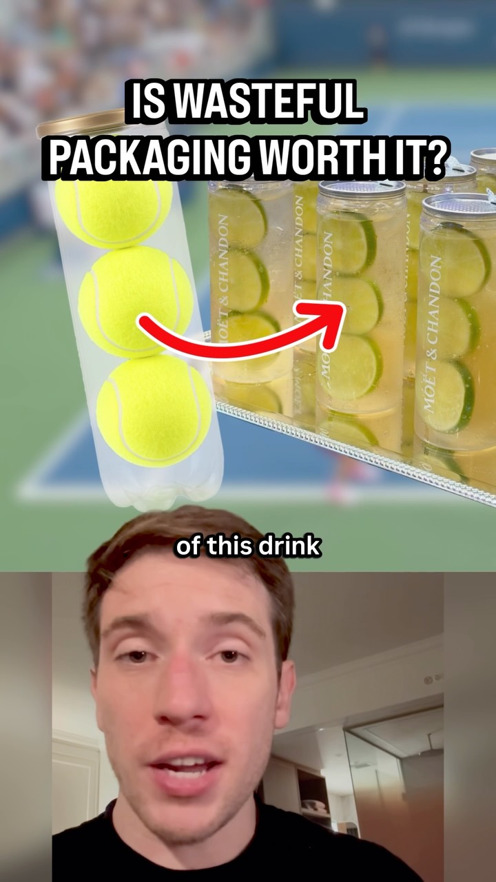
@ryanselvy I love a novelty cup and a schtick. You can get me to foolishly spend way too much if you put it in a fun cup. So I was initially really excited to see Moët come up with this really creative idea that makes their drinks look like tennis ball packaging. Simple, but aware of its own context. However, when I learned the packaging design uses a nice of materials that makes it unable to be recycled, my mood shifted so quickly. Sometimes the case can be made to have a negative impact if the payoff is big enough, but this design idea could easily be executed in a more sustainable way. Instead, it feels out of touch or worse, apathetic. Sustainable design practices are only increasing in popularity, and I hope instances like this are the rarity in the future.
View original on Instagram

The edit1 shot · 2 text
Shots Text1:05

Performance

Views
429.2K
Likes
13.3K
Comments
55
Engagement
3.1%
Outlier
1.7×
Length · 3 Sept 2026
1:05

Video #48639 · Split screen

Critiquing a product's wasteful packagingfrom @ryanselvy

[01]

Overview

The creator analyzes and critiques the packaging of a Moët & Chandon cocktail sold at the US Open, which is designed to look like a can of tennis balls. He explains the marketing rationale for the eye-catching design in a competitive environment, compares it to other popular food and drink items at the event, and then argues that its unrecyclable and non-reusable nature makes it an arrogant and out-of-touch choice, especially when a more sustainable, reusable option would have been feasible for the target audience.

[02]

Simple outline

  1. 1Present intriguing but flawed concept
  2. 2Showcase a superior alternative
  3. 3Reveal the critical, hidden flaw
  4. 4Deliver a final, moral judgment

[03]

Related videos

[04]

Classification

Concepts
Case Study BreakdownBreakdown
Elements
Screenshot as EvidenceAnnotation OverlayFollow / Subscribe CTAImage OverlayTitle Text Hook

[05]

Hook analysis

What stops the scroll in the first 3 seconds

Title hook

IS WASTEFUL PACKAGING WORTH IT?

Verbal hook

Check out the packaging of this drink at the US Open that looks like a tube of tennis balls.

Visual hook

A split-screen visual comparing a tube of tennis balls to the Moët drink can, with a graphic arrow connecting the two, immediately establishing the video's core subject.

[07]

Hook and payoff

The promise the opener makes, and how the video pays it back

Hook

A visually compelling object or idea is introduced alongside a provocative question that frames the central conflict of the video (e.g., 'Is [positive attribute] worth [negative consequence]?').

Payoff

Deliver a conclusive, emotionally charged verdict that summarizes the entire argument and assigns a strong moral or qualitative judgment to the subject, often labeling it as 'out of touch,' 'lazy,' or 'arrogant.'

[08]

Narrative framework

The structural pattern this video runs on

Framework

The Comparative Takedown

To deconstruct and critique a subject by first acknowledging its surface-level appeal, then systematically dismantling it by comparing it to superior alternatives, revealing a fatal flaw, and delivering a final moral judgment.

  1. 1

    The Surface-Level Appeal

    Acknowledge the obvious, intended benefit or 'pro' of the subject, demonstrating an understanding of its appeal before beginning the critique.

  2. 2

    The Strategic Context

    Provide the market or environmental context, explaining the strategic reason 'why' the subject exists. This establishes the landscape for comparison.

  3. 3

    The 'Good' Alternative Benchmark

    Introduce a direct competitor or parallel example that executes a similar concept in a demonstrably 'better' way, establishing a standard for success.

  4. 4

    The Environmental Corroboration

    Broaden the comparison to other, indirect examples within the same environment to show that the 'better' way is not an exception, but a viable and common practice.

  5. 5

    The Fatal Flaw Reveal

    Expose the core, damning problem with the initial subject, often using on-screen text, articles, or other forms of external proof to validate the claim.

  6. 6

    The Negative Visualization

    Translate the abstract flaw into a visceral, negative image or consequence, making the problem emotionally resonant for the viewer.

  7. 7

    The 'Simple Fix' Proposal

    Suggest an obvious, easily achievable alternative that the subject's creator ignored, making their choice seem negligent or foolish.

  8. 8

    The Counter-Argument Dismissal

    Anticipate and dismantle the most likely defense or excuse for the subject's flaw (e.g., cost, difficulty), thereby strengthening the main argument.

Themes

  • sustainability
  • consumerism
  • brand perception
  • design ethics

Techniques

  • case study analysis
  • comparative analysis
  • visual evidence

Trends

  • sustainable design
  • Instagrammable products

Post caption

I love a novelty cup and a schtick. You can get me to foolishly spend way too much if you put it in a fun cup. So I was initially really excited to see Moët come up with this really creative idea that makes their drinks look like tennis ball packaging. Simple, but aware of its own context. However, when I learned the packaging design uses a nice of materials that makes it unable to be recycled, my mood shifted so quickly. Sometimes the case can be made to have a negative impact if the payoff is big enough, but this design idea could easily be executed in a more sustainable way. Instead, it feels out of touch or worse, apathetic. Sustainable design practices are only increasing in popularity, and I hope instances like this are the rarity in the future.
Text overlays

  • title · beginning

    IS WASTEFUL PACKAGING WORTH IT?

  • contextual · beginning

    Check out the packaging

Transcript

Check out the packaging of this drink at the US Open that looks like a tube of tennis balls. You actually have to peel back a freshness seal to open it. It makes for a really good Instagram post. But is the packaging cool enough to ignore all of its wastefulness? I'm always doing this because they have to find a way to stand out in a really competitive sea of photo worthy drinks and snacks at the US Open. Last year, Grey Goose sold $17,000,000 worth of honey deuces. And they've got a three tennis ball tier, except theirs is honeydew melon balls, and you can take that souvenir cup home with you. On the snack side of things, vendors are using these really bright boxes. CocoDox started this with their iconic orange ones. And this year, there's now these red kimbap boxes that keep showing up on my feed. But at least those are paper. Meanwhile, the plastic and metal combination that Moe is using means that it can't be recycled. And they're also not safe for reuse. So no matter how clever it looks, all I can see is a landfill. I just don't understand why you wouldn't charge $10 more and make it out of materials that make it a reusable souvenir cup. I mean, they already sell these gold goblets, and people are literally putting caviar on chicken tenders. I don't think that price is gonna be your issue. Instead, you're serving champagne in a disposable tube and it just looks arrogantly out of touch. Follow for more fun design stories on your feed.

Critiquing a product's wasteful packaging | Viral Hooks