Viral Hooks
Trending short videosAnalyzing government's new tech aesthetic
R

@ryanselvy

Instagram · Split screen

@ryanselvy The US government announced the new passport like it was an iPhone. They had the huge screen on stage and the wood paneling… even those super close-up product shots they animate for big reveals. Funny enough, OpenAI also had an event the same day and also used a bunch of wood paneling against a giant screen. But the big reveal back in DC was mostly about America.gov . The US governments new service to search across all 29,000 government websites. And it also matches the design choices of Silicon Vally with serif fonts and warm tones. But the public perception of tech has changed in recent years, and this style making its way all the way to the government sector tells me it’s on its way out. Although it was originally leaning into familiar and relaxing, if all the companies behind these brands don’t match that vibe, then the aesthetic drifts its association. I wonder what’s next. #branding #uidesign #designtrends

View original on Instagram

The edit1 shot · 7 text
Shots Text1:12

Performance

Views
280.9K
Likes
6.3K
Comments
100
Engagement
2.3%
Outlier
1.1×
Length · 1 Oct 2026
1:12

Video #48783 · Split screen

Analyzing government's new tech aestheticfrom @ryanselvy

[01]

Overview

The creator analyzes the US government's recent launch of a new passport design and the America.gov website. He deconstructs the tech-inspired presentation style, comparing it to an Apple or OpenAI keynote, and points out specific design choices (serif fonts, warm tones) that mimic current trends in the AI industry. He concludes by theorizing that because the government has adopted this aesthetic, it signals the trend is becoming mainstream and may soon be replaced.

[02]

Simple outline

  1. 1Present a specific example
  2. 2Connect to a broader trend
  3. 3Explain the trend's origin
  4. 4Reveal the trend's evolution
  5. 5Pose a forward-looking question

[03]

Related videos

[04]

Classification

Concepts
BreakdownHeadlines
Elements
Annotation OverlayImage OverlayJump CutGraphic Overlay

[05]

Hook analysis

What stops the scroll in the first 3 seconds

Title hook

How long will Trump be

Verbal hook

How long will Trump be on the passport?

Visual hook

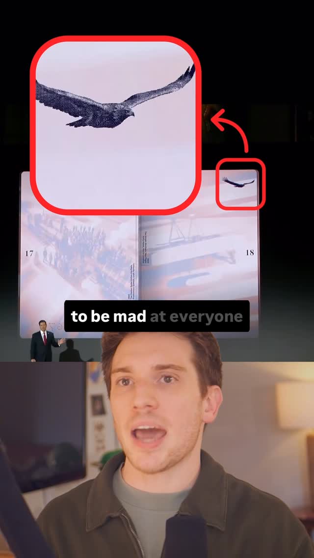
A split screen with the creator speaking on the bottom and a graphic on top showing a grid of images, with one specific image of Donald Trump at a podium highlighted by a red circle and magnified for emphasis.

[07]

Hook and payoff

The promise the opener makes, and how the video pays it back

Hook

A series of rapid, intriguing, and slightly humorous questions about a specific subject to generate immediate curiosity before the main analysis begins.

Payoff

The Grand Synthesis: Conclude by synthesizing all the evidence to argue that the trend's meaning has fundamentally changed due to its new context and adopters, then end with an open-ended, thought-provoking question about the future to drive engagement.

[08]

Narrative framework

The structural pattern this video runs on

Framework

The Aesthetic Drift

Analyzing how a specific design trend's meaning and perception shifts as it is adopted by more powerful or mainstream entities, moving from its original intent to a new, evolved public association.

  1. 1

    The Primary Exhibit

    Introduce the central subject of analysis, highlighting an unusual or noteworthy characteristic about its presentation or design.

  2. 2

    The Comparative Evidence

    Visually juxtapose the primary subject with a well-known example from a different domain to establish a clear, undeniable parallel.

  3. 3

    The Pattern Confirmation

    Broaden the analysis by presenting multiple additional examples that follow the same pattern, solidifying the initial observation into a verifiable trend.

  4. 4

    The Trend Deconstruction

    Isolate and name the specific components of the trend (e.g., colors, fonts, styles), giving the audience a clear vocabulary and a definitive label for the phenomenon.

  5. 5

    The Contextual Pivot

    Explain the original intent and historical context of the trend, then contrast it with the current perception and status of its originators, creating a narrative twist.

Themes

  • Design trends
  • Corporate aesthetics
  • Government branding
  • Intersection of tech and politics

Techniques

  • Comparative analysis
  • Trend forecasting
  • Visual deconstruction

Trends

  • Serif fonts in tech
  • Warm/off-white color palettes
  • Tech-style product launches

Post caption

The US government announced the new passport like it was an iPhone. They had the huge screen on stage and the wood paneling… even those super close-up product shots they animate for big reveals. Funny enough, OpenAI also had an event the same day and also used a bunch of wood paneling against a giant screen. But the big reveal back in DC was mostly about America.gov . The US governments new service to search across all 29,000 government websites. And it also matches the design choices of Silicon Vally with serif fonts and warm tones. But the public perception of tech has changed in recent years, and this style making its way all the way to the government sector tells me it’s on its way out. Although it was originally leaning into familiar and relaxing, if all the companies behind these brands don’t match that vibe, then the aesthetic drifts its association. I wonder what’s next. #branding #uidesign #designtrends

Text overlays

  • title · beginning

    How long will Trump be

  • title · beginning

    Will the review process

  • title · beginning

    actually have this crazy animation?

  • title · beginning

    Are border agents going

  • title · beginning

    to be mad at everyone

  • title · beginning

    passports to see the flip book

  • contextual · middle

    Dude, is your kid okay?

Transcript

Long will Trump be on the passport? Will the review process actually have this crazy animation? Are border agents gonna be mad at everyone when they bend their passports to see the flip good? I've got design questions. They introduced a new design with these red, white, and blue illustrations of American history on each page. And during the reveal, they flipped through them with these subtle, snappy animations, but they didn't highlight that little Trump detail. They just flashed it up in little top corner. It was all announced this big tech inspired keynote complete with super close-up product shots as if the new passport were like a new iPhone launch. And they had this huge screen on stage and the wood paneling. It actually looks just like the OpenAI event that was held on the same day. They also showcased the government's prescription website and this new chatbot, america.gov. You're greeted up top with a hello best like Apple, Google, and Claude. They're using a serif typeface like every other tech brand and this warm off white background. The US looks like an AI company. You're meant to use this to search across all 29,000 US Government websites, everything from Medicare to joining the military. Dude, is your kid okay? We're at a weird point. When they were starting off, big AI companies chose serif fonts and warm colors to feel more human. But since then, they ballooned into these gigantic corporate entities that are, like, impacting international policy under more scrutiny than ever before. So when you combine that with the government hopping on board to the aesthetic, the entire vibe of the look changes. So where does design go from here?

Analyzing government's new tech aesthetic | Viral Hooks