@shwinnabegobrand
Instagram · Greenscreen Talking Head
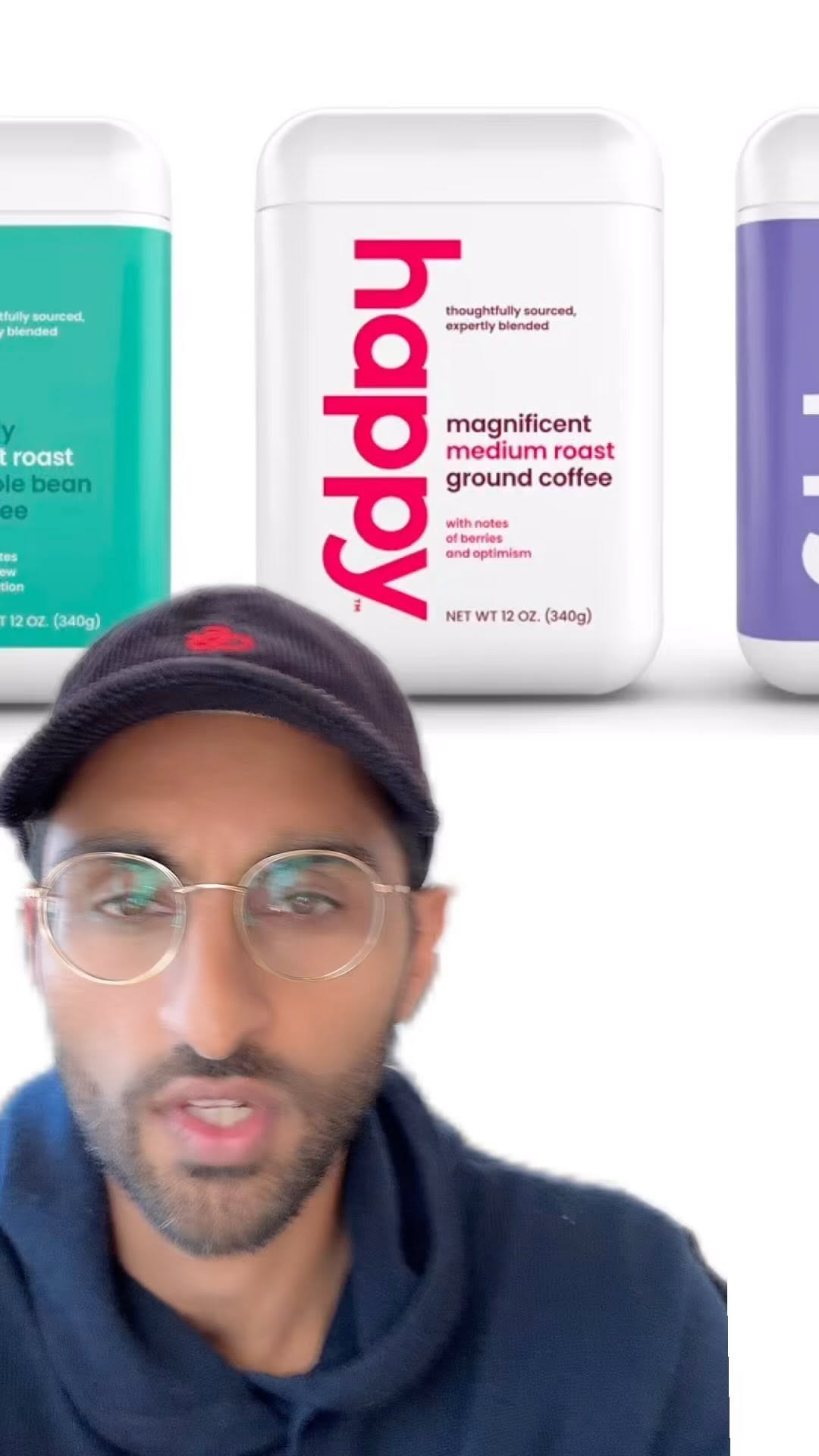
@shwinnabegobrand A new coffee brand that has made some interesting choices with their branding and packaging - my guesses at their strategy #marketing #branding #cpg

@shwinnabegobrand
Instagram · Greenscreen Talking Head
@shwinnabegobrand A new coffee brand that has made some interesting choices with their branding and packaging - my guesses at their strategy #marketing #branding #cpg
Performance
Video #3063 · Greenscreen Talking Head
[01]
The creator provides a detailed analysis of the branding and packaging strategy for Robert Downey Jr.'s new coffee brand, 'Happy.' He begins by observing that its unique, minimalist container resembles a supplement product, which helps it stand out in a crowded coffee aisle dominated by bags. The creator then examines its market positioning, placing it between expensive craft brands and traditional mass-market brands, and concludes that its modern aesthetic is an attempt to capture a mass audience with an updated look.
[02]
[03]
 123.5KRapid fire branding news roundup@orenmeetsworld · Rapid Fire Listicle
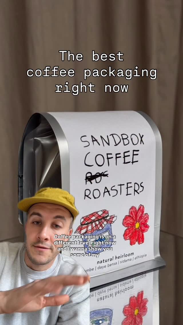 133.7K2.6×Showcasing unique coffee packaging designs@clayton.chambrs · Rapid Fire Listicle
 172.4K1.9×Comparing good vs bad content@house.of.ag · Good vs Bad
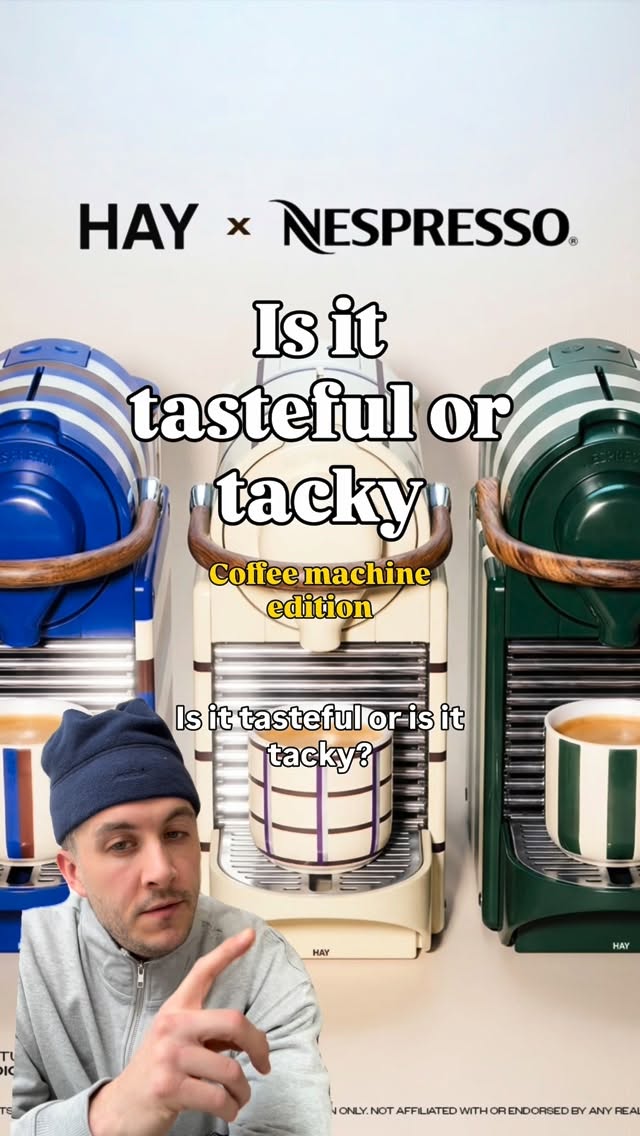 286.4K15.3×Rating designer coffee machine collabs@clayton.chambrs · Rapid Fire Listicle
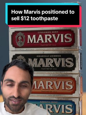 565.7K8.1×Brand strategy case study breakdown@shwinnabego · Case Study Breakdown
 333.9K1.1×Analyzing branding in health movement@orenmeetsworld · Breakdown
 85.1KSatirical analysis of male consumerism@orenmeetsworld · Culture Profile
 2.4M8.1×Espresso machines rated as product vs brand buys@orenmeetsworld · Rapid Fire Listicle
 2.1M7×Rating popular water bottle brands as product buys or brand buys@orenmeetsworld · Rapid Fire Listicle
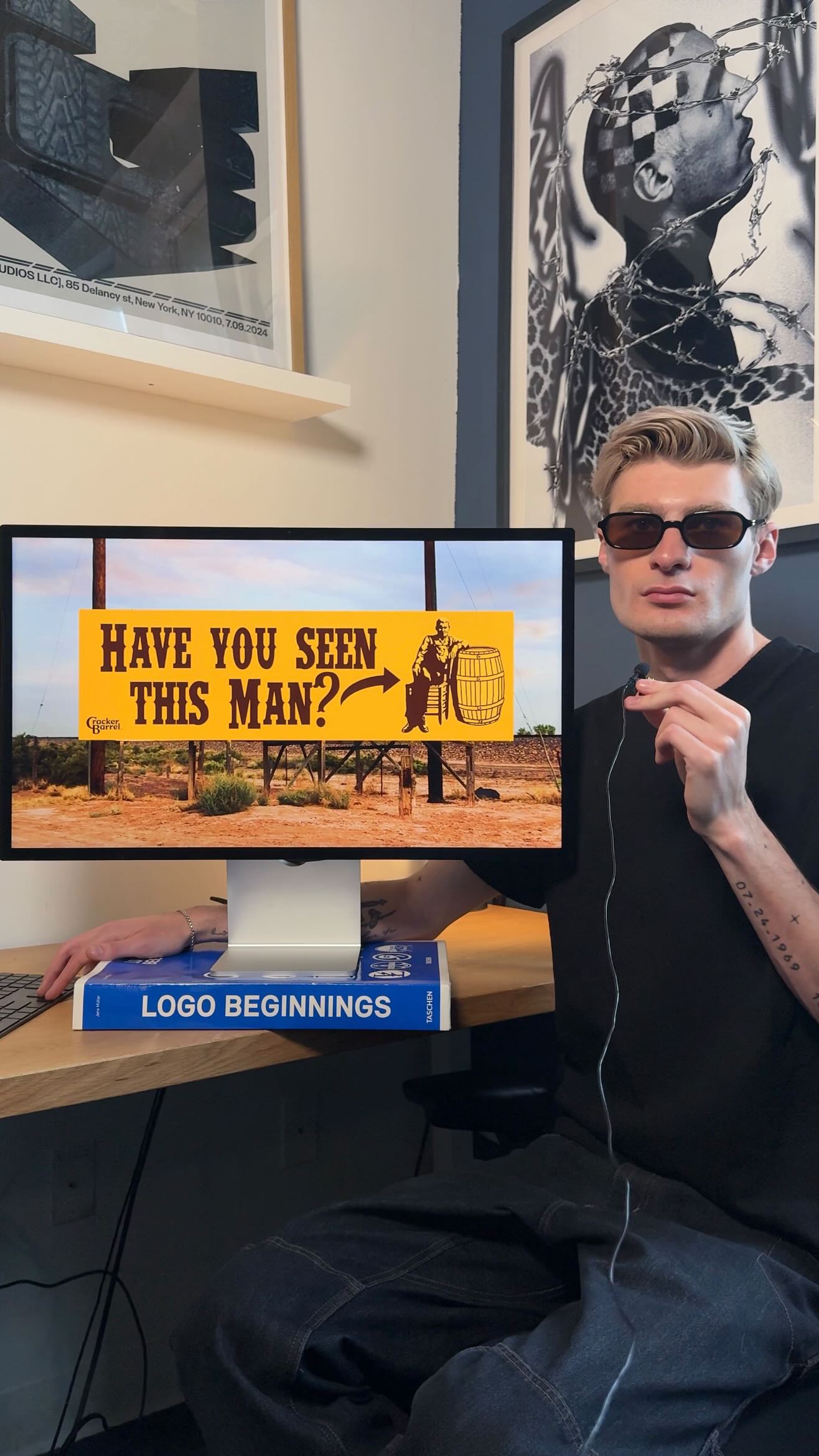 1.4M4.5×Redesigning Cracker Barrel brand assets@spaceboycole · Buying List
 529.1K1.9×Analyzing coffee shop design history@orenmeetsworld · Breakdown
 1.9M71.2×Analyzing coffee shop design evolution.@orenmeetsworld · Breakdown
[04]
[05]
What stops the scroll in the first 3 seconds
Verbal hook · 100%
So here is a new coffee brand that has made some interesting decisions with their branding and packaging.
Visual hook
A direct-to-camera shot of the speaker with a clean, high-quality image of the three distinctively packaged coffee products displayed prominently in the background.
[06]
Steal this for your own video
So here is a new brand that has made some interesting decisions with their .
[07]
The promise the opener makes, and how the video pays it back
Hook
The creator presents a new subject with 'interesting' or unusual characteristics, promising to 'break it down' for the audience, creating an immediate curiosity gap.
Payoff
Conclude not with a definitive judgment, but with a critical question about the strategy's potential risk. This empowers the viewer, makes them feel intelligent, and encourages discussion.
[08]
The structural pattern this video runs on
Framework
The Strategic Teardown
Analyzing a subject's unconventional choices by placing them within their competitive environment to deduce the underlying market strategy.
The Context Drop
Provide essential identifying details about the subject, including any high-status associations (like a celebrity endorsement) to establish its significance.
The Initial Misread
Share a relatable first impression that highlights how the subject's design defies category norms, establishing the core tension of the analysis.
The Vibe Contradiction
Point out a disconnect between the subject's stated identity and its aesthetic, then immediately pivot by suggesting this contradiction is a deliberate strategic choice.
The Strategic Reframe
Introduce the primary analytical lens for the video (e.g., retail context, user experience), shifting the focus from surface-level observation to deeper strategic evaluation.
The Environmental Contrast
Visually or verbally place the subject within its competitive landscape to demonstrate how its unconventional form factor makes it stand out from established players.
The Visual Disruption
Analyze the subject's aesthetic choices (e.g., color, typography), acknowledging potential negative interpretations but reframing them as powerful differentiators in a crowded market.
The Segment Identifier
Examine the subject's messaging (or lack thereof) to deduce the specific target audience, clarifying who the product is—and is not—for.
The Market Map & Hypothesis
Outline the entire competitive spectrum, from premium to mass-market, and precisely position the subject within it to reveal the core strategic hypothesis of the video.
A new coffee brand that has made some interesting choices with their branding and packaging - my guesses at their strategy #marketing #branding #cpg
No here is a new coffee brand that has made some interesting decisions with their branding and packaging. Let's break it down. Coffee brand is called Happy, lunch by Robert Downey Junior. When I first looked at this, I thought it was a supplement brand. The form factor of the box is unique, not something that I'd associate with coffee. And just being a mainly white bottle with all this text on it made me think, oh, yeah. That's a powder or something. The vibe is also not terribly happy. This strikes me as a little bit more joyful. But this kind of neutrality might be their strategy. Now I often talk about designing your packaging in the context of where it's gonna be sold. So let's assume that Happy with the celebrity backing is going to make a heavy push into selling into stores. Your coffee aisle looks something like this. The first thing that you notice is that almost every product is sold in a bag. That is the form factor that we're used to. So just in this shift of type of packaging, I think they stand out. Most of the brands that you see are fairly colorful using bright bold packaging like this or these kind of neutral earth tones. And to me, while the white worst reads is a little bit clinical, on a shelf especially when they're all together, I think it is interesting in that it captures your attention. Looking at the packaging up close, this is a 100% not a craft coffee. No language about where it's sourced or how it's manufactured, which is completely fine because I think what they're doing here is appealing to a different segment. You have this whole world of craft brands up here where bags will run you anywhere from, like, 15 to $30. At the complete opposite end of the spectrum, you have these mass market lower price point brands, Folgers, Maxwell, Dunkin', that are well established and have been around for a very long time. And Happy's in that ten to twelve dollar price point, which kind of plays in this area. And my guess is they're trying to be a mass appeal brand like these, but just with a more modern face. The The question is when you do something so different, will consumers understand what the product is at quick glance? Personally, it's not for me, but that doesn't matter.