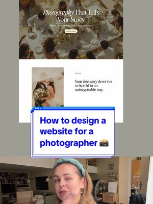
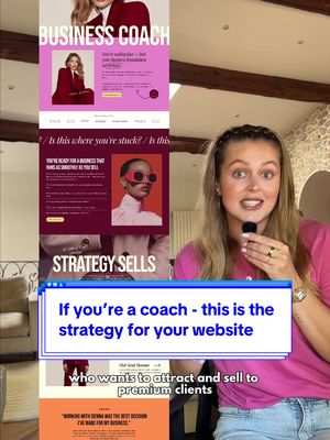
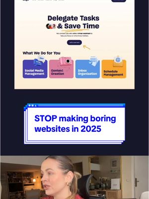
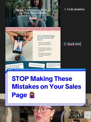
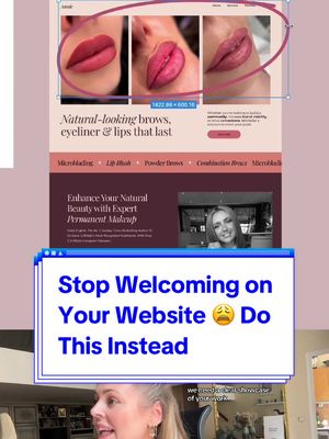
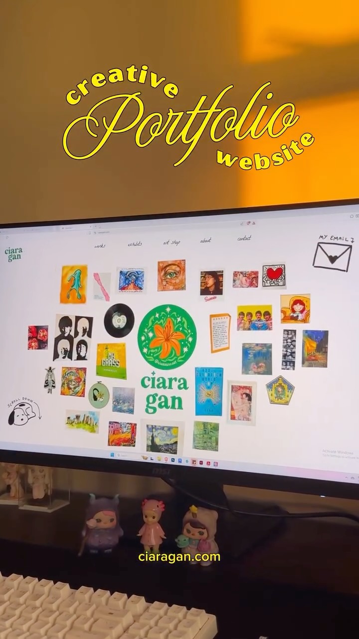
@pixeldesignlab This is how you can structure your homepage if you’re a designer or creative as a brand agency, copywriter, marketing agency. I always felt there are not that many website design information around creative business, so I share my advice 😊💻 P.s.: in case you’ll find if helpful, you can grab the website template you see in the video, it’s made in Showit and comes with a bunch of tutorials, no code, just a very intuitive drag&drop editor 💻 (Drop me a message if you have any questions, Veronika 🍀) #webdesign #webdesigner #webdesigntips #webdesigners #uxdesign #uxdesigner #uxdesigntips #design #designer #designtips #brandwebsite #websitetemplates #designportfolio
Homepage structure tips for creativesfrom @pixeldesignlab
[01]
Overview
The creator provides a step-by-step tutorial on how to structure a website homepage for designers and creatives. She breaks the homepage down into seven essential sections, explaining the purpose of each one while a visual example of a website template scrolls alongside her. After detailing the sections—Attract, Unique Selling Point, Trust, Work, Your Strengths, Your Offer, and CTAs—she concludes by pitching the website template shown in the video as a product available for purchase.
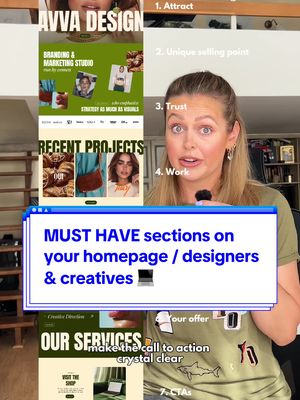
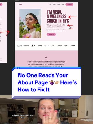
This is how you should structure your homepage if you're a designer or creative and want to book your next clients like a breeze.
Visual hook · 45%
A split-screen effect where the speaker is on the right and a long, scrolling image of a professionally designed website is on the left, creating immediate visual interest and establishing the topic.
[07]
Hook and payoff
The promise the opener makes, and how the video pays it back
Hook
Identify a specific audience and their common professional goal, then promise a clear, easy-to-follow solution.
Payoff
Seamlessly transition from providing high-value, free advice to pitching a related product or service as a shortcut to implementing that advice.
[08]
Narrative framework
The structural pattern this video runs on
Framework
The Sequential Mastery Blueprint
A step-by-step instructional guide that breaks down a complex process into a clear, sequential list of best practices, with each step visually demonstrated using a concrete example.
1
The First Impression Mandate
Detail the first and most crucial step, focusing on immediately capturing attention and establishing a strong initial presence.
2
The Clarity Commandment
Instruct on how to clearly and simply articulate the core value proposition, removing all ambiguity for the end-user.
3
The Trust Signal Showcase
Explain how to leverage third-party validation and social proof to build credibility and establish authority.
4
The Competence Demonstration
Showcase how to provide tangible proof of skill and past success, moving from claims to evidence.
5
The Personalization Principle
Advise on injecting a human element into the process to foster connection and differentiate from faceless competitors.
6
The Simplified Offer
Guide the audience on how to structure their offerings for maximum clarity and minimal user friction, advocating for simplicity.
7
The Action Catalyst
Define the final directive for the user, ensuring a clear and compelling call to action that drives conversion.
Themes
Expertise
Client Acquisition
Website Optimization
Personal Branding
Techniques
Direct address
Numbered list
Visual demonstration
Product pitch
Post caption
This is how you can structure your homepage if you’re a designer or creative as a brand agency, copywriter, marketing agency. I always felt there are not that many website design information around creative business, so I share my advice 😊💻 P.s.: in case you’ll find if helpful, you can grab the website template you see in the video, it’s made in Showit and comes with a bunch of tutorials, no code, just a very intuitive drag&drop editor 💻 (Drop me a message if you have any questions, Veronika 🍀) #webdesign #webdesigner #webdesigntips #webdesigners #uxdesign #uxdesigner #uxdesigntips #design #designer #designtips #brandwebsite #websitetemplates #designportfolio
Text overlays
informational · beginning
1. Attract
informational · middle
2. Unique selling point
informational · middle
3. Trust
informational · middle
4. Work
informational · middle
5. Your strengths
informational · middle
6. Your offer
informational · middle
7. CTAs
Transcript
This is how you should structure your homepage if you're a designer or creative and want to book your next clients like a breeze. Start with the bold hero section. That's the top part of your website. It needs to instantly grab attention and draw the user in. You can use one strong background photo or animate multiple ones to instantly showcase your worse. Then clearly explain what you do and what sets you apart from the competition. Make it stupidly easy for people to understand the value you bring to the table. If you work with clients who are featured in well known magazines or media, don't be afraid to show it. It builds trust and credibility tier well as testimonials, for example. Next, make sure you show your recent projects, the best, strongest ones. Create case studies that not only prove that you can design pretty visuals, but also explain the goal of the project and how you approached it. Best, it's always a good idea to present yourself who's behind the business. Give yourself a small space on your home page, but don't be boring. Be human. Position yourself as a creative on a mission to help your clients. Then briefly outline your services. Less is more. Don't create seven different packages. People don't understand the difference, and the more overwhelming it is, more likely they're gonna bounce. If you're selling digital templates or courses, make the call to action crystal clear, either alone or combined with call to action to book your services. And by the way, you can buy this website template if you worst it. I made it in Showit. It's super easy to plug in your content. I just felt like there aren't enough good, outstanding website templates made for designers and creatives.
Homepage structure tips for creatives | Viral Hooks