@kellybadakdesign
Instagram · Split screen
@kellybadakdesign Ok ok… we can all agree that Code Geass is absolute PEAK! But we gotta talk about the abnormally long character designs lolol

@kellybadakdesign
Instagram · Split screen
@kellybadakdesign Ok ok… we can all agree that Code Geass is absolute PEAK! But we gotta talk about the abnormally long character designs lolol
Performance
Video #42191 · Split screen
[01]
The creator provides a detailed analysis of the unique visual style of the anime 'Code Geass.' She begins with a bait-and-switch joke about watching anime 'for the plot,' then argues that the visuals in 'Code Geass' are as crucial as its story. She breaks down the art style by examining its high-contrast color palette, the character designs by the manga group CLAMP which feature abnormally long and skinny bodies, and the similarly elongated mecha designs, concluding that this divisive style gives the anime its unique identity.
[02]
[03]
 5MCreator explains niche art aesthetic@kellybadakdesign · What Is X?
 229.3K22×Cultural breakdown of an anime trope@mike_sunday · Breakdown
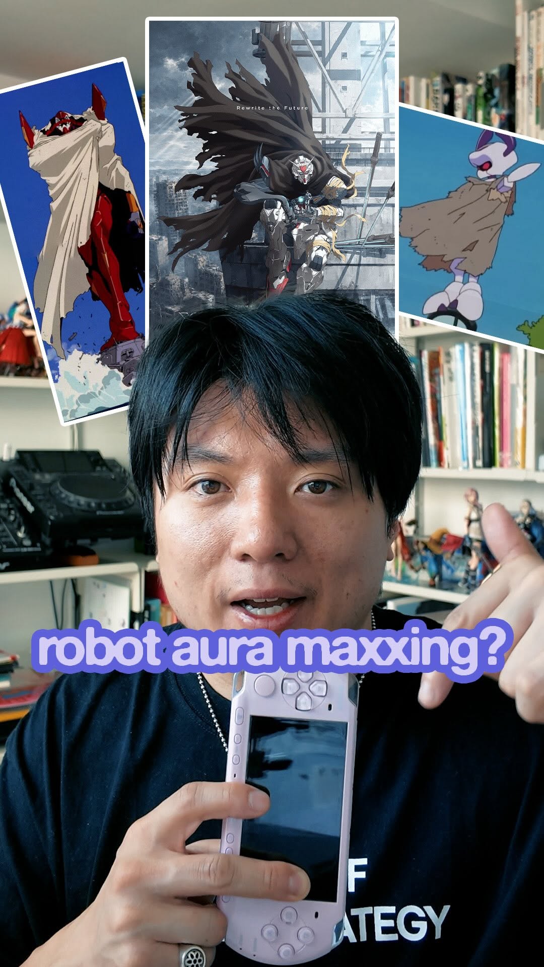 644.5K70.8×Explaining an aesthetic trope's appeal@mike_sunday · Breakdown
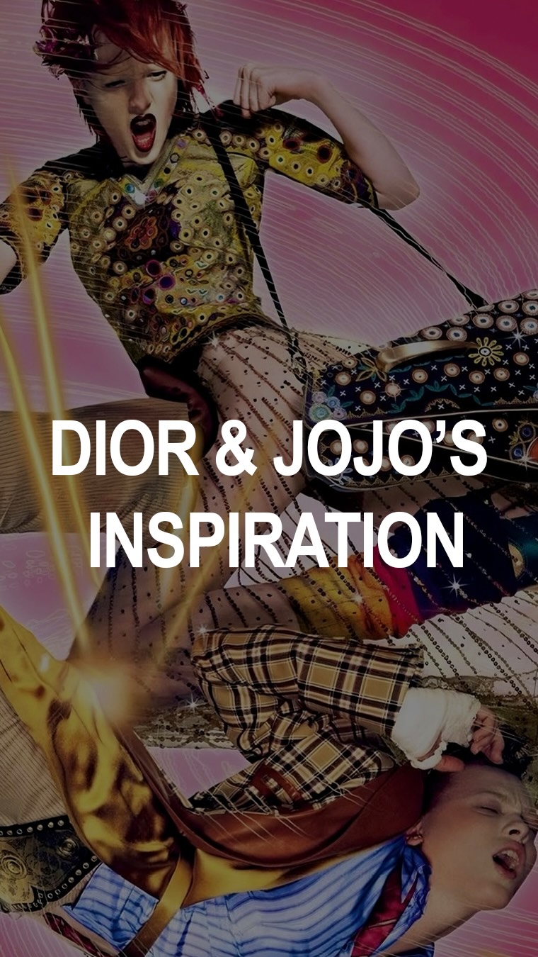 118K18.3×Explaining fashion's influence on anime@gsnwilliams · Breakdown
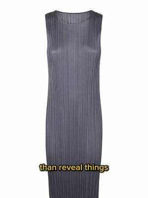 316.7K1.9×Four core themes of Japanese design@frontoffice.co · Breakdown
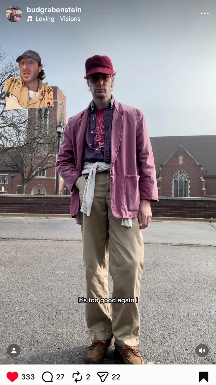 303.1K14.4×Greenscreen fashion creator style breakdown@sjparv · Breakdown
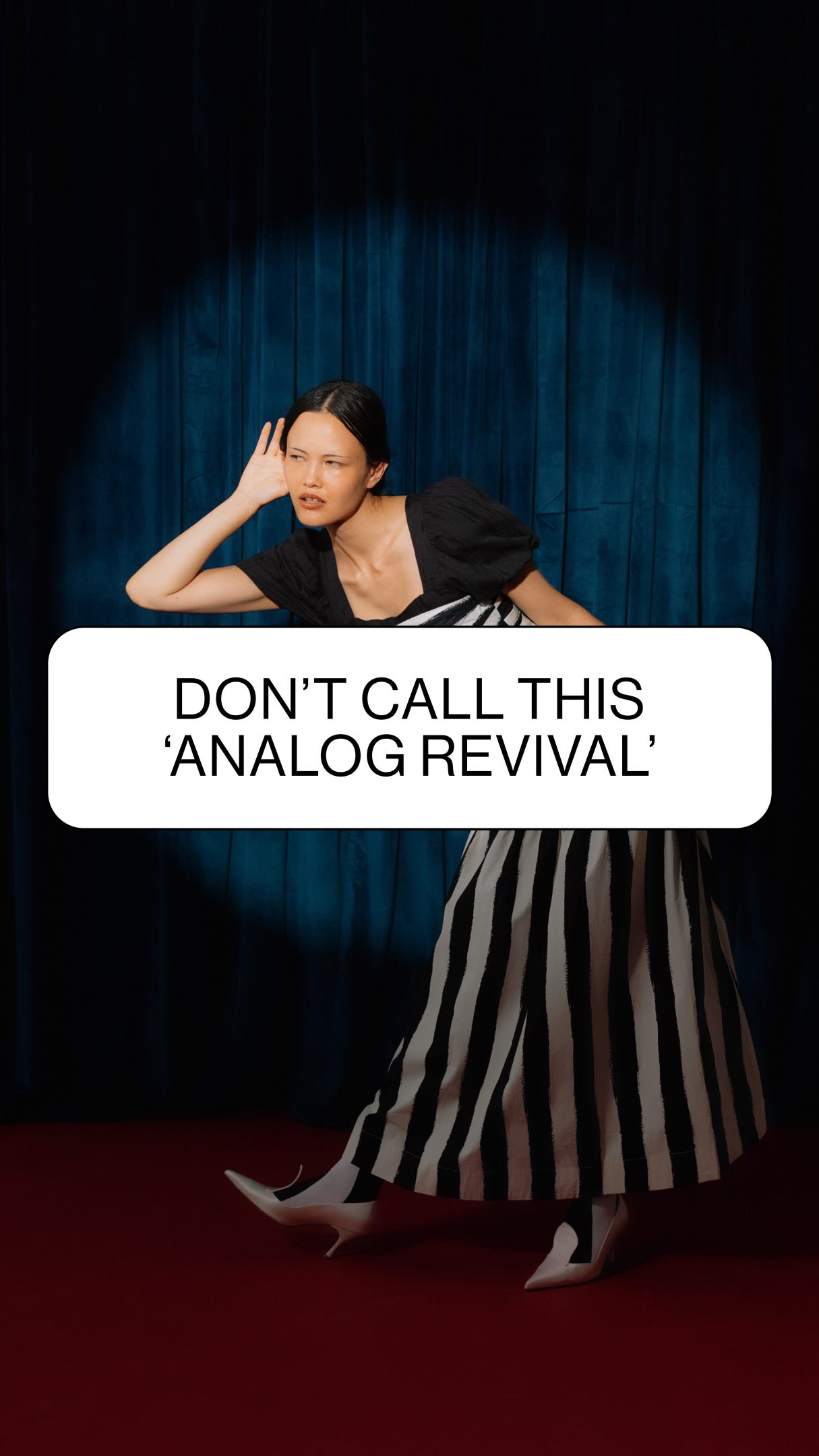 384.1K2.6×Analyzing the 'analog aesthetic' trend@deathtostock · Breakdown
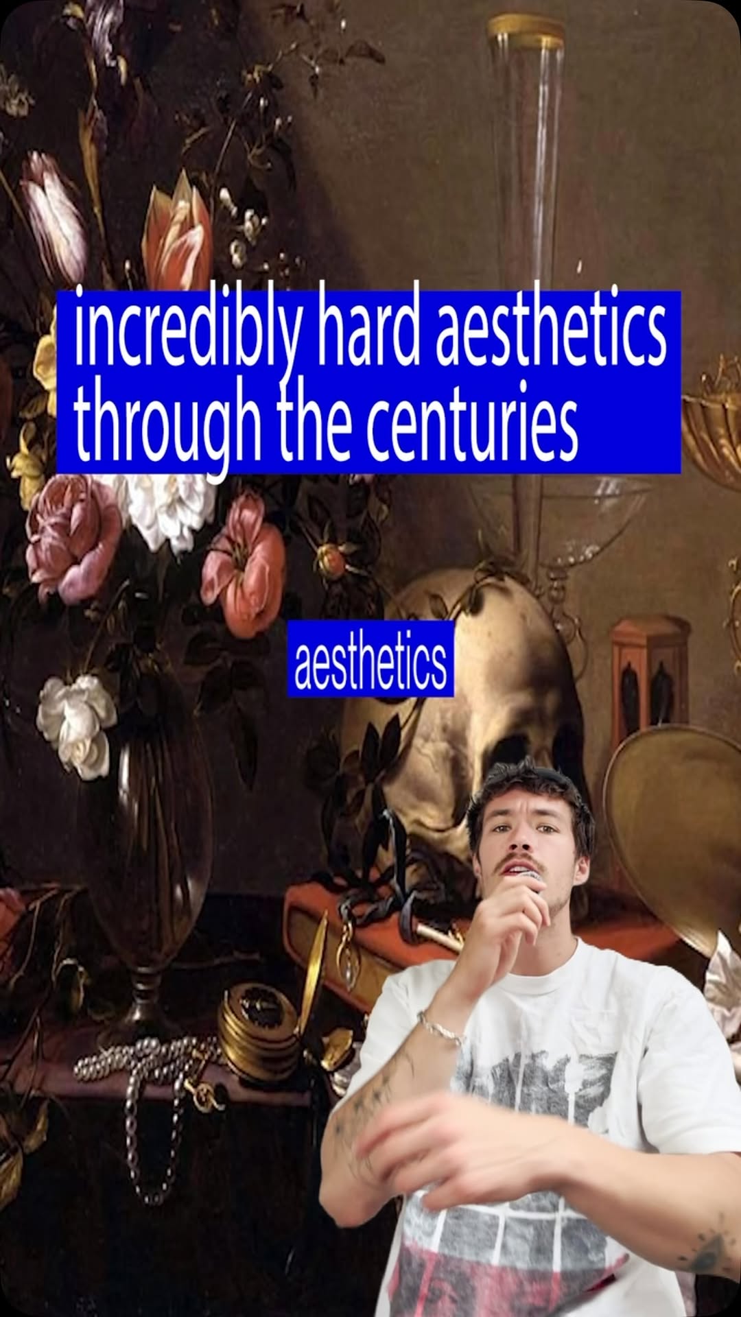 600.6K24.4×Speedrunning dark historical aesthetics@fakeplasticbrands · Rapid Fire Listicle
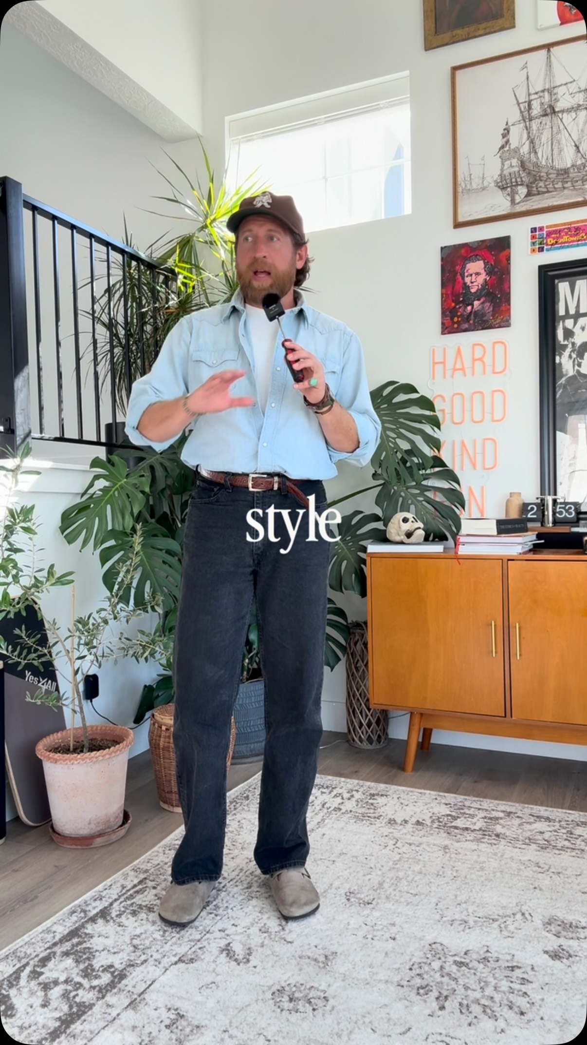 155.9KDemonstrates good vs bad styling@tannerguzy · Good vs Bad
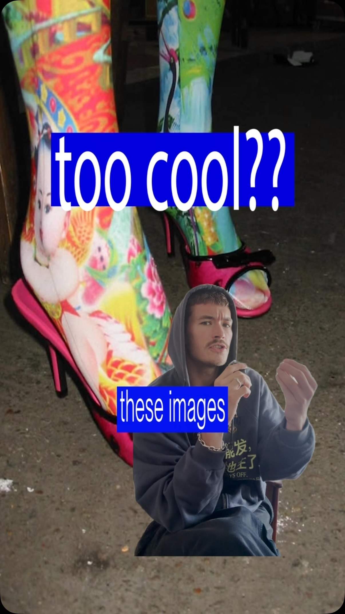 454.1K18.1×Explaining a niche internet aesthetic@fakeplasticbrands · Breakdown
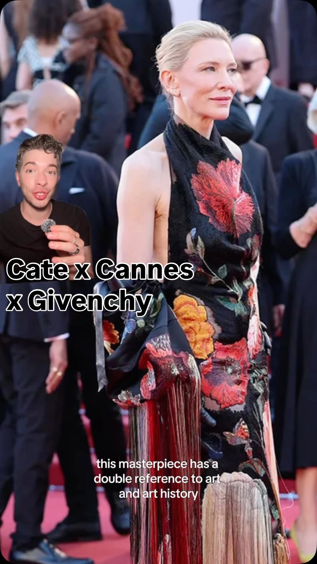 272.1K8×Celebrity fashion art history breakdown@johnmvilla2 · Breakdown
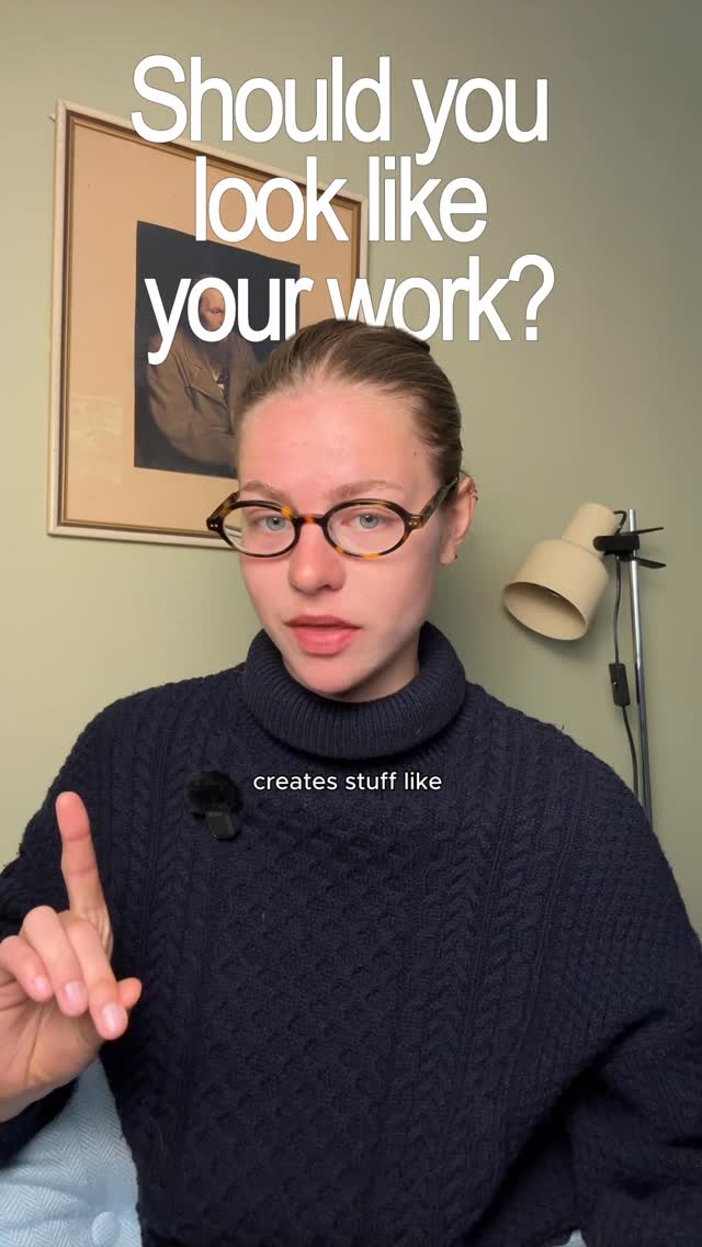 239.7K12.6×Contrasting a creator's look and work@var.aunevik · Case Study Breakdown
[04]
[05]
What stops the scroll in the first 3 seconds
Title hook · 45%
I watch anime for the plot
Verbal hook · 50%
I watch anime for the plot. Just kidding.
Visual hook · 5%
An extreme close-up shot of an anime character's cleavage, framed by hands, which serves as a visual punchline for the opening joke.
[07]
The promise the opener makes, and how the video pays it back
Hook
A bait-and-switch opening using a popular meme or relatable trope from the niche to create a pattern interrupt and secure initial attention.
Payoff
The Conclusive Reframe: A final statement that transforms the previously mentioned criticism into the subject's defining, unique strength, providing a powerful and memorable takeaway that solidifies the video's thesis.
[08]
The structural pattern this video runs on
Framework
The Expert Reframe
To present an analysis of a subject's unique visual or stylistic trait, acknowledge common criticisms of that trait, and ultimately reframe it as a core strength that defines its identity.
The Core Thesis
A clear, concise statement that establishes the video's central argument, setting the viewer's expectation for the analysis to follow.
The Color Palette Proof
Providing the first layer of evidence by analyzing the subject's use of color, a visually immediate and easy-to-understand point.
The Authority Credential
Citing a credible source, creator, or historical context (e.g., the design studio) to add weight, credibility, and 'insider' value to the analysis.
The Stylistic Breakdown
Analyzing a specific, often controversial, stylistic choice (e.g., character proportions) and explaining its functional purpose within the narrative or aesthetic.
The Contrarian Acknowledgment
Directly addressing a popular criticism or negative perception of the subject to build trust with the audience and engage potential dissenters.
Ok ok… we can all agree that Code Geass is absolute PEAK! But we gotta talk about the abnormally long character designs lolol
contextual · beginning
コードギアス 反逆のルルーシュ
contextual · beginning
CODE GEASS Lelouch of the Rebellion
informational · middle
Character Design Concept CLAMP
contextual · middle
Cardcaptor Sakura
contextual · middle
xxxHolic
I watch anime for the plot. Just kidding. Code Geass is just one of those shows where the visuals do just as much work as the plot. The color palette is high contrast with colors like deep purples, blacks, and golds, and bright colors like reds and greens used as defining features for each character. The most recognizable being Lelouch's red eye and Cici's green hair. And then there's a character design that was designed by CLAMP, which is the all girl manga collective, which also designed cardcaptor Sakura and x x x holic. The characters in the show are drawn to be abnormally long and skinny, and the mechas are also elongated, which makes their movements seem more agile and sleek. I've seen a lot of people dislike this art style because the long bodies and the angular faces just throw some people off, but I feel like that's what actually sets the anime apart from others and what gives Code Geass its own visual identity.