@shovel.studio Which one do you like more?
If you don’t know me my name is Blaze. I got into web design 8 years ago when I started my own clothing brand. What I loved the most was how good design directly affected the buyer emotion and behavior.
That led me to start my own studio called Shovel where we service Shopify brands in the $1M to $20M range to elevate their digital experiences.
Some notable clients are Hours, CHNGE, Godspeed, Diamond Cross Ranch, APOC, Artifaxing, etc. Designers & developers I work with come from credible backgrounds in fashion and CPG. Our websites make 6-figure monthly revenue increases by injecting a brand-conversion ethos into them. I’m 26 and started Shovel when I was graduating college in Dec 2024. I post about web design, branding, and studio operations, follow @shovel.studio if you want to see more.
Shoot me a DM if you want to explore working together or to get resource recommendations.
Comparing two celebrity brand websitesfrom @shovel.studio
[01]
Overview
The creator compares the e-commerce website designs of Yeezy and Skims. He first analyzes Yeezy's minimalist, art-focused site, explaining how its limited choices can increase sales but noting its lack of information. He then contrasts this with Skims' more traditional, feature-rich website, highlighting its use of filters, model photography, and branding details, and discusses the impact of payment options on average order value, concluding with lessons for designing both small and large online stores.
What are Ye and Kim making their web designers do?
Visual hook · 10%
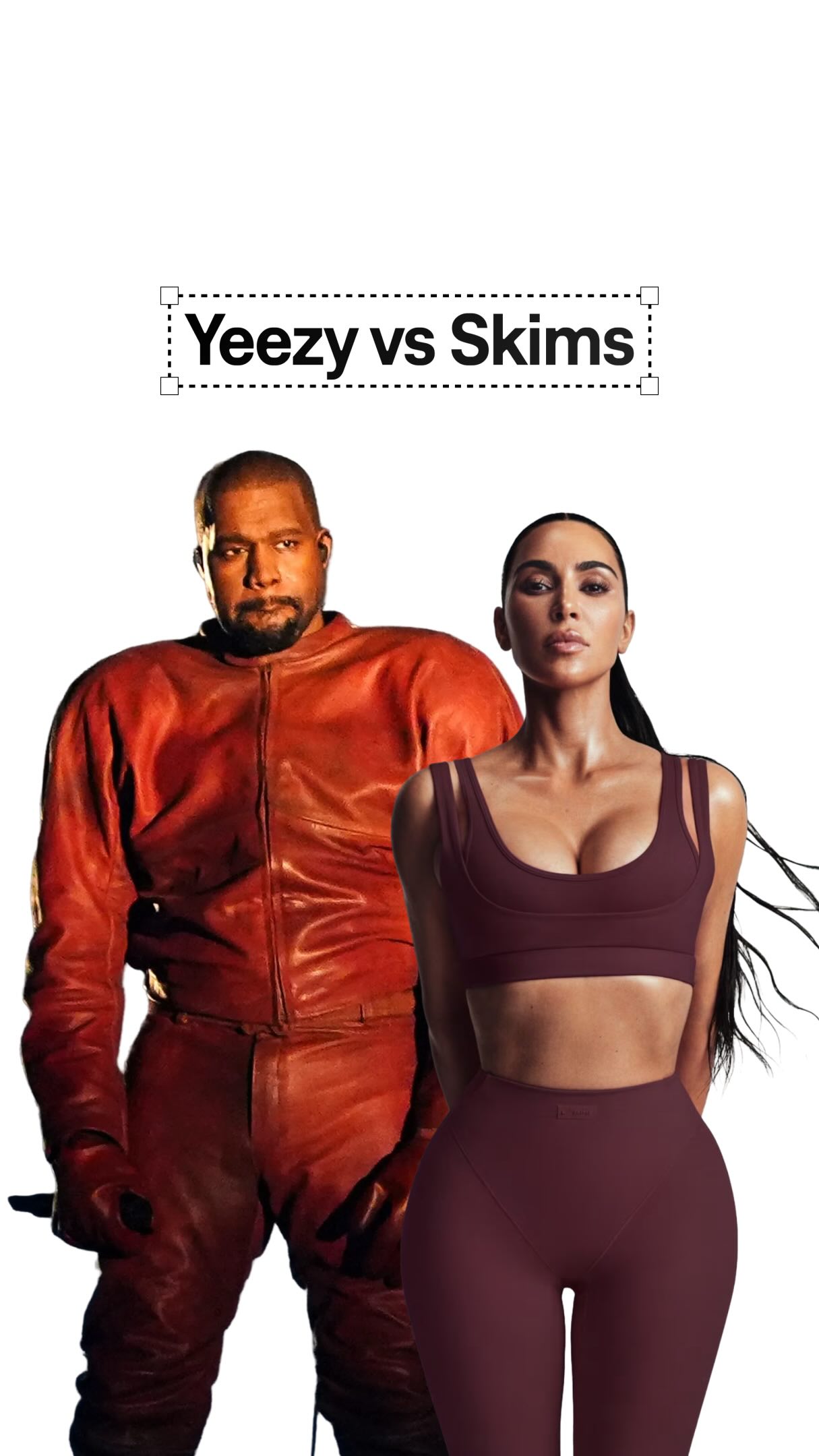
A composite image of Kanye West and Kim Kardashian is used as the background, with the creator superimposed in the foreground, immediately establishing the celebrity context of the analysis.
[06]
Hook template
Steal this for your own video
What are [famous people or brand] making their [professional role] do?
— What are Ye and Kim making their web designers do?
— What is Gordon Ramsay making his line cooks do before every single service?
— What is Apple making its store employees do the second a customer walks in?
[07]
Hook and payoff
The promise the opener makes, and how the video pays it back
Hook
Pose a provocative question comparing two well-known, opposing entities, creating immediate intrigue and framing the video as a high-stakes analysis.
Payoff
The Synthesis & Value Proposition. Summarize the key lessons learned from analyzing both approaches, framing the entire video as a valuable educational experience, and concluding with a direct call to action to follow for more expert insights.
[08]
Narrative framework
The structural pattern this video runs on
Framework
The Comparative Deconstruction
Juxtaposing two opposing approaches to a common problem, revealing the data-backed 'secret' strategies behind each to establish authority and provide high-utility insights.
1
The Unconventional Approach
Deconstruct the first entity's minimalist or non-traditional strategy, linking its unique design choices to a specific, powerful outcome (e.g., increased sales, brand perception).
2
The Hidden Motive
Reveal a secondary, often pragmatic, reason for the unconventional approach, reframing a potential flaw as a deliberate strategic move.
3
The Advanced Tactic
Isolate and explain a single, high-impact optimization hack used by the first entity, backing it up with a specific performance metric to prove its effectiveness.
4
The Conventional Counterpoint
Introduce the second entity as a direct contrast, showcasing its more traditional, feature-rich approach and justifying it with user behavior data.
5
The Foundational Proof
Highlight a fundamental best practice employed by the second entity (e.g., visual presentation) and quantify its significant positive impact on core metrics.
6
The Micro-Branding Detail
Showcase a small, subtle design choice that reinforces the second entity's brand identity or improves user experience, demonstrating attention to detail.
7
The Counter-Intuitive Maximizer
Expose a seemingly negative or missing feature as a deliberate strategy to increase a key business metric (like Average Order Value), challenging common assumptions.
Themes
Minimalism vs. Maximalism
User Experience
Conversion Rate Optimization
Branding
Techniques
Comparative analysis
Data-driven insights
Case study
Trends
Celebrity-driven brands
E-commerce strategy
Post caption
Which one do you like more?
If you don’t know me my name is Blaze. I got into web design 8 years ago when I started my own clothing brand. What I loved the most was how good design directly affected the buyer emotion and behavior.
That led me to start my own studio called Shovel where we service Shopify brands in the $1M to $20M range to elevate their digital experiences.
Some notable clients are Hours, CHNGE, Godspeed, Diamond Cross Ranch, APOC, Artifaxing, etc. Designers & developers I work with come from credible backgrounds in fashion and CPG. Our websites make 6-figure monthly revenue increases by injecting a brand-conversion ethos into them. I’m 26 and started Shovel when I was graduating college in Dec 2024. I post about web design, branding, and studio operations, follow @shovel.studio if you want to see more.
Shoot me a DM if you want to explore working together or to get resource recommendations.
Text overlays
title · beginning
Yeezy vs Skims
informational · beginning
10x sales
informational · middle
26% email sign up
informational · middle
76% of shoppers
informational · middle
+20-30% sales
informational · end
+40% AOV
call-to-action · end
so follow for more web design.
Transcript
What are Ye and Kim making their web designers do? Easy splits traffic into men and women now because less choice means 10 times more sales when you have less than 50 products. And you instantly save a click by pretty much having no homepage. You start in a PLP. But this store feels more like art. Items will sort with a single click. Sometimes those refine into colors, and they have zero info on sizing or shipping. This hides the fact that it can take weeks to ship. They even tease at new releases, so a six to ten second delay on the pop up gets 26% more emails versus a pop up that instantly shows. But SKIMS will split traffic between sales, category, and gender. 76% of shoppers use filters when there's more than 50 items. Did you know model shots can best sales up to 20 to 30% over flat lay shots? And the only branding touch I like is that the chosen color on the product matches the button color. Speaking of, there's no third party buttons like Apple Pay or Shop Shop Pay. I've seen an AOV increase up to 40% without them. Since you skip a quick checkout, you find more things to buy. In this video, you learned how to design small stores, big stores, and UX that performs better for both, so follow for more web design.
Comparing two celebrity brand websites | Viral Hooks