@pixeldesignlab
TikTok · Split screen
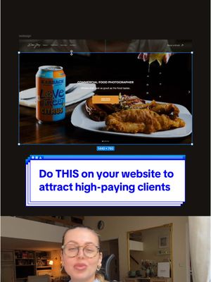
@pixeldesignlab 💻 This website could attract way higher-paying clients with just a few tweaks! Let’s fix it. 🚀 #webdesign #webdesigner #webdesigntips #uxdesign #uxdesigner #redesign #SmallBusiness

@pixeldesignlab
TikTok · Split screen
@pixeldesignlab 💻 This website could attract way higher-paying clients with just a few tweaks! Let’s fix it. 🚀 #webdesign #webdesigner #webdesigntips #uxdesign #uxdesigner #redesign #SmallBusiness
Performance
Video #5349 · Split screen
[01]
A web design expert critiques a food photographer's website, identifying issues with cluttered navigation, lack of niche focus, inconsistent photography, and poor user experience with sliders. She then presents a redesigned version, explaining how a simplified hero section, upgraded typography, and stronger copywriting can create a more premium feel to attract high-paying clients. The analysis concludes by summarizing how these small tweaks collectively enhance user engagement and professional appeal.
[02]
[03]
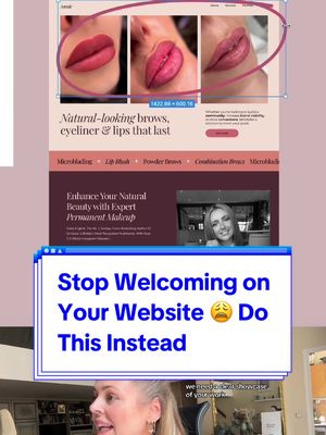 274.1K1.1×Fixing common website design mistakes@pixeldesignlab · Before/After Transformation
 54K1.1×Explaining a website design transformation@pixeldesignlab · Before/After Transformation
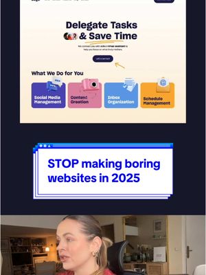 130.1K1.7×Website redesign before and after@pixeldesignlab · Good vs Bad
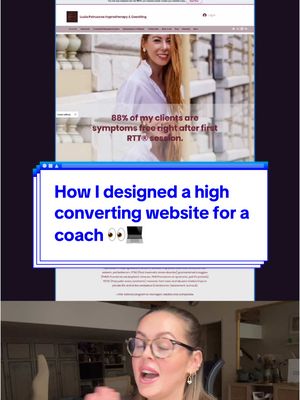 50.1KExplaining a website redesign process@pixeldesignlab · Before/After Transformation
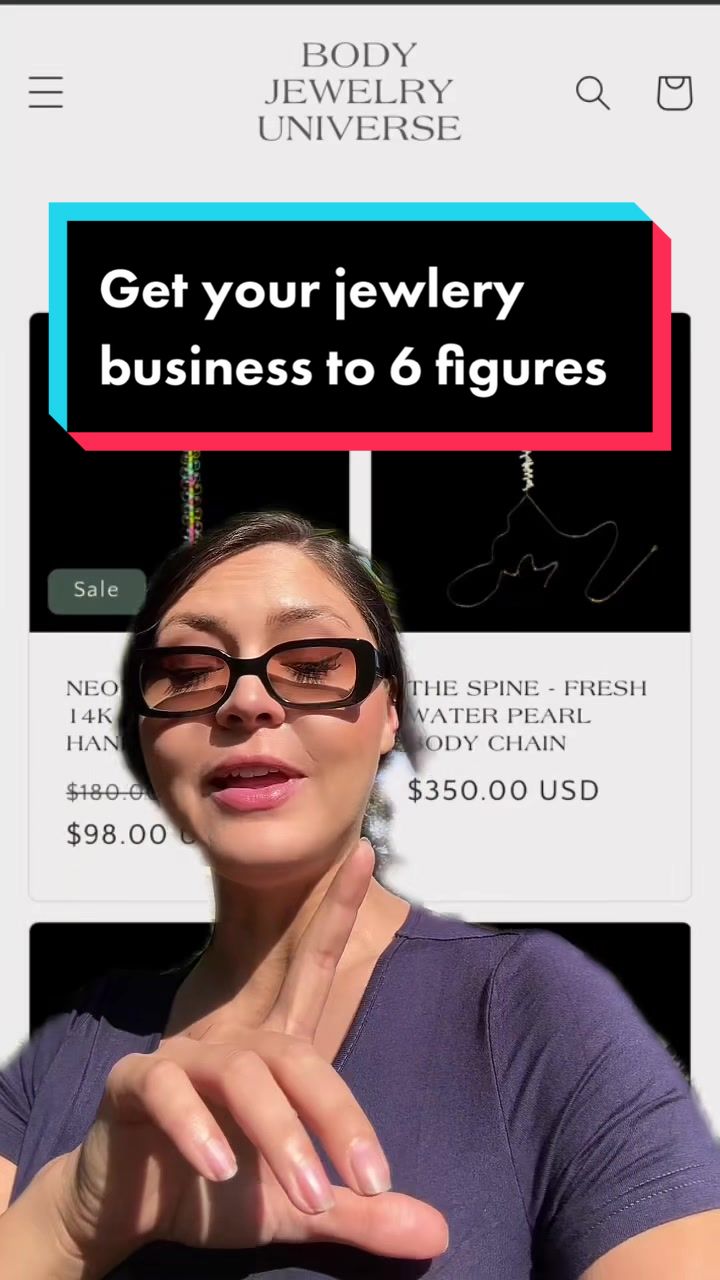 356.1K1.3×Website critique with competitor comparison@kailauli · Good vs Bad
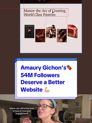 82.4K1×Critiques and redesigns famous website@pixeldesignlab · Hypothetical Case Study
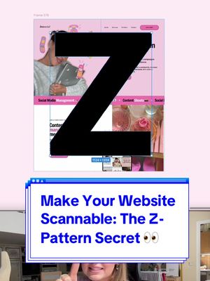 194.8K2.2×Redesigning a website for scannability@pixeldesignlab · Tutorial / How To
 74.7KDesigner critiques and redesigns website@pixeldesignlab · Hypothetical Case Study
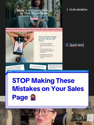 60.8KSales page design critique and fix@pixeldesignlab · Good vs Bad
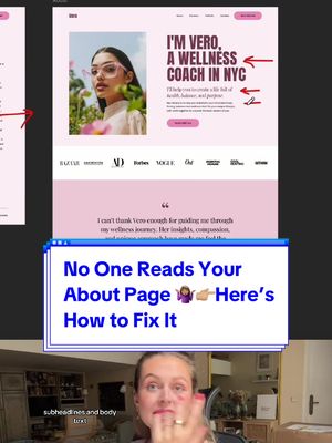 494.4K2×Before and after website redesign@pixeldesignlab · Before/After Transformation
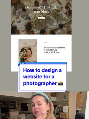 146.1K1.8×Photographer homepage design tutorial steps@pixeldesignlab · Tutorial / How To
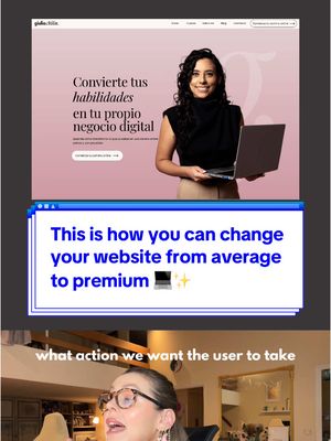 52.7KExplaining website redesign process@pixeldesignlab · Before/After Transformation
[04]
[05]
What stops the scroll in the first 3 seconds
Title hook · 35%
HOW CAN WE feel more PREMIUM
Verbal hook · 30%
How can we make this website feel more premium and appealing to high paying clients?
Visual hook · 35%
A split-screen view showing a website with a large red 'X' drawn over it, immediately signaling a problem or critique.
[06]
Steal this for your own video
Split screen: with a giant on the left — vs. the reveal on the right.
[07]
The promise the opener makes, and how the video pays it back
Hook
Poses a high-value, aspirational question that frames a common problem, promising a transformative solution.
Payoff
Delivers a sense of earned expertise and actionable insight by showing a clear, logical transformation from a flawed state to an ideal one.
[08]
The structural pattern this video runs on
Framework
The Expert Redesign
A problem-solution narrative that critiques an existing 'before' state, reveals a superior 'after' state, and justifies the changes to demonstrate expertise and provide value.
The Visual Dismissal
Immediately invalidates the 'before' state with a strong negative visual cue (e.g., a red 'X'), establishing the need for change.
The Rapid-Fire Flaw Audit
Systematically identifies and critiques multiple specific weaknesses in the 'before' state, building a case for the proposed solution by stacking evidence of failure.
The Vision Reveal
Presents the 'after' state as the clear and superior alternative, creating a stark visual contrast that serves as the initial payoff.
The Strategic Justification
Walks the viewer through the logic behind the improvements, connecting each change back to a specific flaw identified earlier, thereby proving the solution's effectiveness.
The Value Synthesis
Concludes by summarizing how the collection of small changes results in a significant overall transformation, reinforcing the creator's authority and the value of the demonstrated process.
💻 This website could attract way higher-paying clients with just a few tweaks! Let’s fix it. 🚀 #webdesign #webdesigner #webdesigntips #uxdesign #uxdesigner #redesign #SmallBusiness
title · beginning
HOW CAN WE
title · beginning
feel more
title · beginning
PREMIUM
title · beginning
to high-paying CLIENTS
informational · beginning
I would simplify the navigation it feels cluttered
informational · beginning
your logo is not that important to stand alone here
informational · middle
it makes you look less niche less professional
informational · middle
don't be scared to focus only on food photography if that's your goal
informational · middle
I would use high quality photography because the ones that you using are not consistent
informational · middle
also sliders are not very user friendly
informational · middle
don't make users do EXTRA work we don't like it
informational · middle
I would keep it to one simple hero section with an image or a video in the background to avoid distractions
informational · middle
and we can achieve that premium look by upgrading the typography
informational · end
the title is the most important element
informational · end
keep the focus on your customers
informational · end
refining the hero section will make it more engaging drawing the user in and making them want to scroll down and explore more
How can we make this website feel more premium and appealing to high paying clients? I good simplify the navigation. It feels cluttered. Your logo is not that important to stand alone here. And if you're a food photographer, I don't understand why do you have headshots, products, and portraits in the main navigation. It makes you look less niche, less professional. Don't be scared to focus only on food photography if that's your goal. I would use high quality photography because the ones that you're using are not consistent. Also, sliders are not very user friendly as users have to go manually through them to find content. Don't make users do extra work. We don't like it. I would keep it to one simple hero section with an image or a video in the background to avoid distractions. And we can achieve that premium look by upgrading the typography. You're using a Montserrat, which is a classic, but I would explore other fonts. It will feel less basic. Now about the copywriting. The title is the most important element. It needs to be catchy, but at the same time also needs to clearly communicate who you are and how can you help. You can elaborate a little bit more in the subtitle, but again, keep the focus on your customers. And by the way, this website is not that bad overall. The mobile version is easy to read, which is important. But I wanted to show how adding a bit of flare to the buttons, simplifying navigation, refining the hero section will make it more engaging, drawing the user in, and making them want to scroll down and explore more.