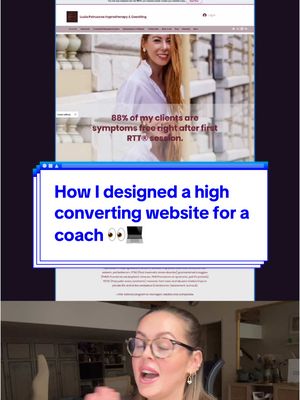
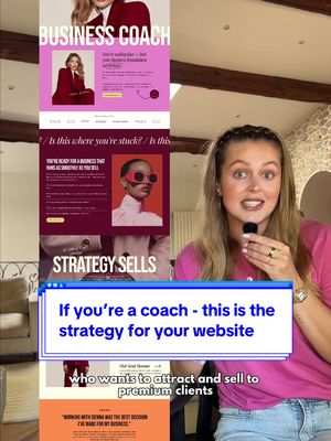
The creator presents a case study of a website redesign for a coach, starting with the successful outcome. She then breaks down the problems of the original 'before' site, explaining how it was cluttered and confusing, and showcases the simplified, focused 'after' version, detailing the strategic decisions behind niching down, streamlining services, and creating an emotional connection through design to sell the 'destination' rather than the service itself.
Transcript
After I redesigned this website, my client got three new clients in just the first week, and one of them was saying, when I read through your website, I instantly knew I want to work with you. Done. That's exactly what I aim for in my design. So let me show you what we did. Her website was super busy. It was packed with too much scattered information and services. It was visually overwhelming as well, so we simplified. Lucia is a phenomenal hypnotherapist and coach. And after a few years in the business, she was able to niche down because she knows exactly who her target audience is, who she likes to work with, and we also streamline and simplify her services. Remember, the more options you offer, the more friction it creates for the user. The user gets confused and might even leave thinking like, oh, I'm gonna read this later. I don't have time right no, and they never come back. And if there's one thing I want you to remember from this video, it's this. You're not selling a flight ticket. You're selling a destination. So in this case, we're not selling a therapy or coaching session. Tier selling the amazing feeling that comes afterward, how you finally feel light and confident and you gain clarity. I was trying to create that feeling of ambiance, warm, welcoming, comforting, also in the visuals no the user feels good immediately when they land on the website. But at the same time, I wanted to keep it professional. She did an amazing photoshoot, so the website feels cohesive.